.png)
<project brief>
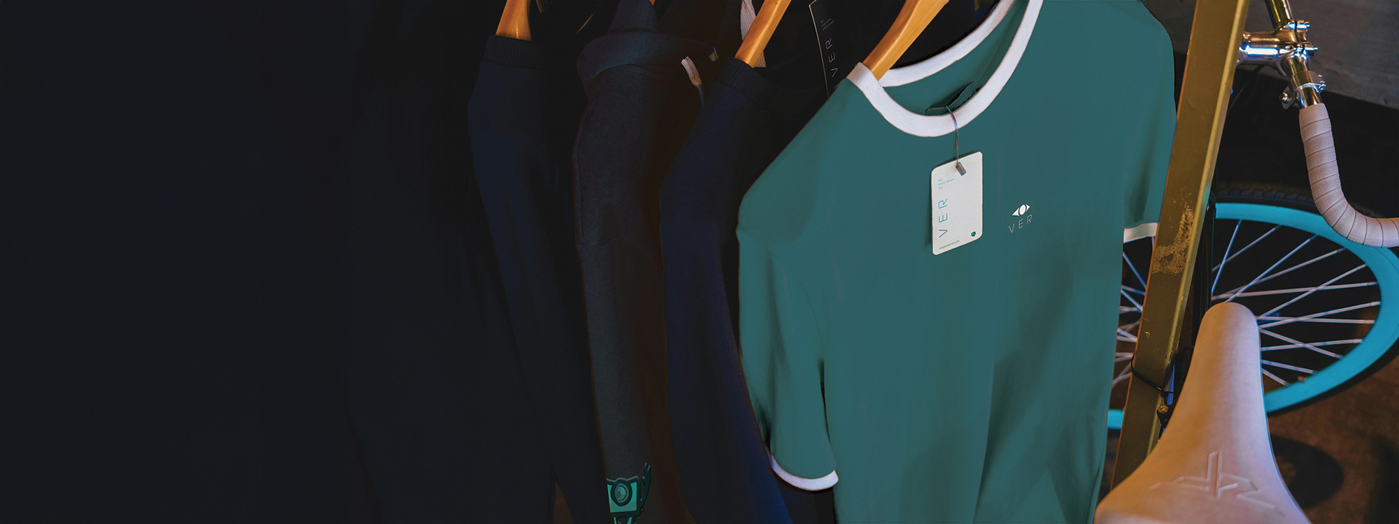
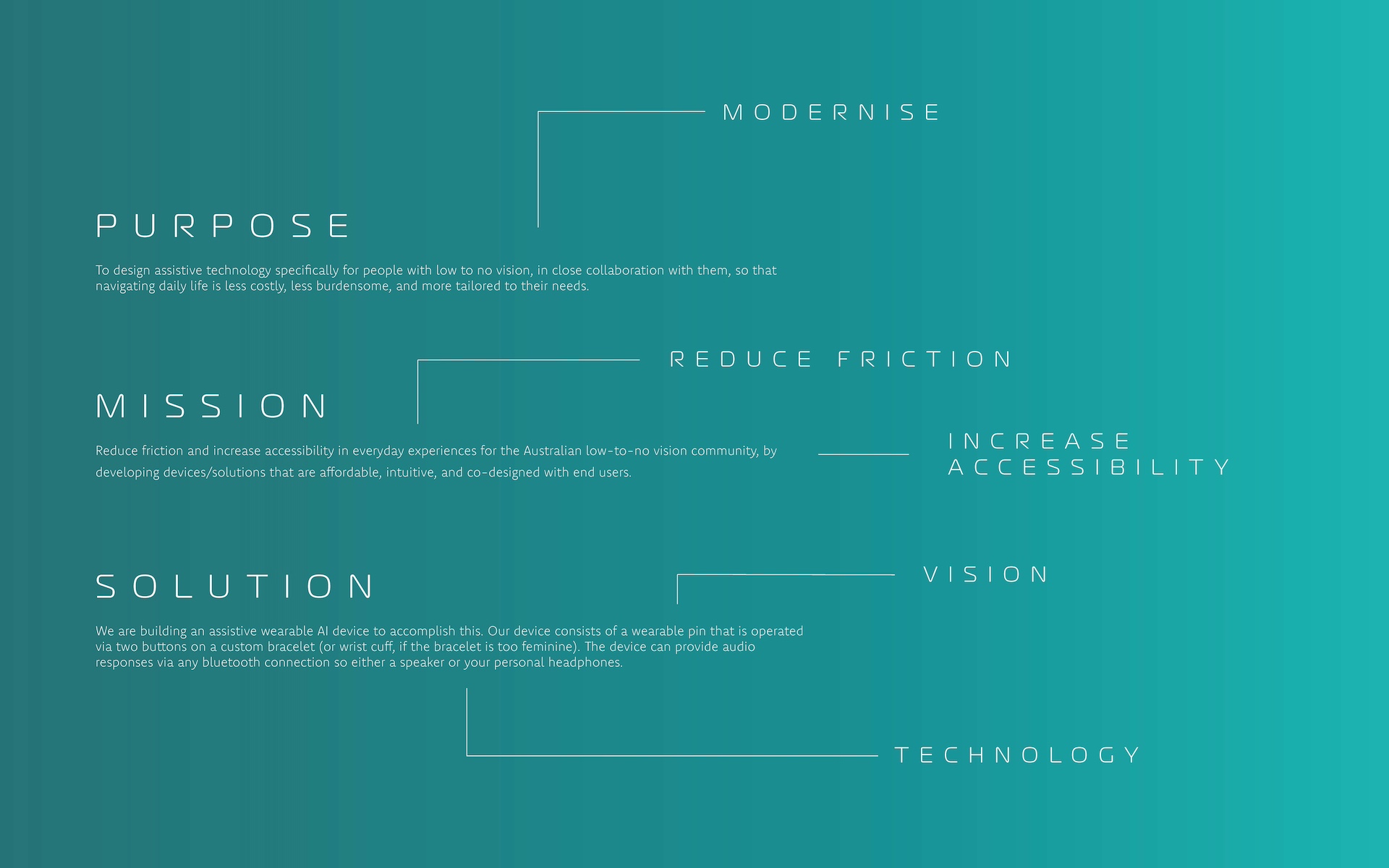
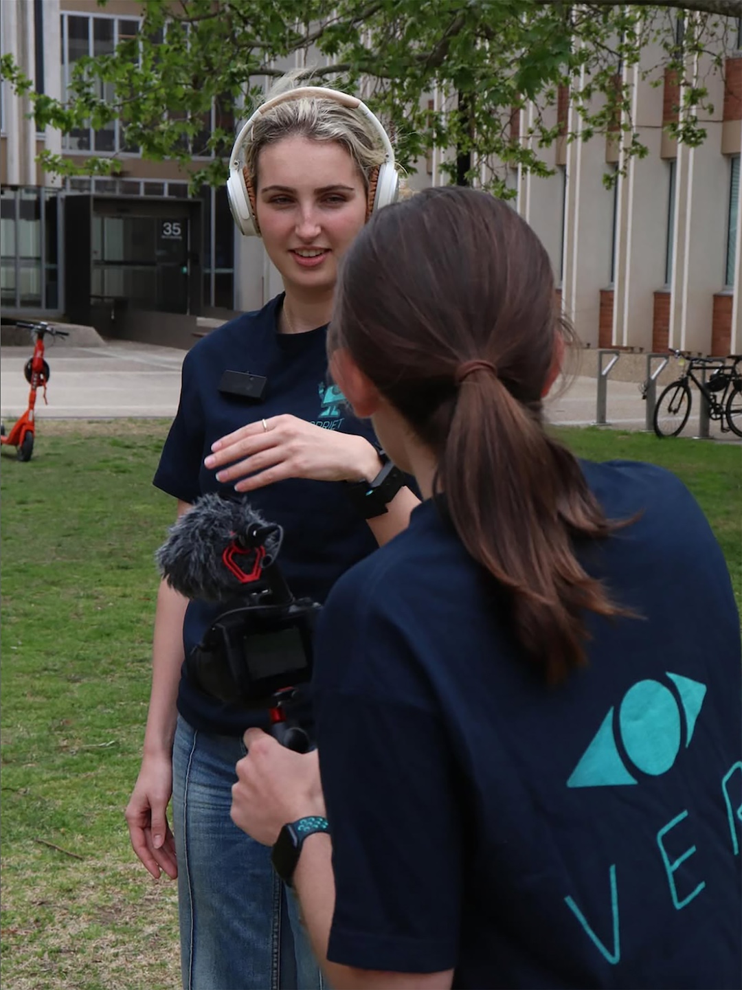
VER is a graduate-engineered assistive technology project designed to support people with low to no vision in their everyday lives. Inspired by the team’s mission to reduce friction, increase accessibility, and co-design with users, this identity translates the device’s purpose into a visual system built around clarity, modernity, and tactile logic. The brand uses refined typography, simple modular forms, and a cool, tech-forward palette to echo themes of vision, guidance, and intuitive technology.
</project breif>
<touchpoints>
<touch points>
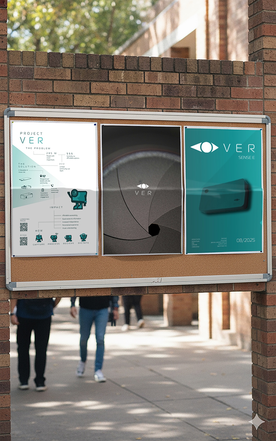
<key deliveries>
<key deliveries>
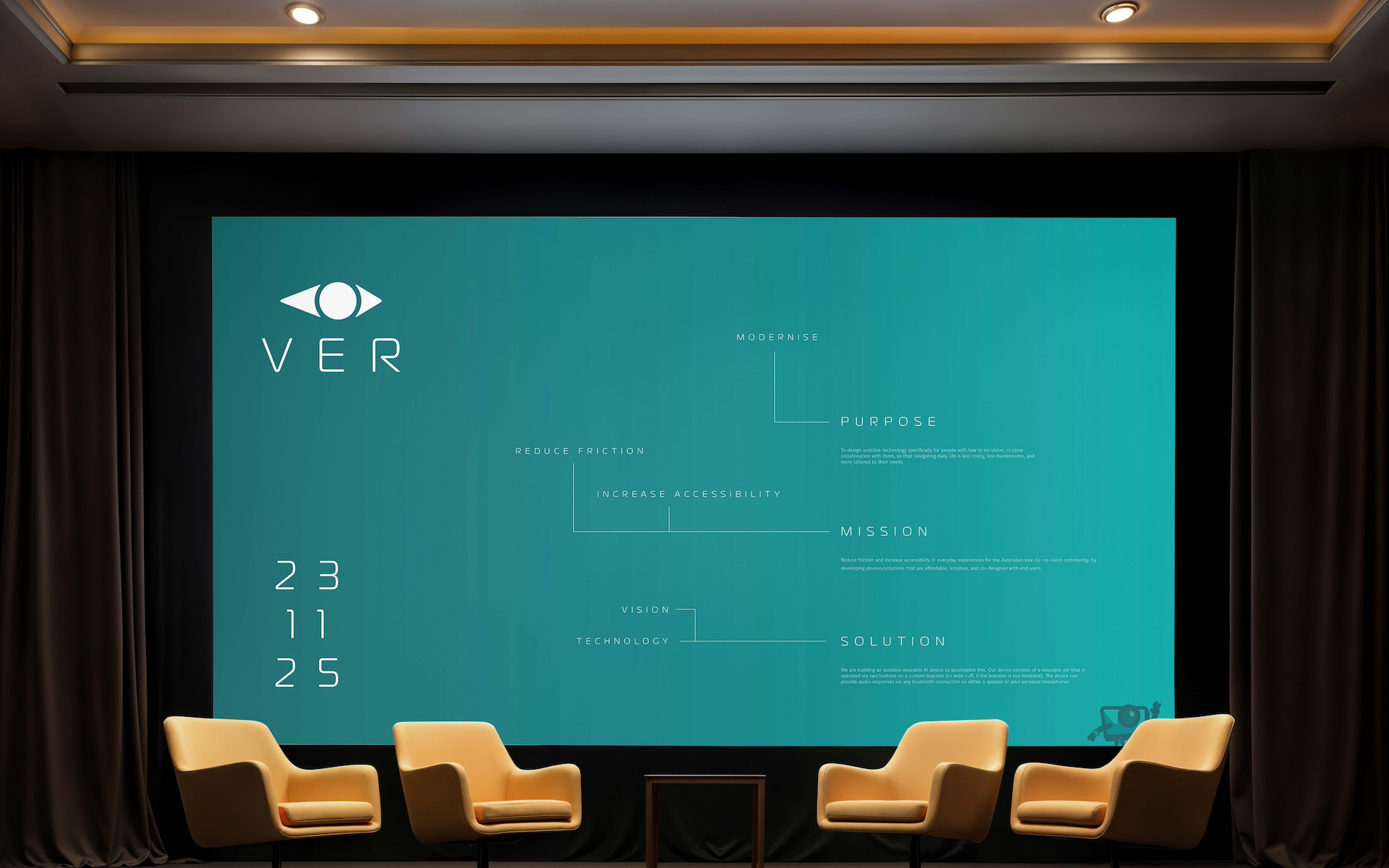

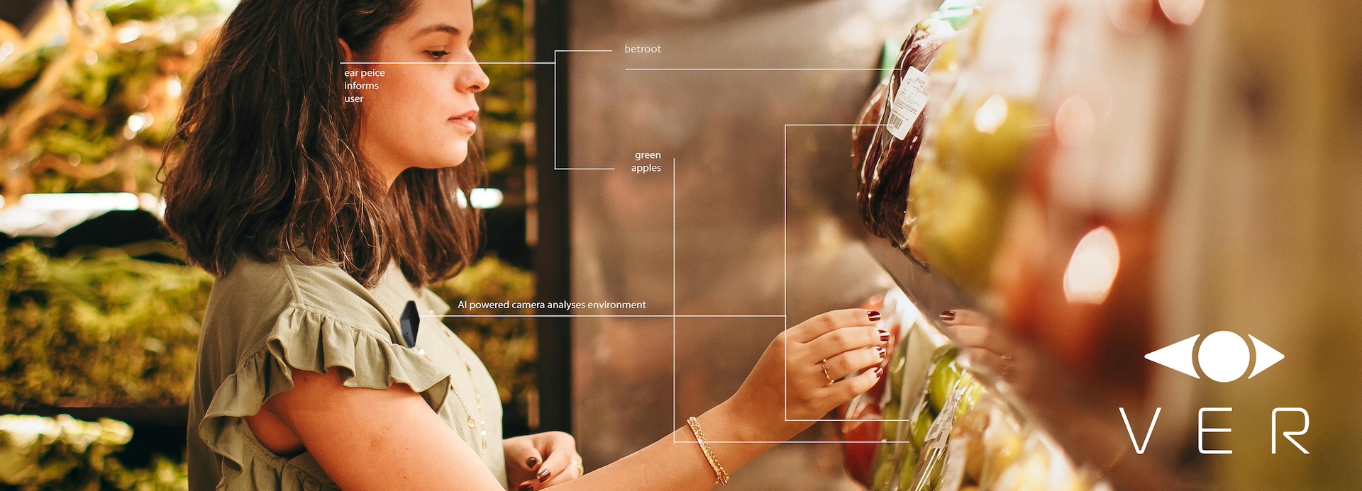
The client’s early branding felt a bit static, so I began by learning directly from the space the device lives in, looking at assistive tech, low vision accessibility standards, and the everyday tasks the Sensee is designed to support. I reviewed the client’s mission and purpose carefully so the visual language would actually reflect their values rather than sit on top of them. This early research made it clear that the identity needed to feel simple, modern, and accessible in use.
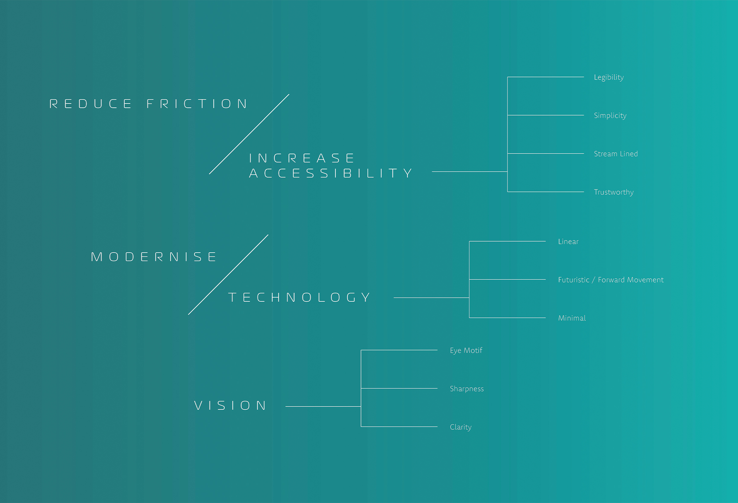
From there I explored how line, shape, and type could express vision, clarity, and forward movement without feeling clinical. I sketched variations of the device and tested how its form could inform the tone of the identity and explored an eye motif. The goal was to create a visual language that felt modern and minimal, tied to the Sensee itself, and comfortable for users who rely on clarity above everything else.
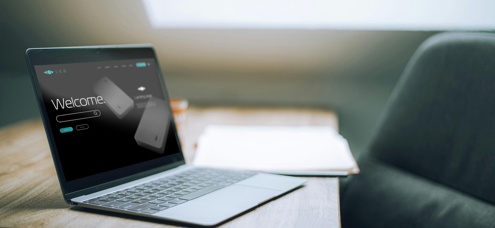
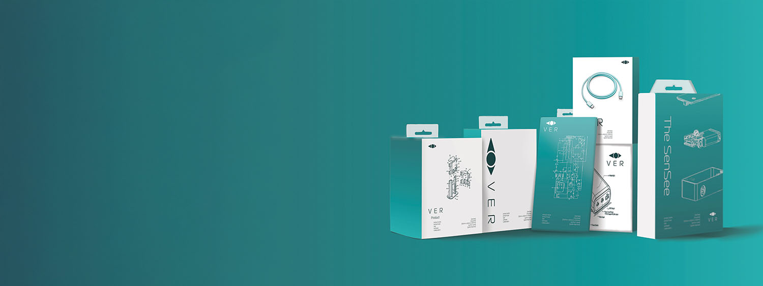
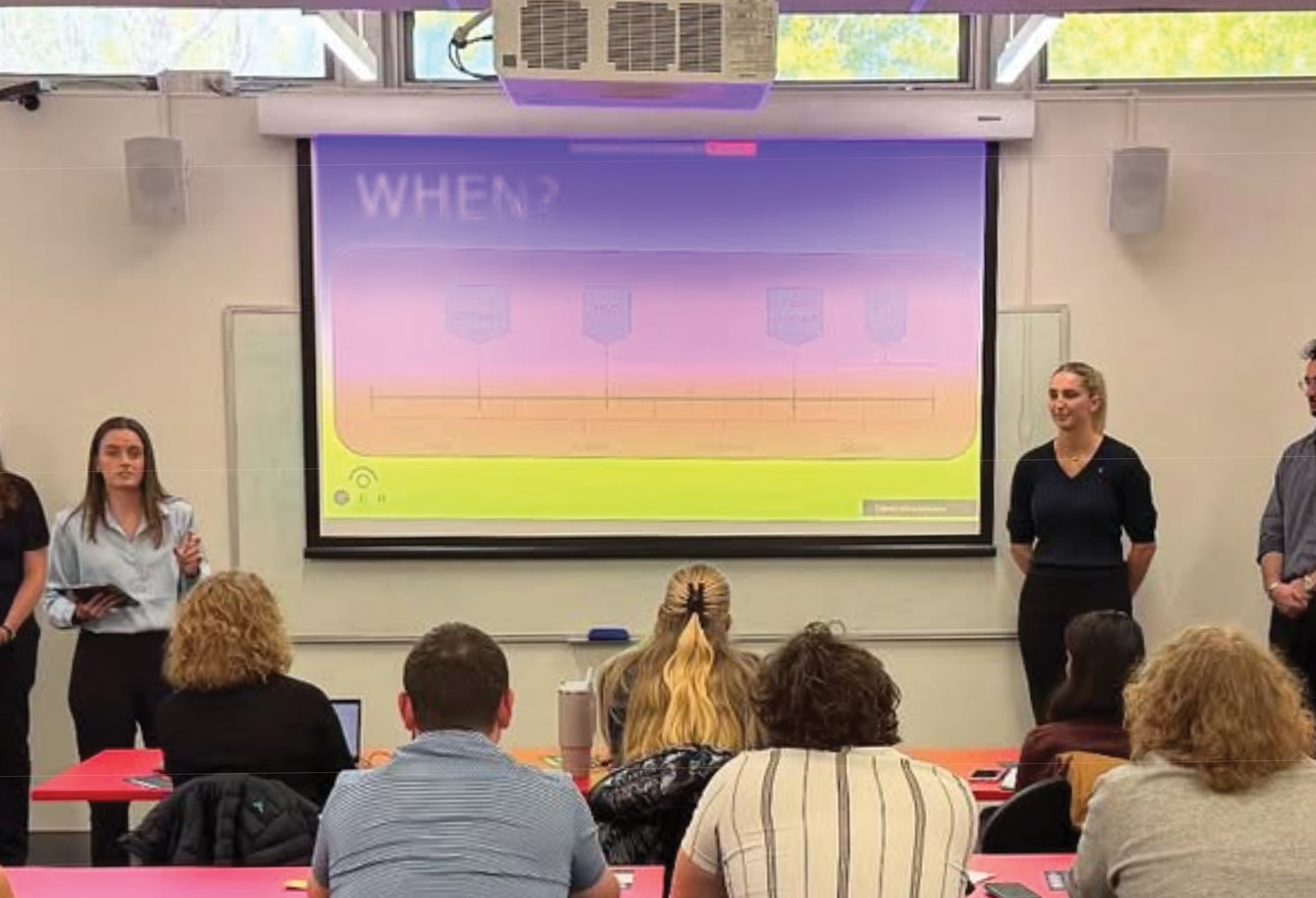
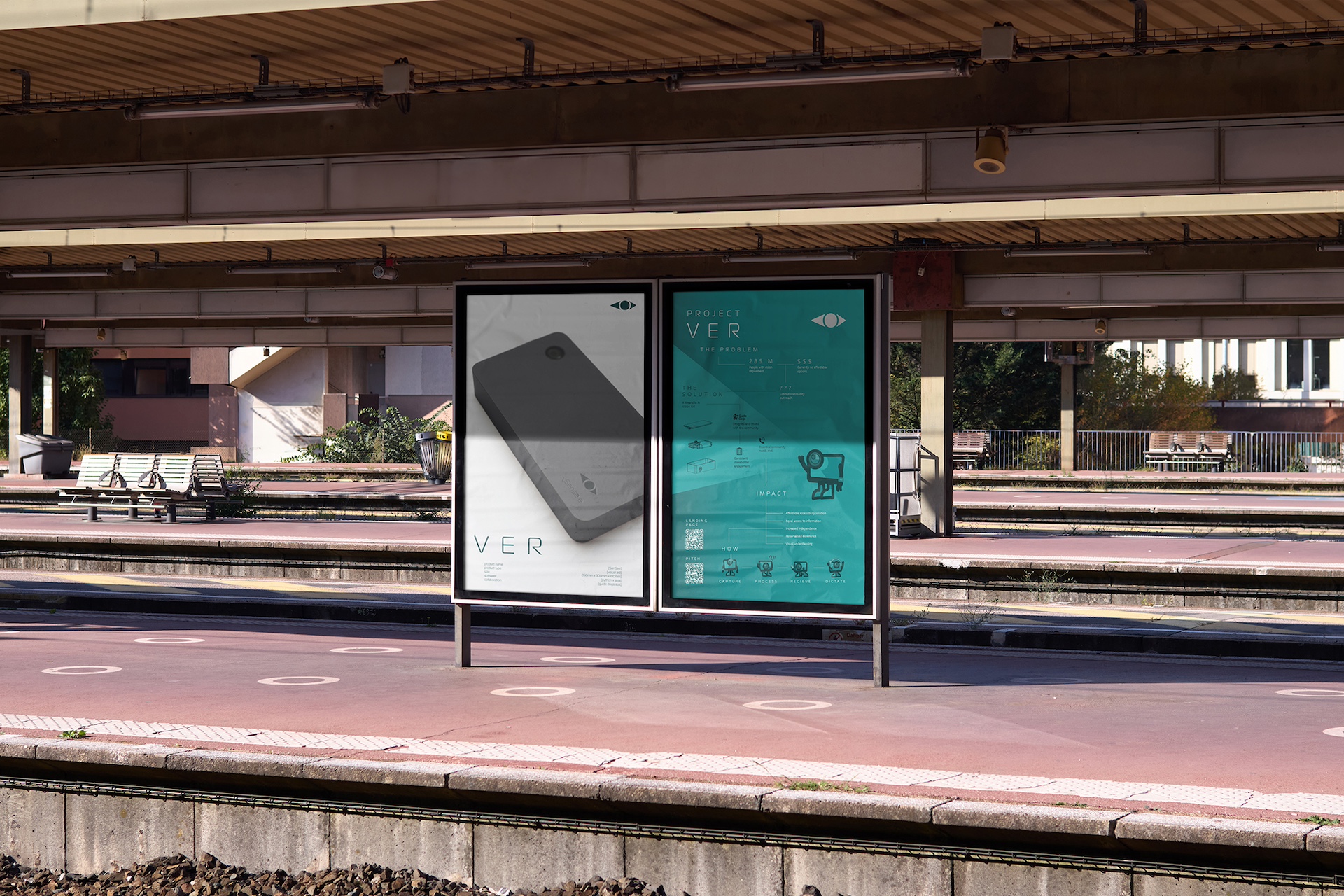
I built out early wordmarks, icons, and palettes and tested them in simple use cases like app screens and product packaging. Feedback from the team helped guide what needed to feel softer, clearer, or more direct. Iteration focused on improving legibility, simplifying shapes, and making sure the graphics worked at real scale, not just in a designer’s workspace.
The final identity is clean, device led, and grounded in the client’s mission of reducing friction for people with low to no vision. It reflects the Sensee’s form and purpose without becoming overly literal, and it stays accessible in the moments that matter most. The project reinforced the value of designing with function and clarity at the front of every choice.

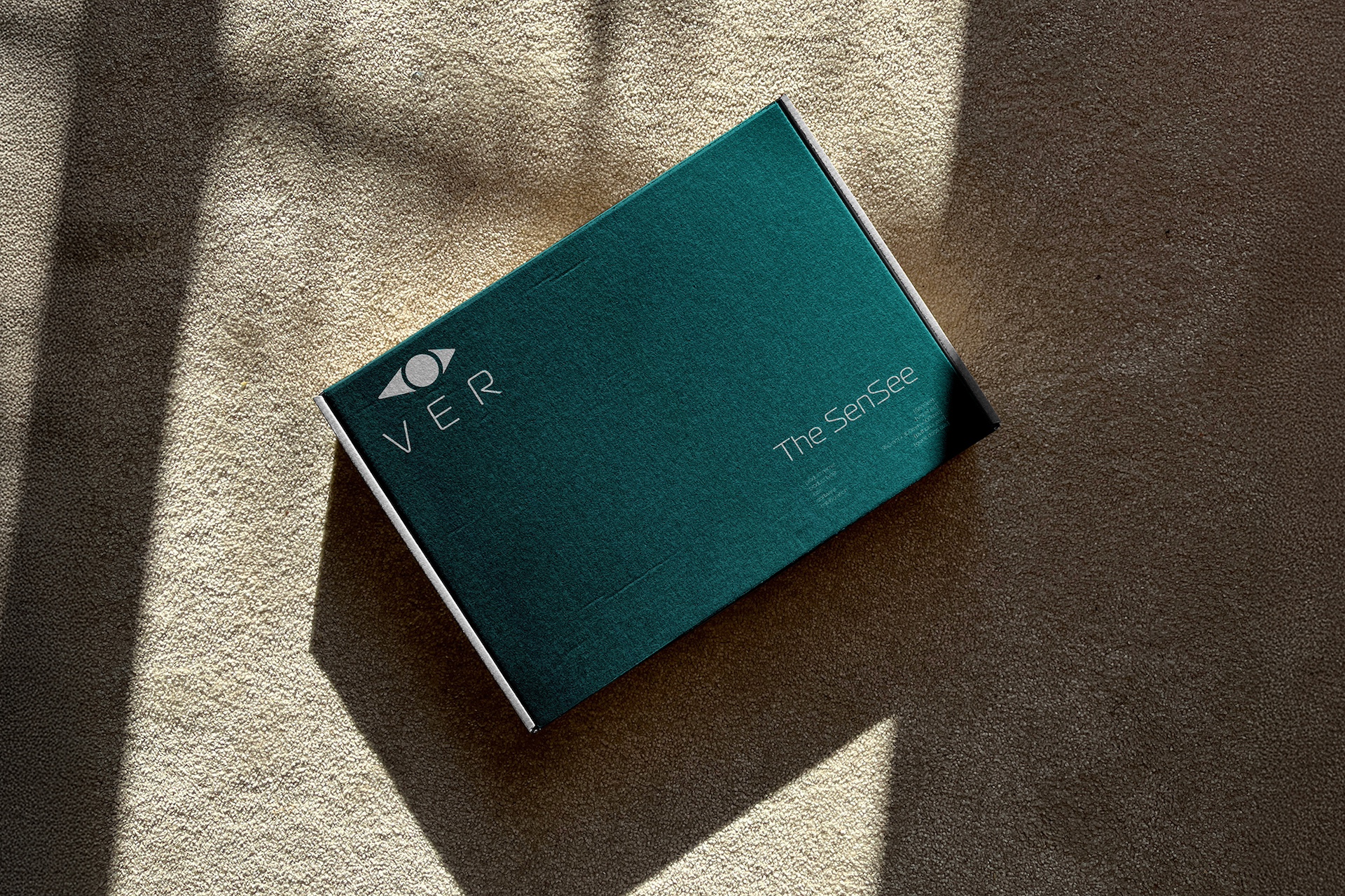
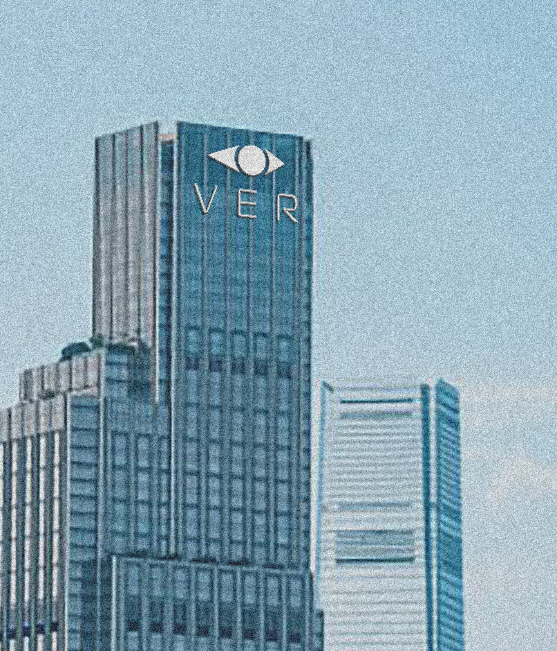
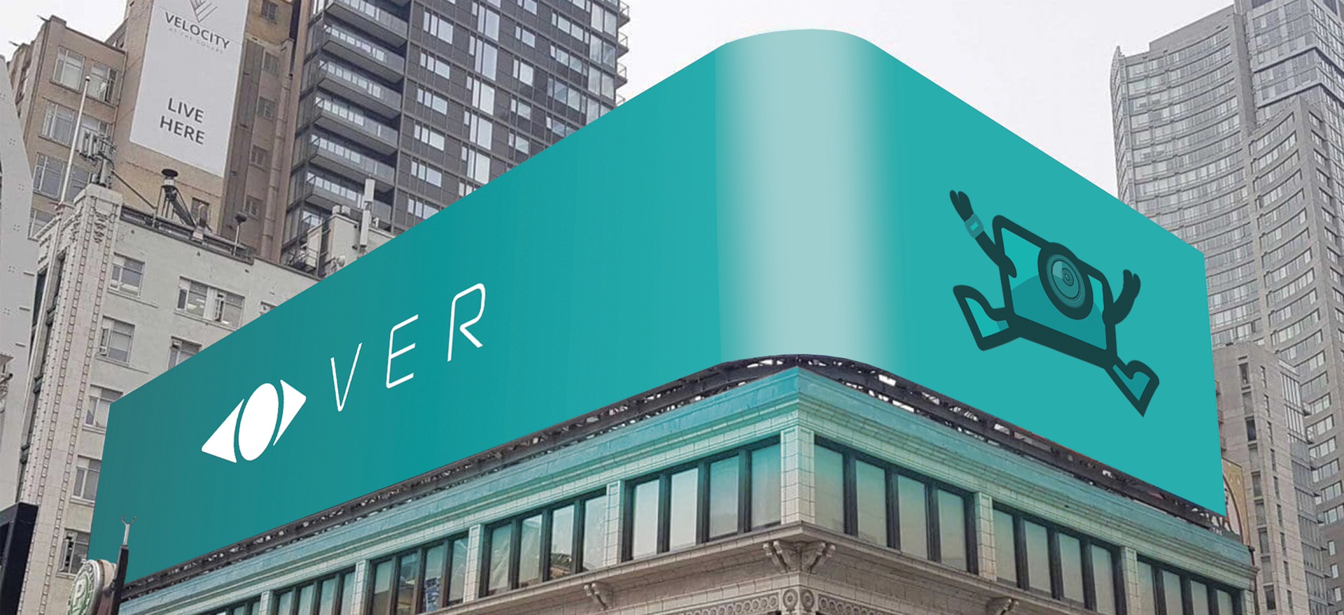
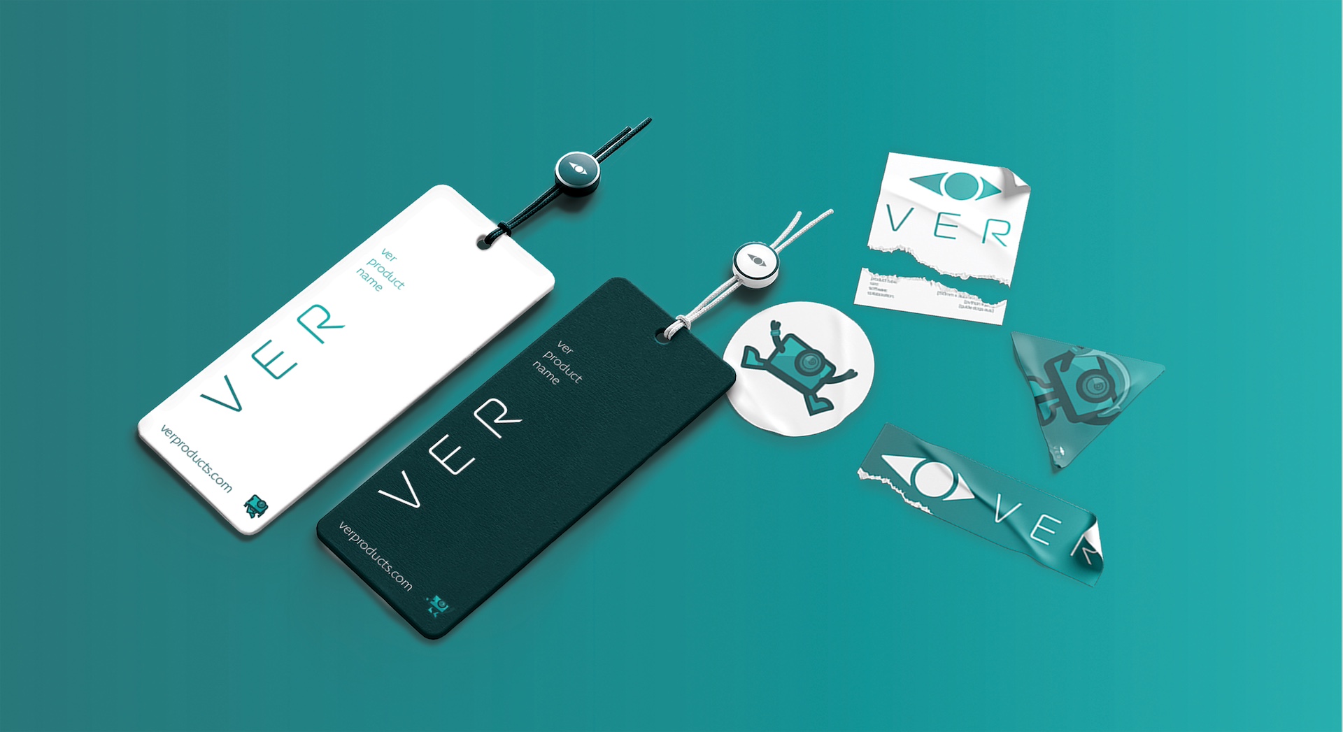
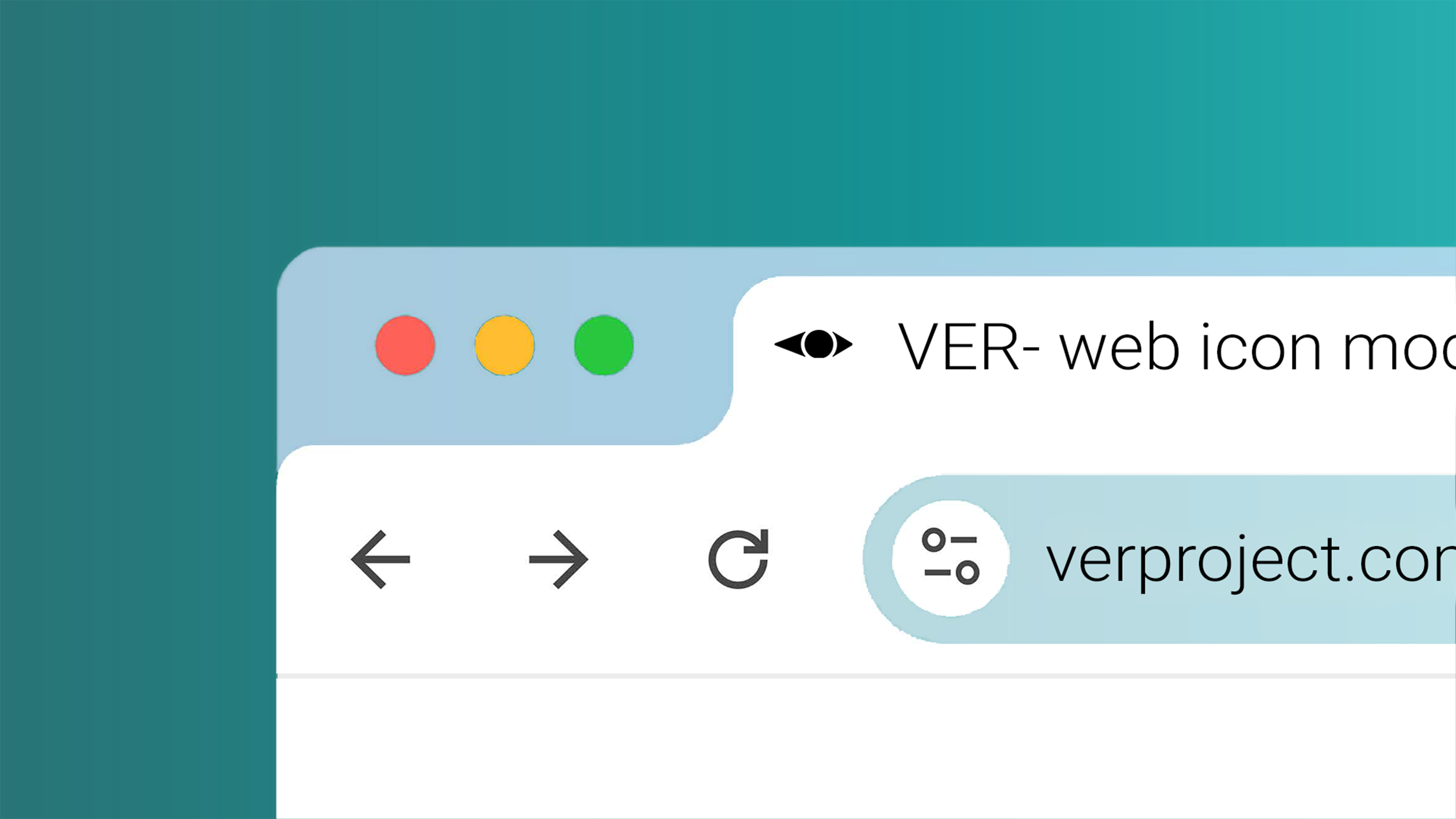
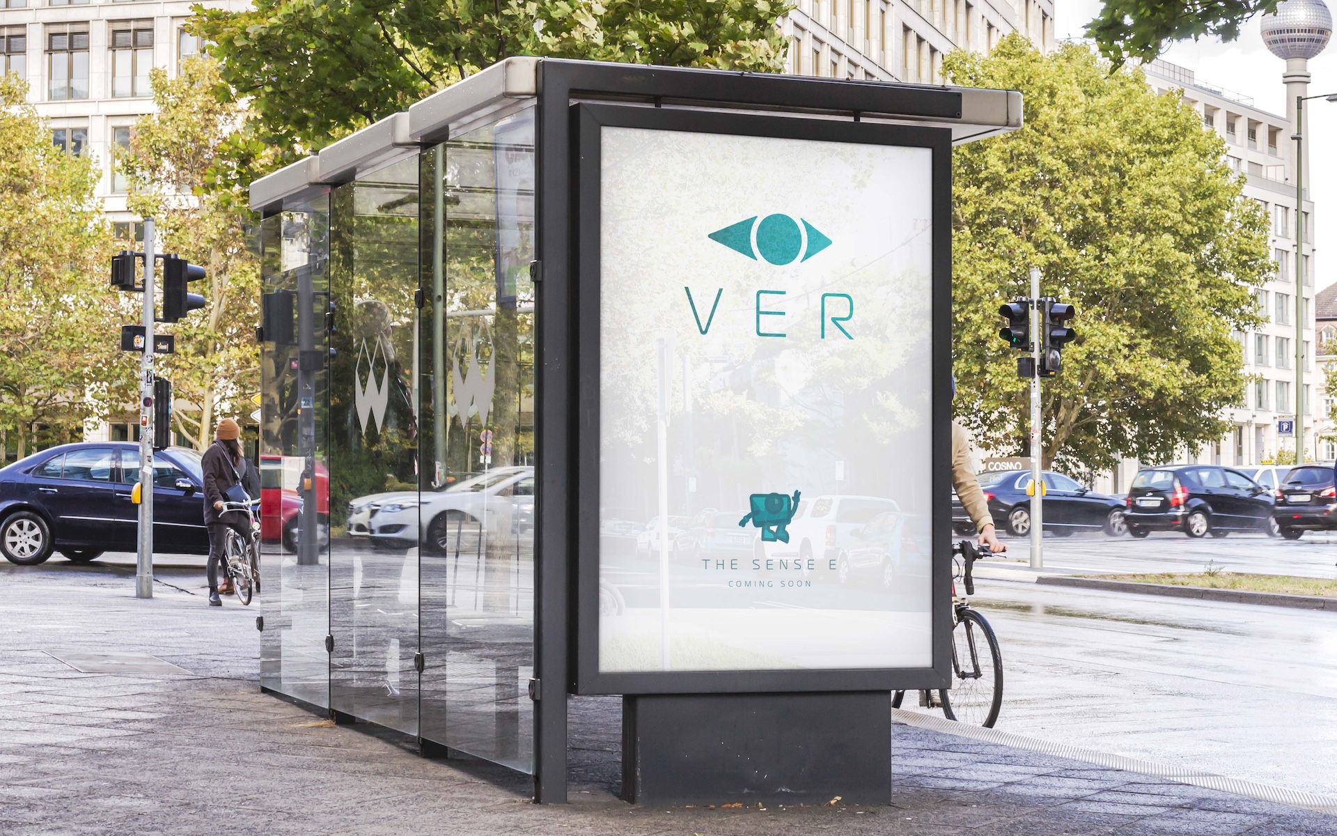
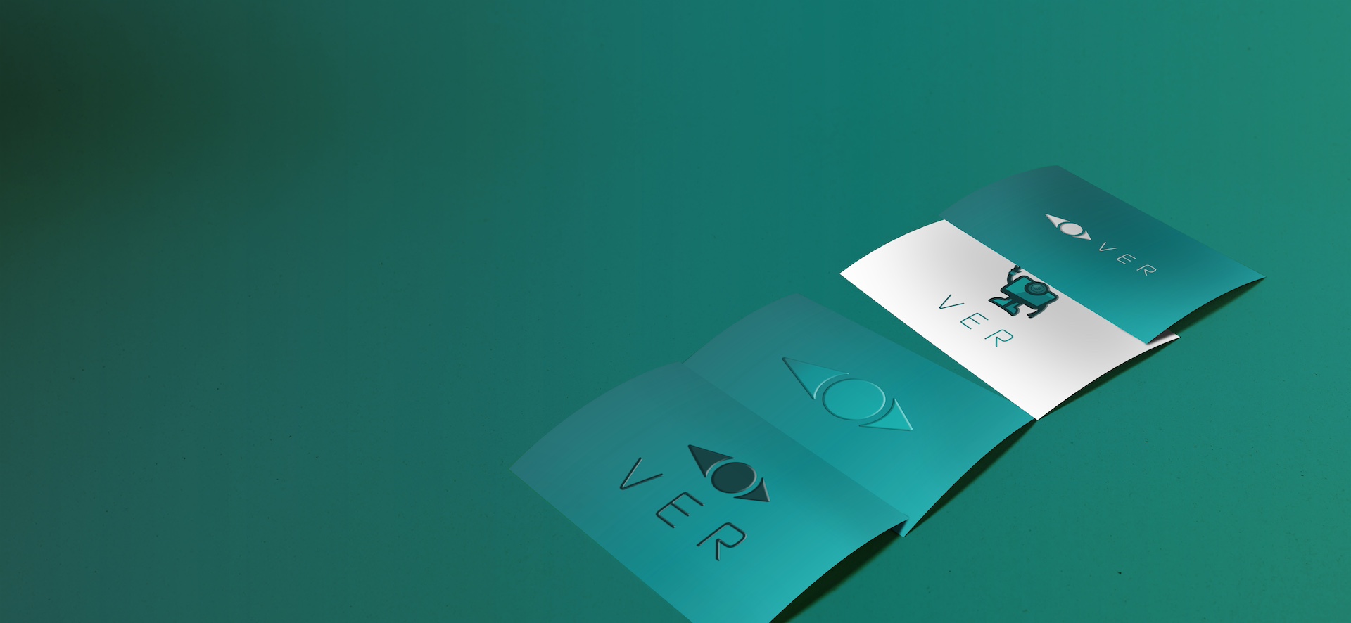
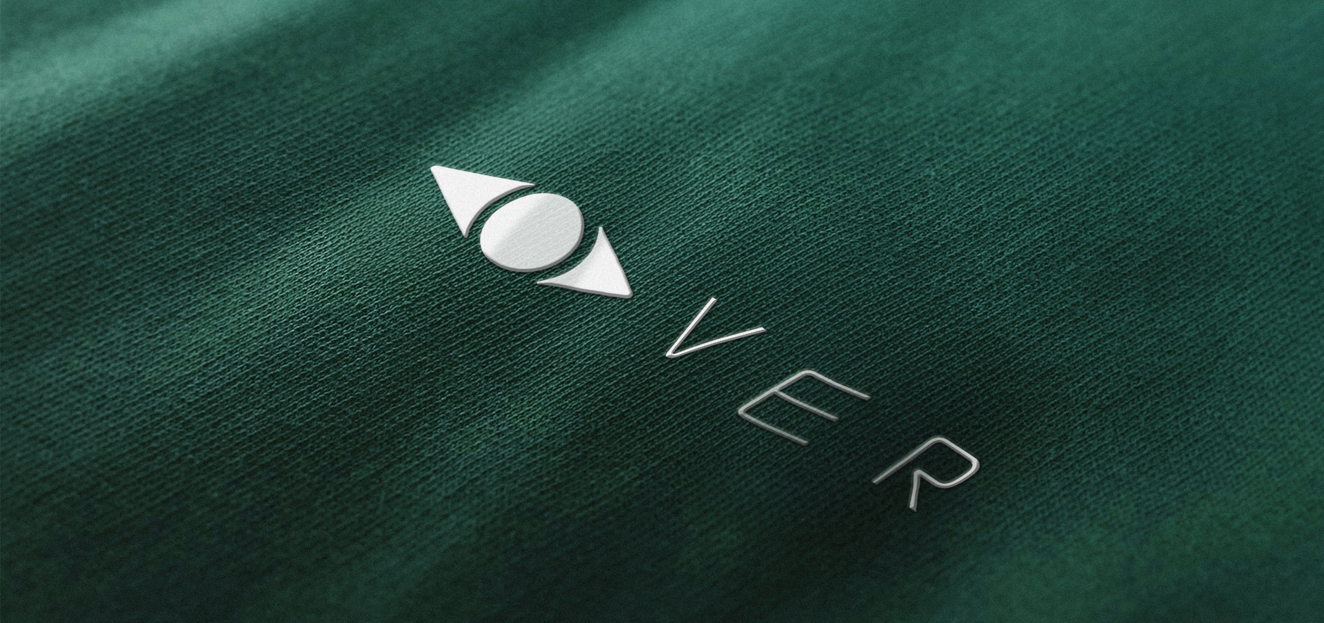
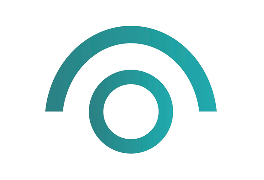
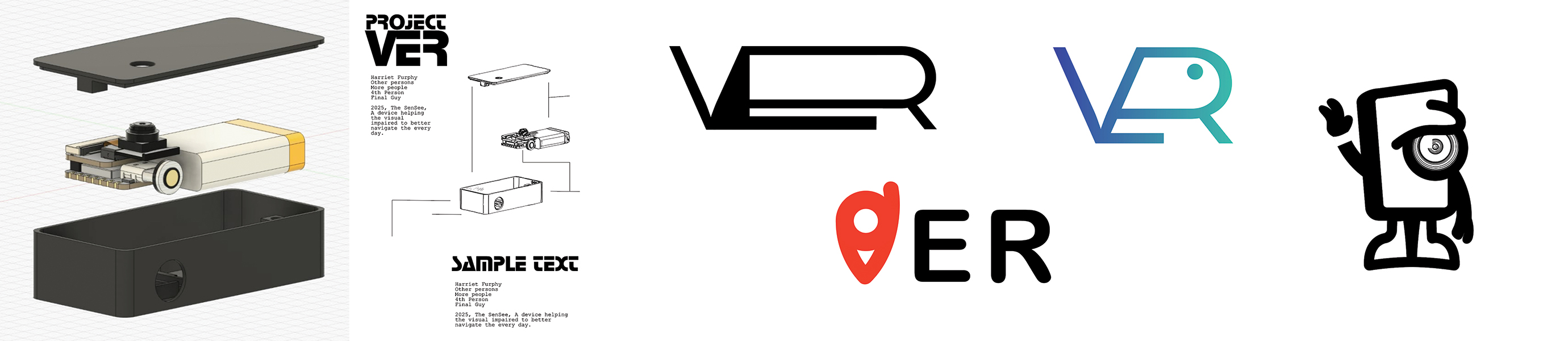
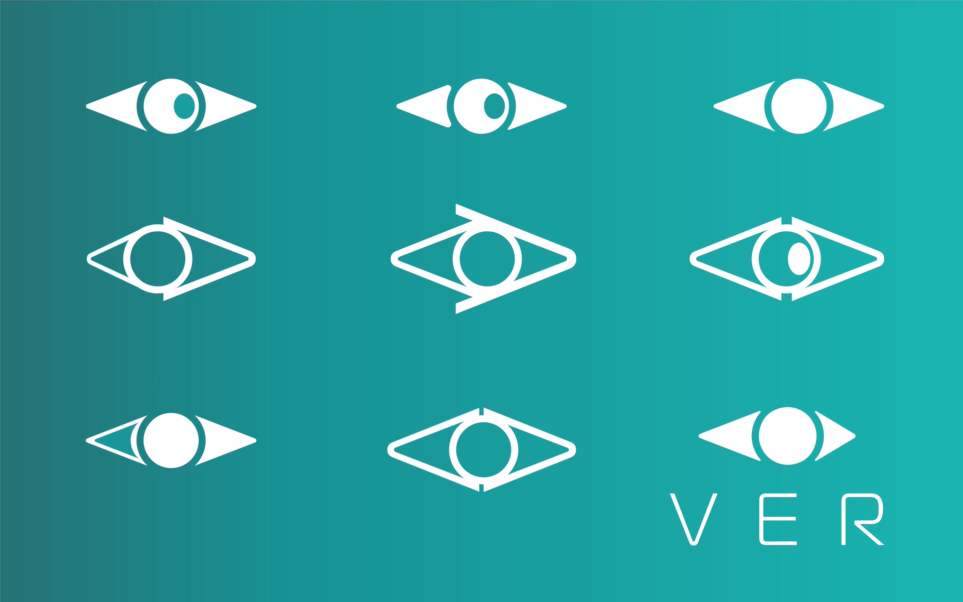
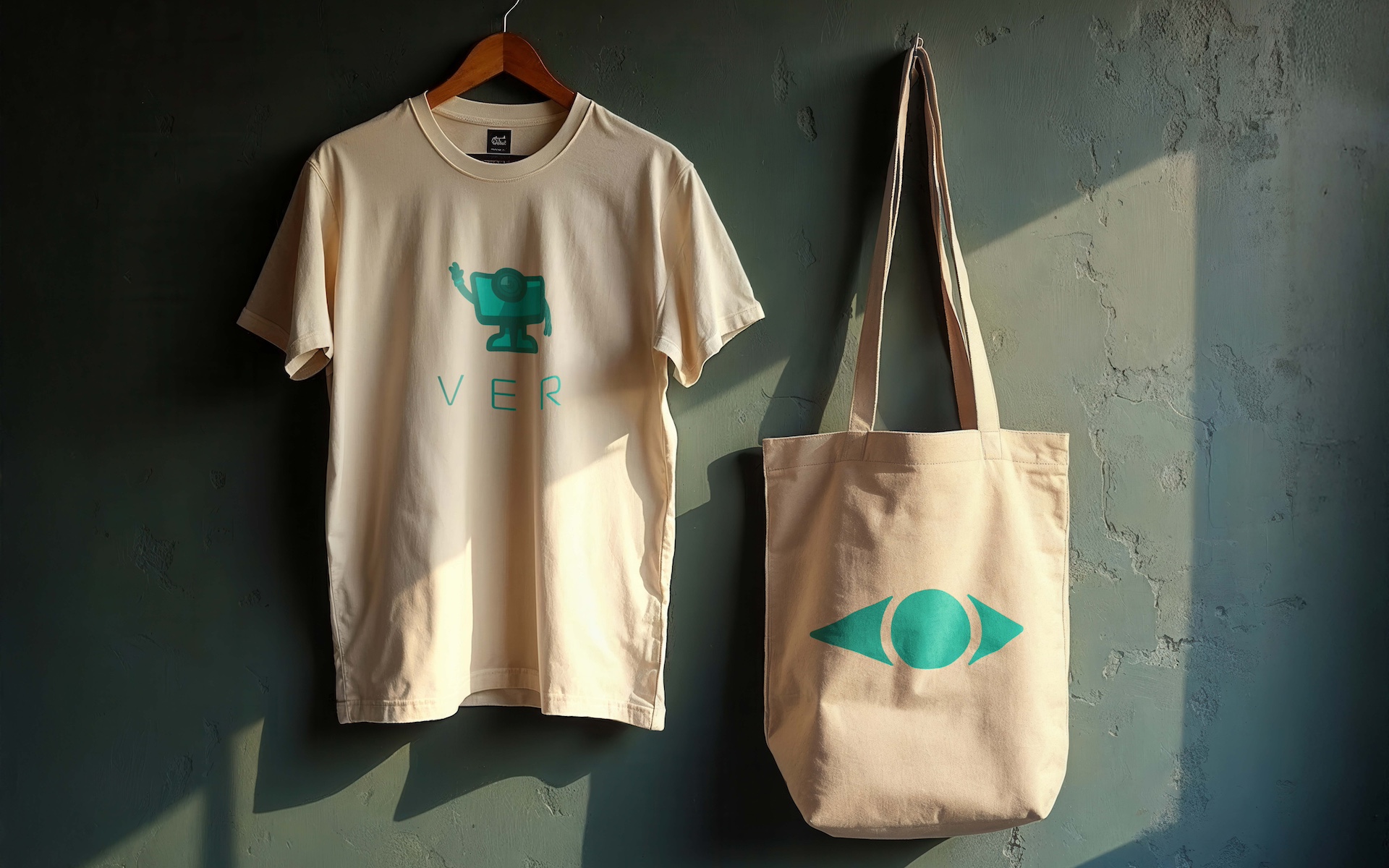
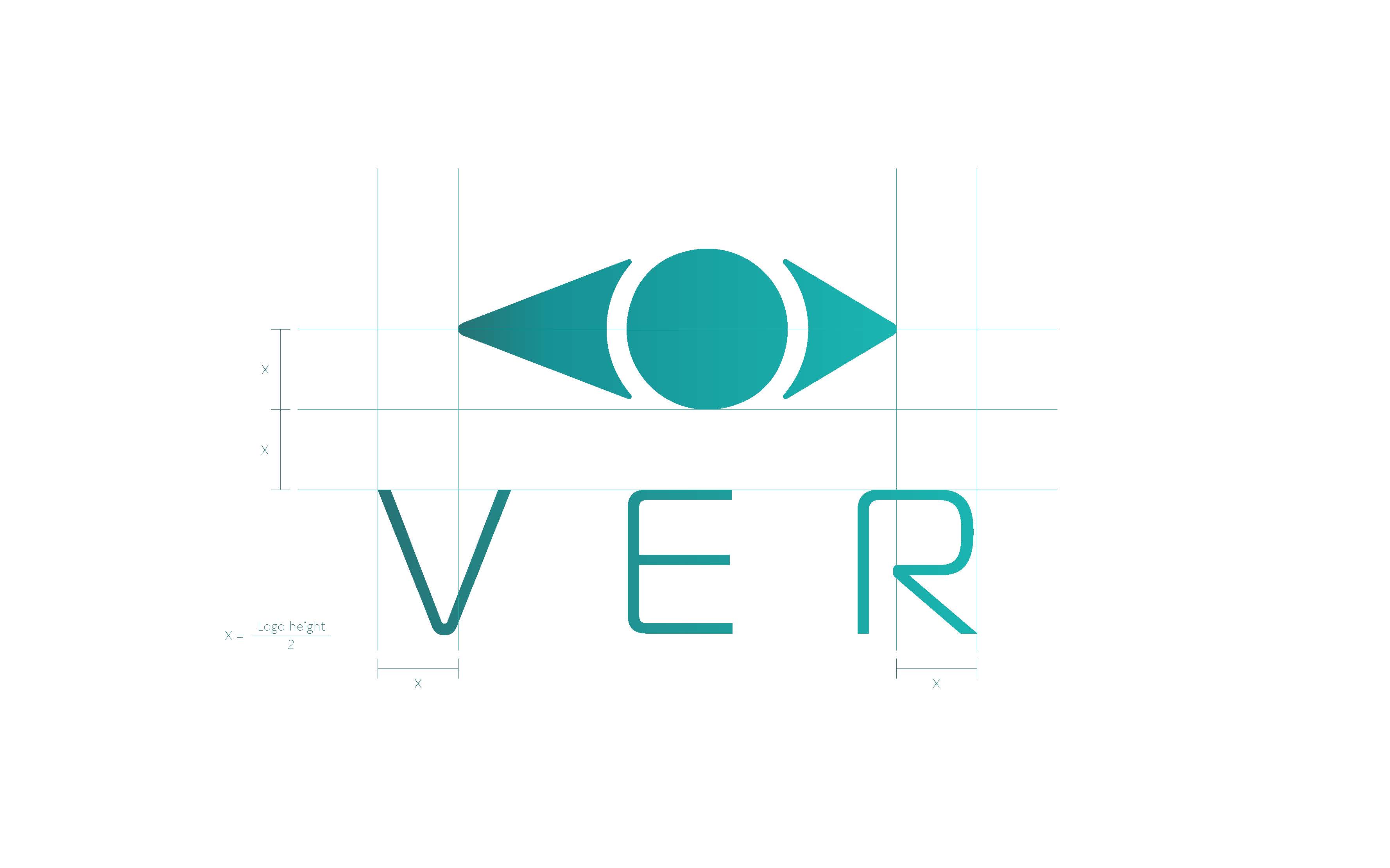
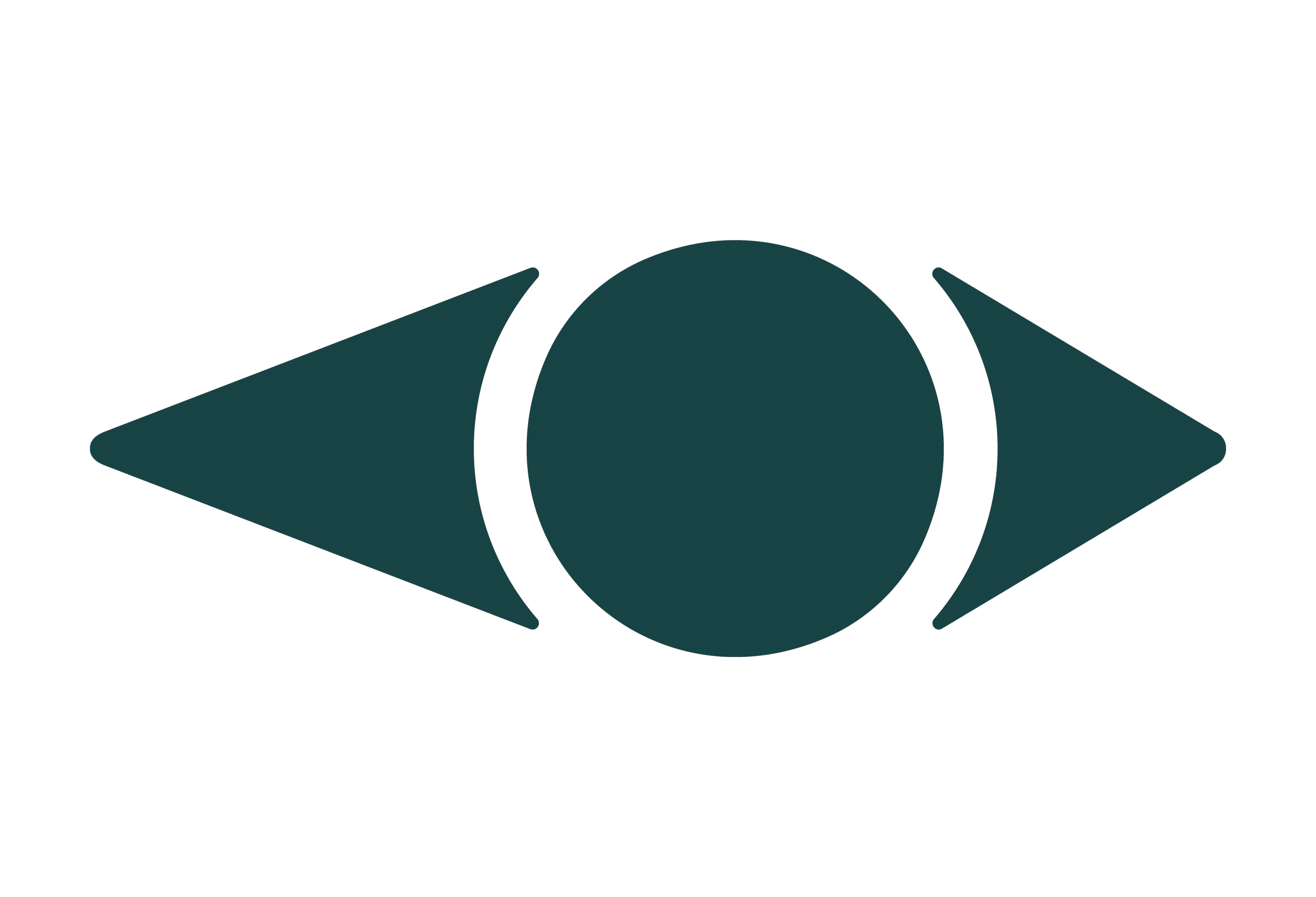
The logo centres on an abstract eye motif with soft, rounded edges to keep it approachable rather than clinical. I made the form intentionally asymmetrical so it feels active and directional instead of static, giving it a subtle sense of movement that reflects the client’s focus on progress and everyday usability. The slight arrow-like silhouette reinforces the idea of forward momentum without becoming too literal, creating a mark that is clear, modern, and tied directly to the product’s purpose.

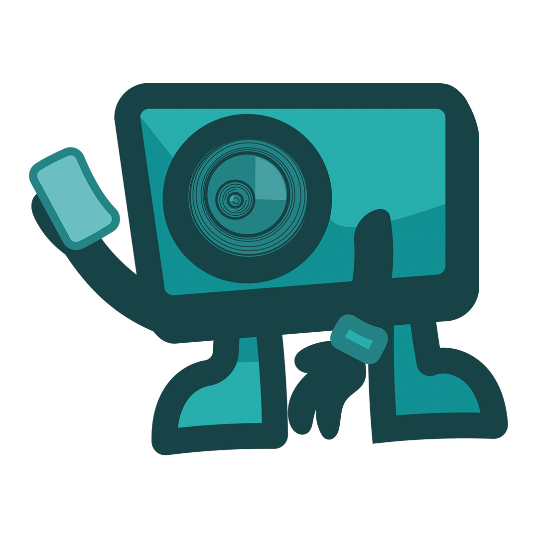
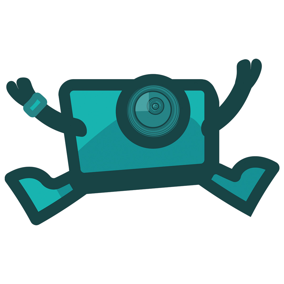
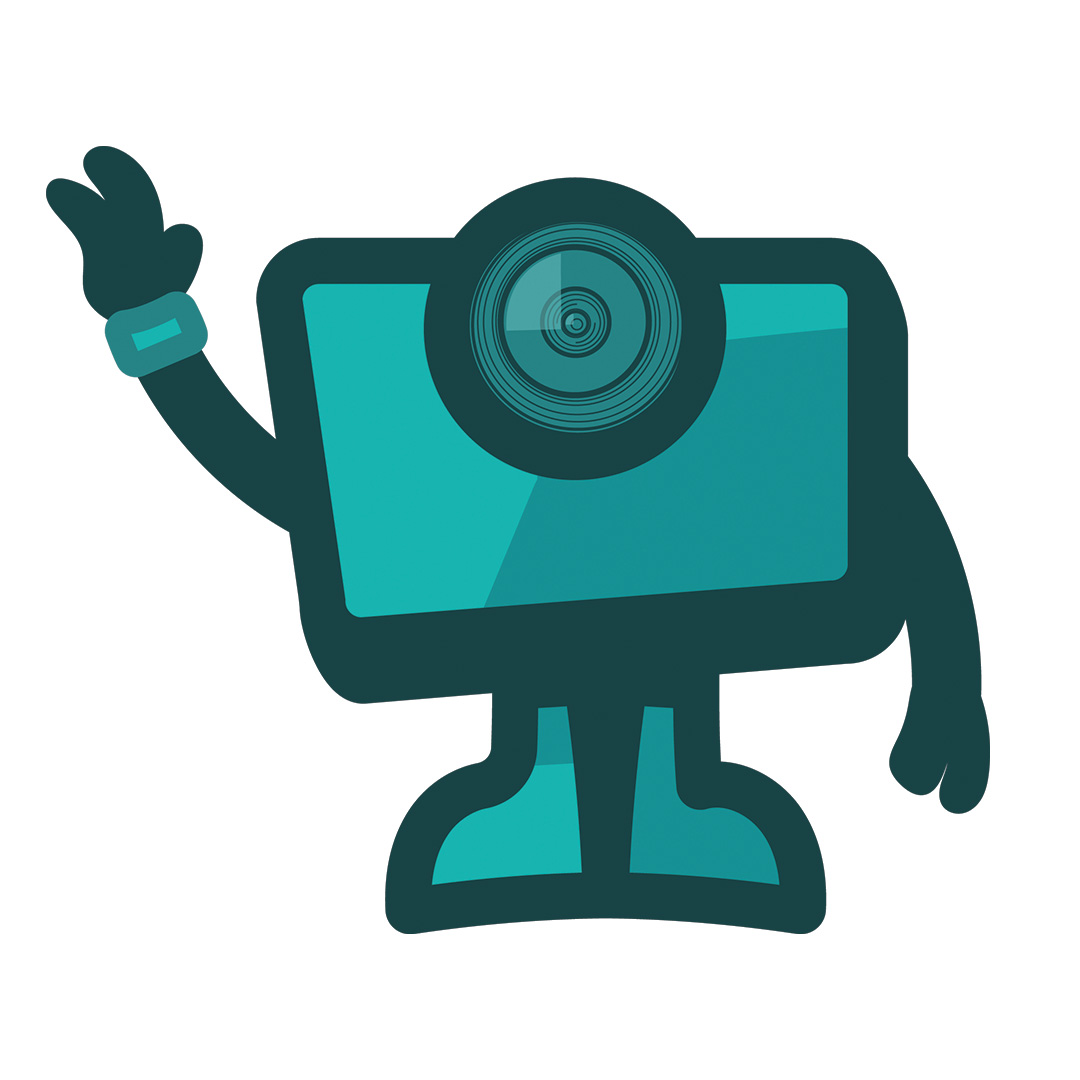
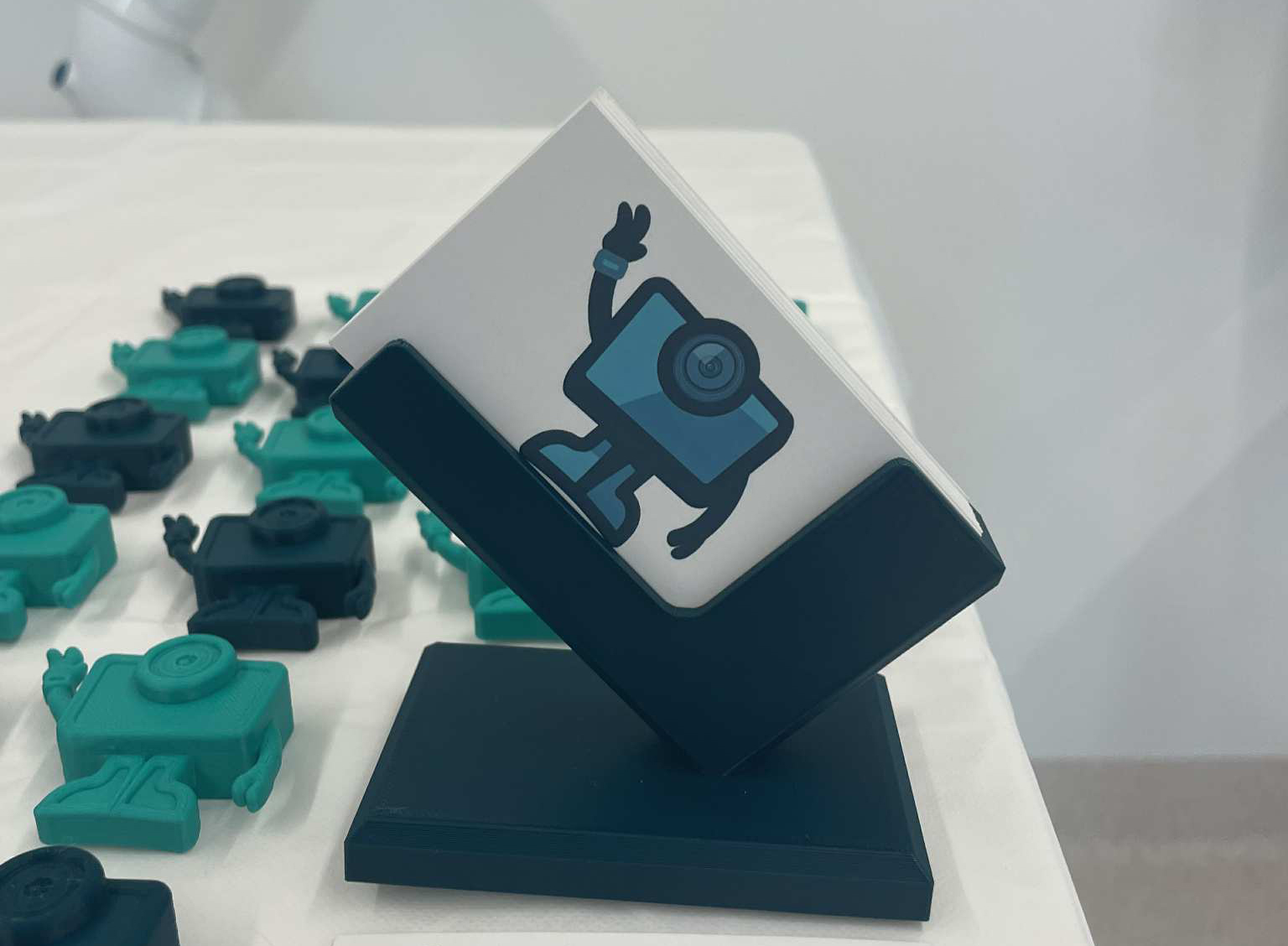
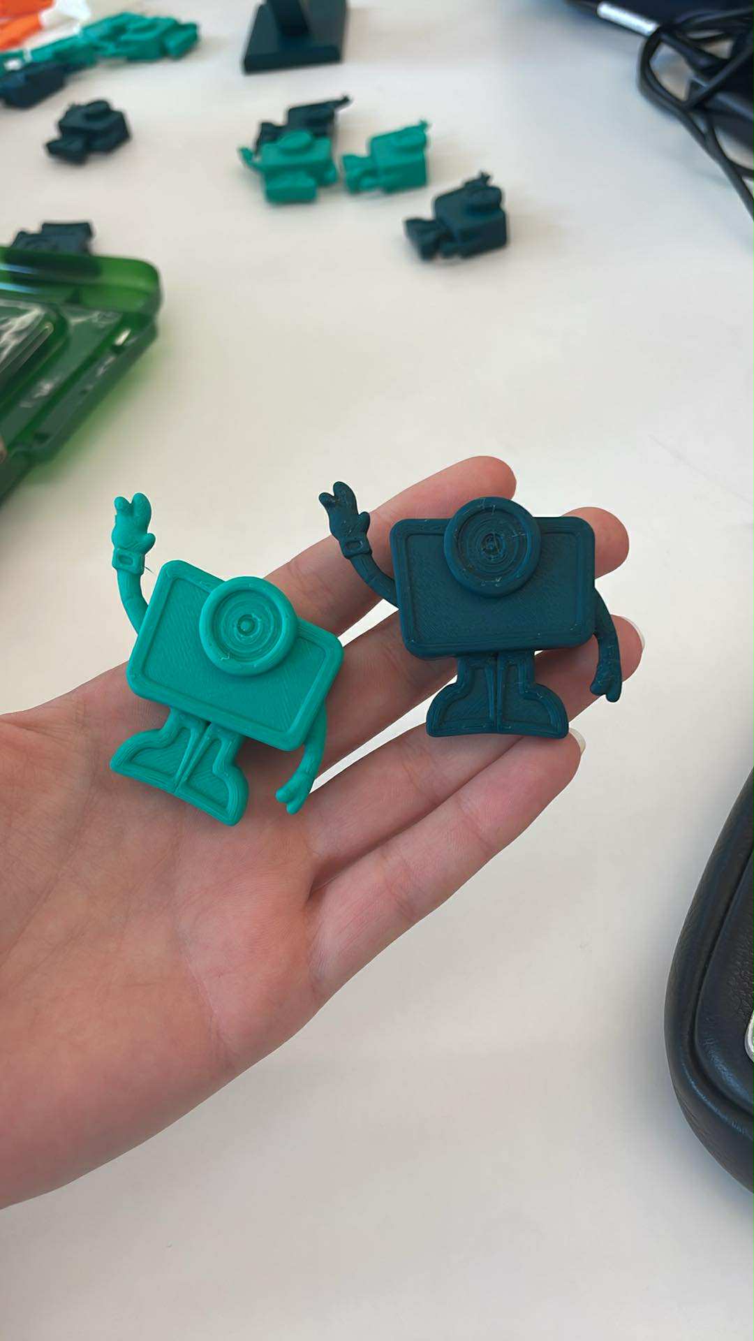
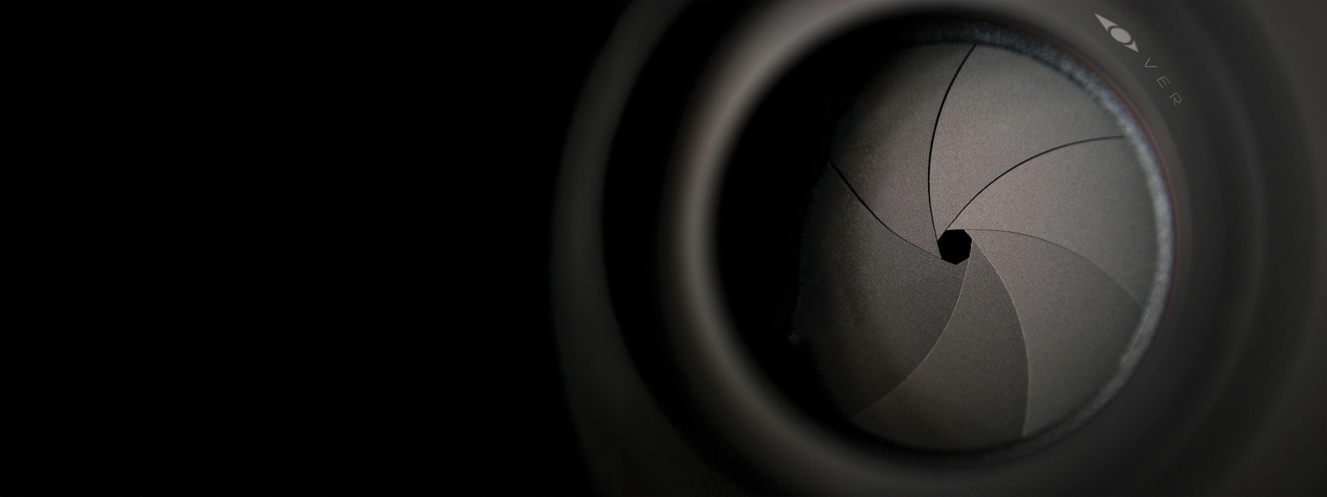
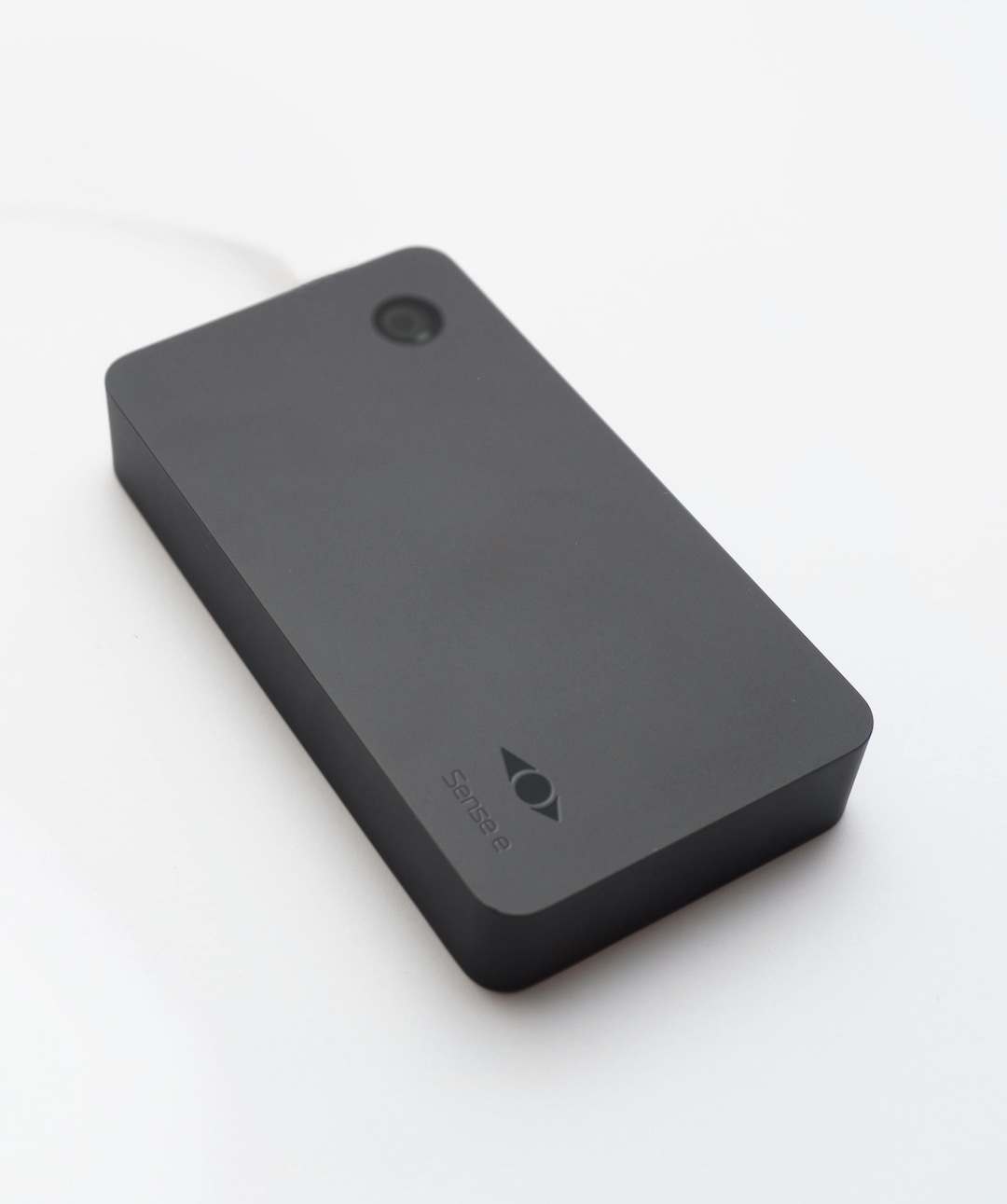
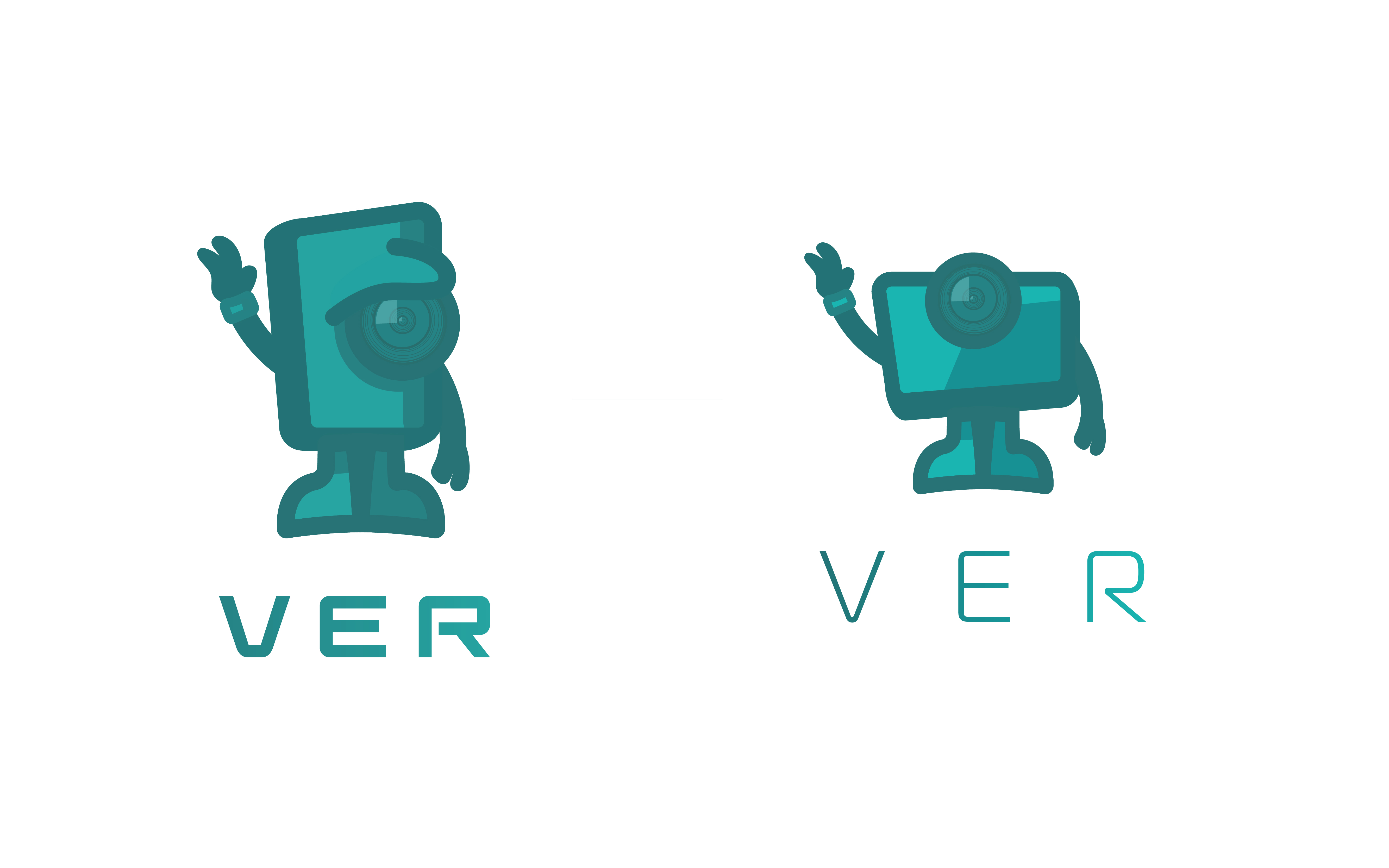
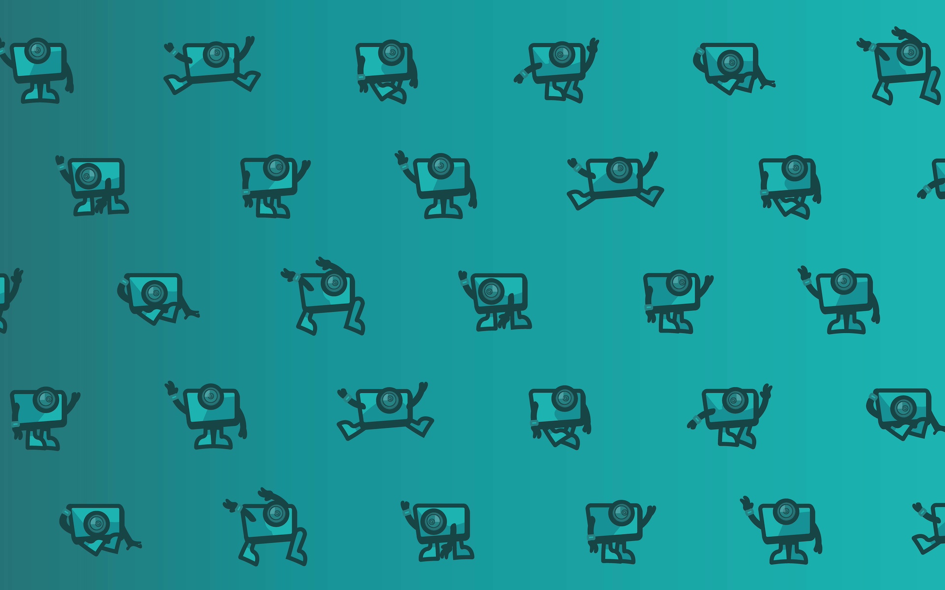
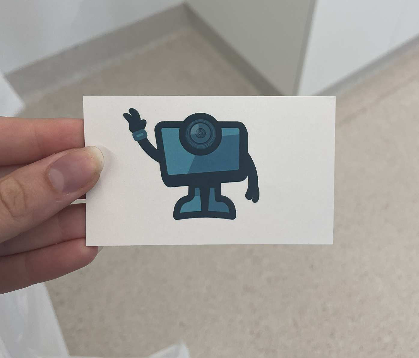
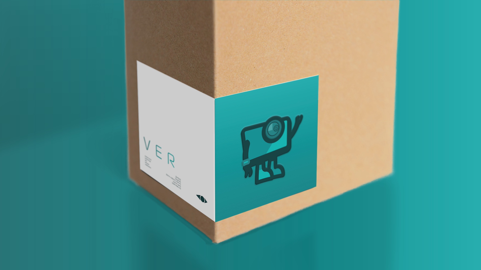
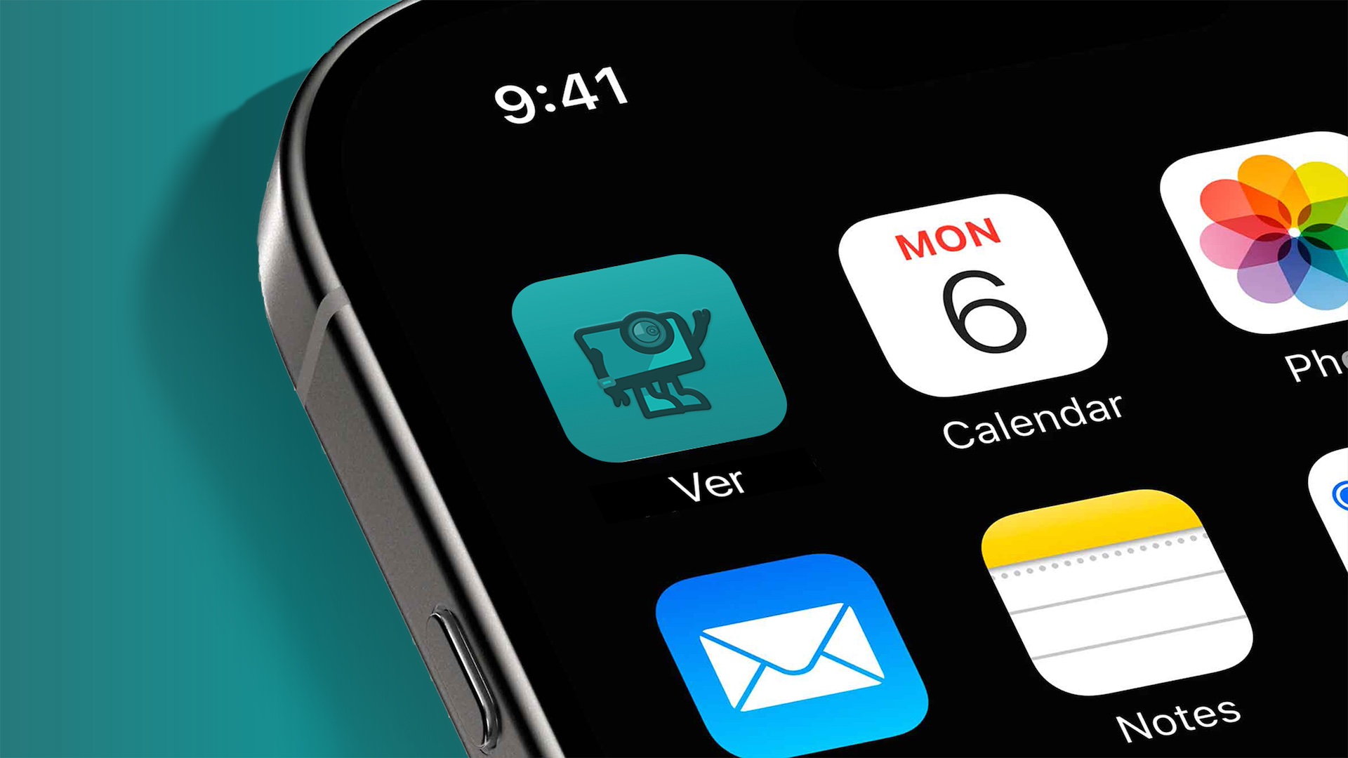
The mascot, Vernon, is shaped directly from the Sensee device so he feels like a natural extension of the product rather than an added character. His single eye functions as a stand in for the device’s camera, and his rounded body mirrors the soft, compact form of the wearable itself. Adding simple arms and legs gives him enough personality to bring a playful edge to the brand, which was something the client really wanted. He feels warm and approachable without drifting into anything overly cartoonish, keeping the design minimal and consistent with the wider visual system
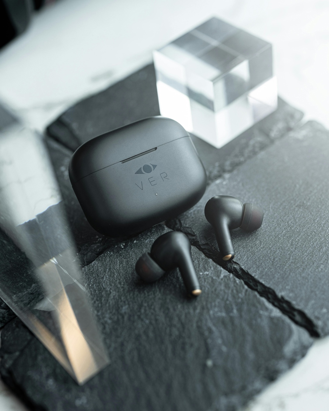
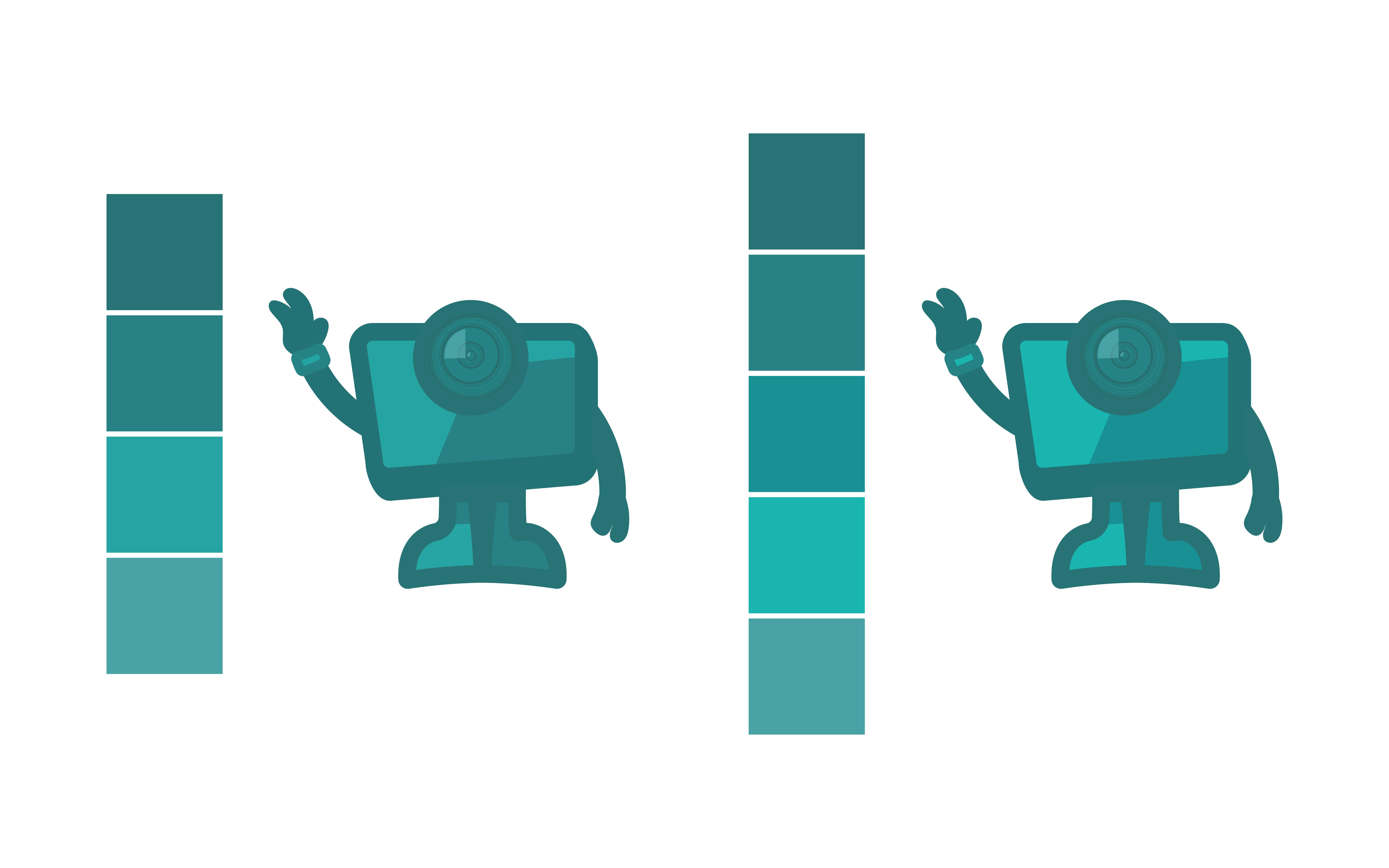
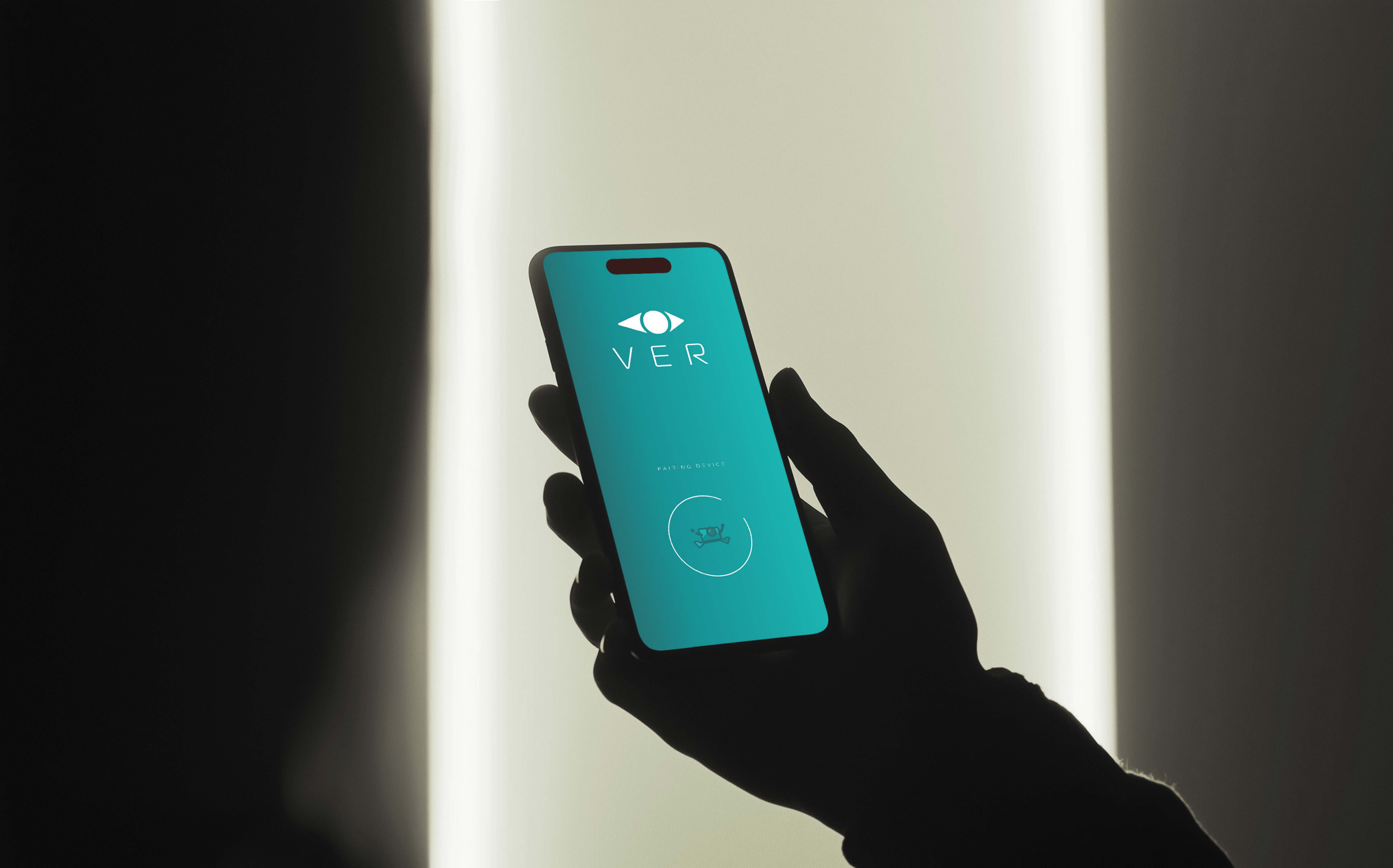
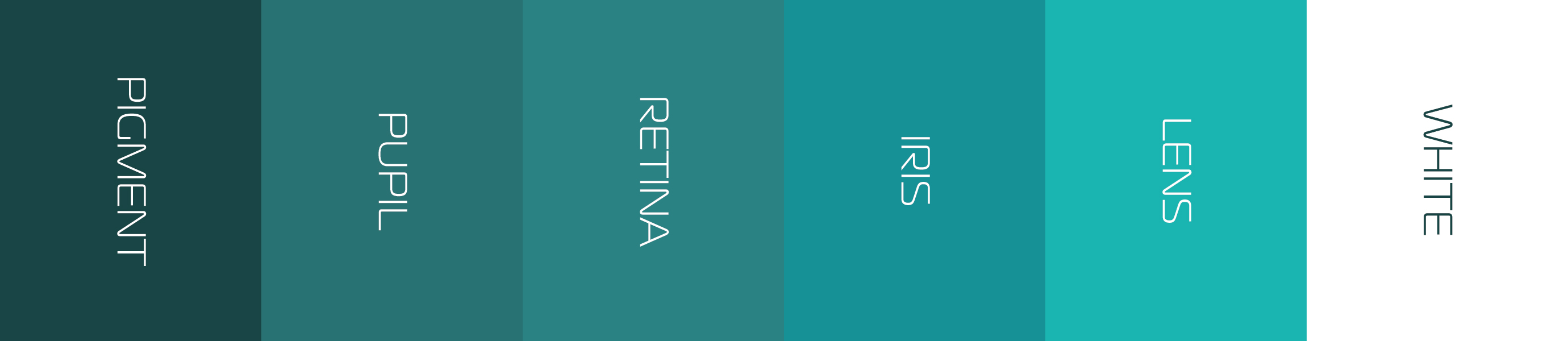
The colour palette leans into cool blues taken directly from Ver’s original branding, keeping a sense of continuity while giving the identity a calmer, more modern tone. These hues pair well with the device’s sleek form and help reinforce the feeling of clarity the brand aims to communicate. I also built the palette around accessibility contrast standards so text, icons, and UI elements stay readable for users with low vision. This keeps the system visually consistent while making sure it actually works in real use.
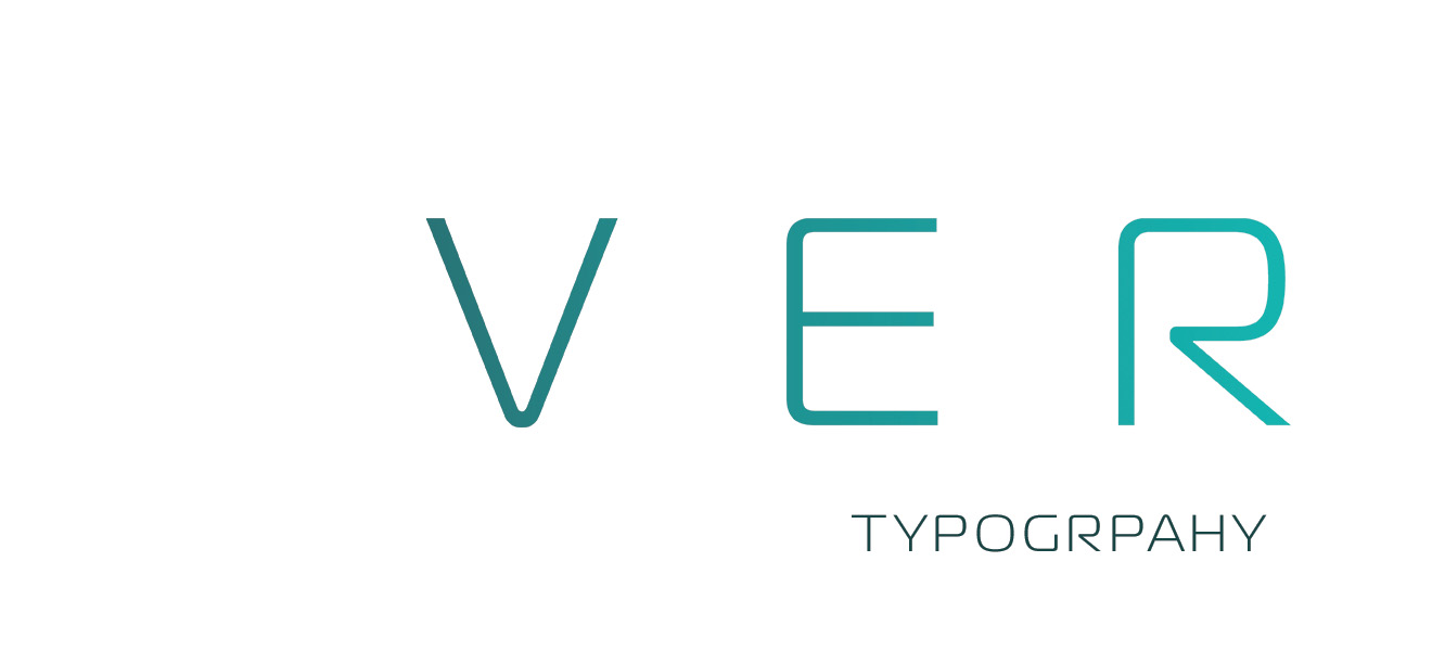
The logotype and hero text use Magistral Light for its minimal, futuristic feel and strong legibility, giving the brand a forward-looking tone that aligns with the assistive technology focus. For body copy, I chose Komet, which remains highly readable at smaller sizes and in longer passages, ensuring all written content is clear and accessible. The type palette is deliberately minimal, using only these two typefaces, which keeps the visual language clean, reduces complexity for users, and reinforces the streamlined, modern character of the brand.
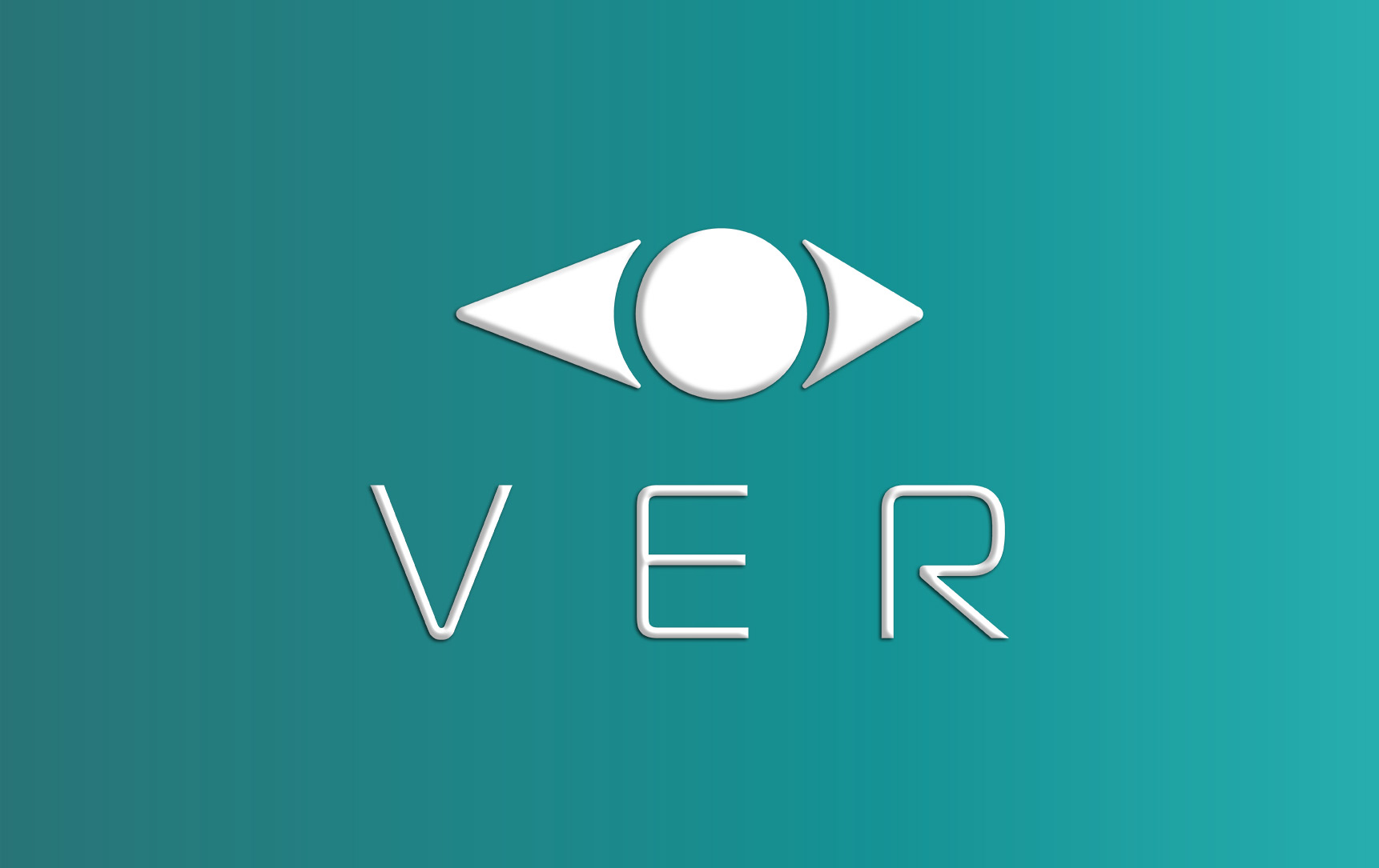
Using a gradient helps make layouts feel more dynamic and modern, adding visual interest without overwhelming the content. In this identity, the gradient moves from the darker tones of the palette on the left to the brighter tones on the right, reinforcing a sense of forward movement and progress. It adds depth while maintaining clarity and accessibility, supporting the brand’s focus on intuitive, user-centered design.