.png)
<project brief>
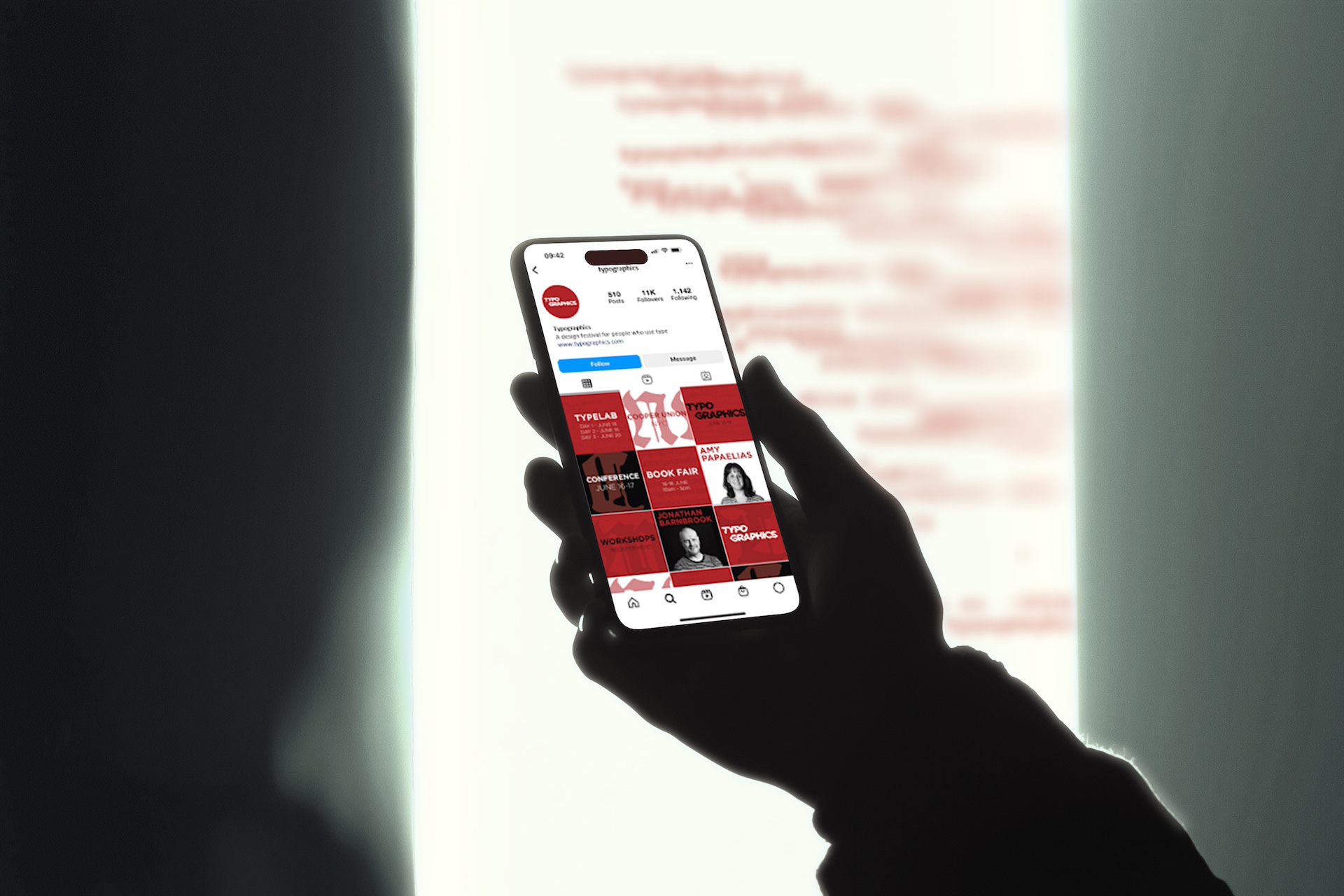
Inspired by the evolving culture of type, the identity for Typographics 2024 blends historical craft with contemporary digital energy to create a living visual system. It uses expressive contrasts, experimental textures and a mix of classic and modern typefaces to celebrate the ongoing dialogue between tradition and innovation. The result feels dynamic and insightful for designers while staying bold and inviting for the wider creative community attending the festival.
</project breif>
<touchpoints>
<touch points>
<key deliveries>
<key deliveries>

We began by digging into previous Typographics identities and the broader culture of type-focused events to understand what had already been done and where the visual gaps were. We also explored the festival’s roots in both historical and contemporary typography, looking at how designers marry analogue craft with digital tools. This helped us shape a clear direction, one that recognised the festival’s legacy while making space for experimentation and modern influence.
From there we sketched out a range of concepts that explored contrasts, such as refined versus distressed type and structure versus spontaneity. We tested how different eras of typography could sit together without feeling forced, and how textures, pacing and rhythm could express the tension between tradition and innovation. This stage was about finding the core idea that felt true to the festival, something expressive but still cohesive.
Once the direction was locked in we moved into digital prototyping, building out layouts, motion tests and a flexible set of components. We trialled multiple typeface pairings, explored different levels of grunge and texture and refined the colour system so it felt energetic without losing clarity. Feedback loops helped us tighten the hierarchy and ensure the identity worked consistently across posters, social assets and event materials.
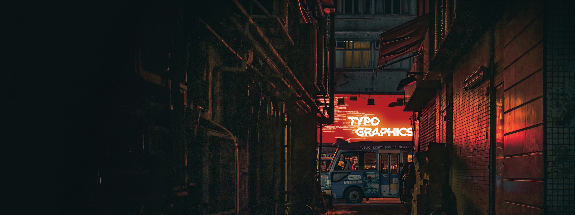
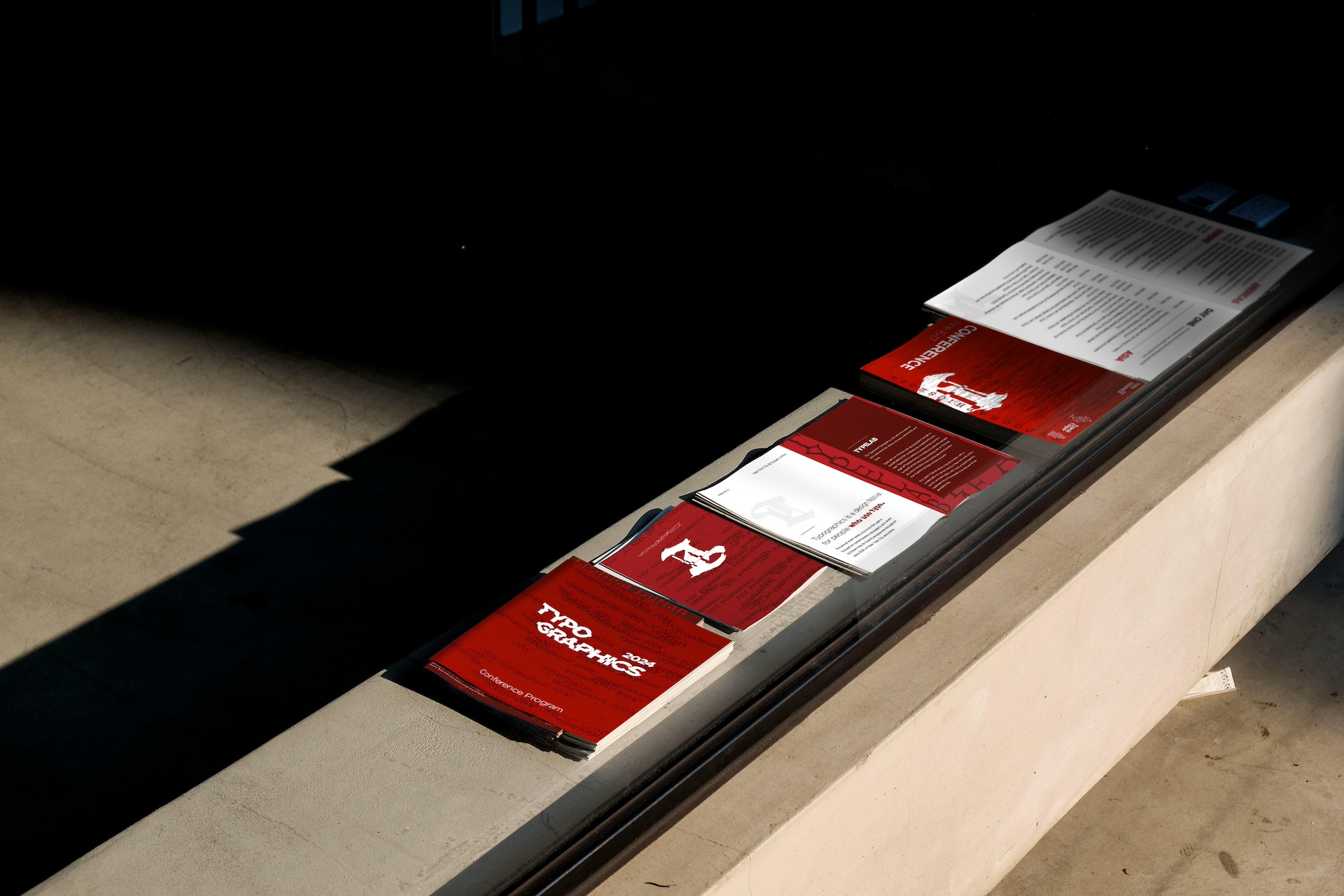
The final identity captures the push and pull between historical craft and digital experimentation, creating a visual system that feels alive, adaptable and true to the spirit of Typographics. It performs well across both static and motion formats and gives the festival a recognisable personality without limiting creative play. Looking back, the project reinforced for us the value of balancing structure with exploration, especially when designing for a community built around curiosity and typographic expression.
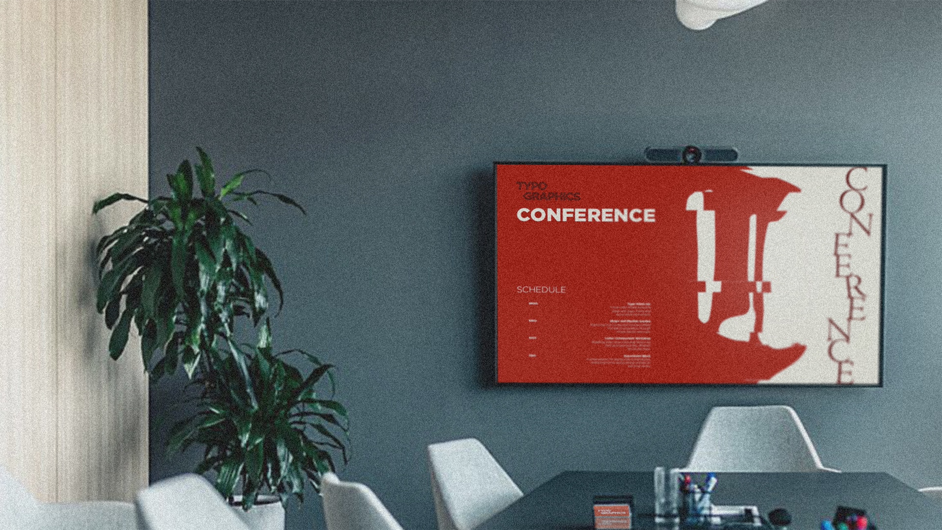
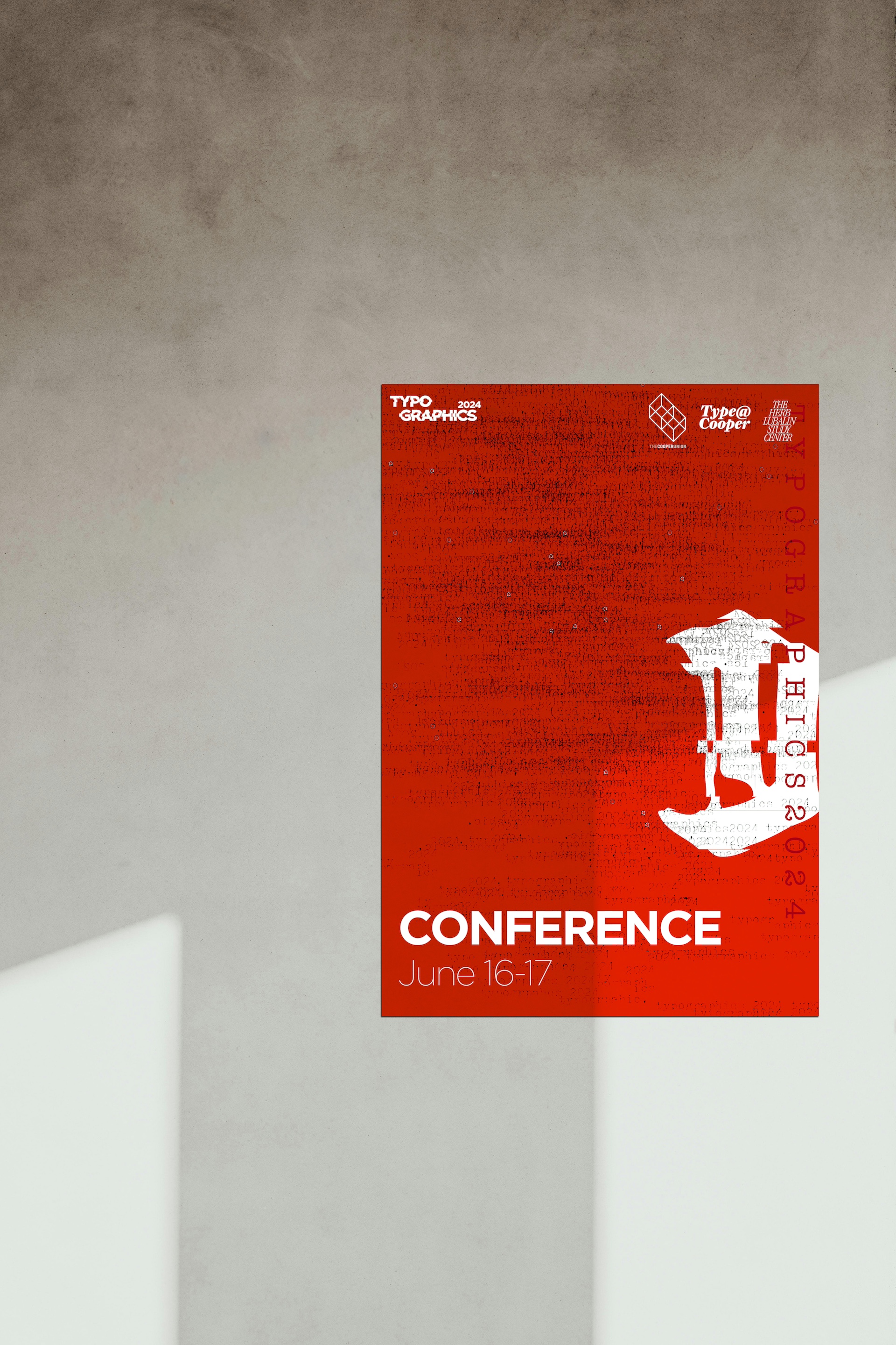
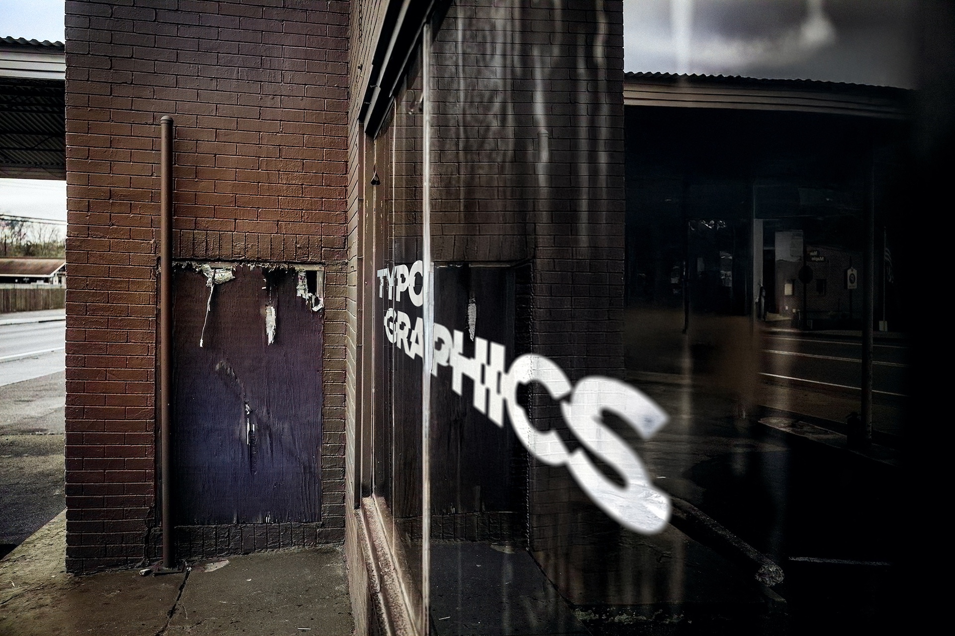
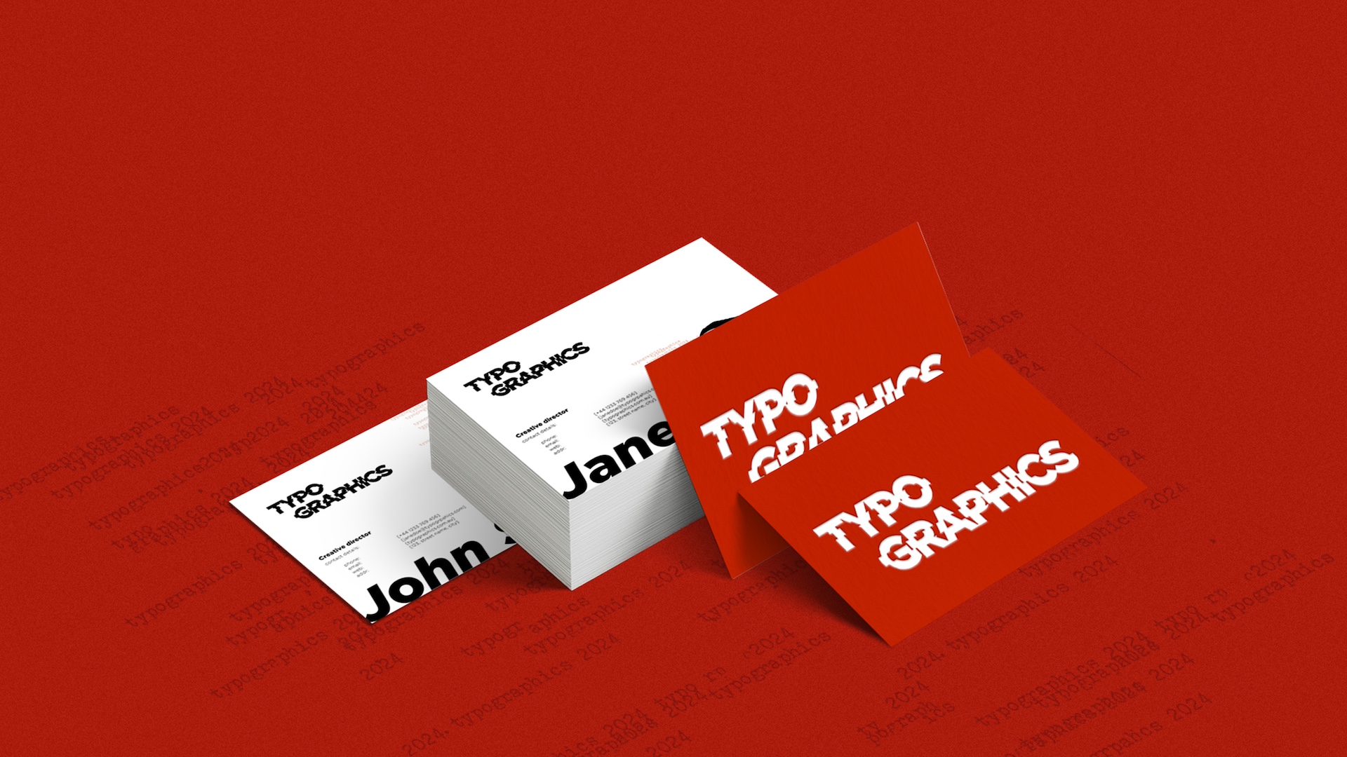
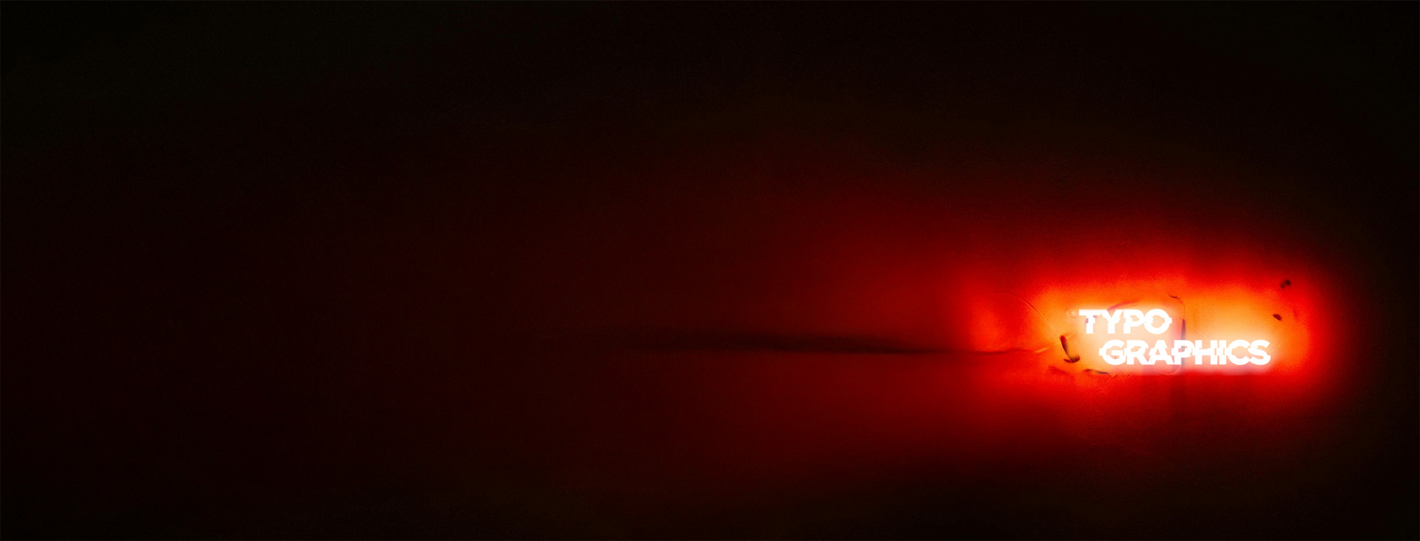
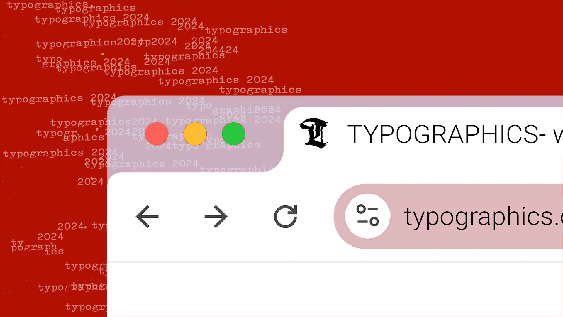
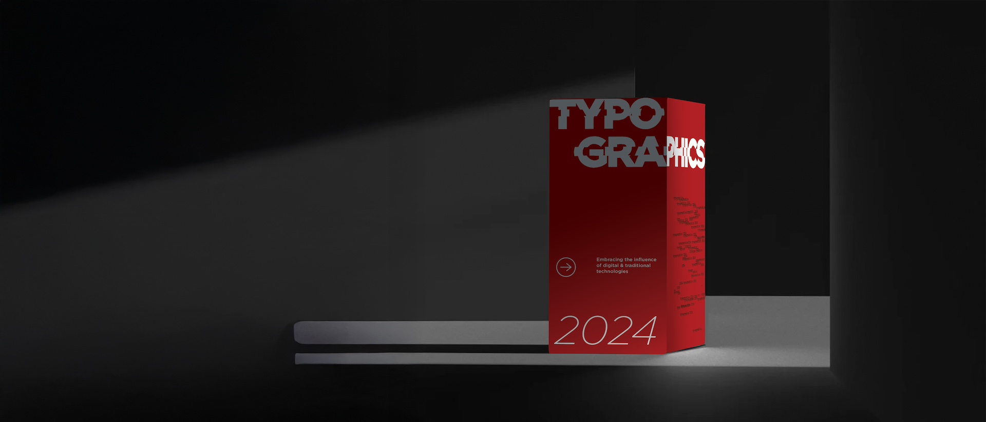
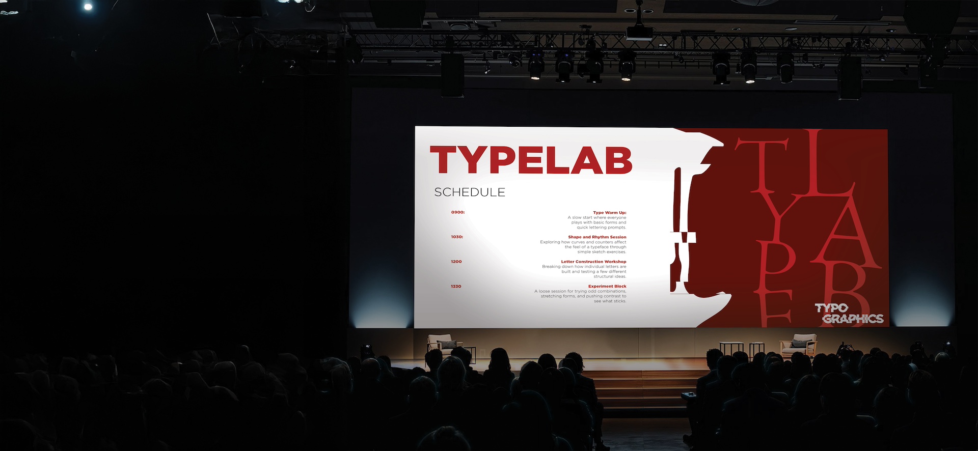
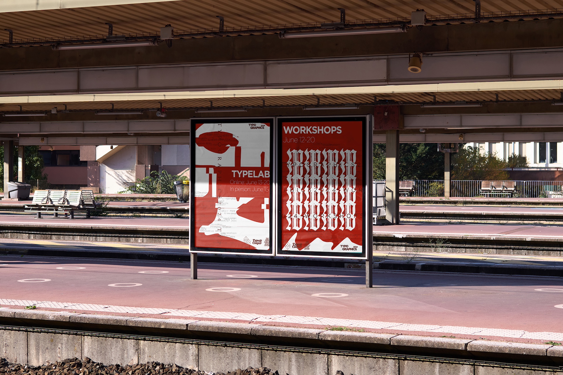
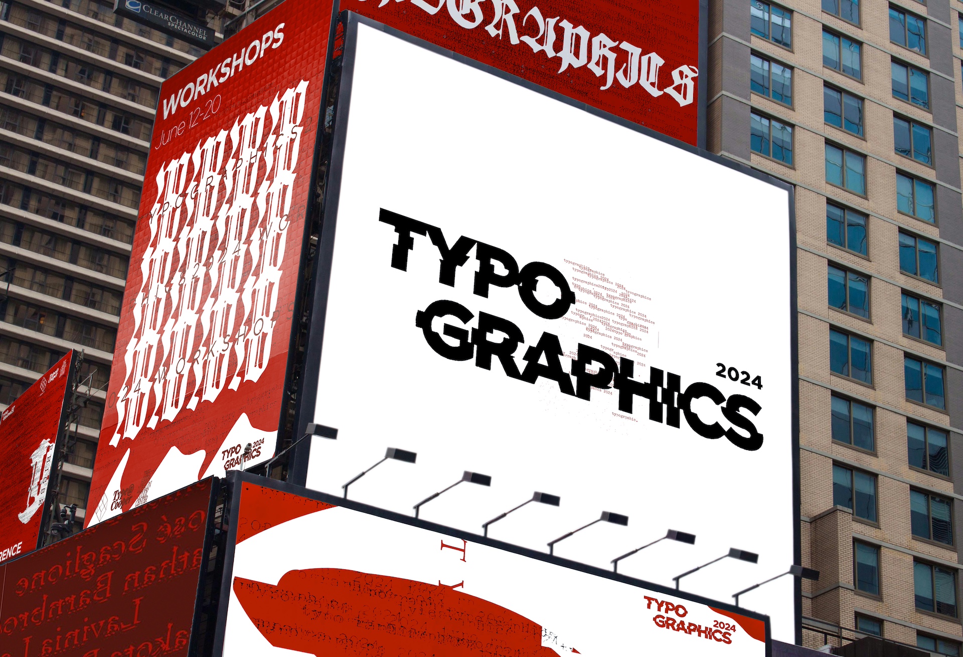
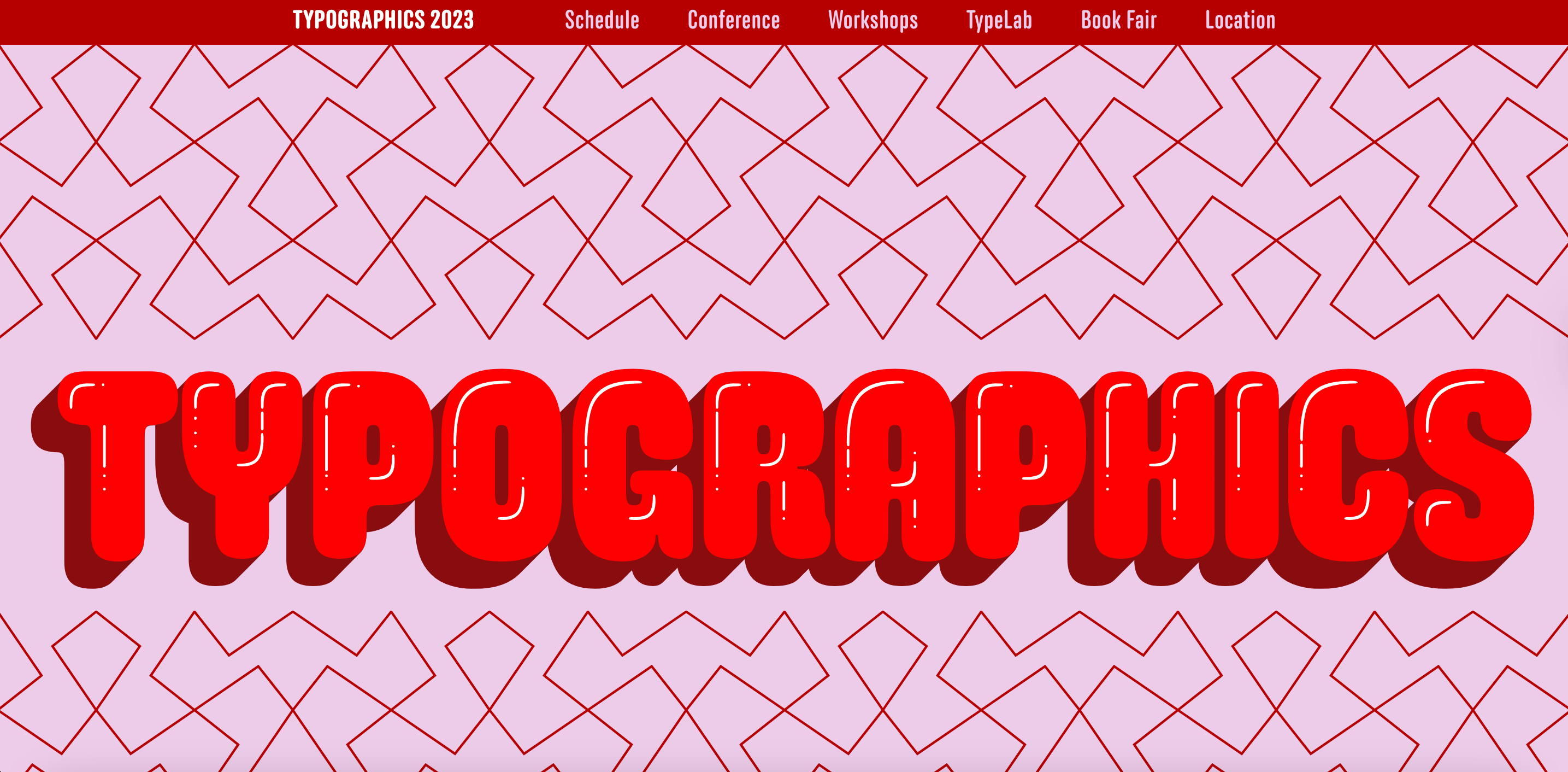
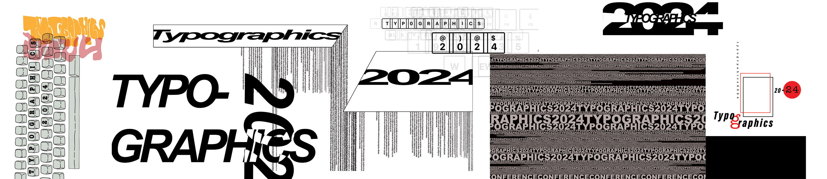
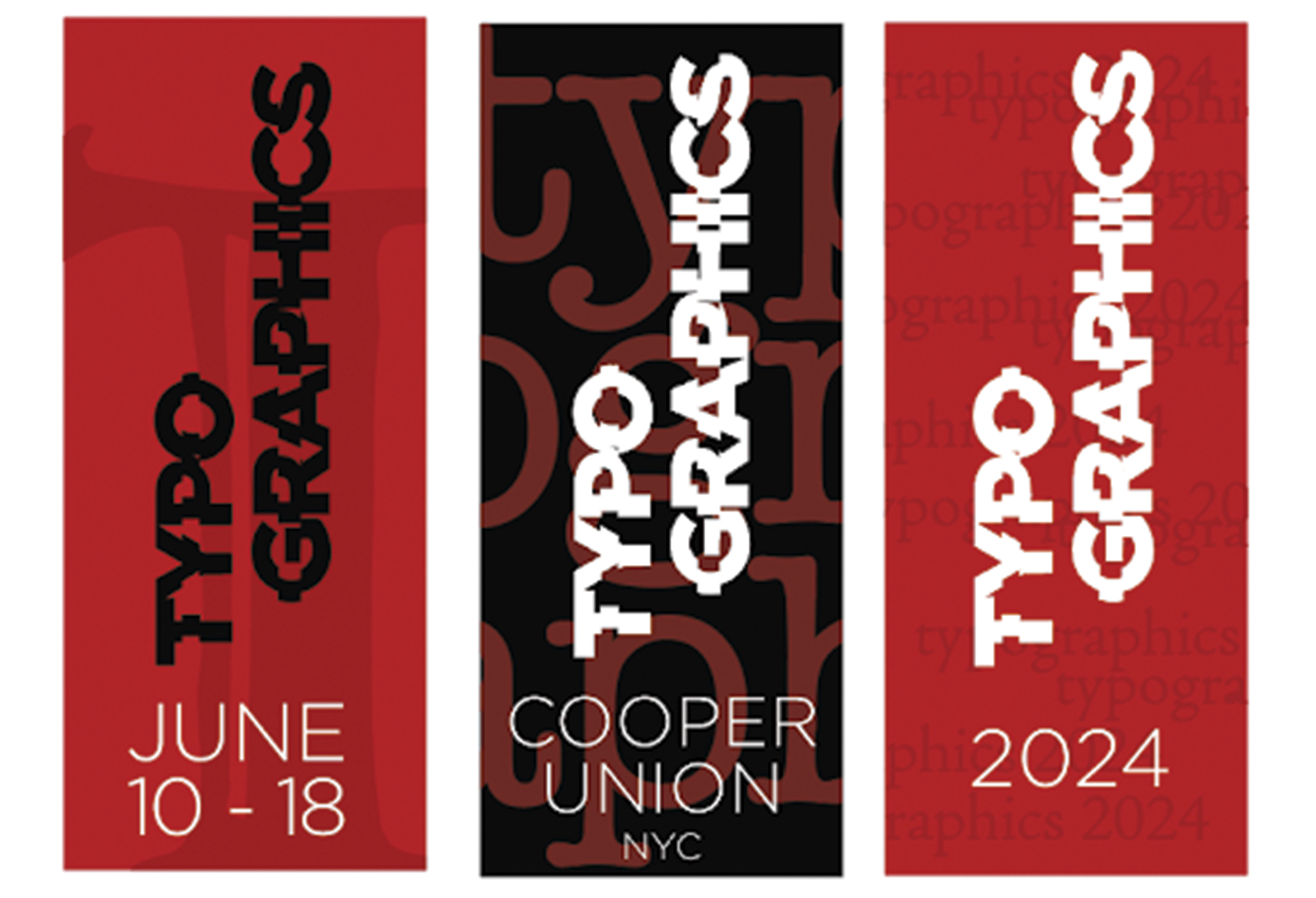
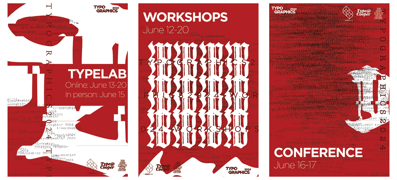
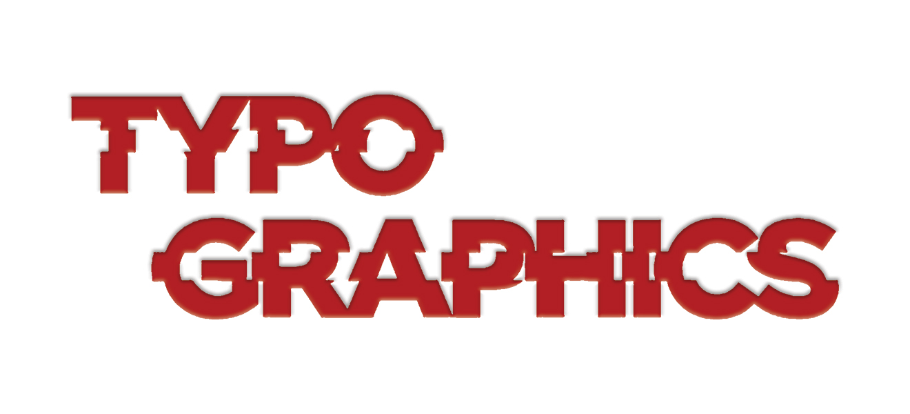
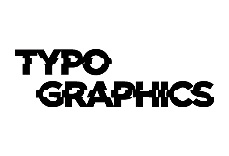
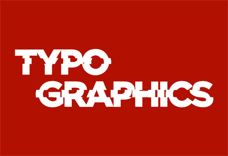
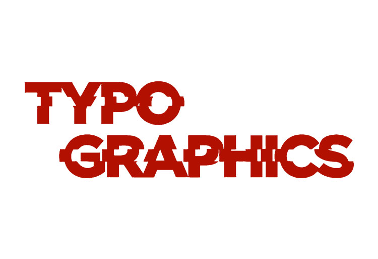
The logo is set in Gotham Bold to convey confidence and modernity, while the two-line structure creates a balanced hierarchy that reads clearly at any scale. The subtle glitched effect reflects Typographics’ exploration of digital experimentation and the tension between tradition and innovation, reinforcing the festival’s core theme.
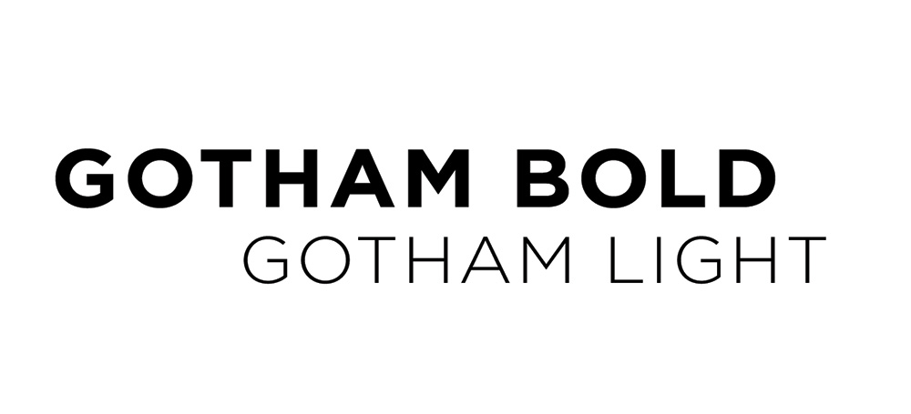
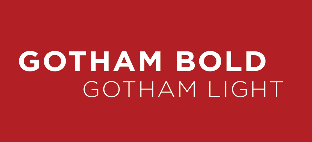
<Gotham>
Gotham was chosen as the primary typeface for its clean, geometric forms and versatility. Using Bold for emphasis and Thin for body text allows us to create a dynamic contrast within the same family, supporting the brand goal of balancing visual harmony with expressive tension.
<Gotham>
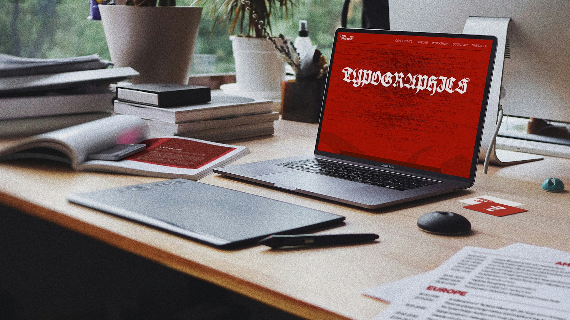
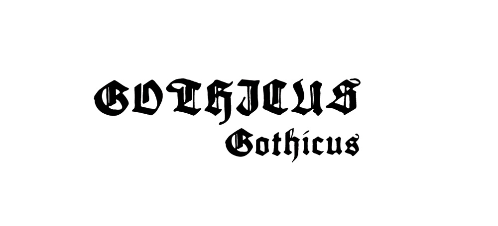
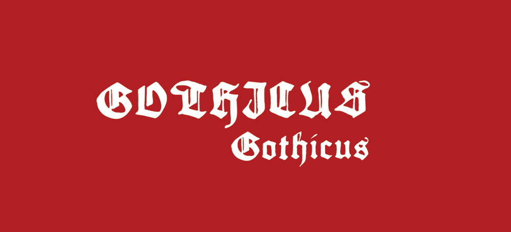
<Gothicus>
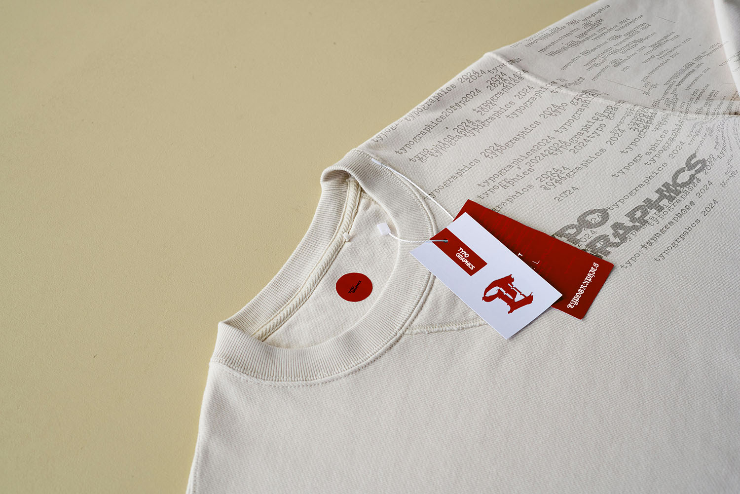
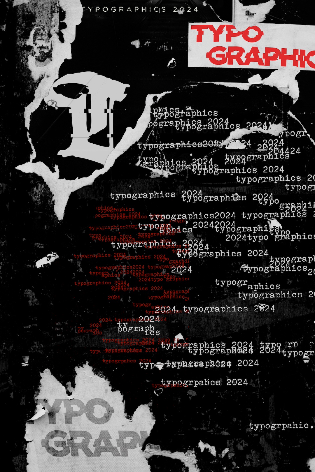
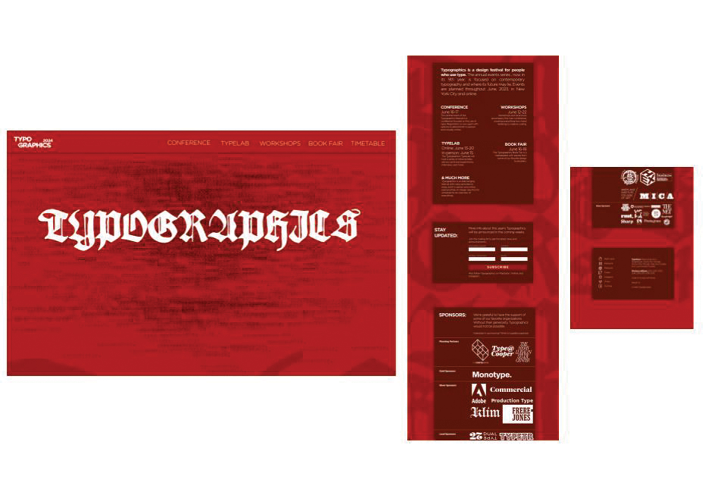
Gothicus is used as a decorative element, highlighting the historical influence of blackletter typography. Large, digitally manipulated letters bring a unique, expressive flair to compositions, adding depth and historical context without compromising readability.
<Gothicus>
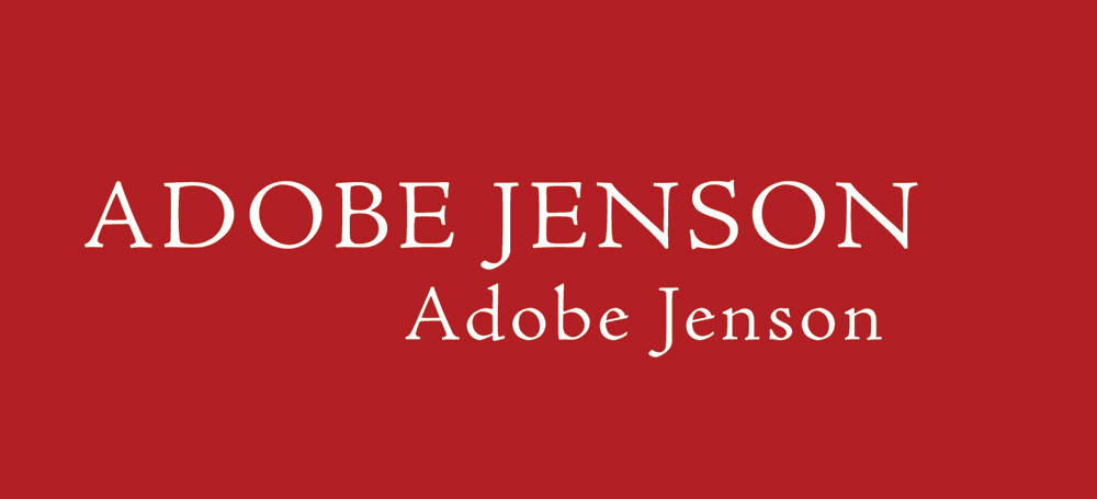
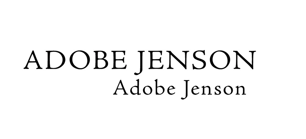
<Adobe Jenson Pro>
Adobe Jenson Pro is deployed at a large scale as a decorative typographic asset. Its classic serif forms evoke the elegance of Roman type, giving designs a refined, historical dimension that contrasts with the modernity of the primary typefaces.
<Adobe Jenson Pro>
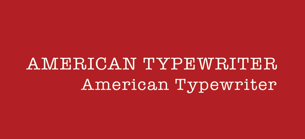
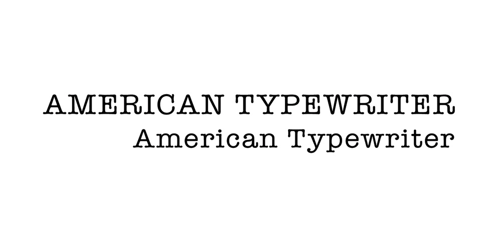
<American Typewriter>
American Typewriter is layered subtly in backgrounds, often blurred or reduced in opacity to create texture. Its vintage slab serif forms reference the typewriter era, adding depth, interest and a tactile, retro aesthetic to the compositions.
<American Typewriter>
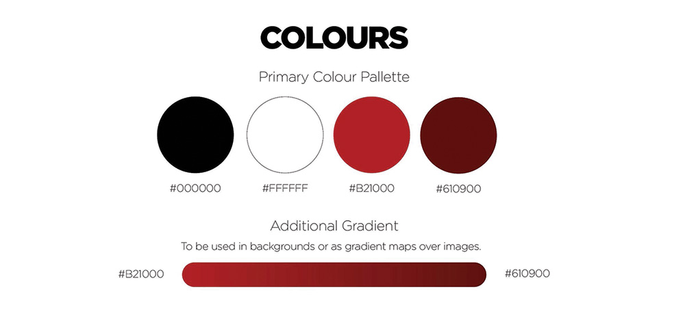
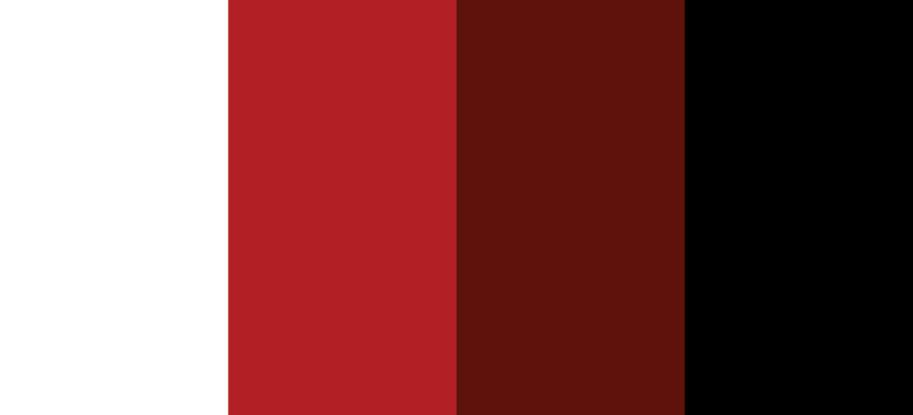
The palette of black, white, bright red (#b21000) and deep red (#610900) was chosen to create visual impact while maintaining clarity and hierarchy. Red serves as a bold accent, energising the system and drawing attention to key elements, supporting the festival’s dynamic and experimental tone.
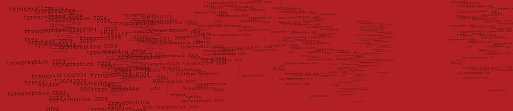
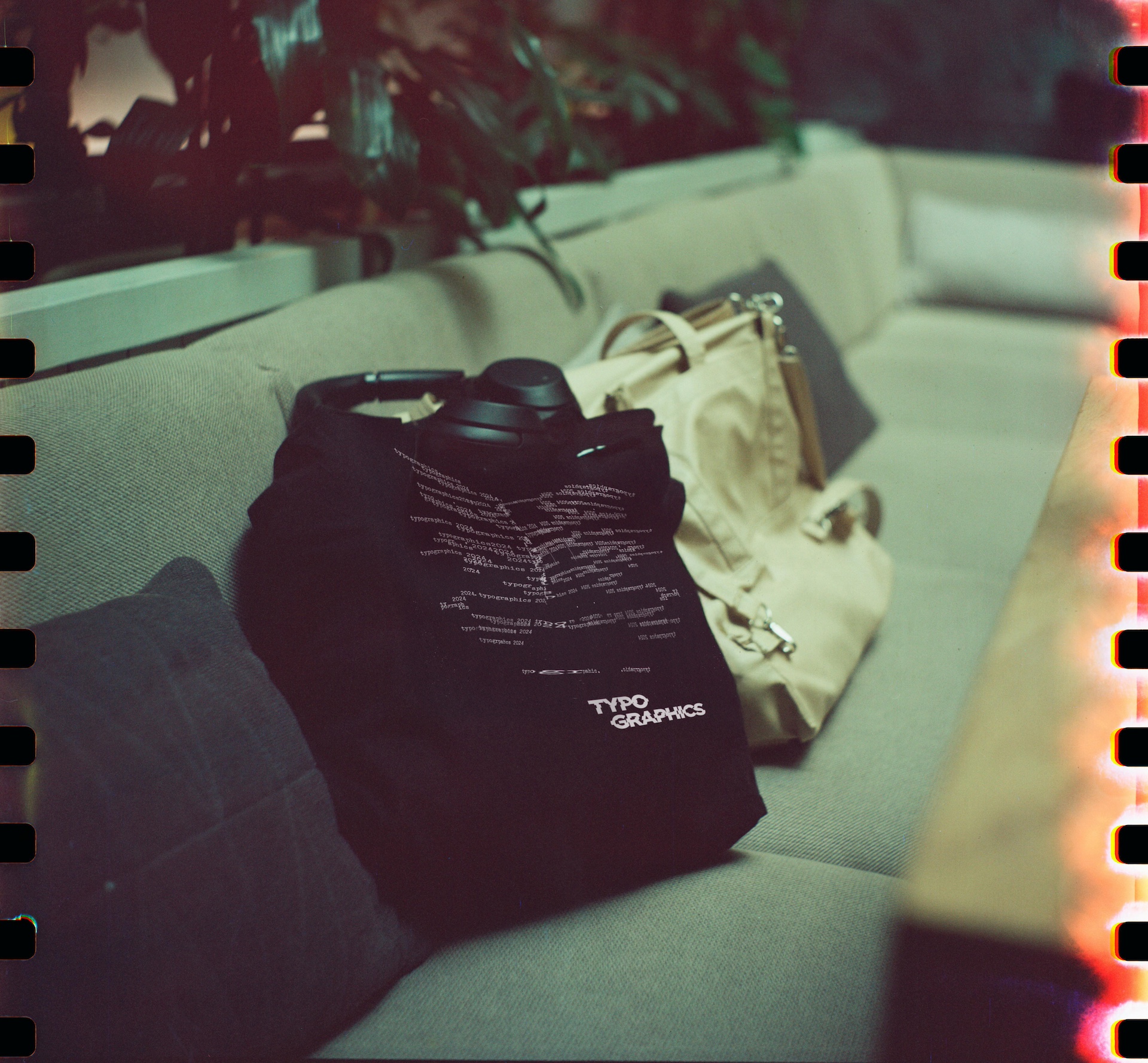
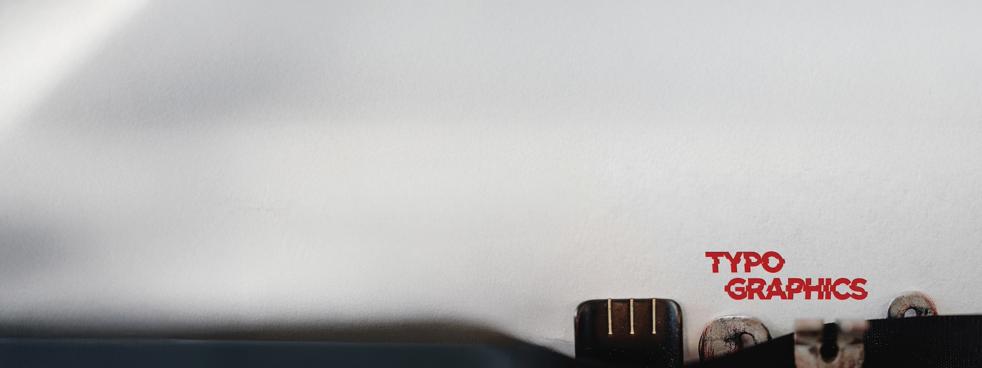
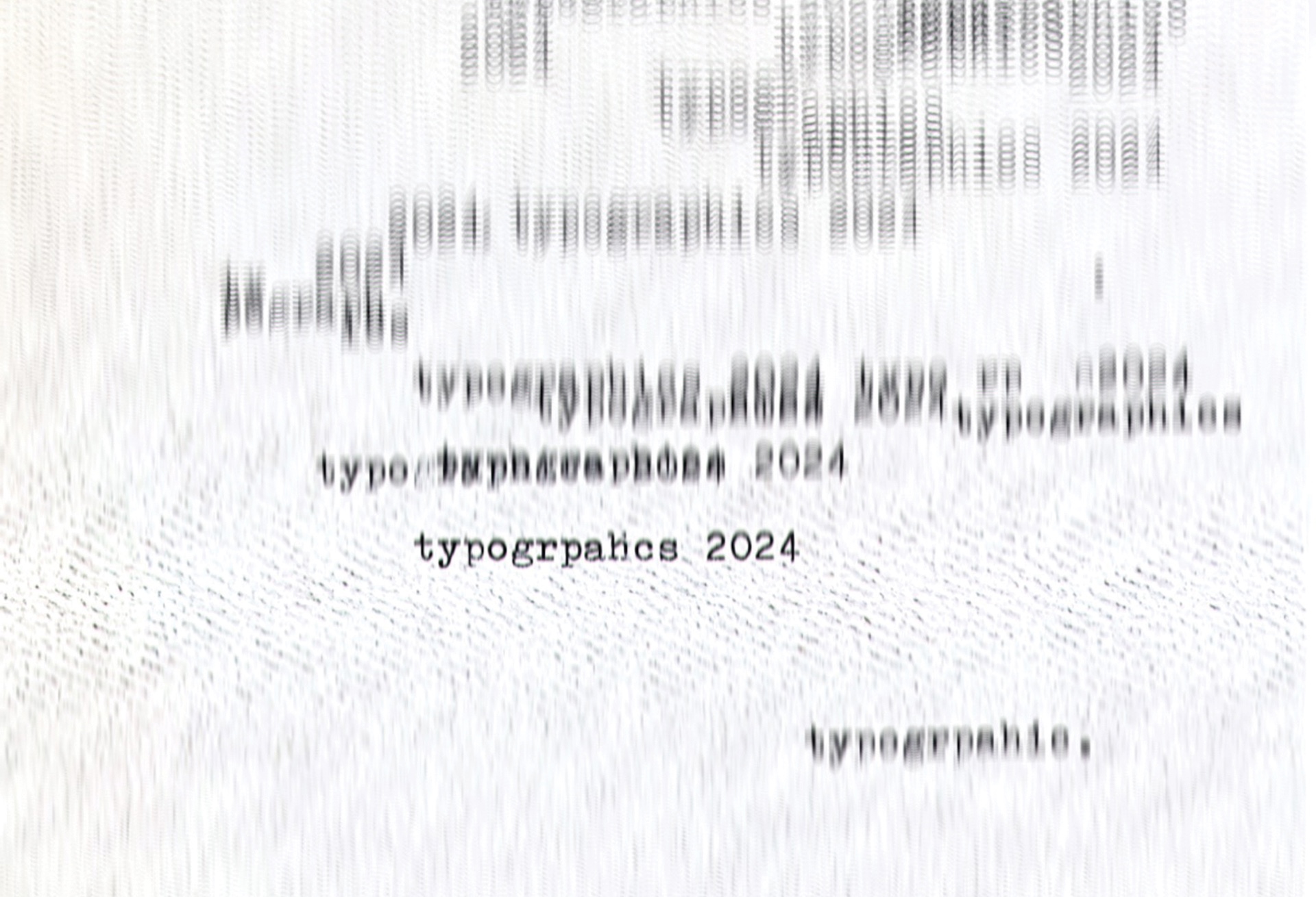
The disrupted pattern was created by typing “Typographics 2024” on an actual typewriter, using the machine’s natural quirks, uneven spacing, misaligned letters, and variable pressure, to introduce unpredictability and texture. By embracing these mechanical imperfections, we added a tactile, human layer that digital tools can’t replicate, reinforcing the festival’s theme of balancing historical craft with contemporary experimentation. The resulting patterns were then layered and manipulated digitally to enhance rhythm and energy, creating a background element that feels both authentic and dynamic.