.png)
<project brief>
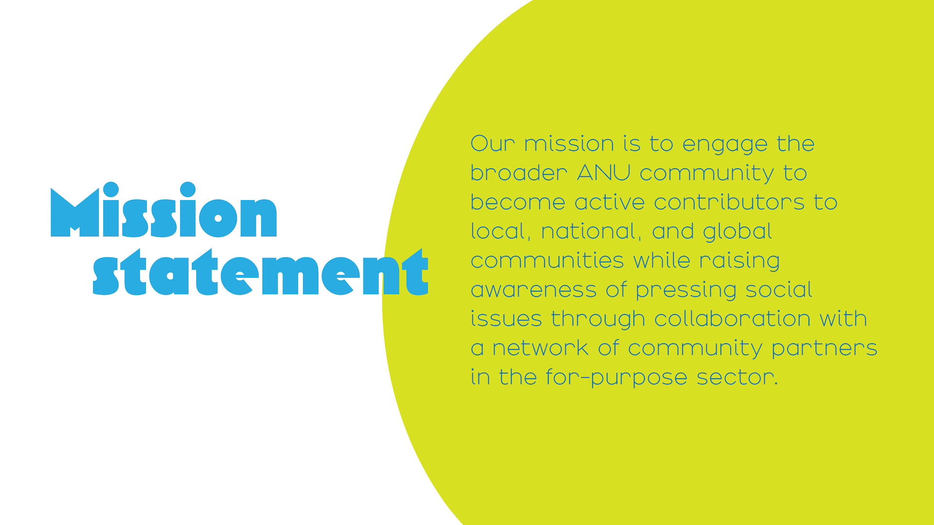
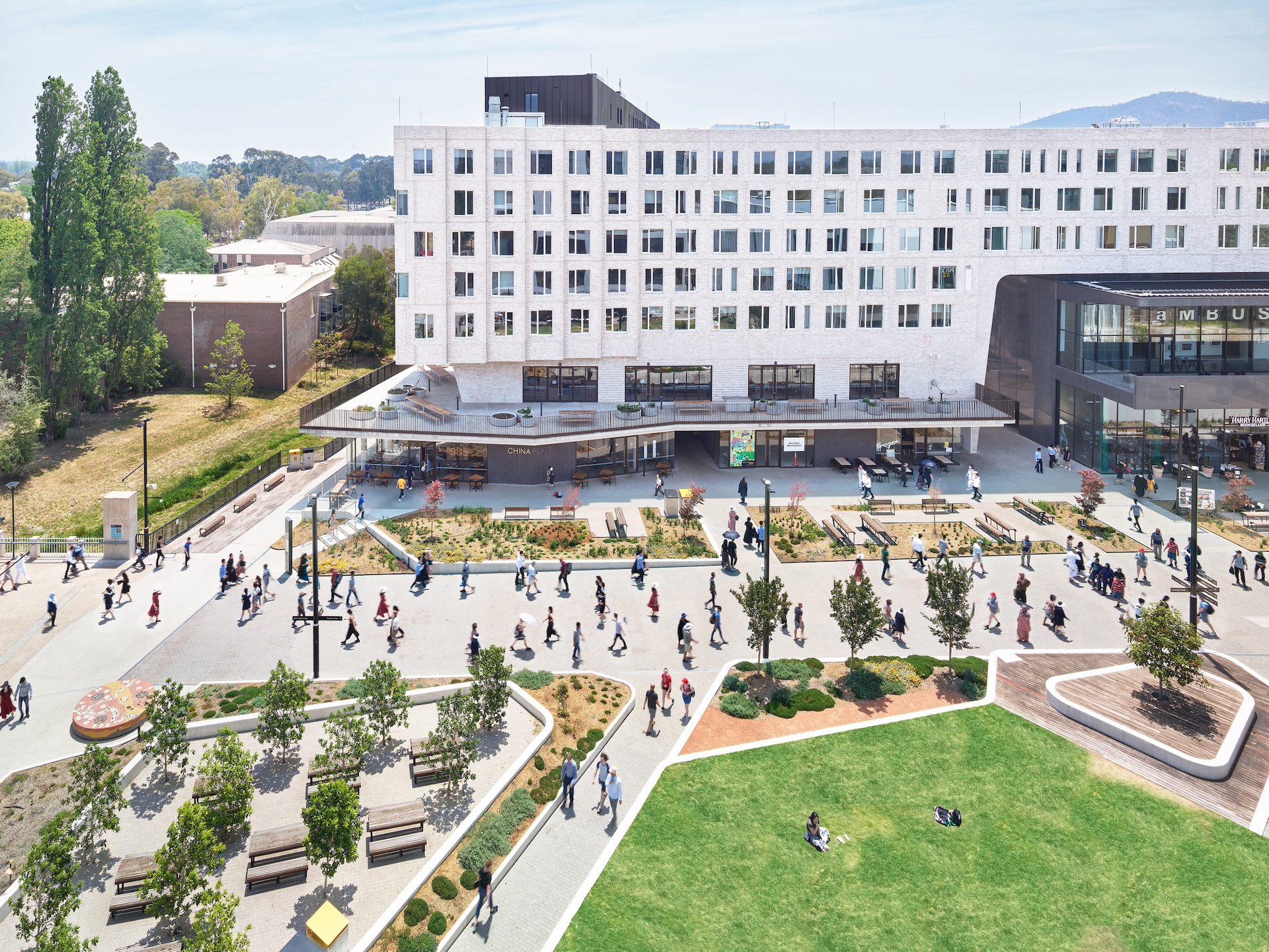
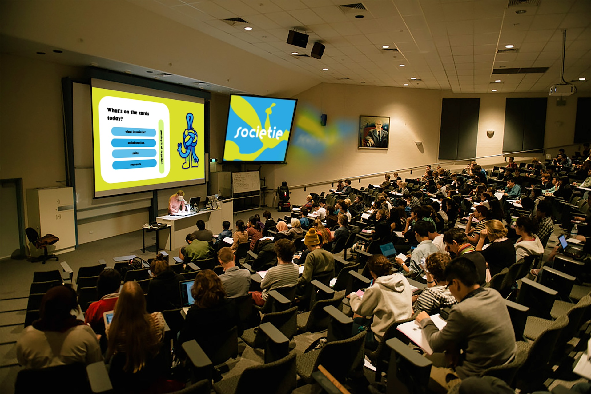
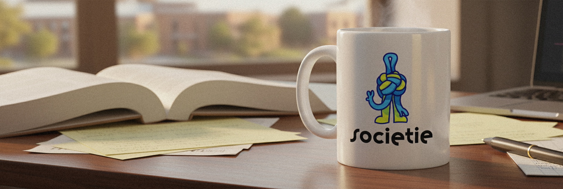
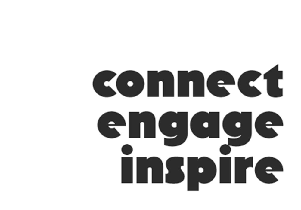
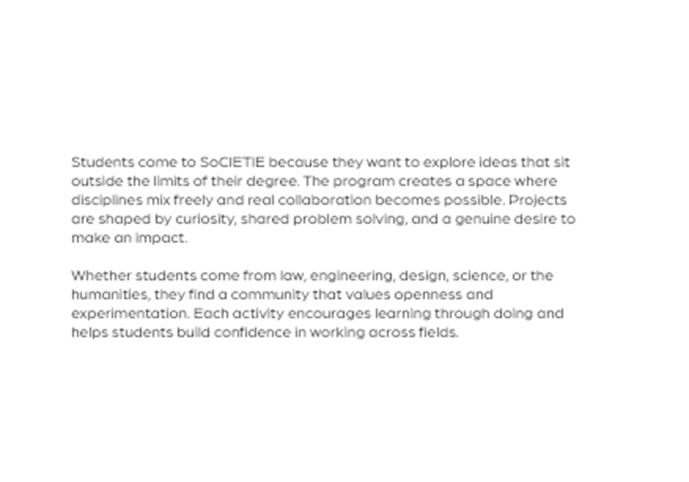
SoCIETIE is an Australian National Ujniversity (ANU) based initiative, founded in 2025, that connects students across disciplines to collaborate on projects. Informed by the geography of the ANU campus, SoCIETIE's core values, and hub and spoke systems, this identity uses bold type, cool green and blue hues, simple modular graphics, and a brand mascot to create a visual language that feels open and connected. It brings clarity and character to the organisation, making SoCIETIE easy to recognise across workshops, events, digital spaces, and everyday student life.
</project breif>
<touchpoints>
<touch points>
<key deliveries>
<key deliveries>


The project began with understanding SoCIETIE's role at ANU and the need for an identity that reflected collaboration across disciplines. Early research involved mapping the project's core values and identifying visual anchors tied to ANU's physical and conceptual landscape. Weekly meetings with Chris and stakeholders established clear communication channels and helped define what success looked like for the client.
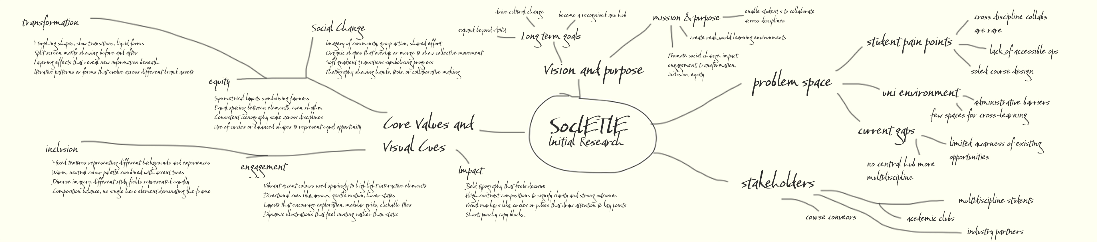
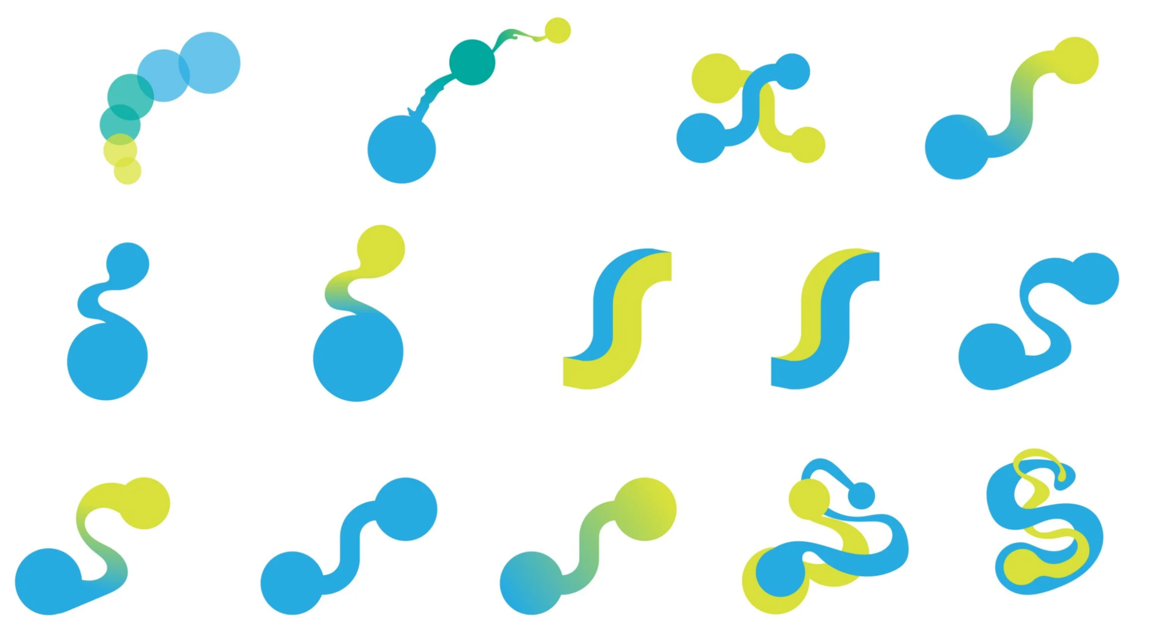
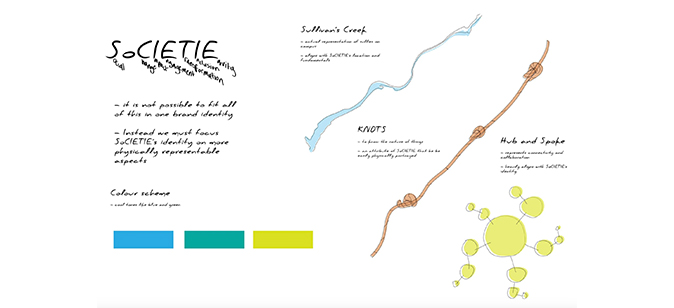
Over 12 weeks, we explored numerous logo directions, each with a distinct rationale linking it to ANU and SoCIETIE's mission. Presenting ideas regularly allowed us to test concepts against stakeholder feedback and refine our thinking in real time. This iterative dialogue eventually narrowed the field to three strong concepts: Sullivans Creek, KNOTs, and a hub and spoke system, each offering a different way to visualize connection and collaboration.
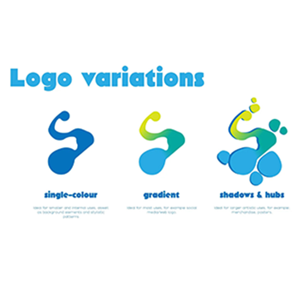
With the three concepts established, the focus shifted to testing how each could function as a flexible identity system. We developed variations, explored applications, and assessed which direction best balanced visual impact with practical usability. Ongoing client feedback helped us push each concept further while maintaining clarity and cohesion.
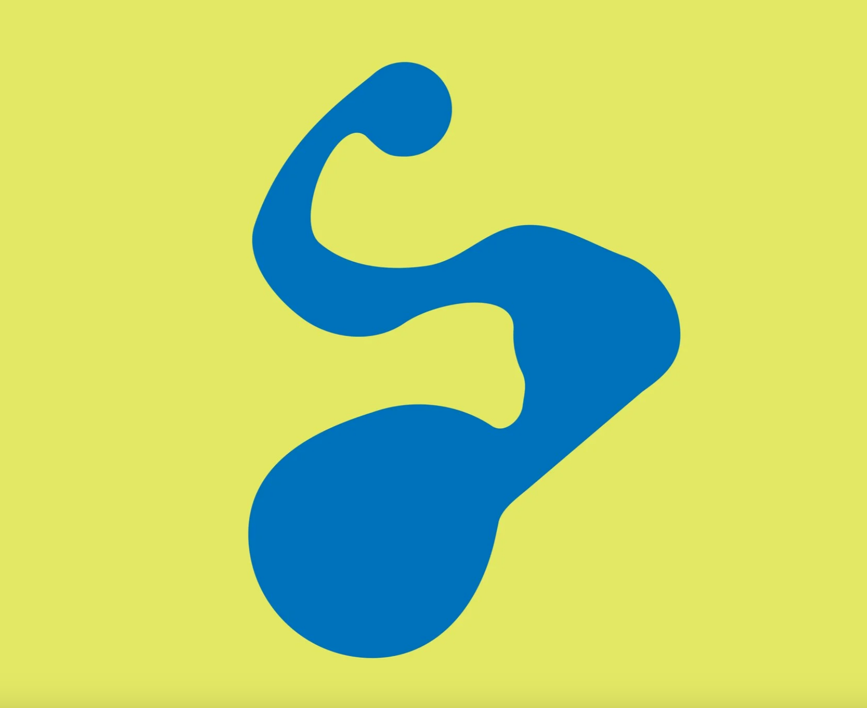
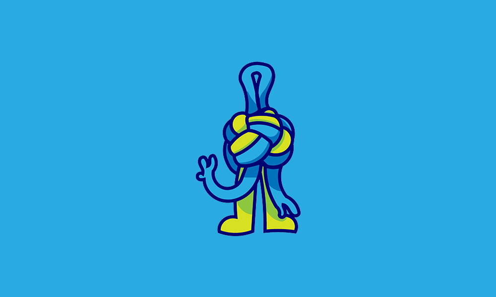
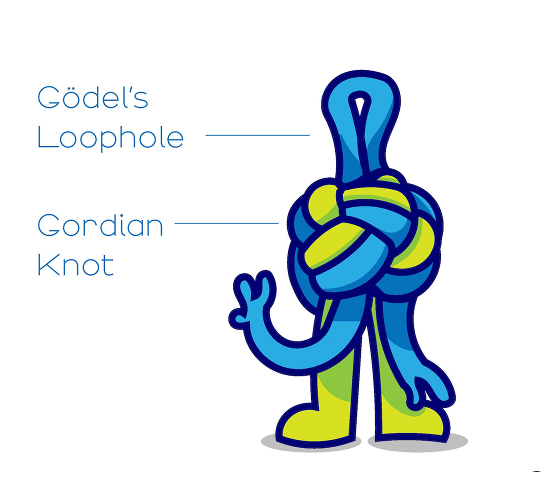
The final identity emerged from sustained client collaboration rather than a single eureka moment. Regular communication ensured the design stayed aligned with SoCIETIE's goals while allowing space for creative exploration. The key outcomes included modular graphics inspired by the form of Sullivans Creek, hub and spoke systems, and knots along a rope, alongside Knox, the brand mascot who became a recognizable face for the project. The process reinforced that identity work thrives on dialogue, strong concepts need room to evolve, and the best outcomes come from balancing vision with responsiveness to client needs.
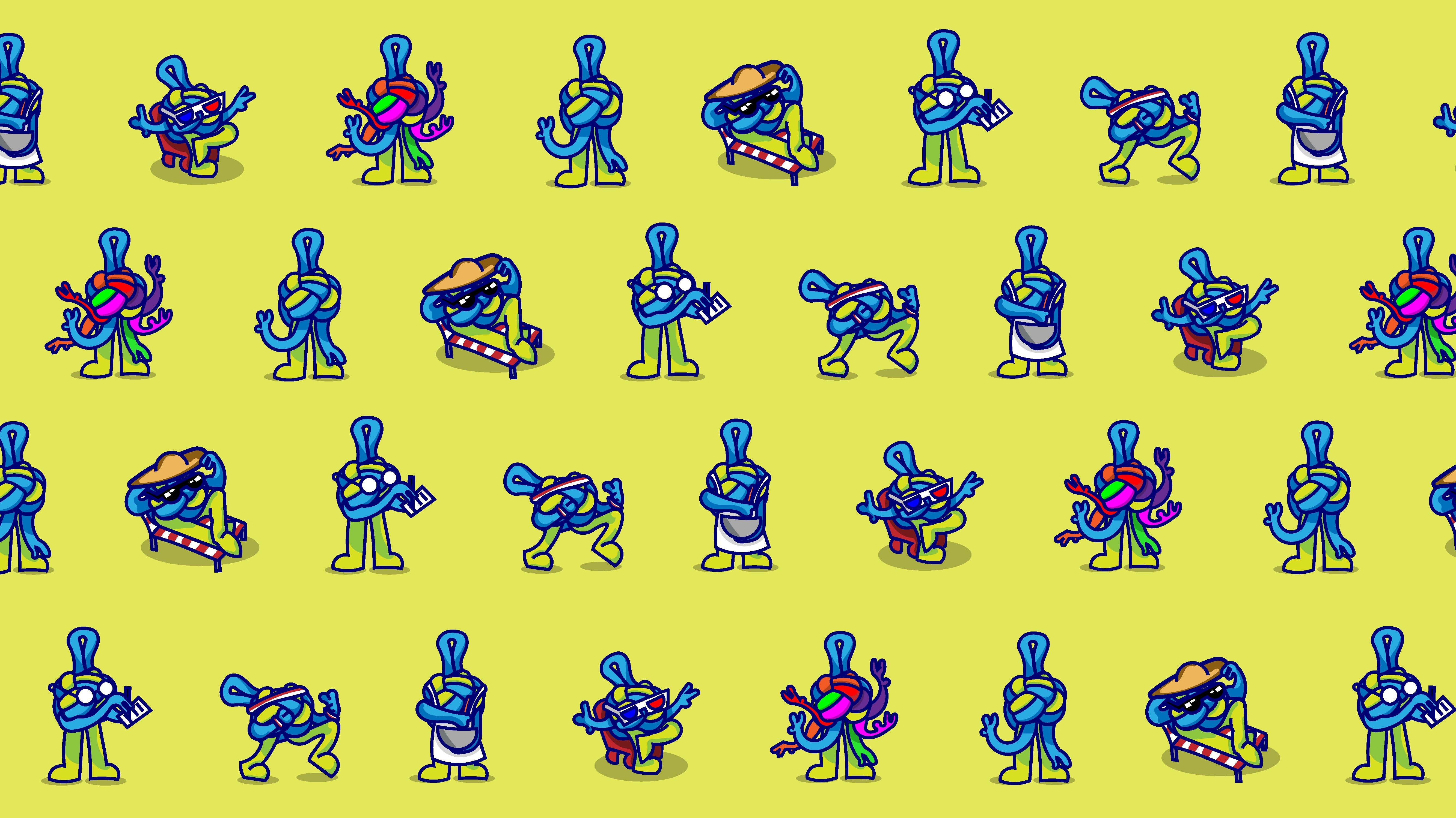
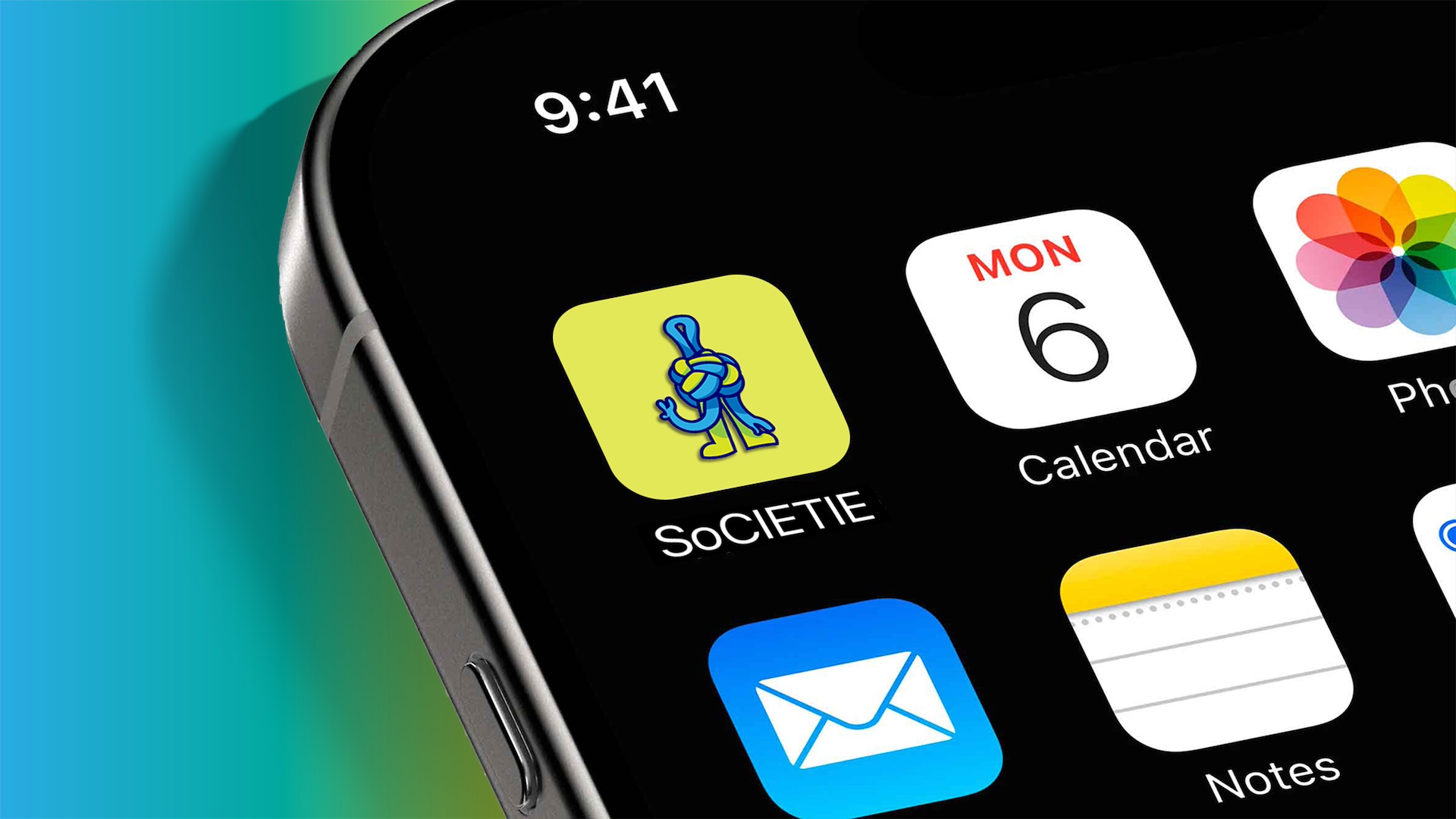
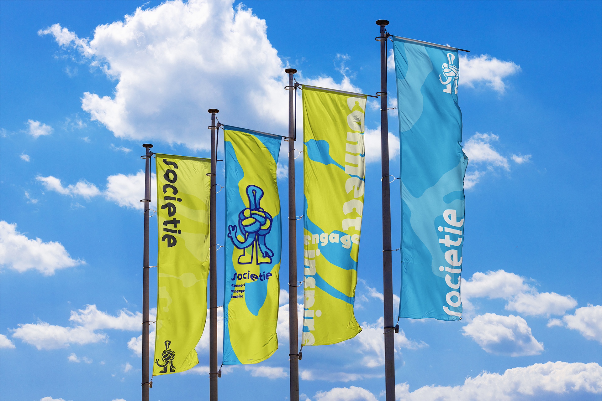
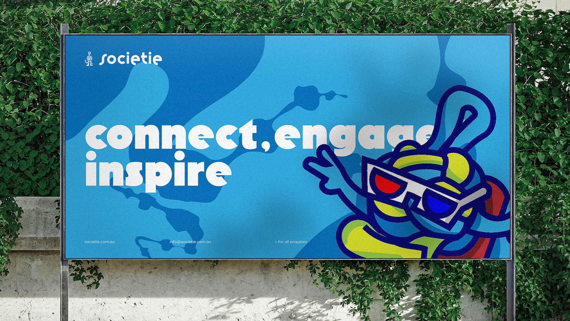
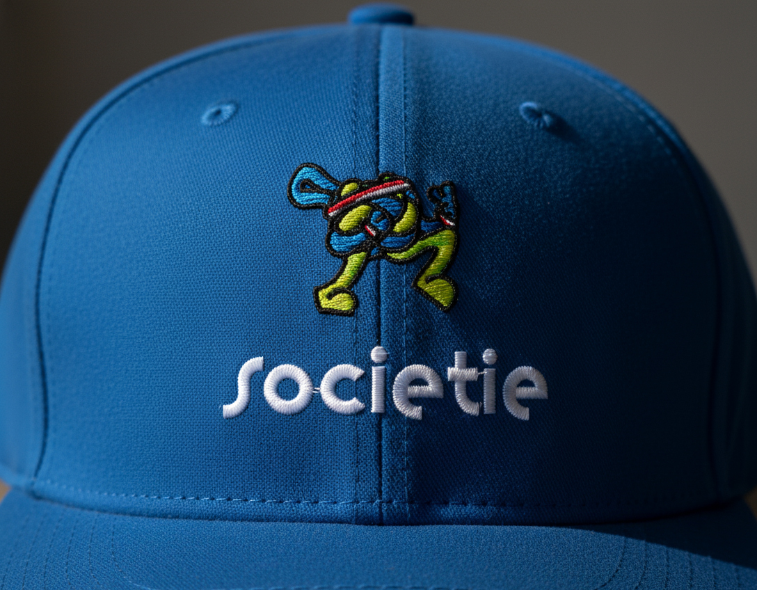
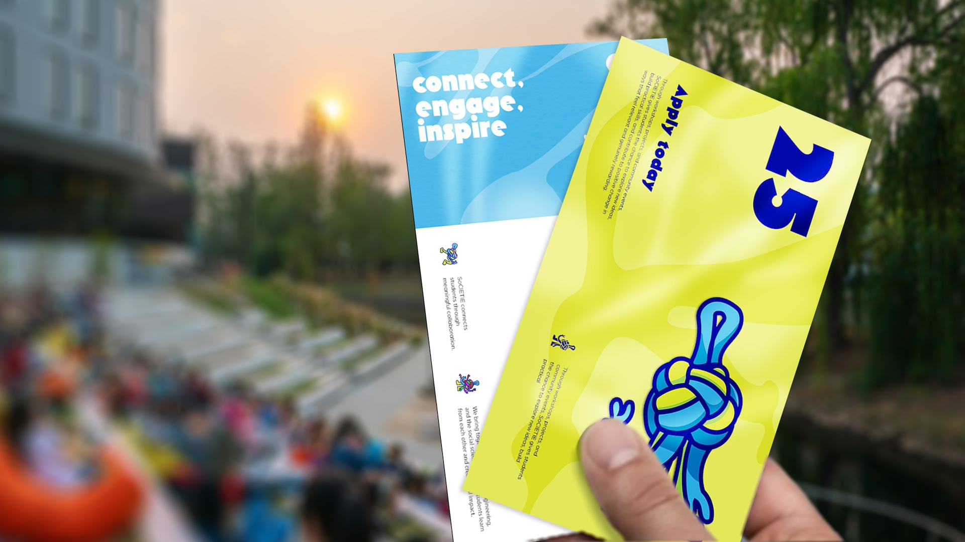
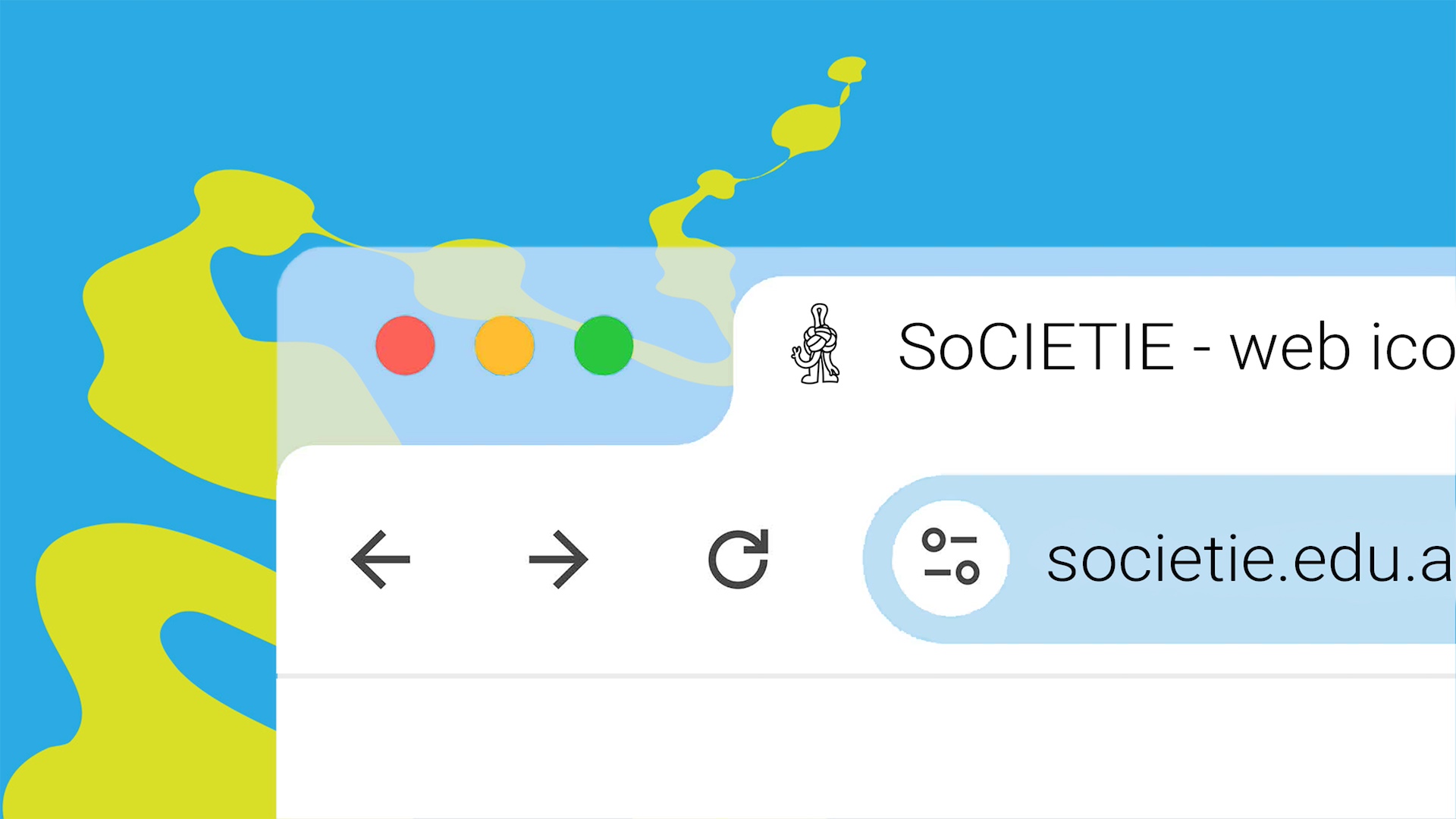
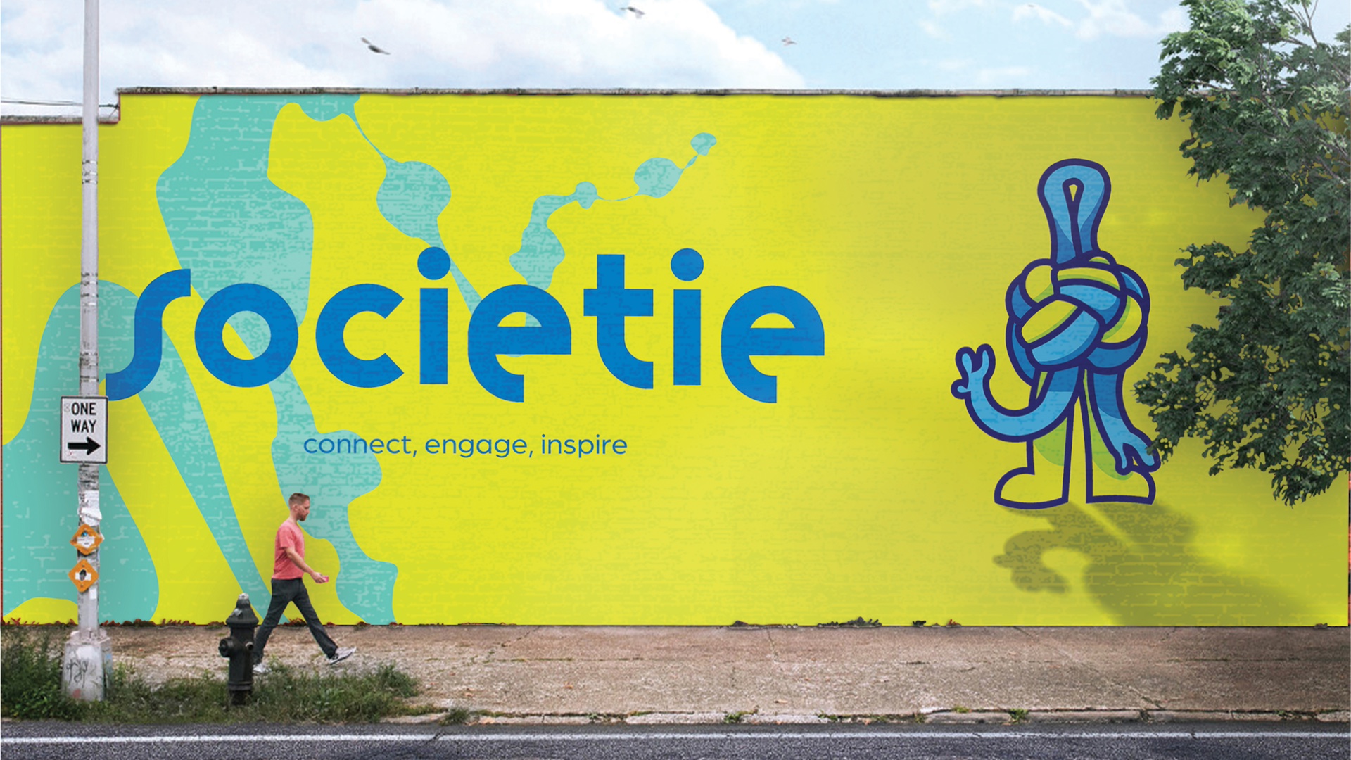
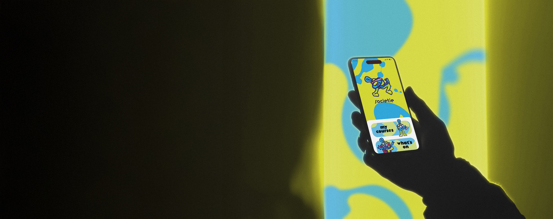
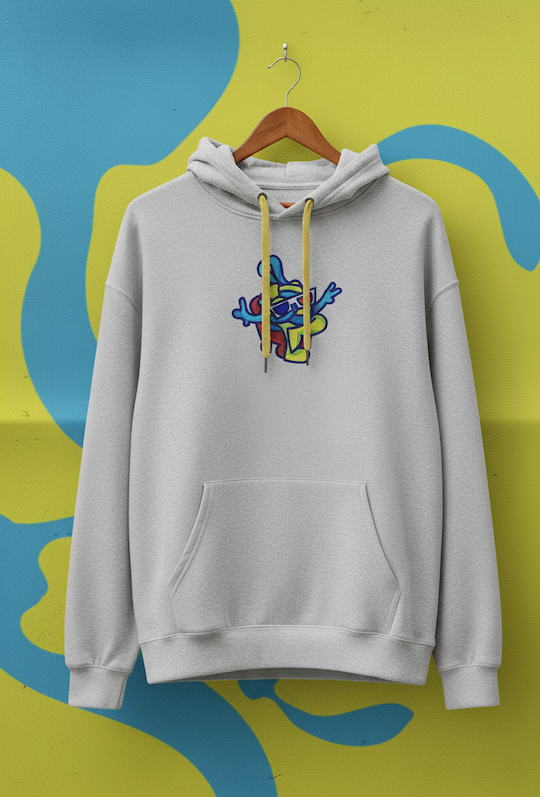
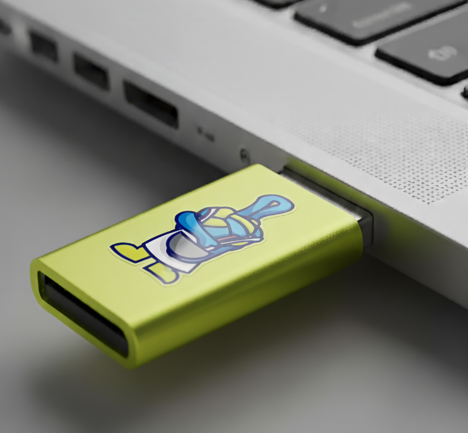
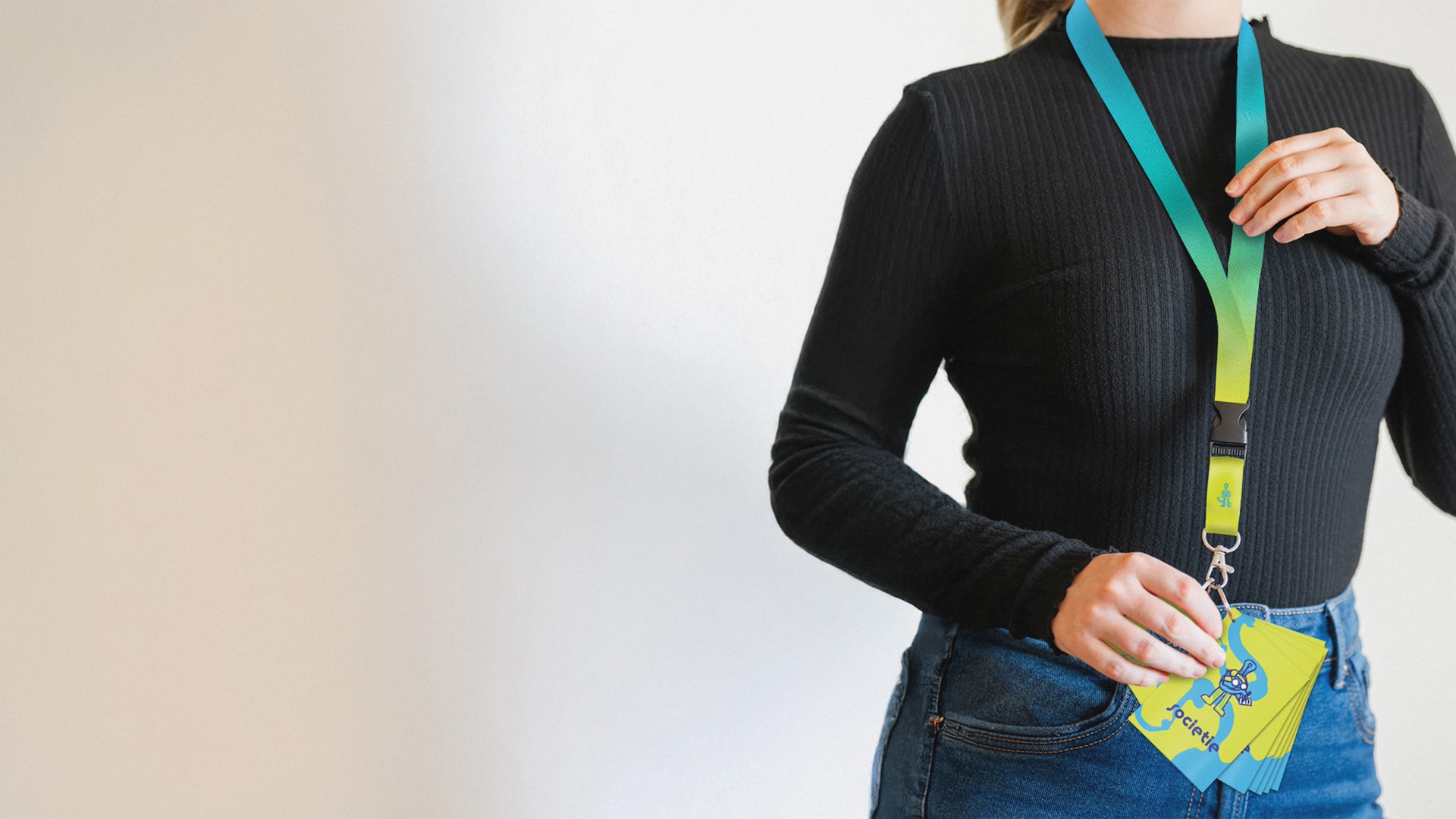
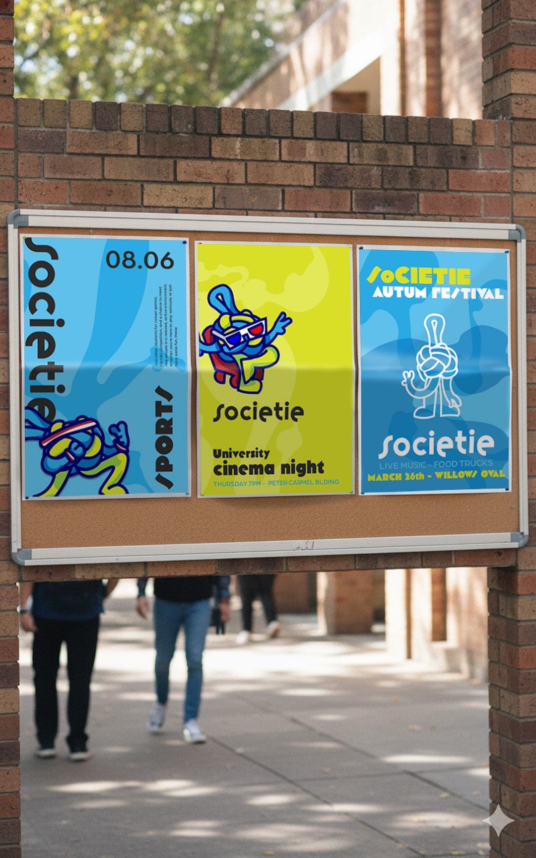
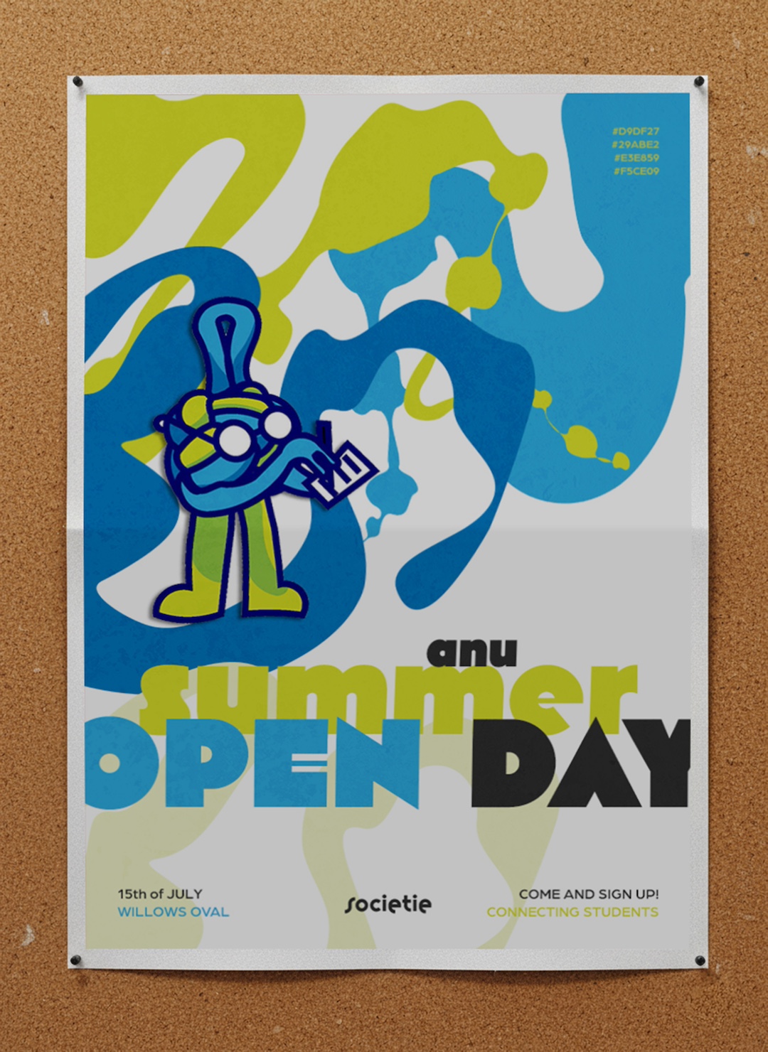
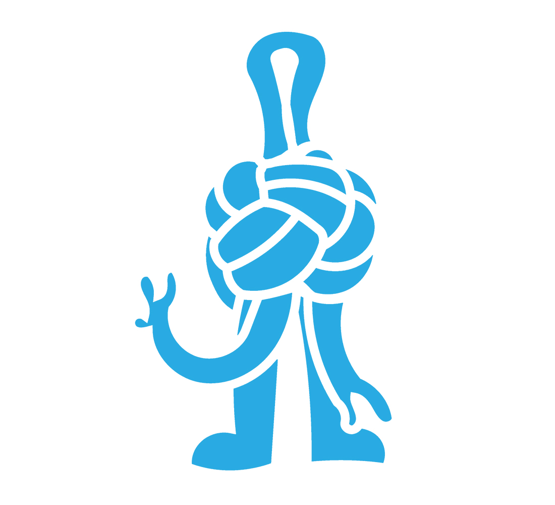
Using a character as the logo makes the brand instantly warm and memorable, something students can connect with. Knox's form is inspired by the Godel loop and the Gordian Knot, two ideas that capture what SoCIETIE is all about, complex problems and creative solutions. The looping form hints at constant learning and the flow of ideas between disciplines, and the knot references challenges that feel impossible until you look at them from a new angle. Together they create a mascot that feels clever, approachable, and symbolic of the way SoCIETIE helps students untangle tough problems through collaboration.


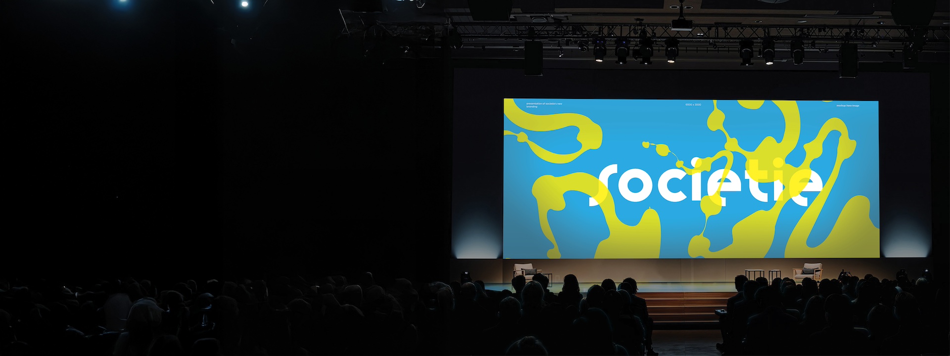
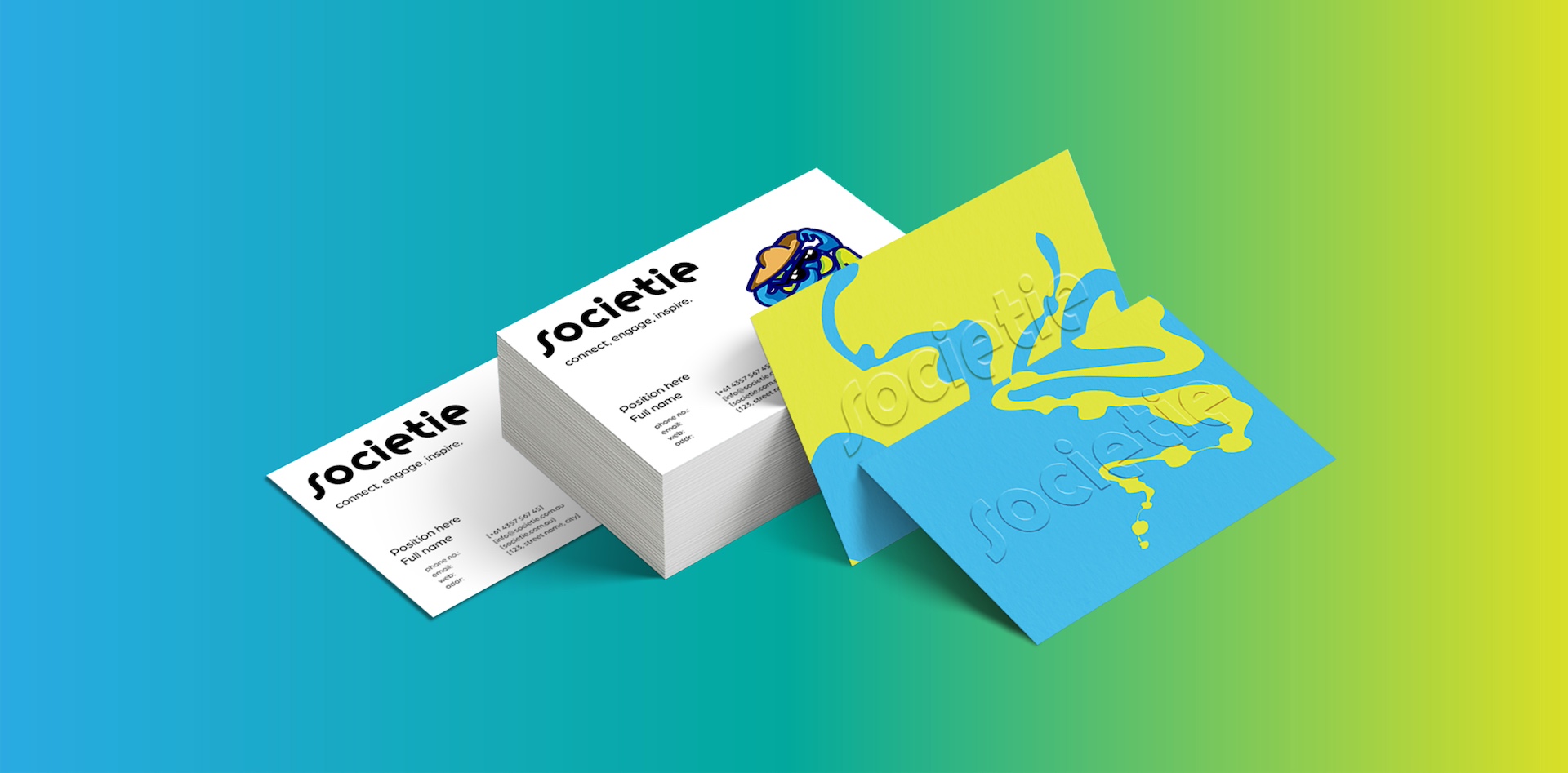
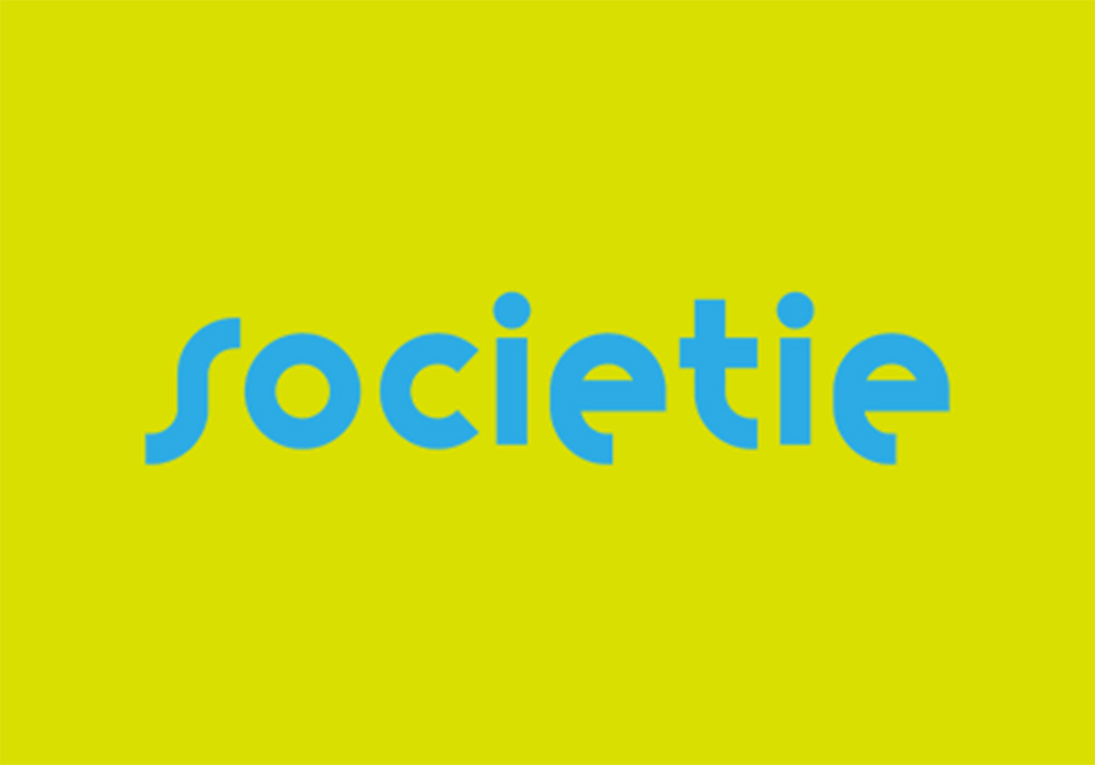
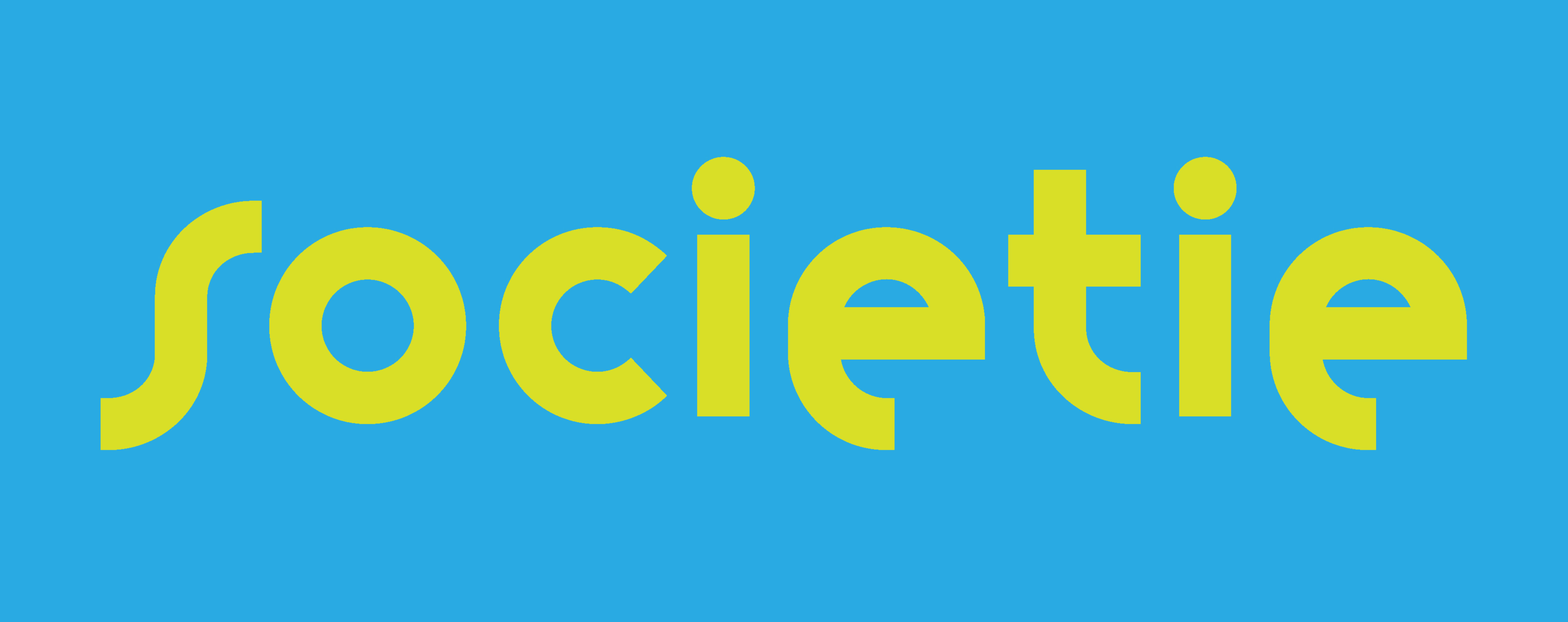
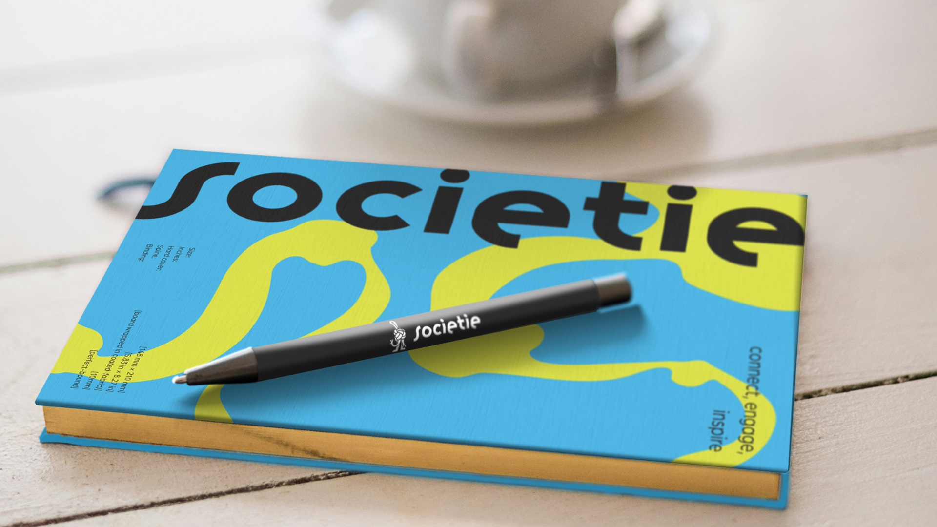
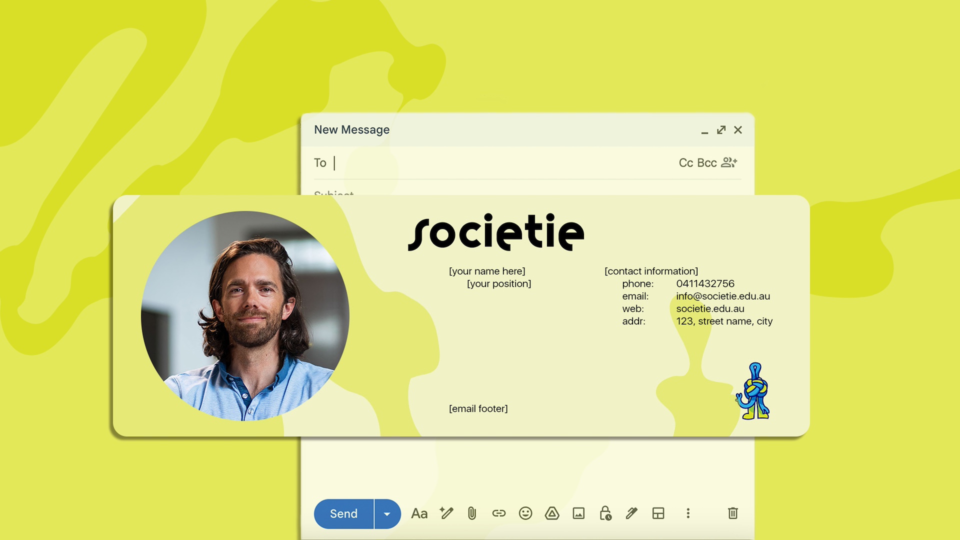
TThe typography works as a clean system that feels modern and playful without losing clarity. Variex OT gives the logotype personality and movement, a perfect match for a brand built on creativity and crossover thinking. Arbotek Ultra carries the big moments, its bold shapes giving headings and hero text real presence. Arboria keeps everything grounded, a friendly and readable body typeface that makes longer content feel light and accessible. Together they create a balanced voice that feels smart, approachable, and distinctly SoCIETIE.
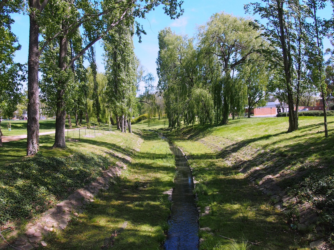
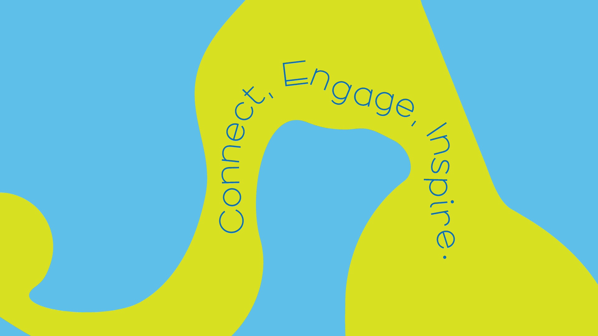
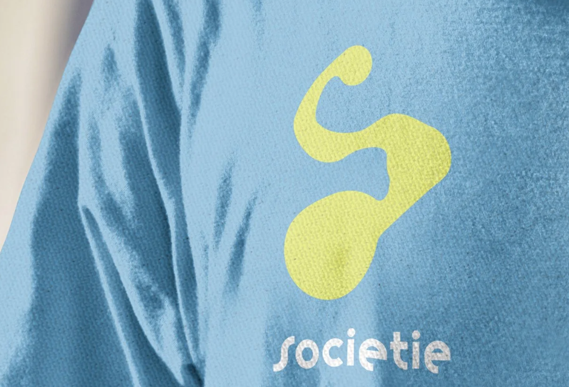
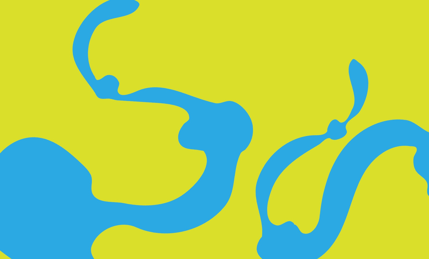
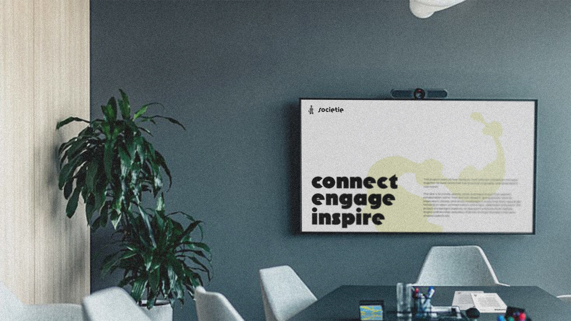
The colour palette draws from real places and feelings on campus. The vibrant blues and greens come from Sullivan’s Creek, the surrounding greenery, and the general energy of students moving through a shared hub. The lighter tones echo the openness of outdoor spaces, and the deeper shades bring the calm and focus you find in quieter parts of campus. Together they create a palette that feels local, fresh, and full of life, a natural fit for a brand built around connection and collaboration.
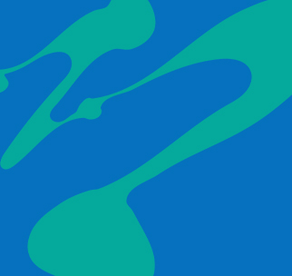
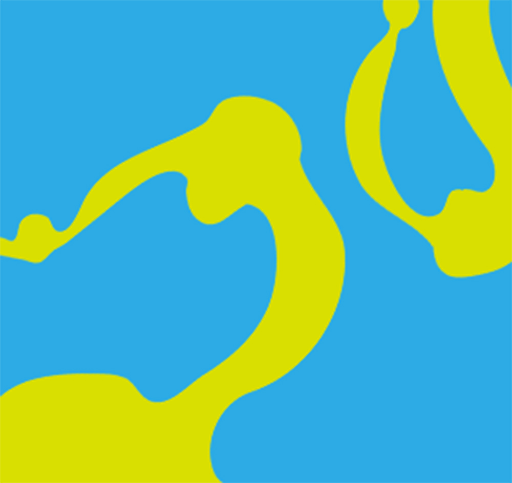
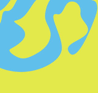
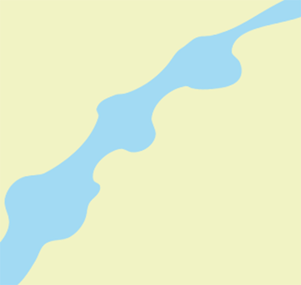

The graphic background elements take their shape from waterways and knots along a rope, two visual ideas that tie back to movement and connection. The flowing forms echo the curves of Sullivan’s Creek and the natural lines that run through campus, while the knot inspired shapes bring in the idea of tension, problem solving, and things coming together. Together they create a backdrop that feels alive and fluid, adding texture and personality without overpowering the content.