.png)
<project brief>
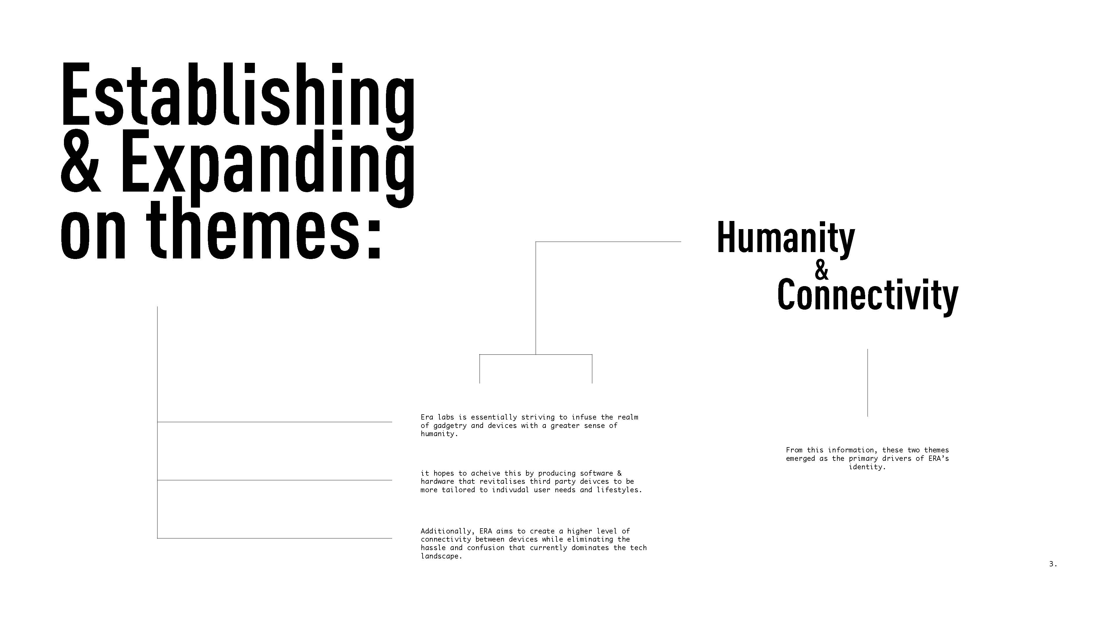
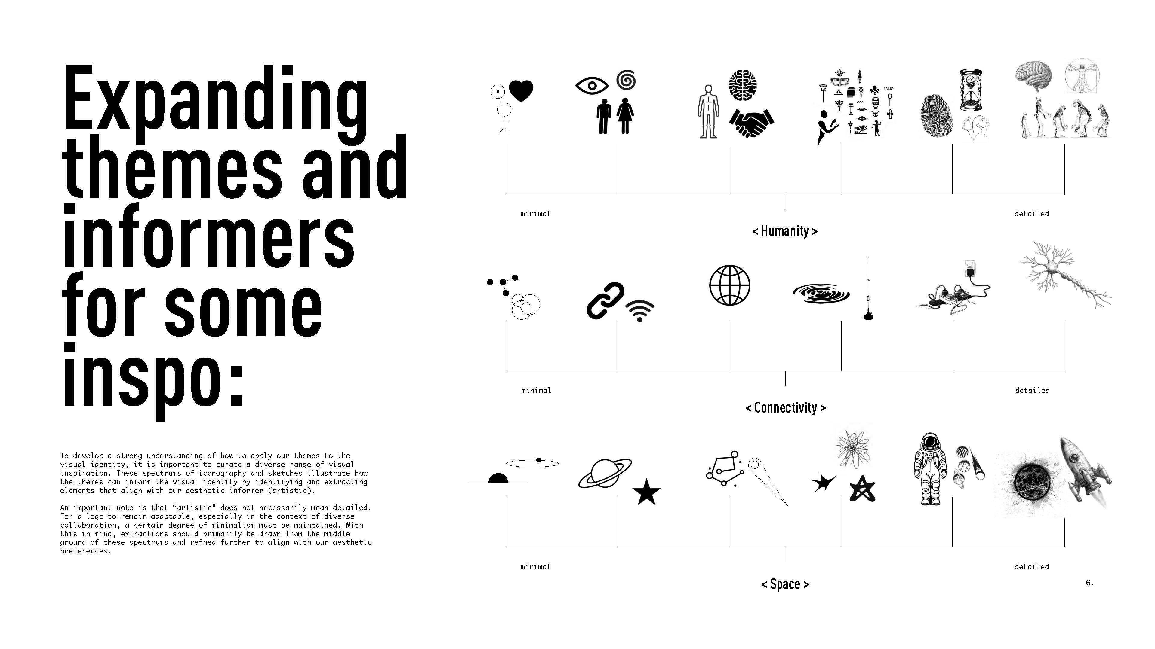
Era Labs builds infrastructure that lets devices and AI agents work together seamlessly, giving people more control over their technology. This project involved early brand directions that could make such a company feel human and approachable. My role was to set Era's branding on the right path and get ideas flowing with early explorations. My focus was on representing humanity and connectivity in a visually engaging / artistic manner.
</project brief>
<approach>
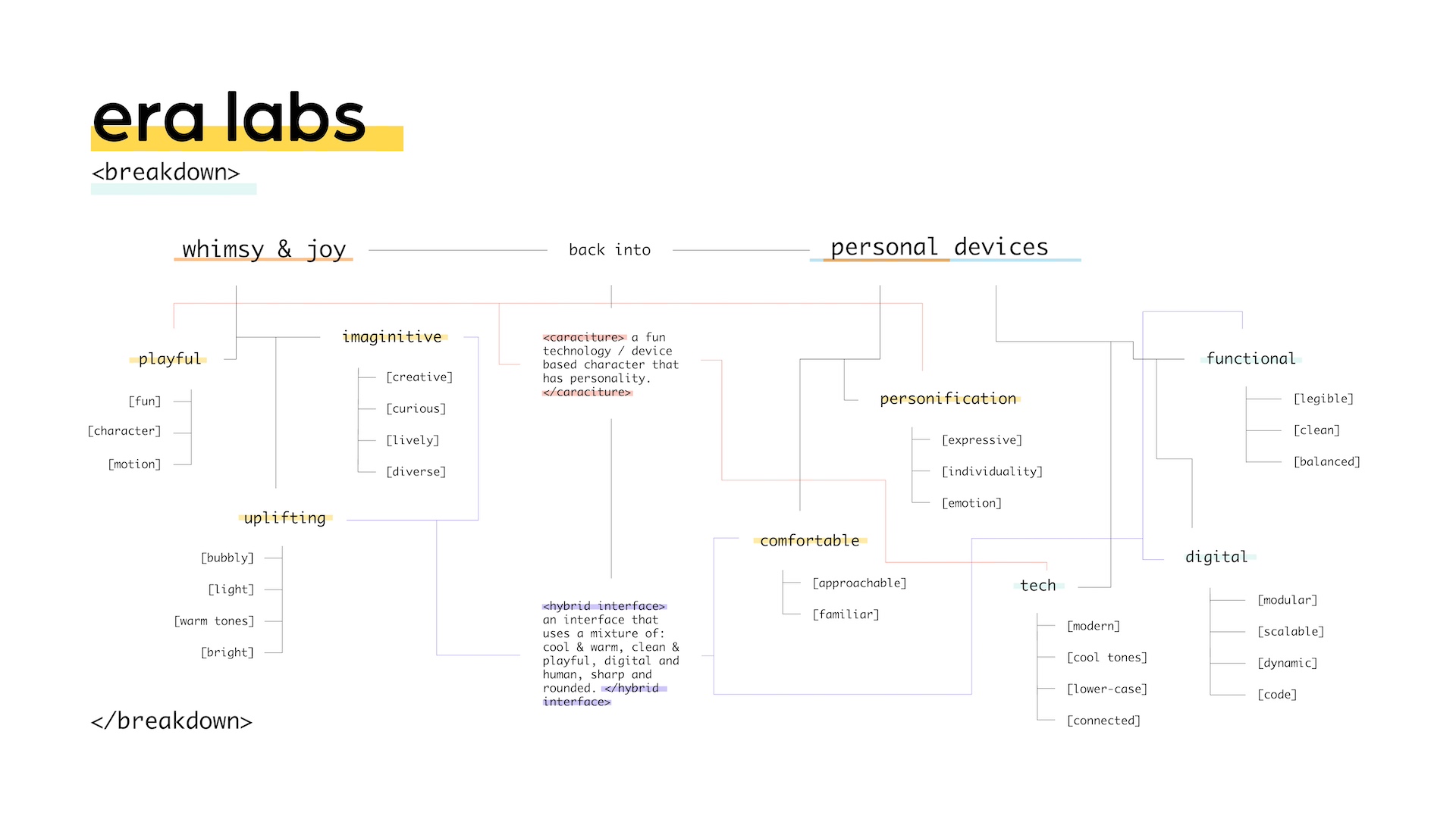
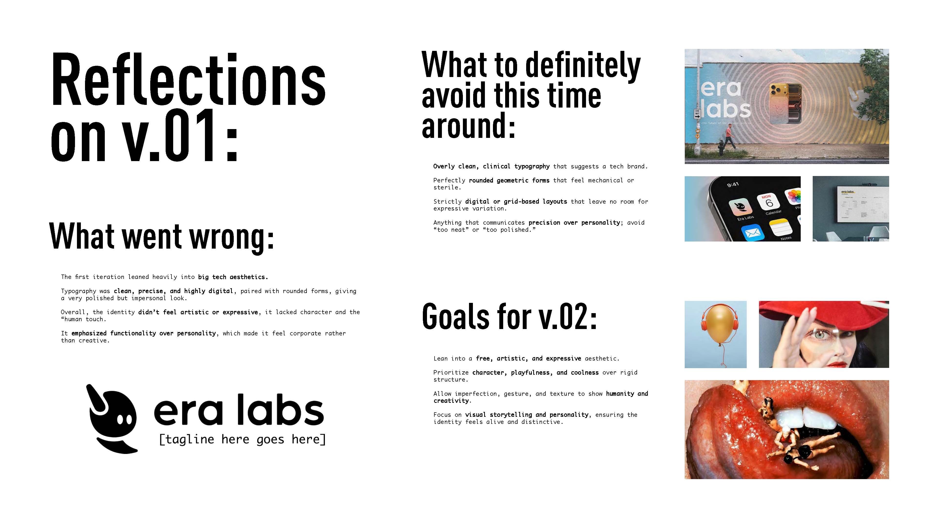
V.01 was a test run to get some feedback and see what resonated with the team. I pulled keywords from the brief: playful, imaginative, functional, digital, and used them to explore ways of bringing a bit of whimsy and joy into how personal tech looks and feels. This version helped us figure out what worked and more importantly what did not, setting the direction for what came next.
</approach>

<concept>
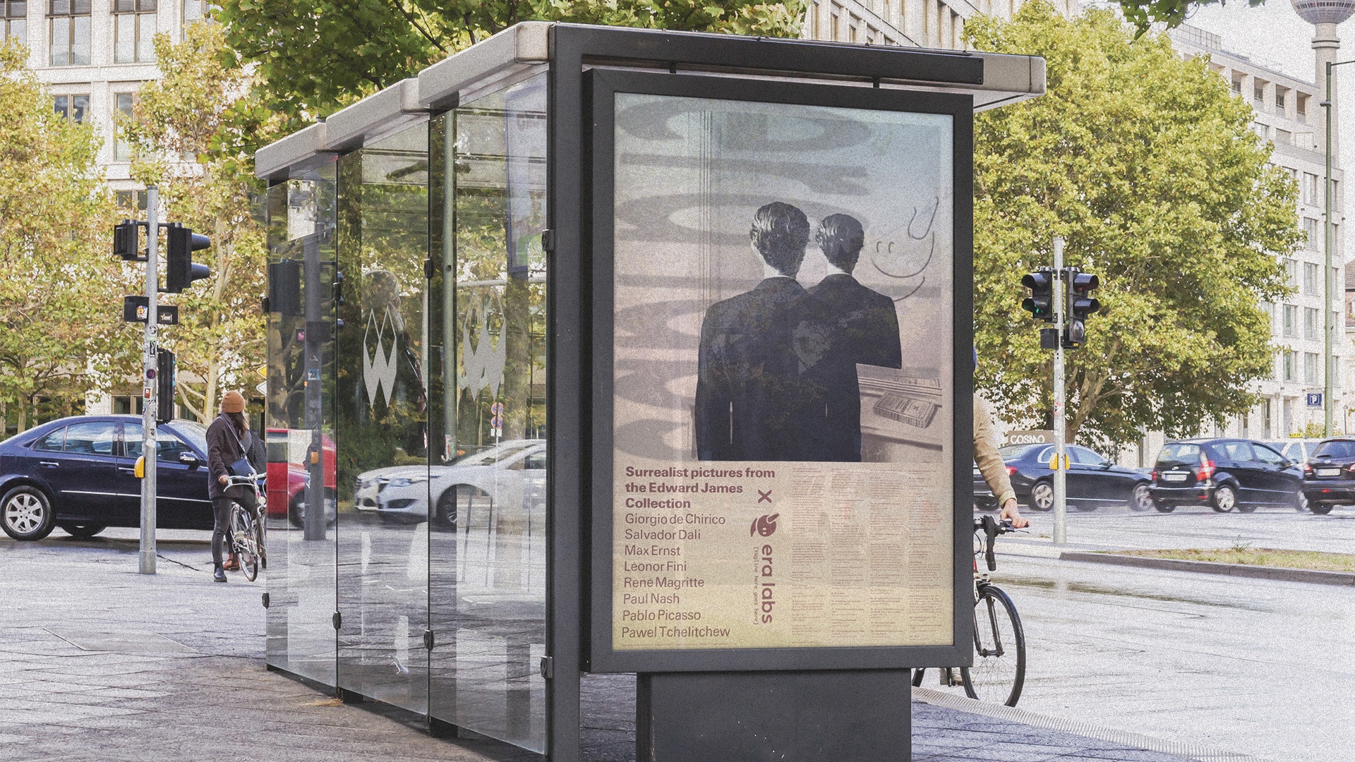
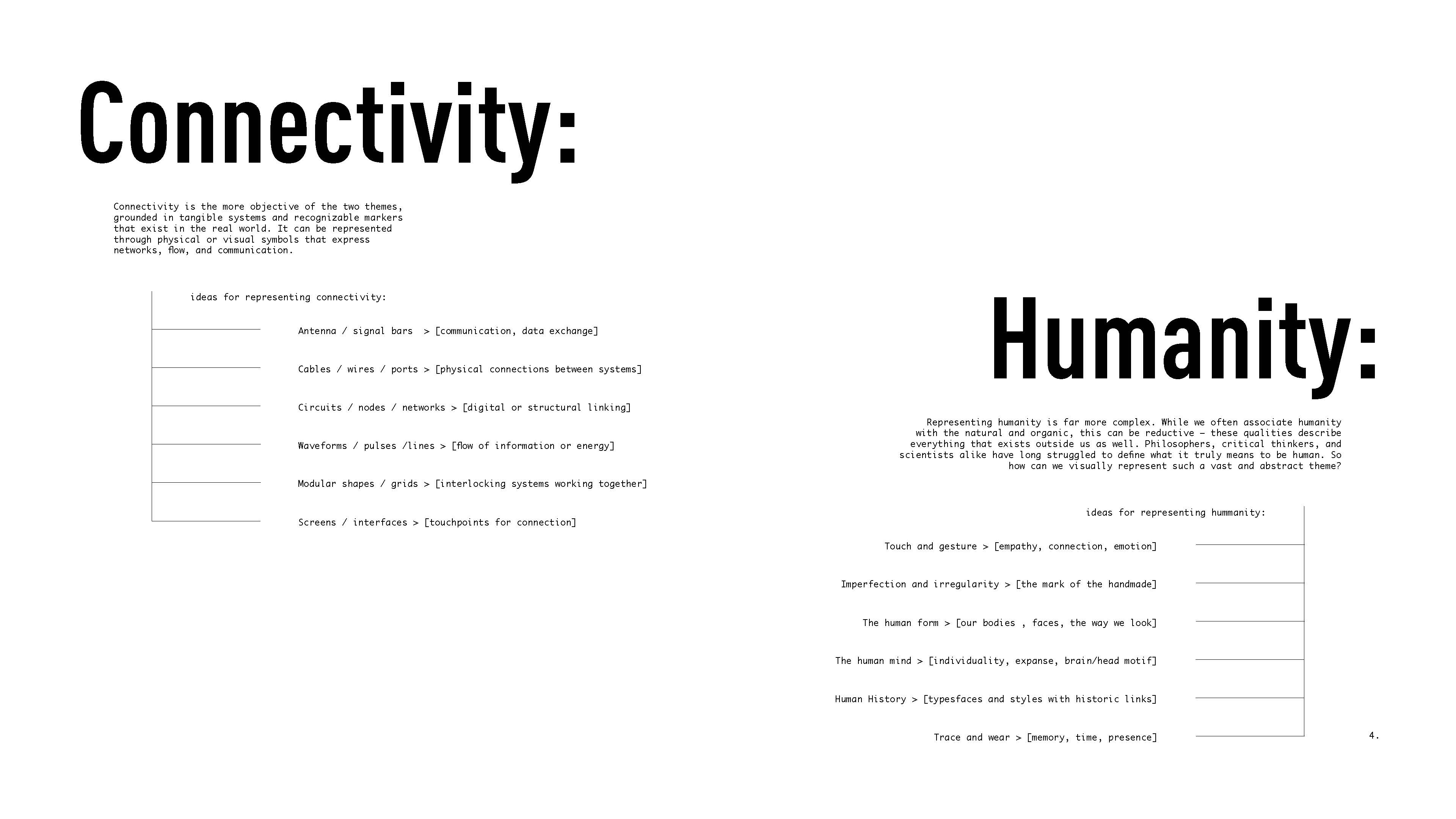
Learning from client feedback, V.02 shifted away from the clean, corporate feel of the first iteration and leaned into something more artistic and human. I focused on bringing warmth, imperfection, and expressiveness into the identity—using hand-drawn textures, goopy forms, and nostalgic references to make the brand feel less like polished tech and more like something crafted and alive. The direction pulled from themes of humanity, connectivity, and space, aiming for a visual language that felt personal, playful, and distinctly not corporate.
</concept>
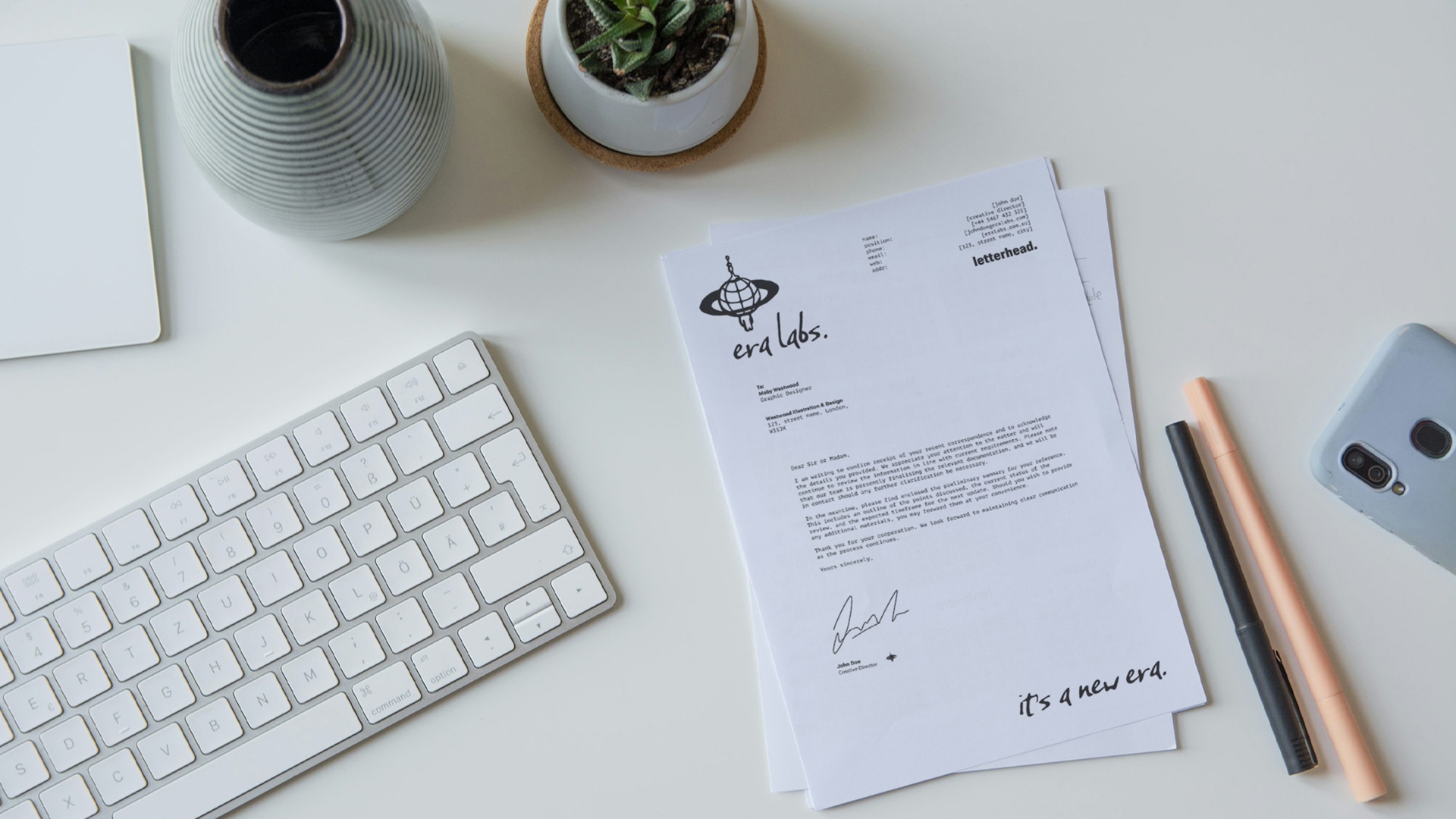
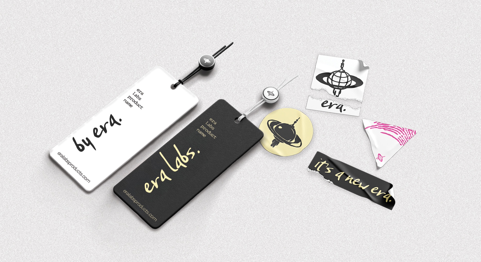


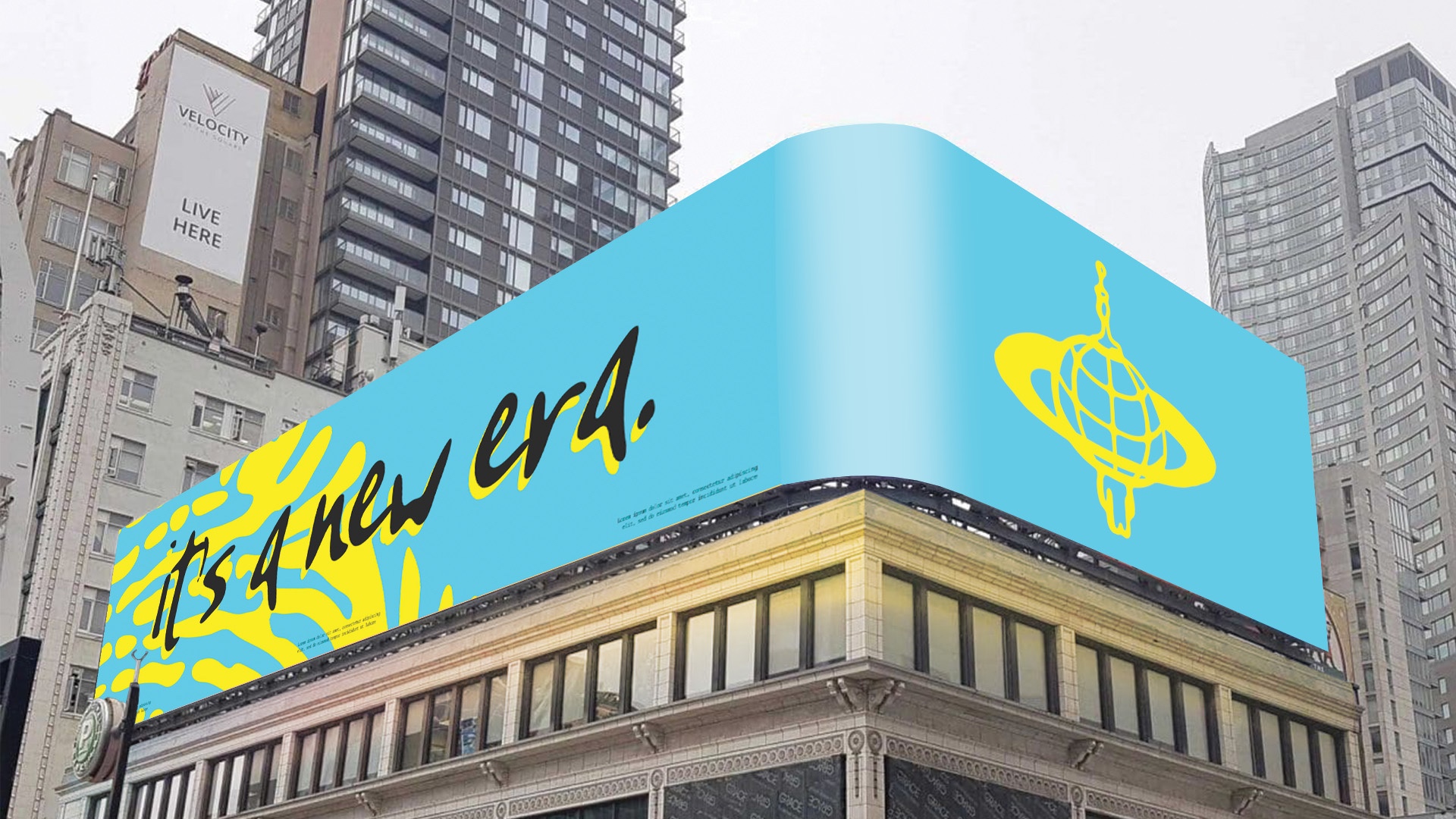
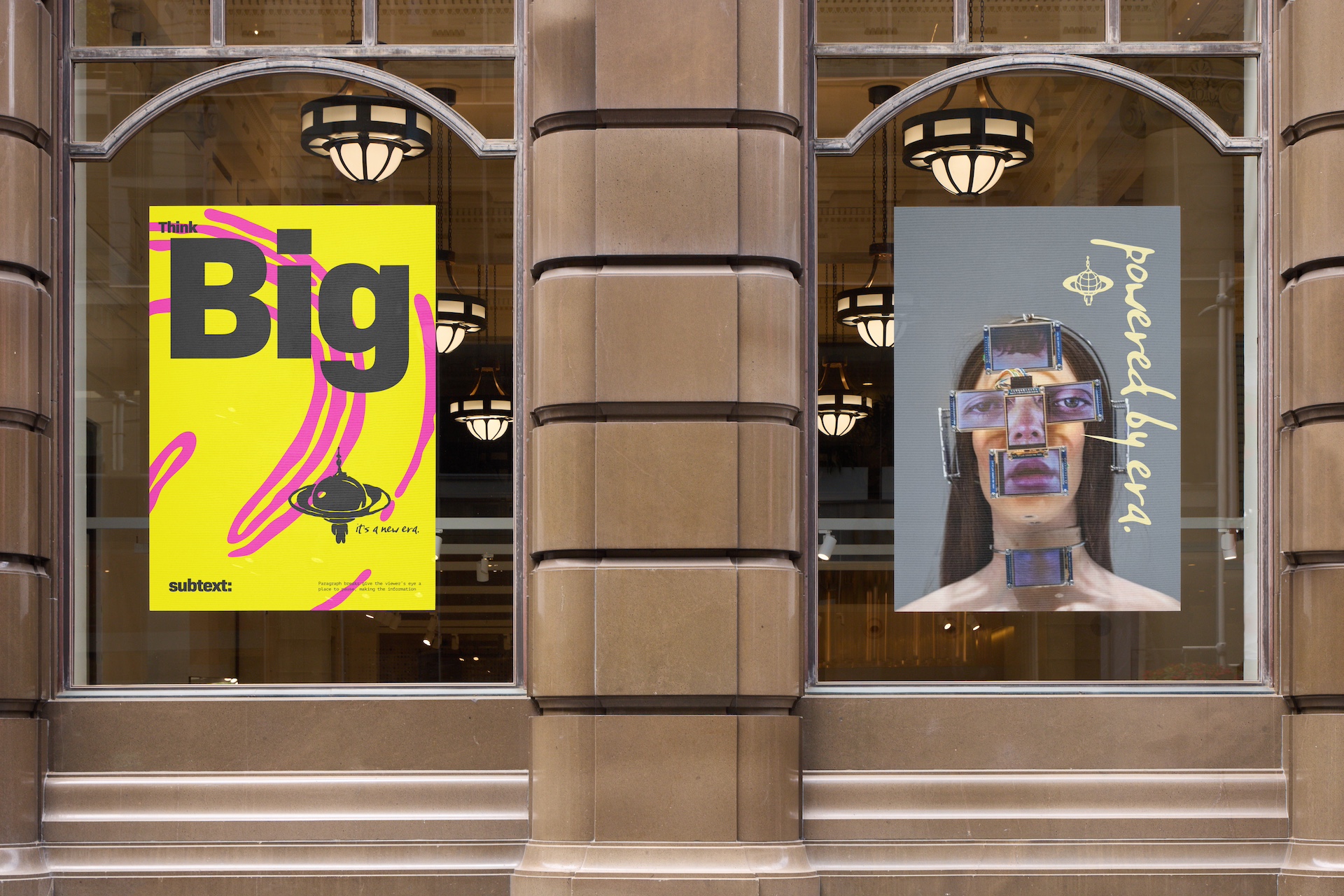
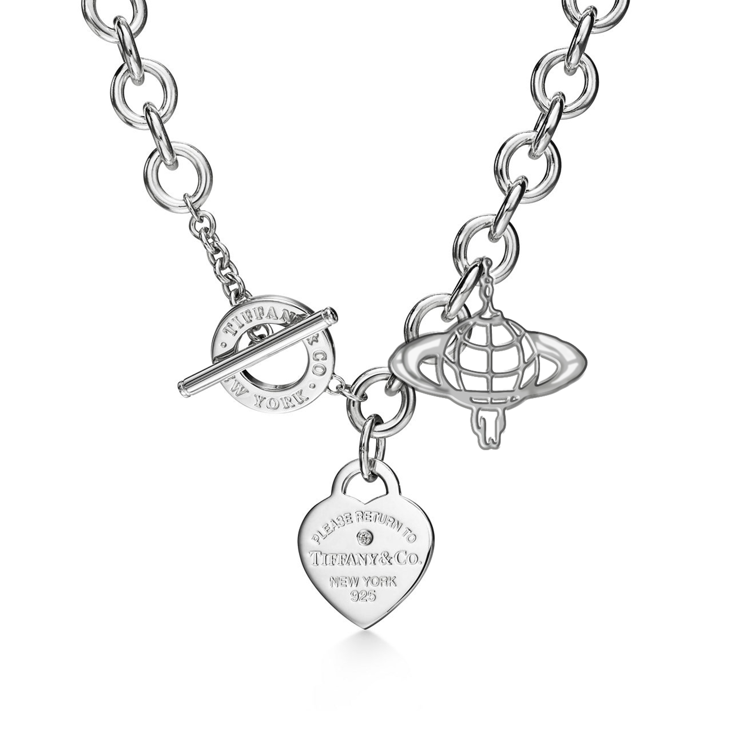
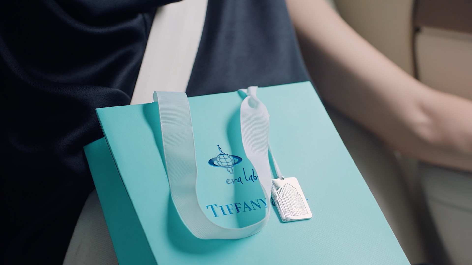
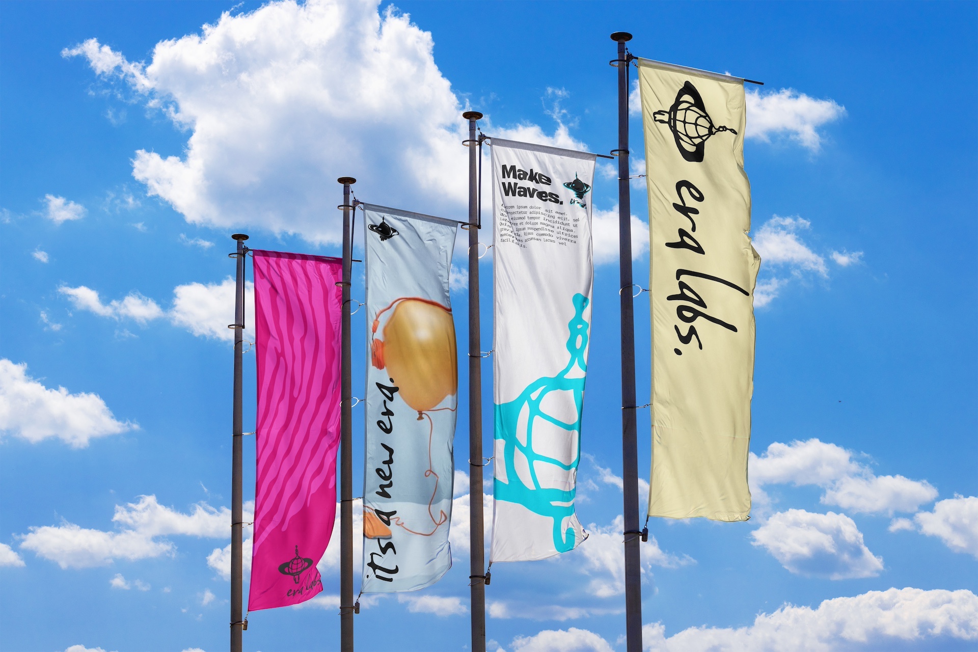
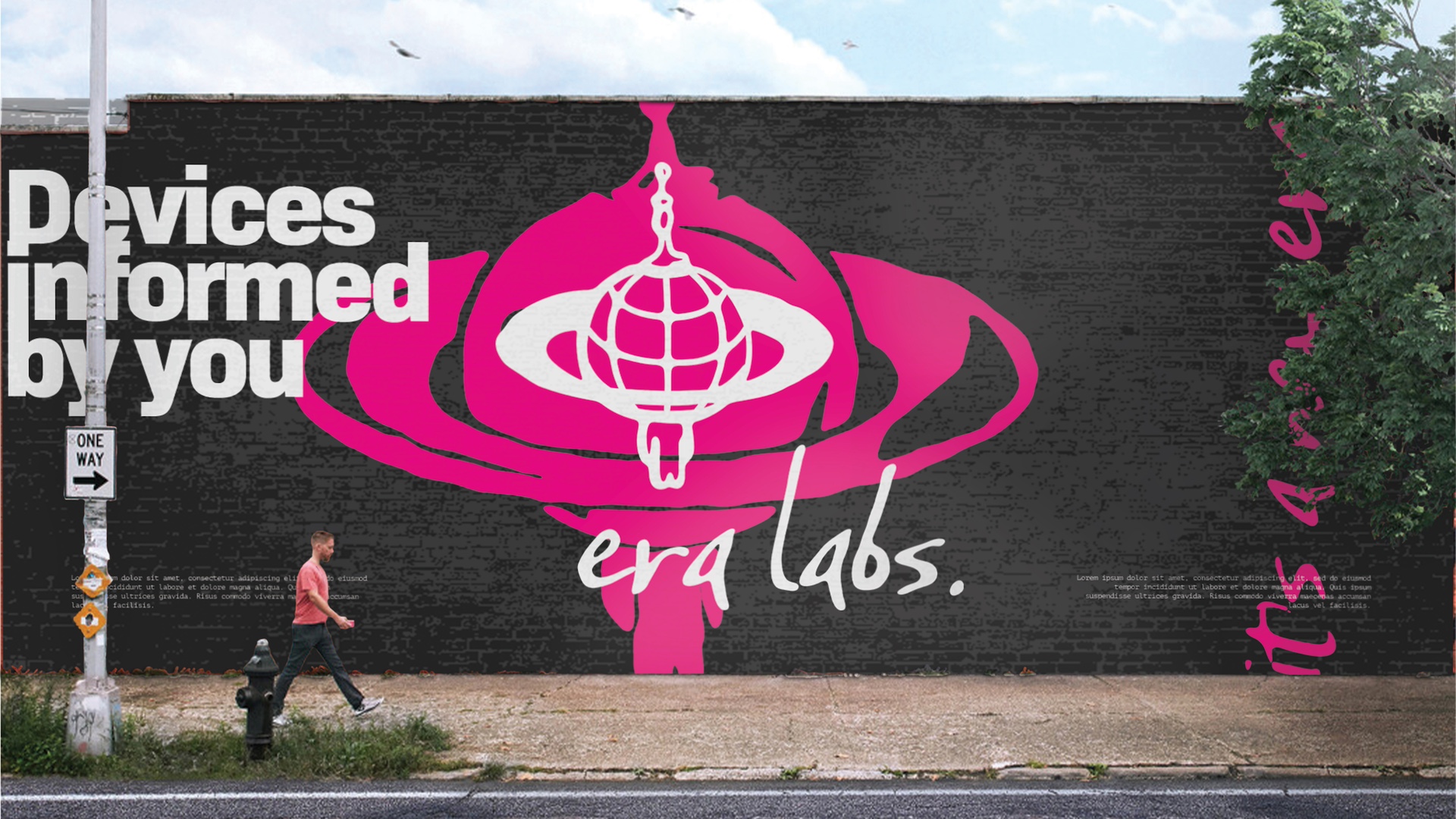
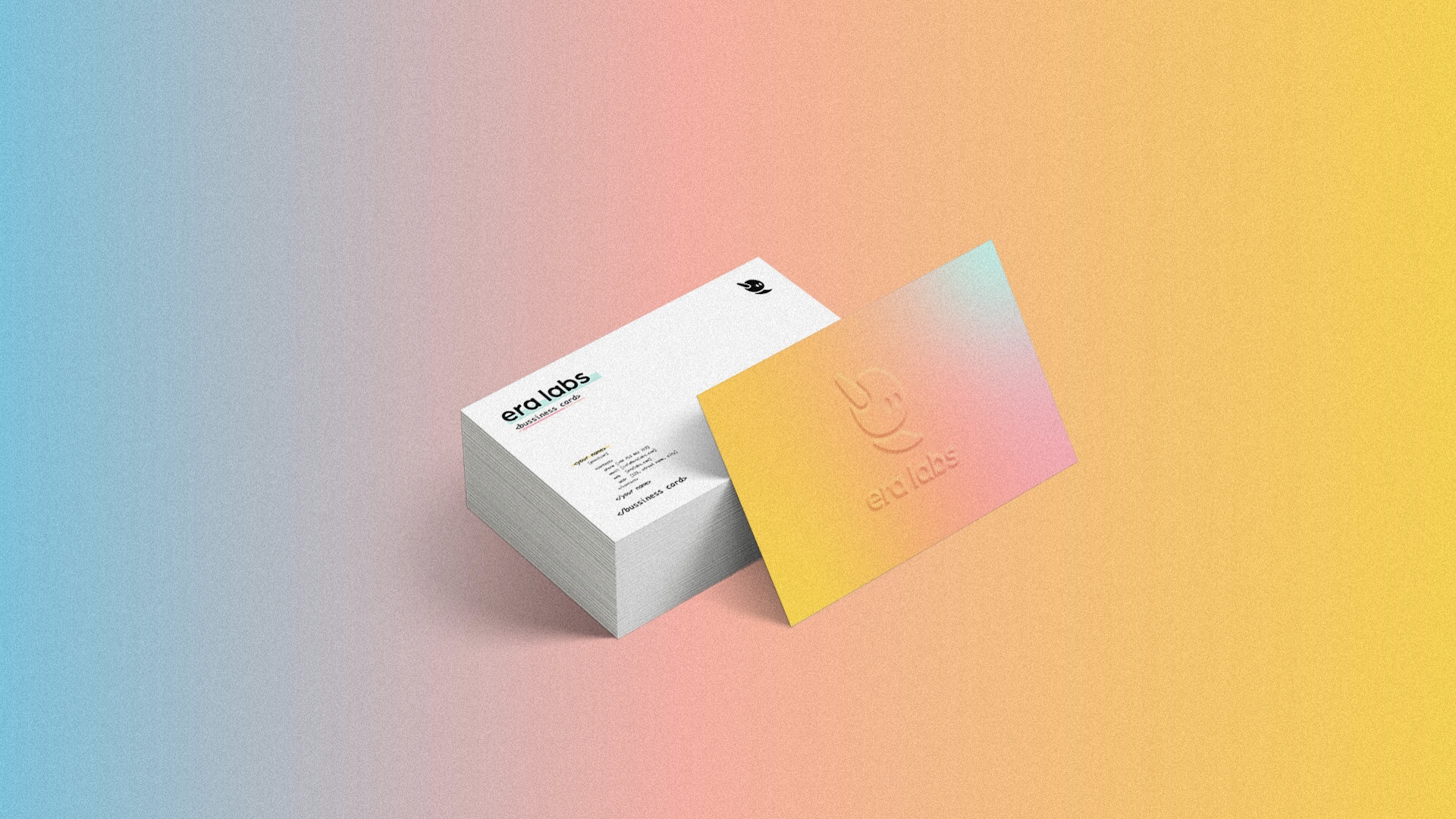
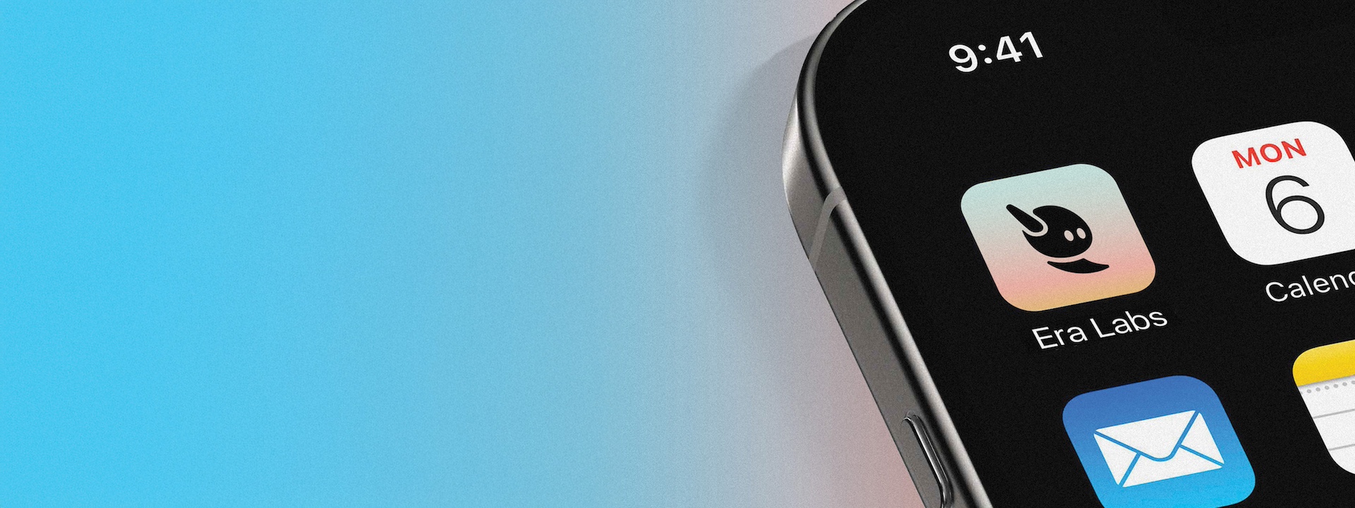
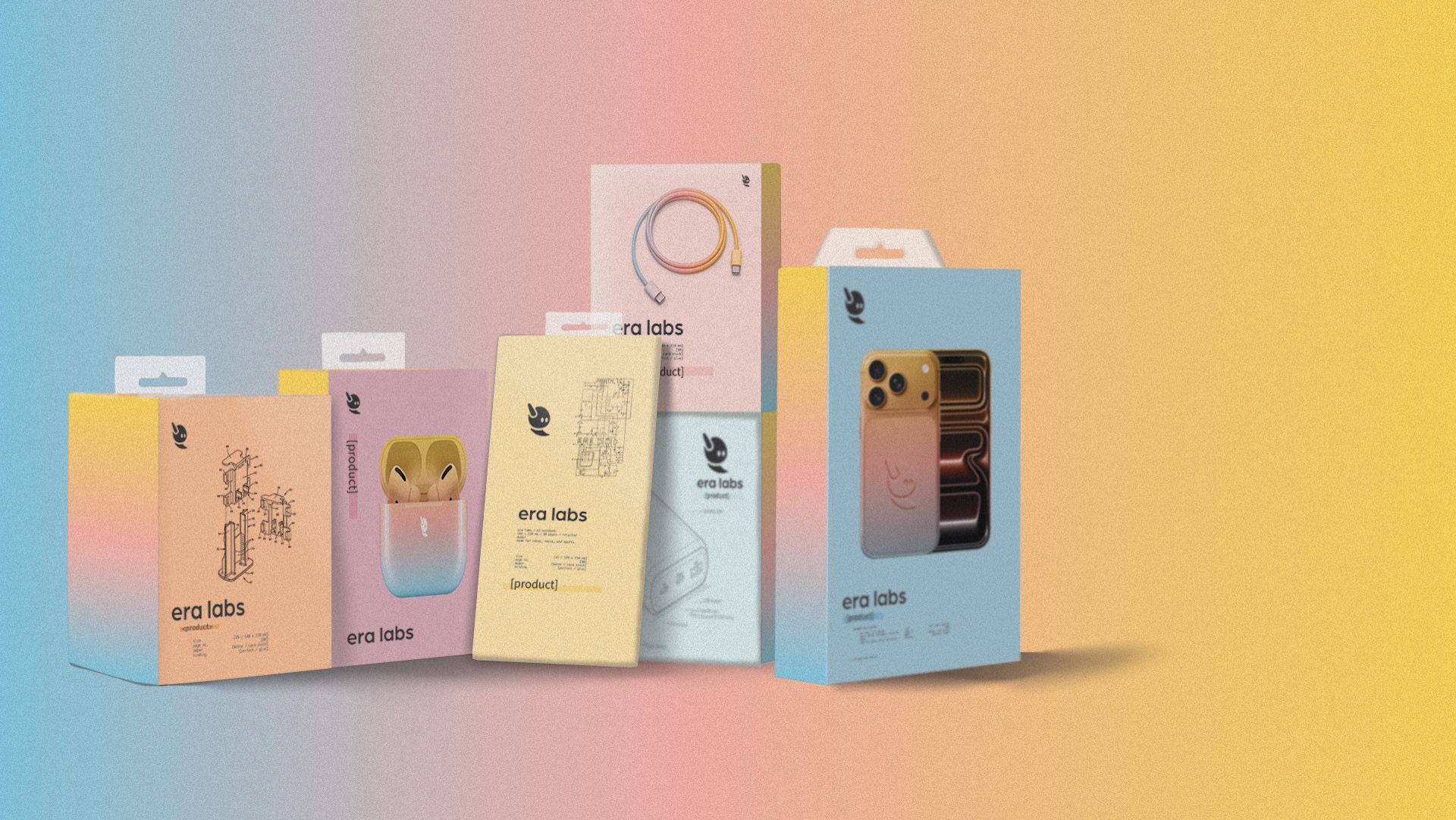
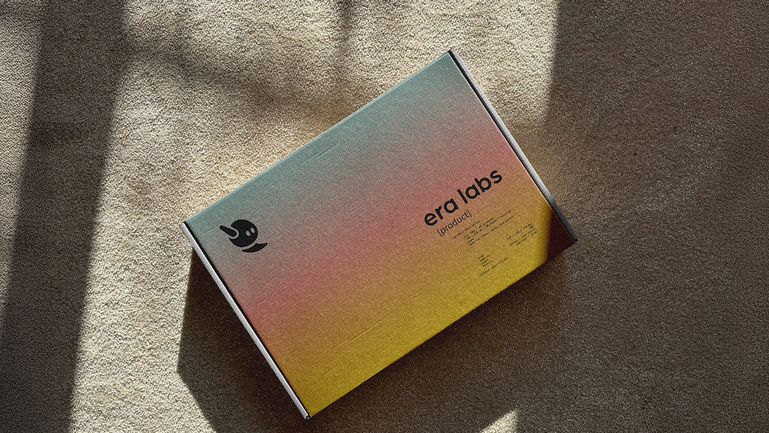
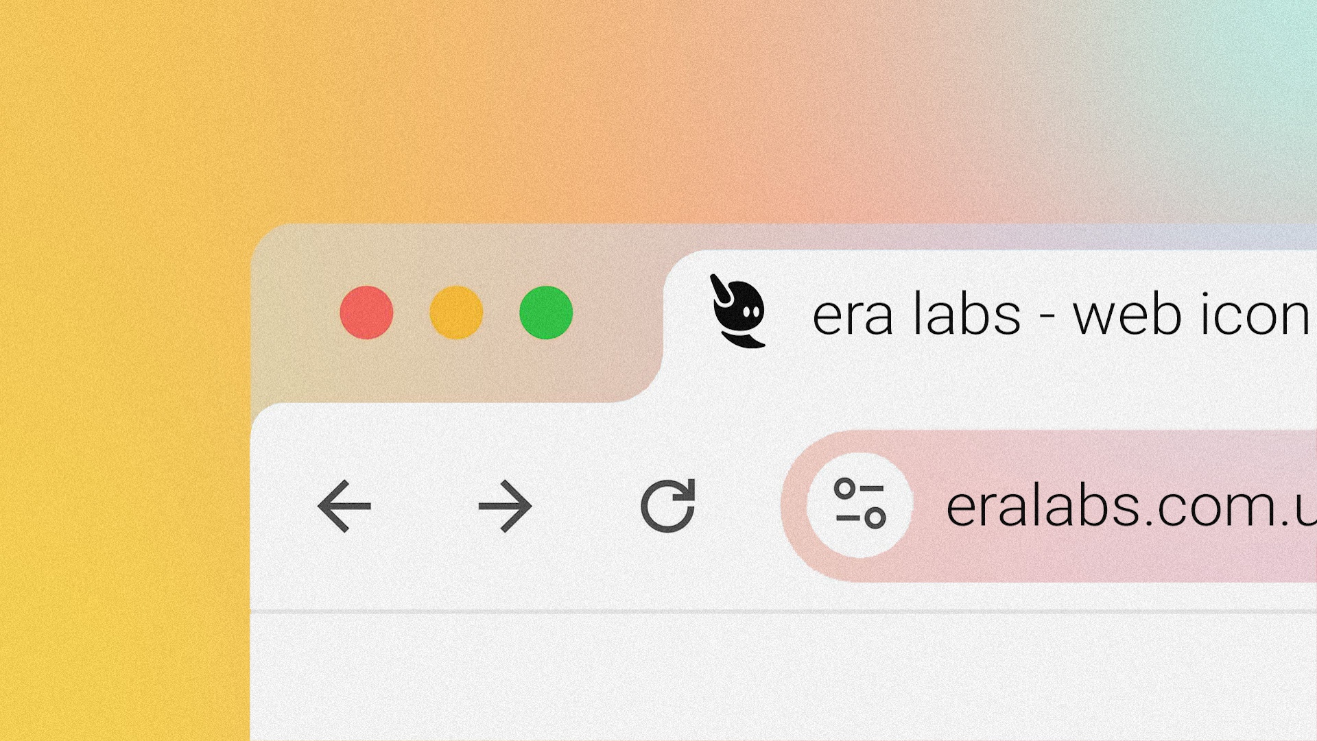
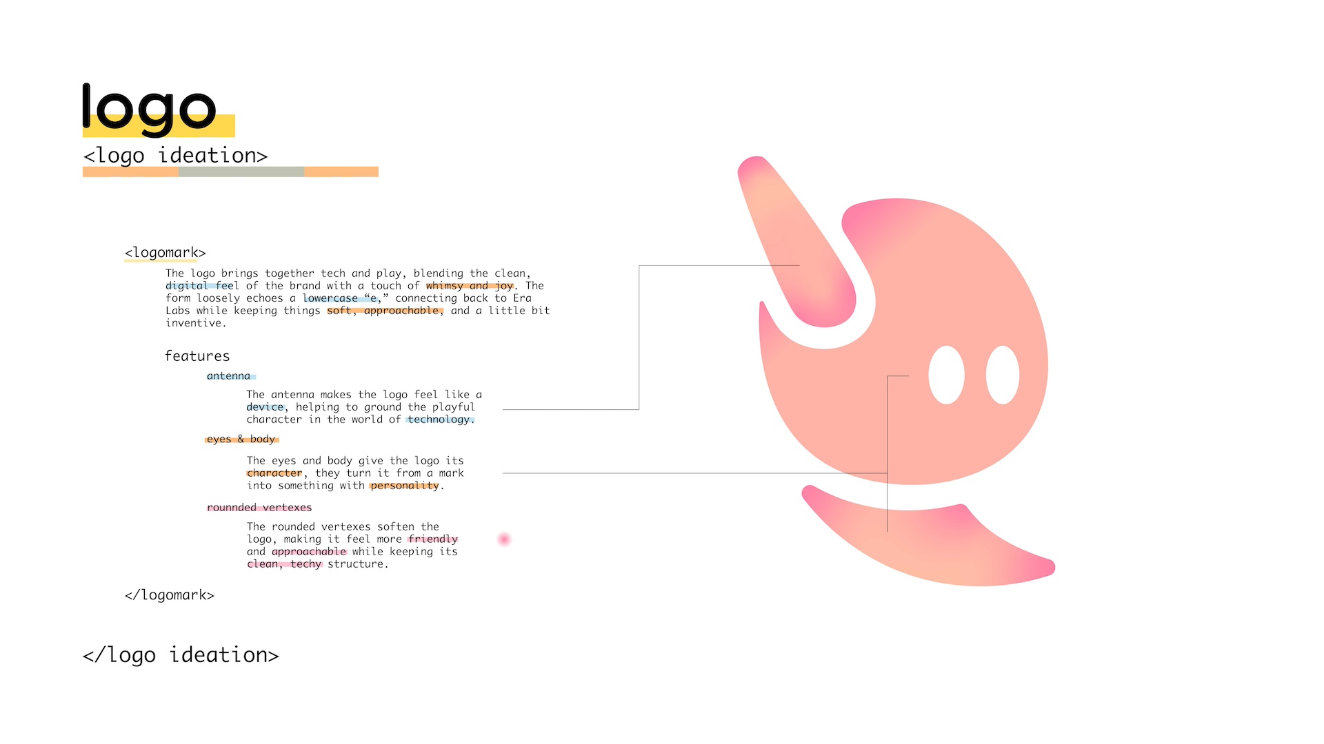
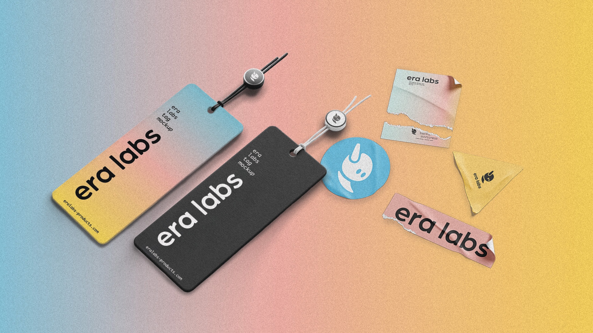
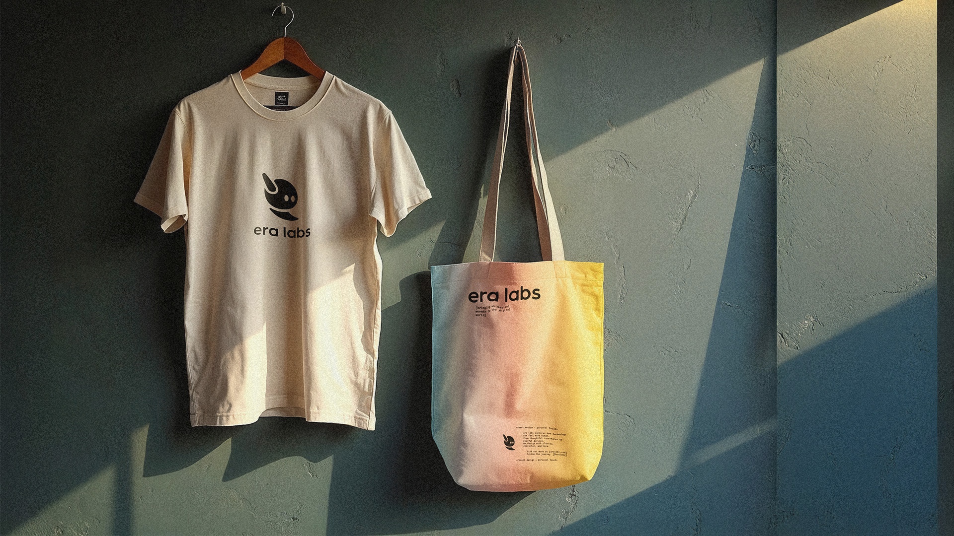
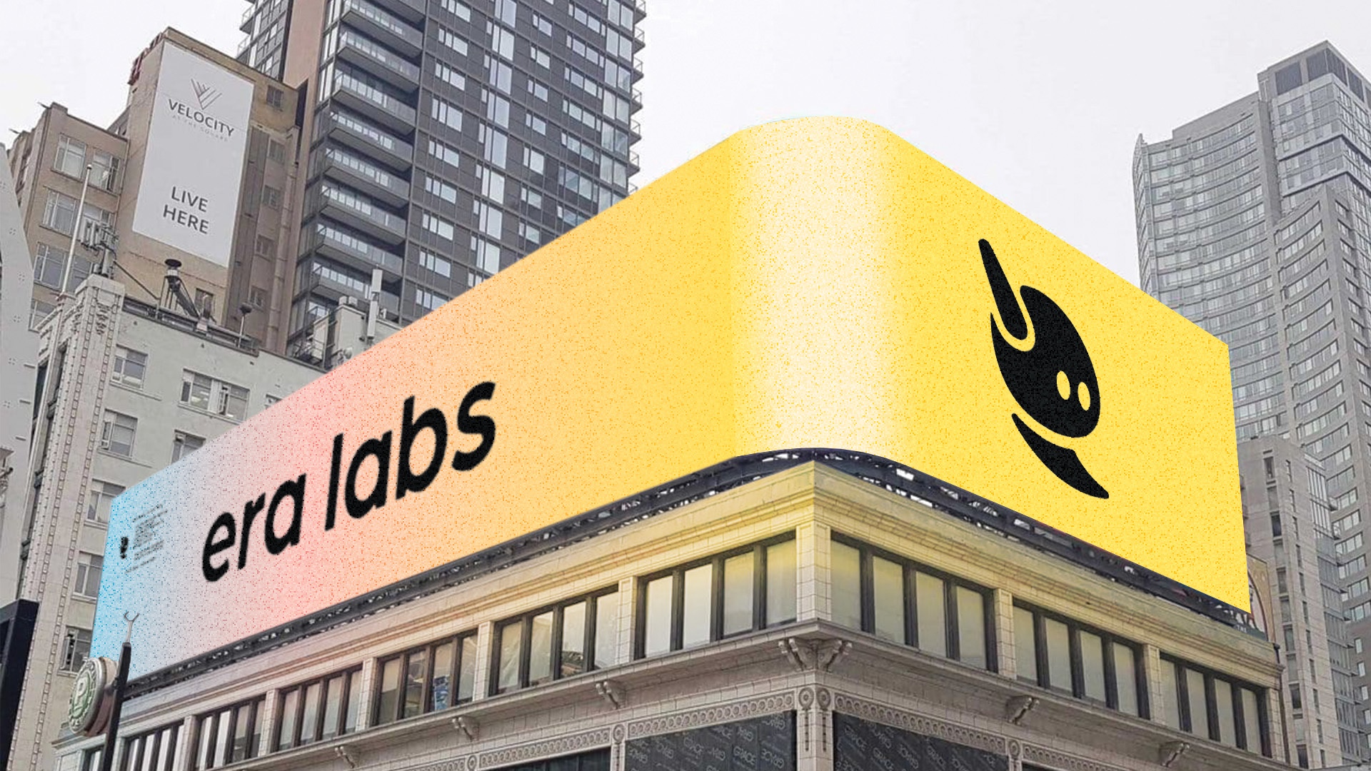
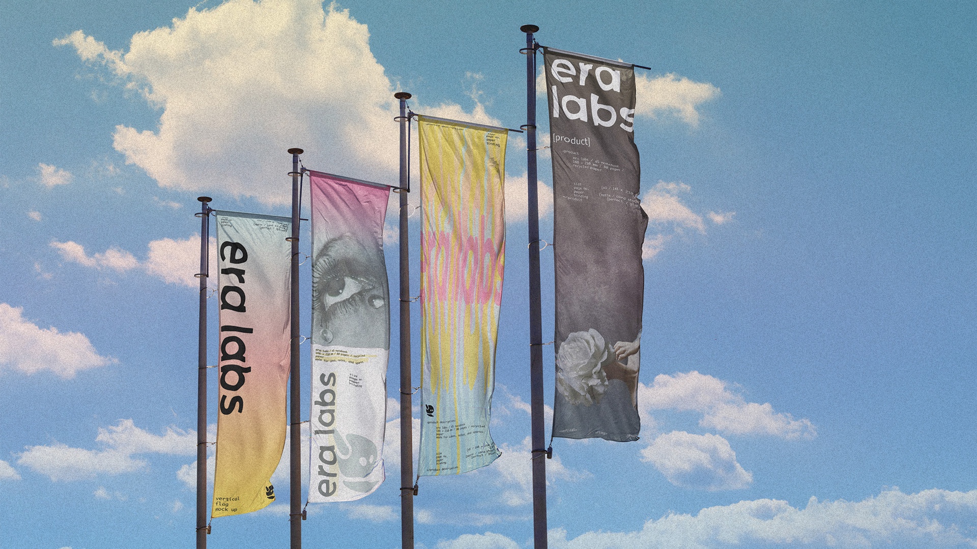
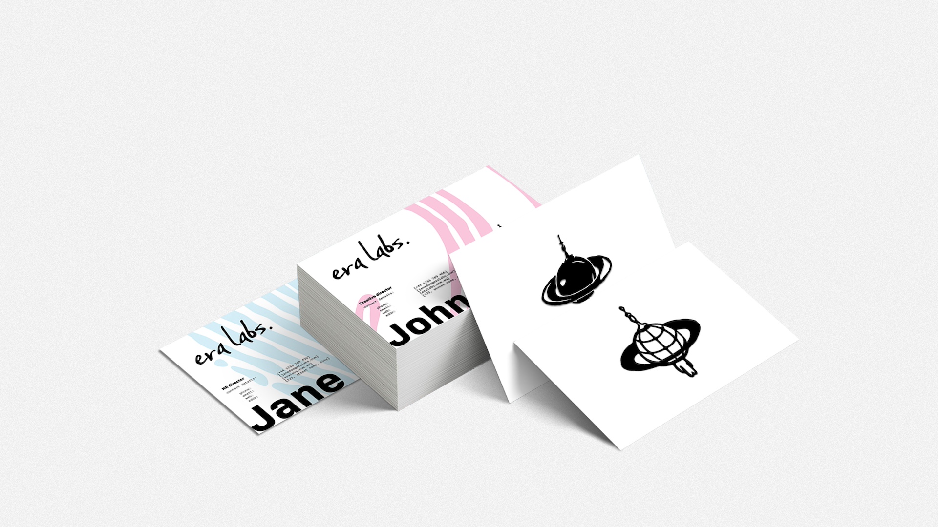
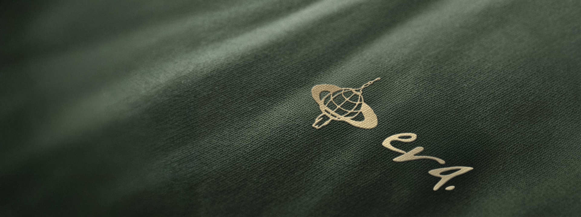
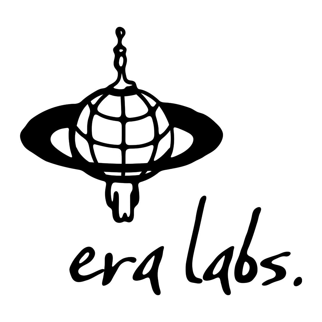
The logo brings together three core themes: connectivity, space, and humanity—into one cohesive emblem that expresses Era Lab’s purpose and character. The antenna at the top symbolises connectivity, drawing subtle inspiration from a classic car radio aerial to add a sense of nostalgia. The central planet anchors the space theme while its abstract grid suggests global networks and connection; it was chosen over a star for its stronger recognisability and clearer association with humanity. At the base, the human figure reinforces the theme of humanity and introduces a slight surrealist quality, echoing artworks that merge the human body with abstract forms. The goopy, hand-drawn texture ties everything together, reflecting Era Lab’s artistic aesthetic and distinguishing the brand from the polished look of typical big-tech identities.


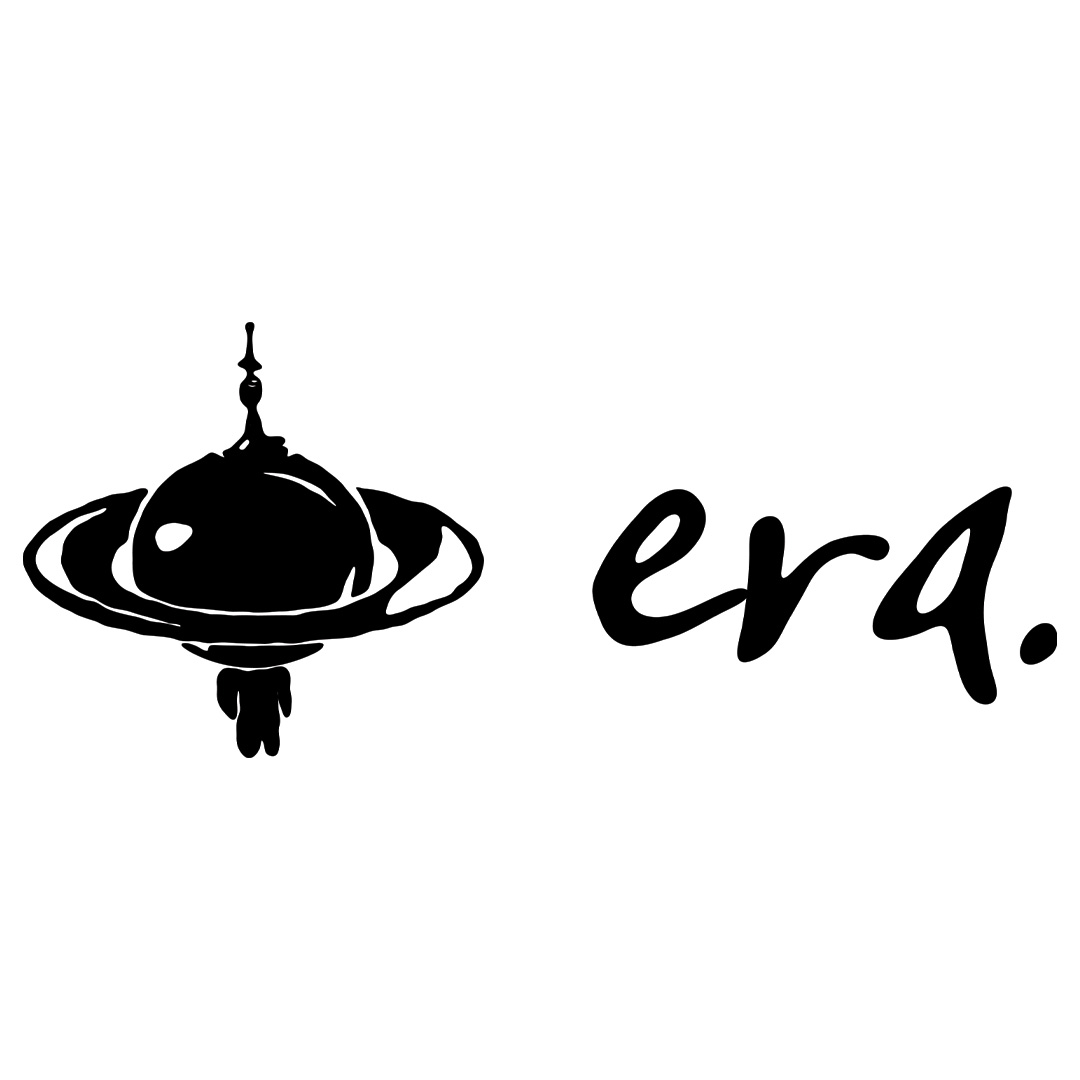
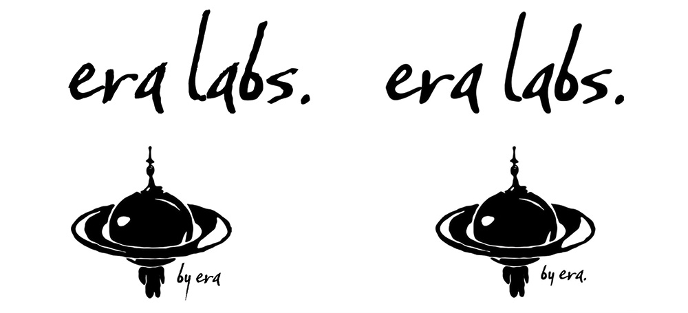
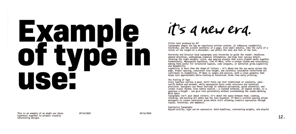
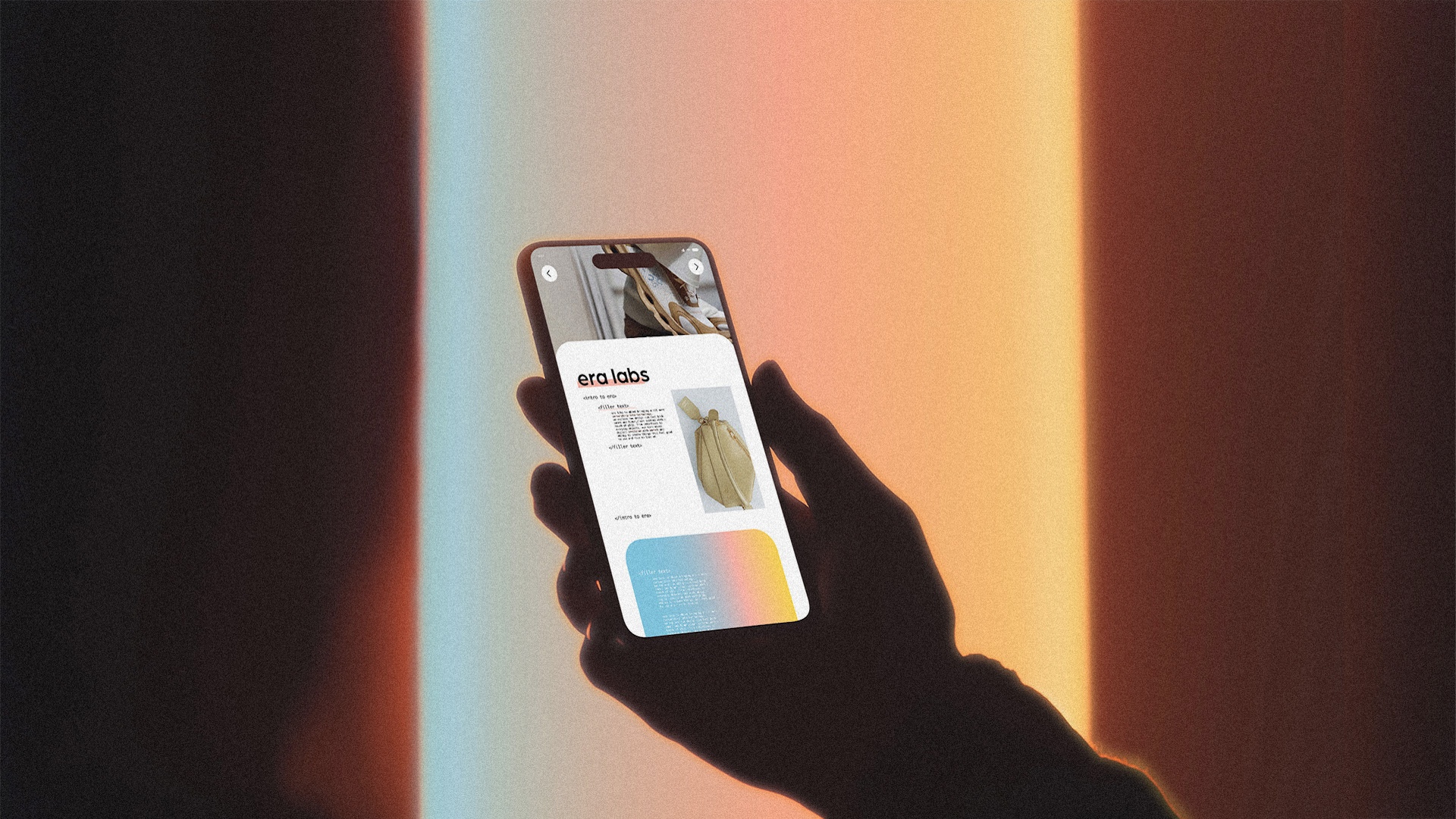
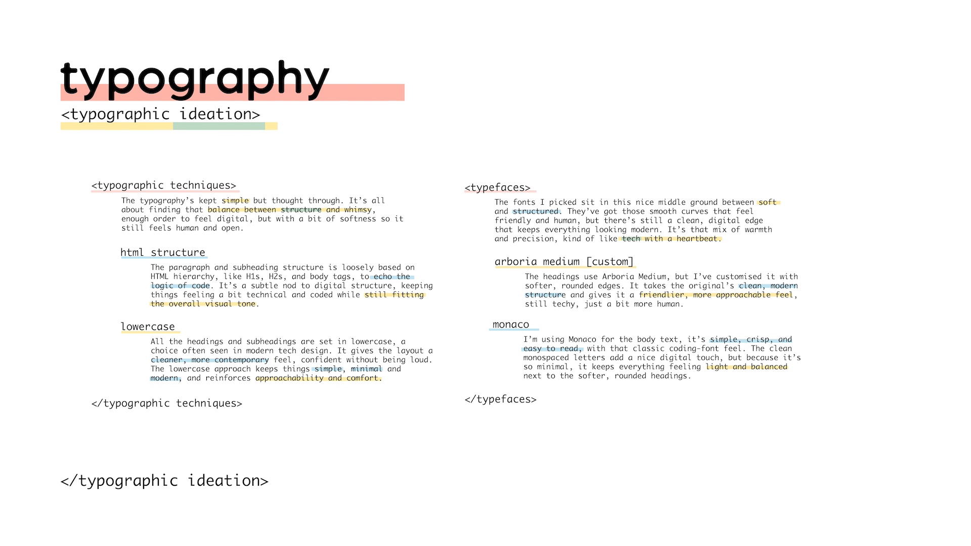
For the logotype, I chose Baka Too for its hand-drawn, humanist feel, with gentle irregularities and rounded forms that make it feel warm and crafted rather than mechanical. I subtly refined the letterforms; softening curves and adjusting proportions like the ascenders and descenders, to better balance the logo mark and create a cohesive silhouette. To keep the wider identity modern and legible, the logo type is supported by PT Mono for body text, adding a subtle digital, nostalgic tone, and Bio Sans for headings, which provides clean, versatile contrast while maintaining personality and readability
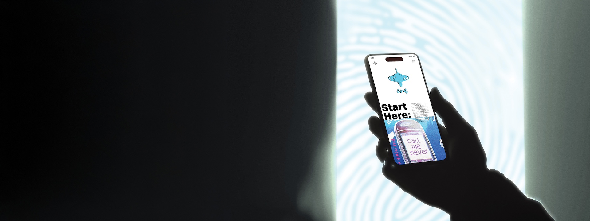
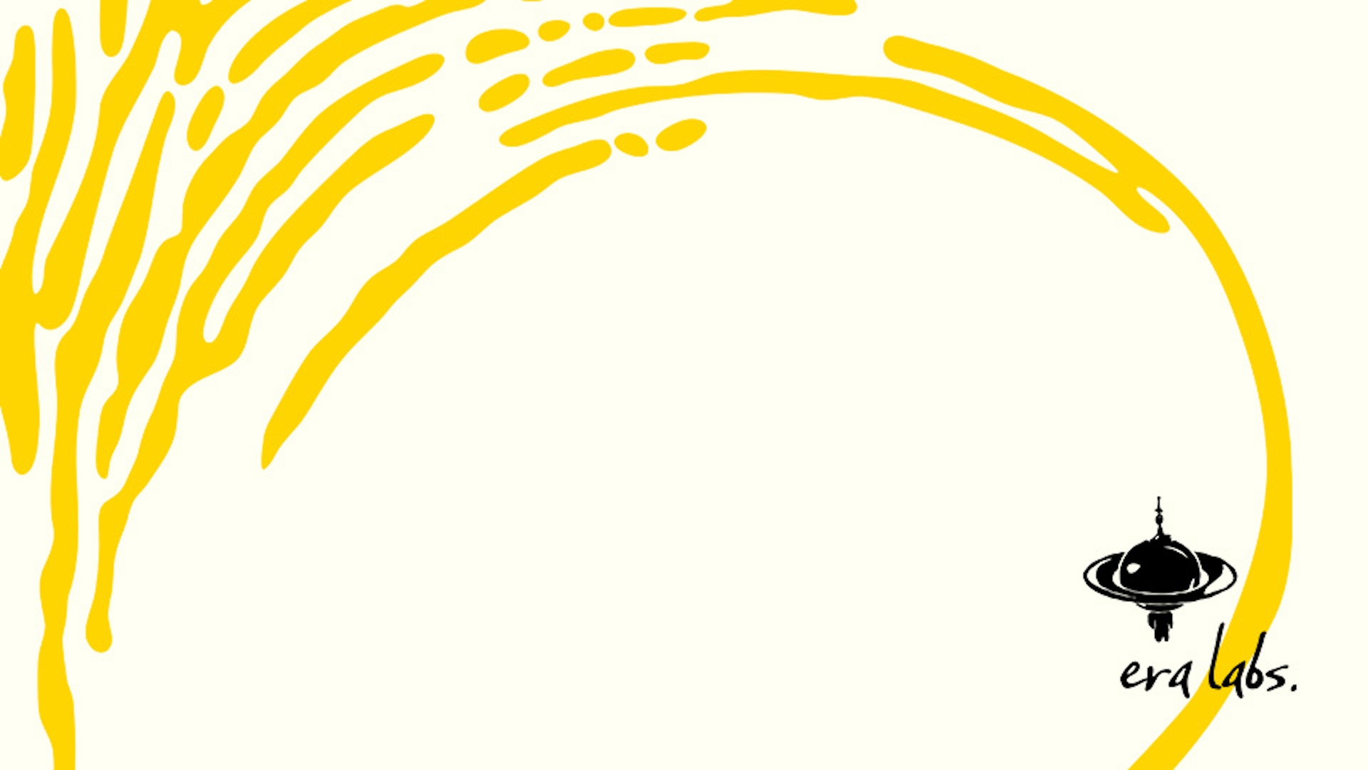
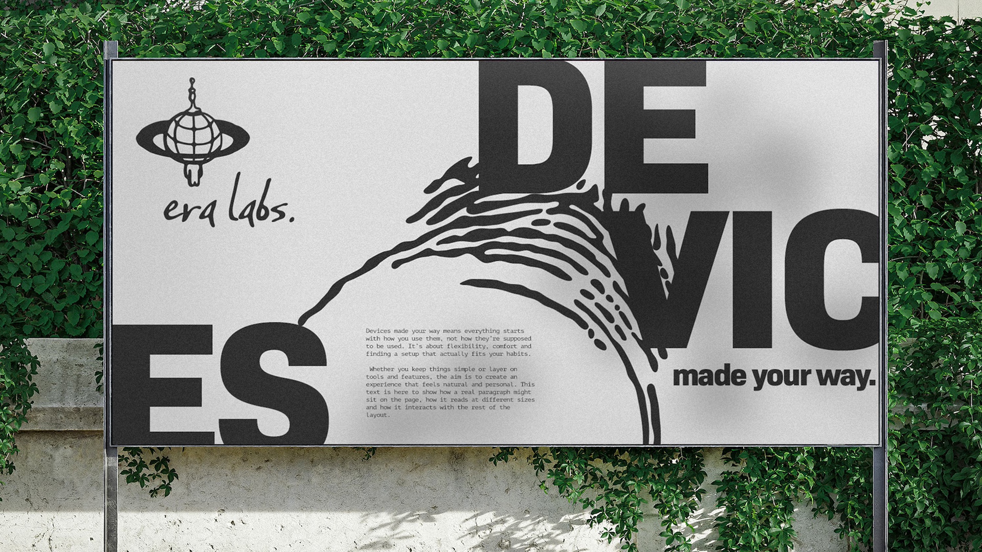
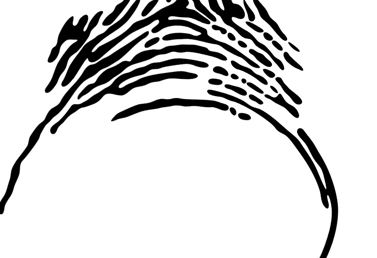
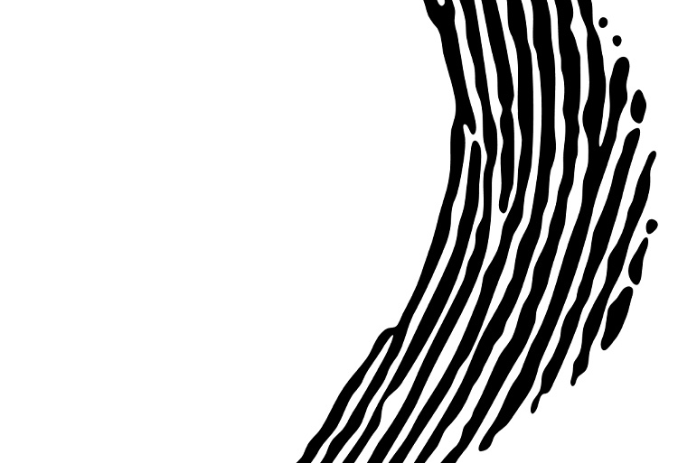
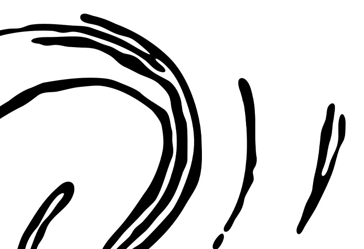
The fingerprint-maze concept expands the visual identity through expressive background elements, stylisations, and motion. Using sticky, goopy lines that morph in length and width, the pattern forms a fluid, transient maze reminiscent of a fingerprint. This approach visually communicates both humanity and connectivity, reinforcing the core themes of the brand while offering a flexible, distinctive element that works across digital, animated, and printed applications.
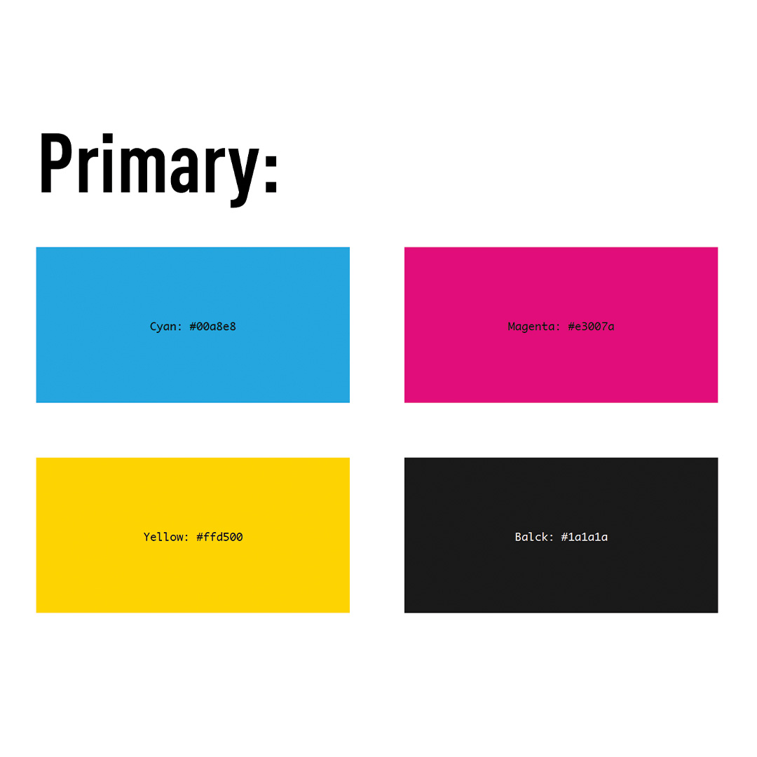
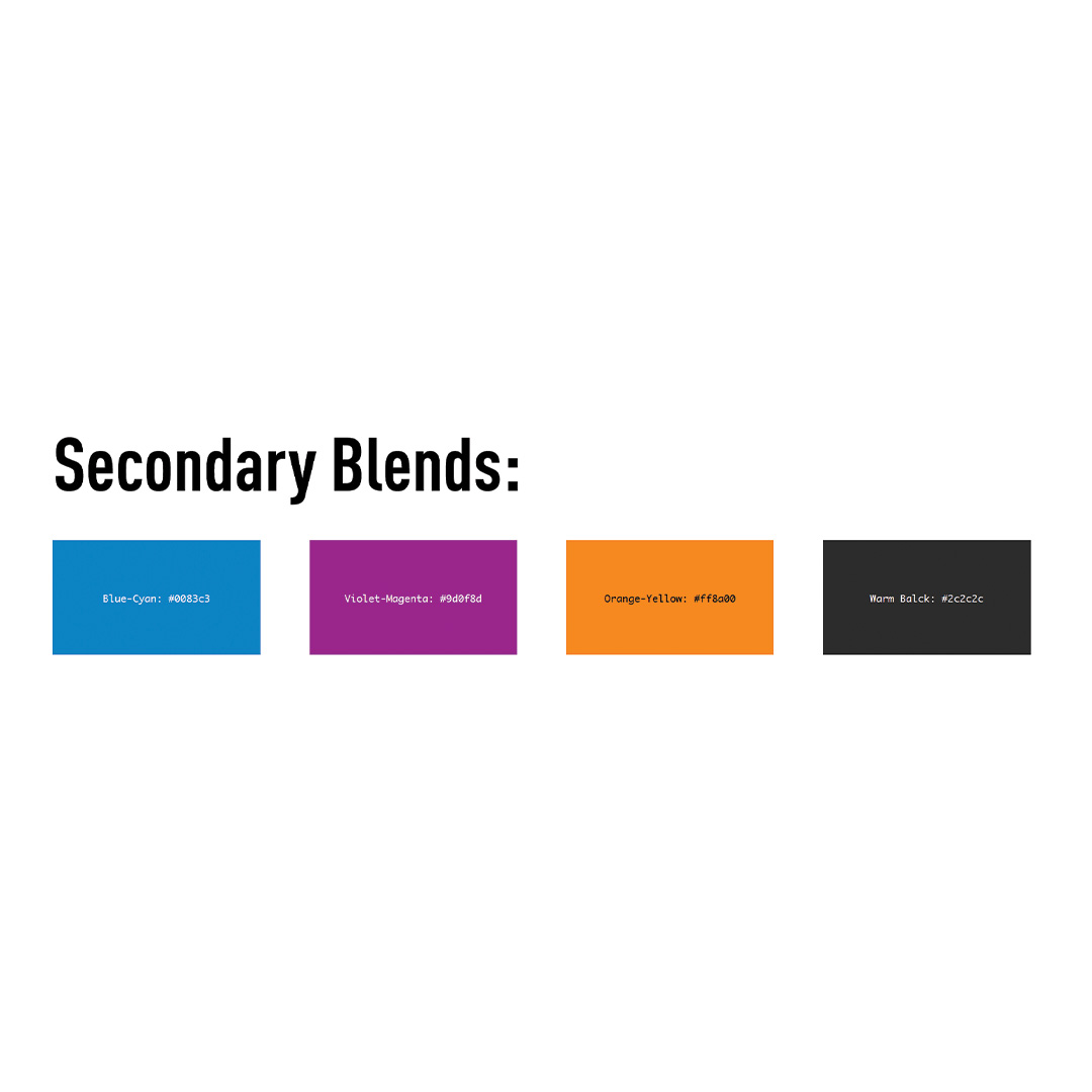
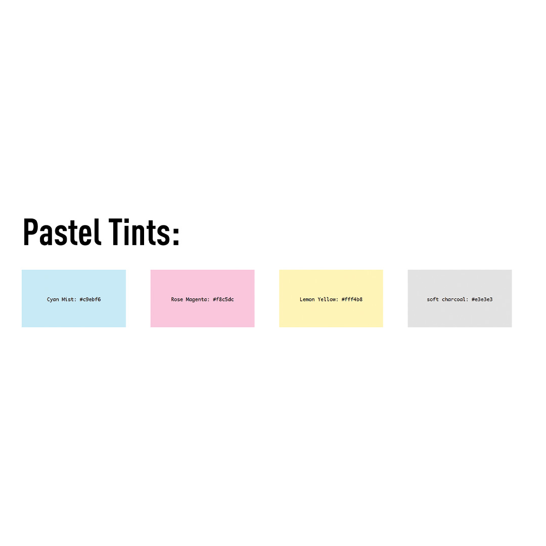
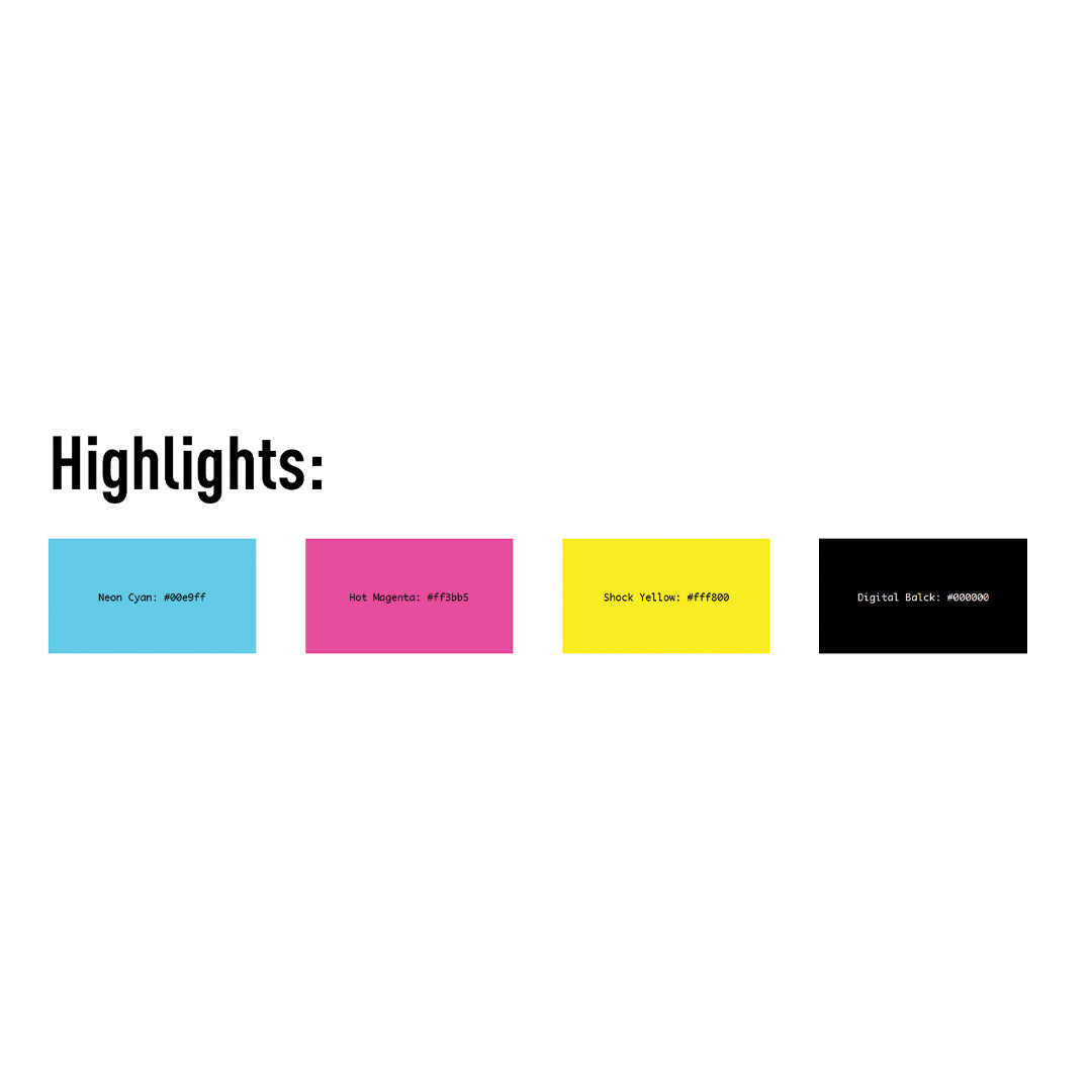
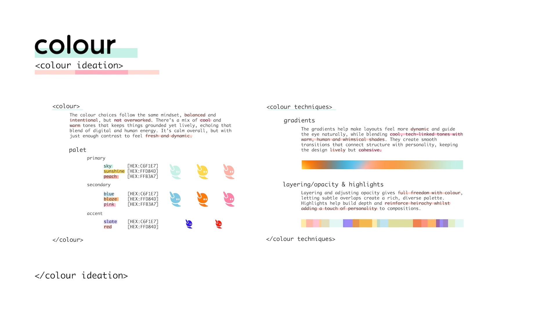
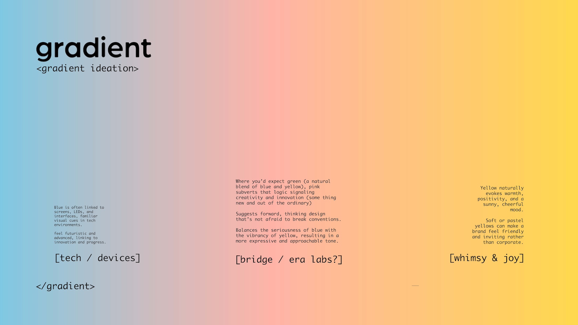
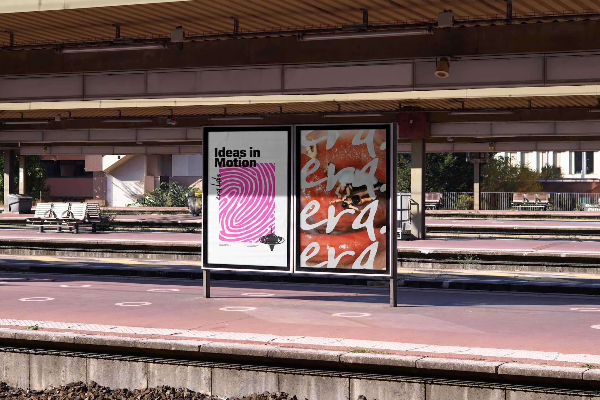
The colour palette remains intentionally open, giving us flexibility to explore the themes of humanity, connectivity, and space without becoming restrictive. It is grounded in a CMYK foundation; cyan, magenta, yellow, and black, which nods to traditional print while ensuring consistency across digital and physical applications. Warm tones create a tactile, human feel, cooler hues introduce balance and connection, and deeper shades provide contrast and breathing space. Together, the brights, blends, pastels, and neons form an expressive yet controlled system that feels artistic while remaining cohesive and reproducible.