.png)
<project brief>
CarpeCarp is a passion project I completed attmepting to tackle Australia’s rampant carp infestations through engaging visual communication. As a keen fisherman, I was drawn to the environmental impact of these prolific invaders, and this project gave me a chance to combine humour, irony, and surreal illustration to make the issue memorable. The visual identity turns mundane ecological data into playful, anthropomorphised carp scenarios, using bold illustration, witty narrative, and striking colour to capture attention and inspire public action.
</project breif>
<touchpoints>
<touch points>
<key deliveries>
<key deliveries>
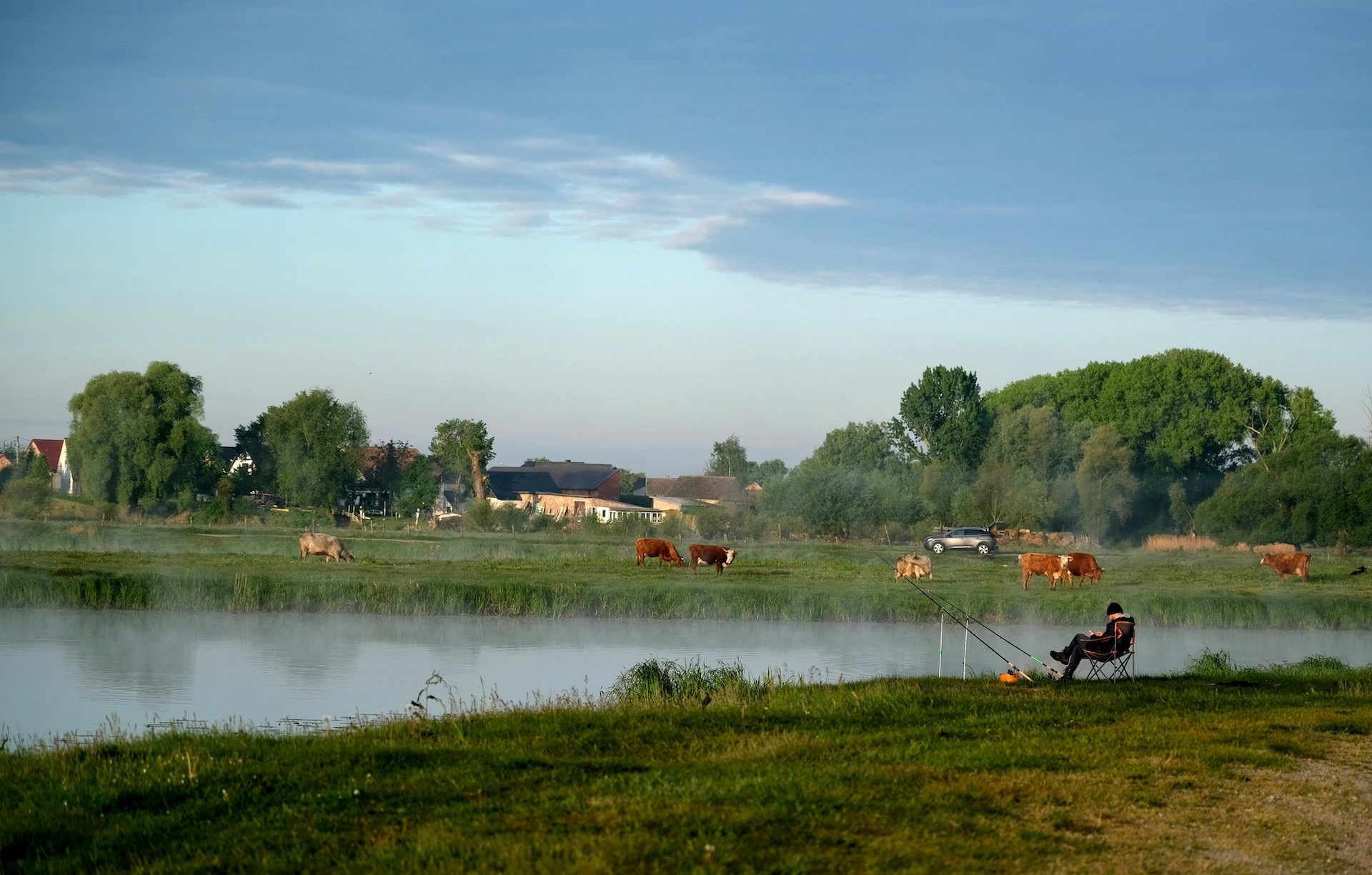

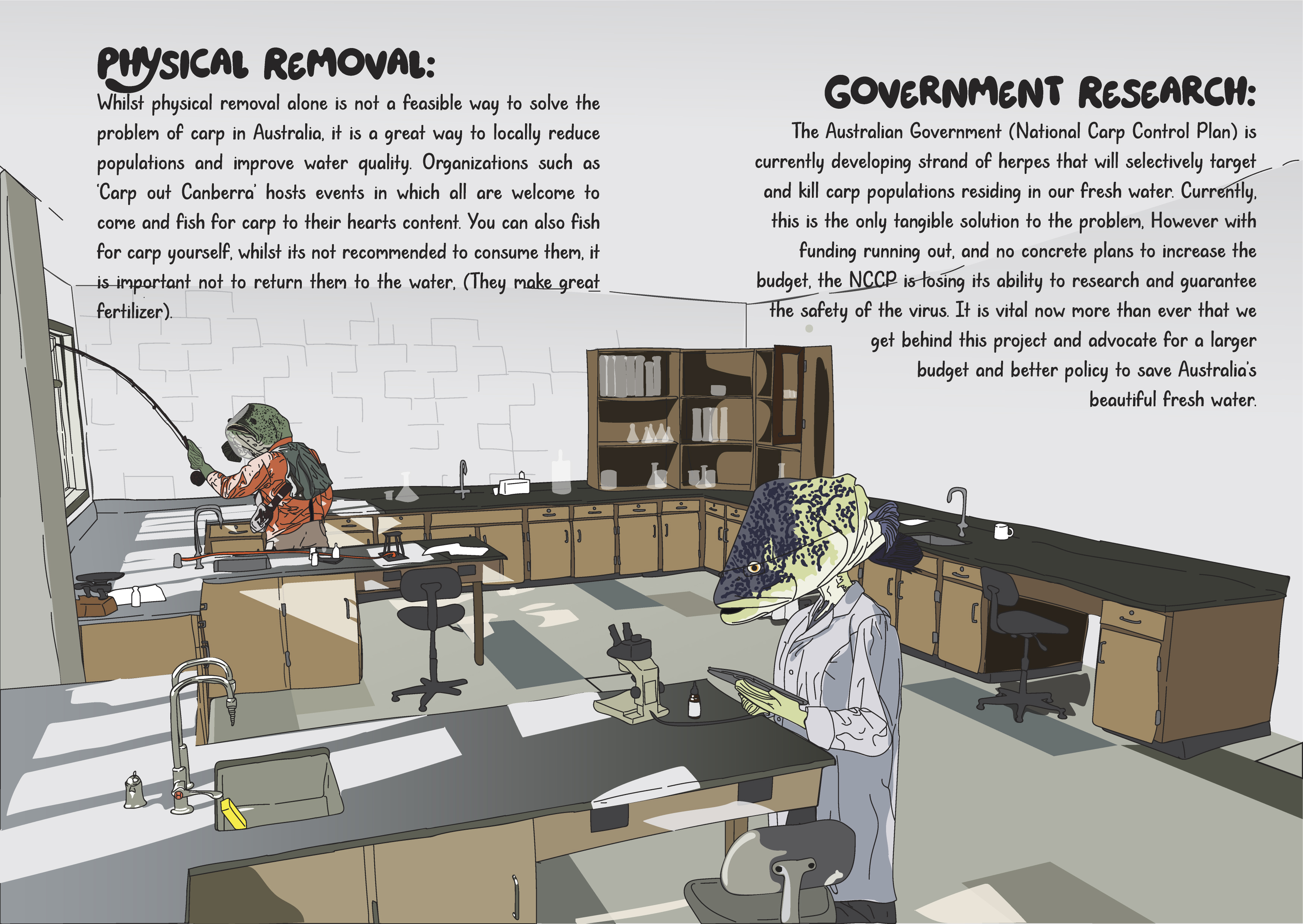
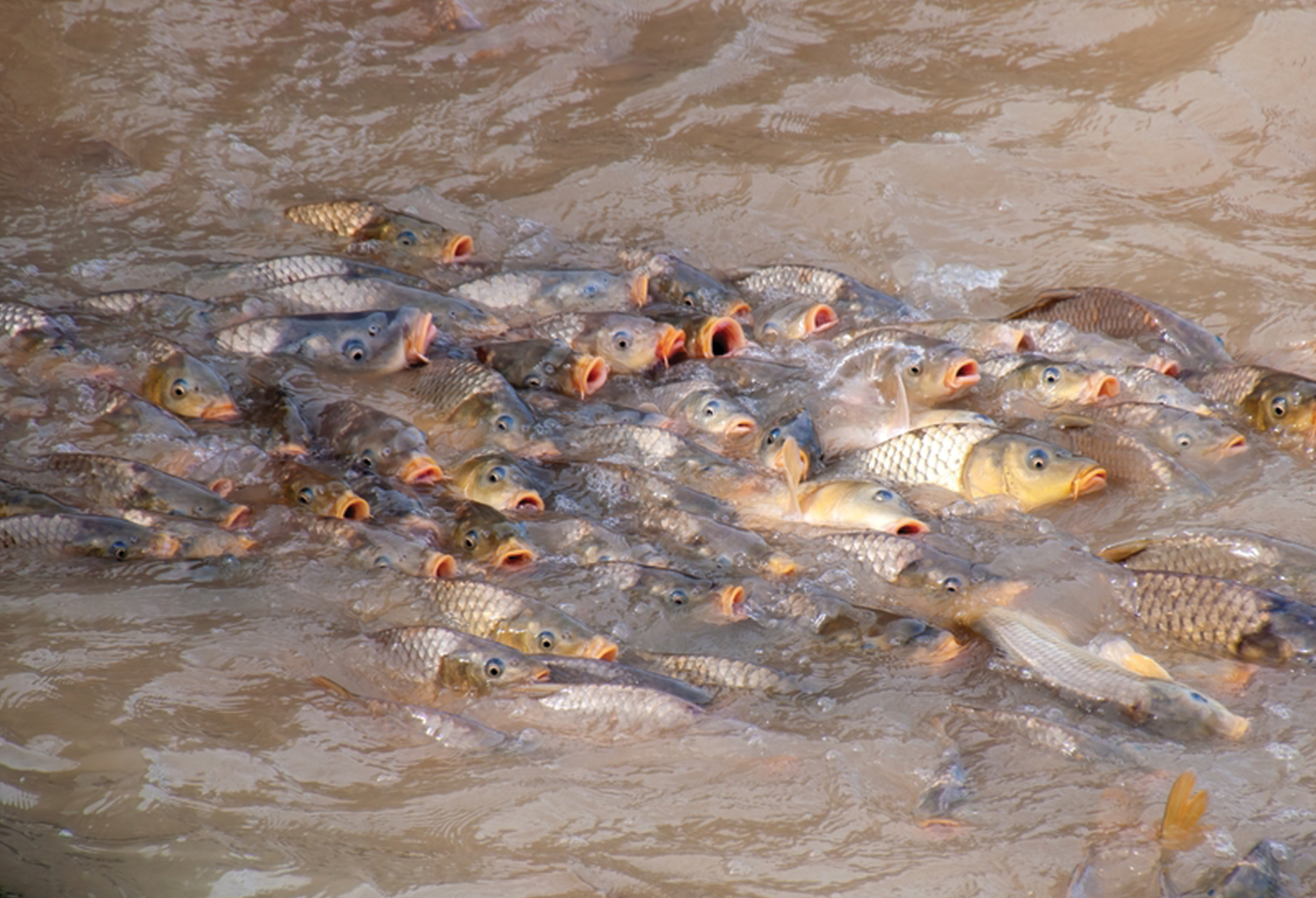
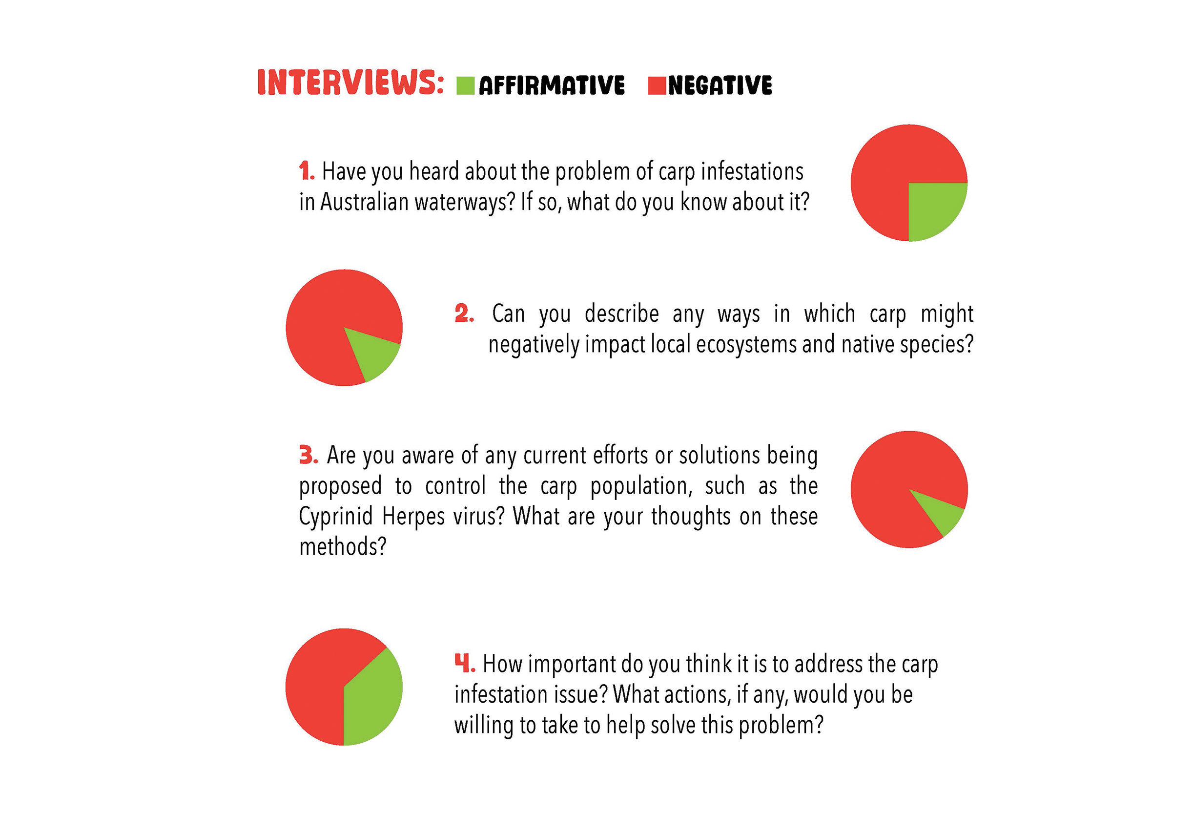
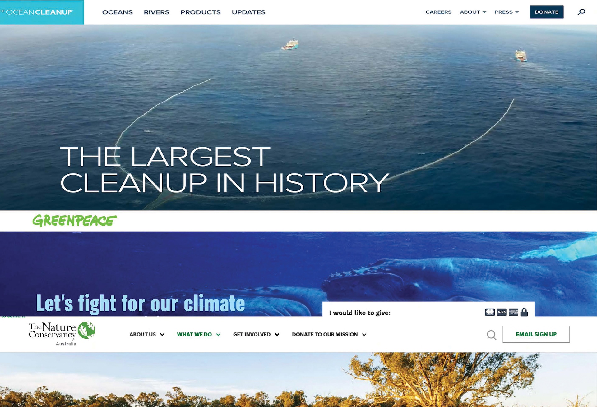
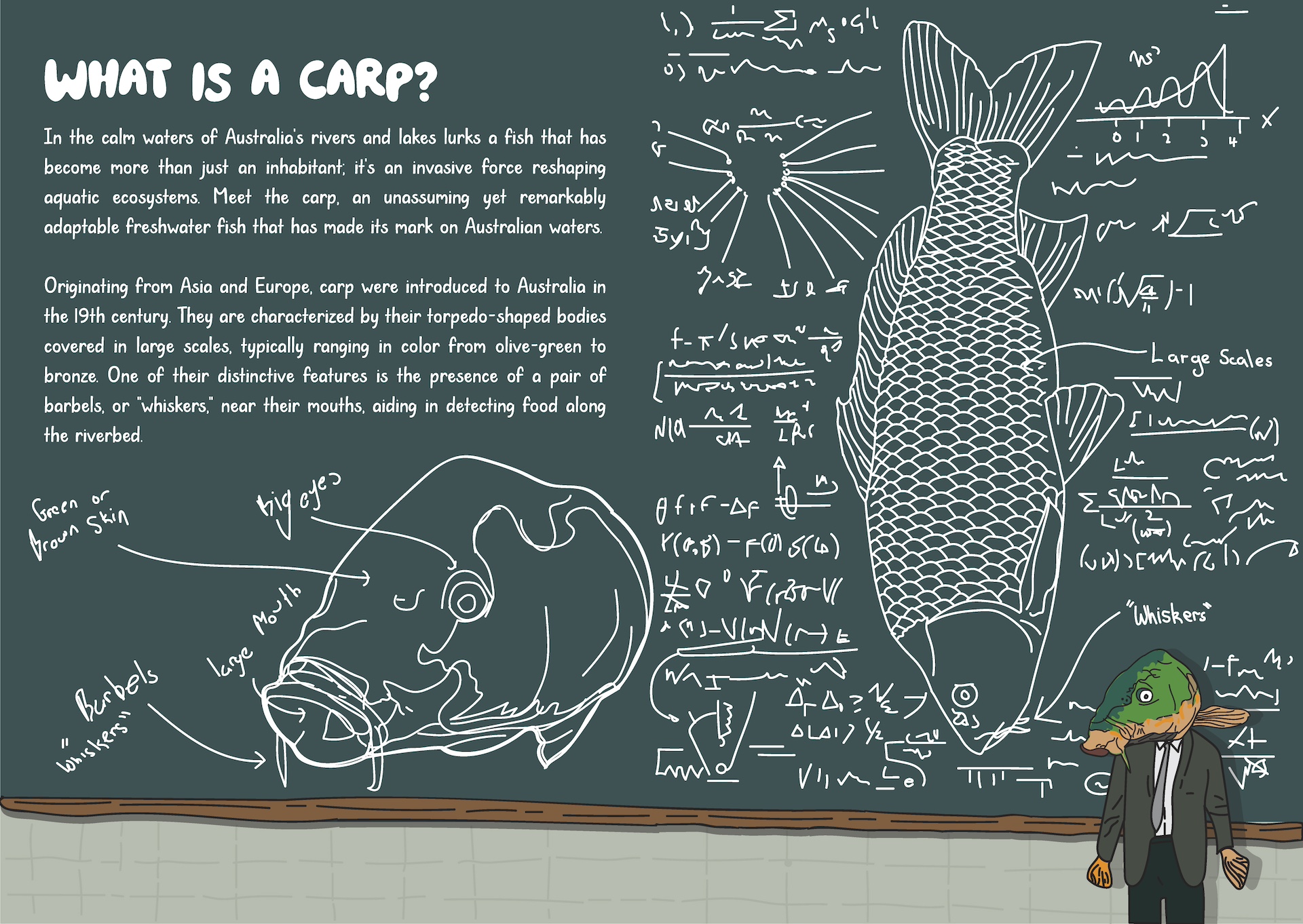
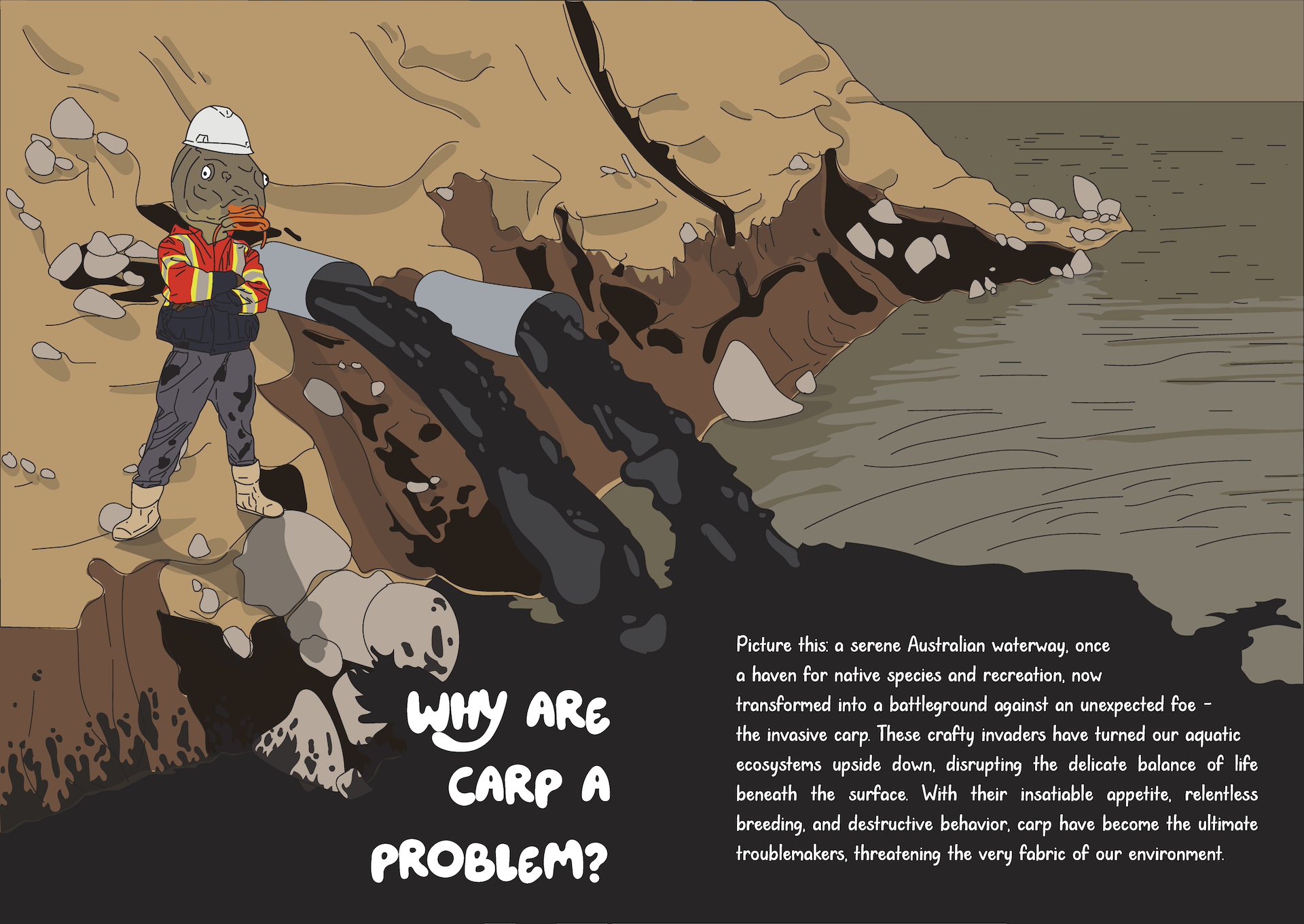
I started by digging into the ecological impact of carp in Australian freshwater systems, reviewing the National Carp Control Plan, government reports, and local removal programs like Canberra’s Carp-Out. I also spoke with members of the public to understand awareness levels and attitudes, which revealed widespread apathy and limited knowledge. Analysing conservation campaigns from organisations like The Ocean Cleanup and Greenpeace helped me identify what worked and, crucially, what felt flat or unengaging. This research established the foundation: the designs needed to be visually striking, informative, and capable of inspiring action.
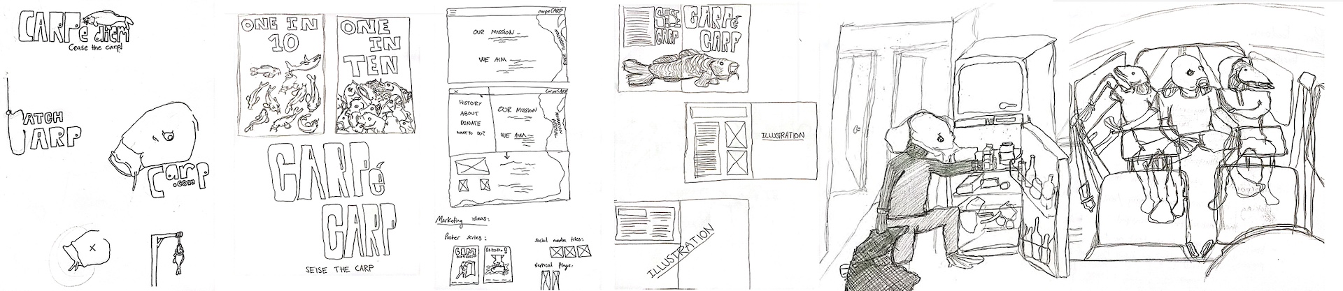
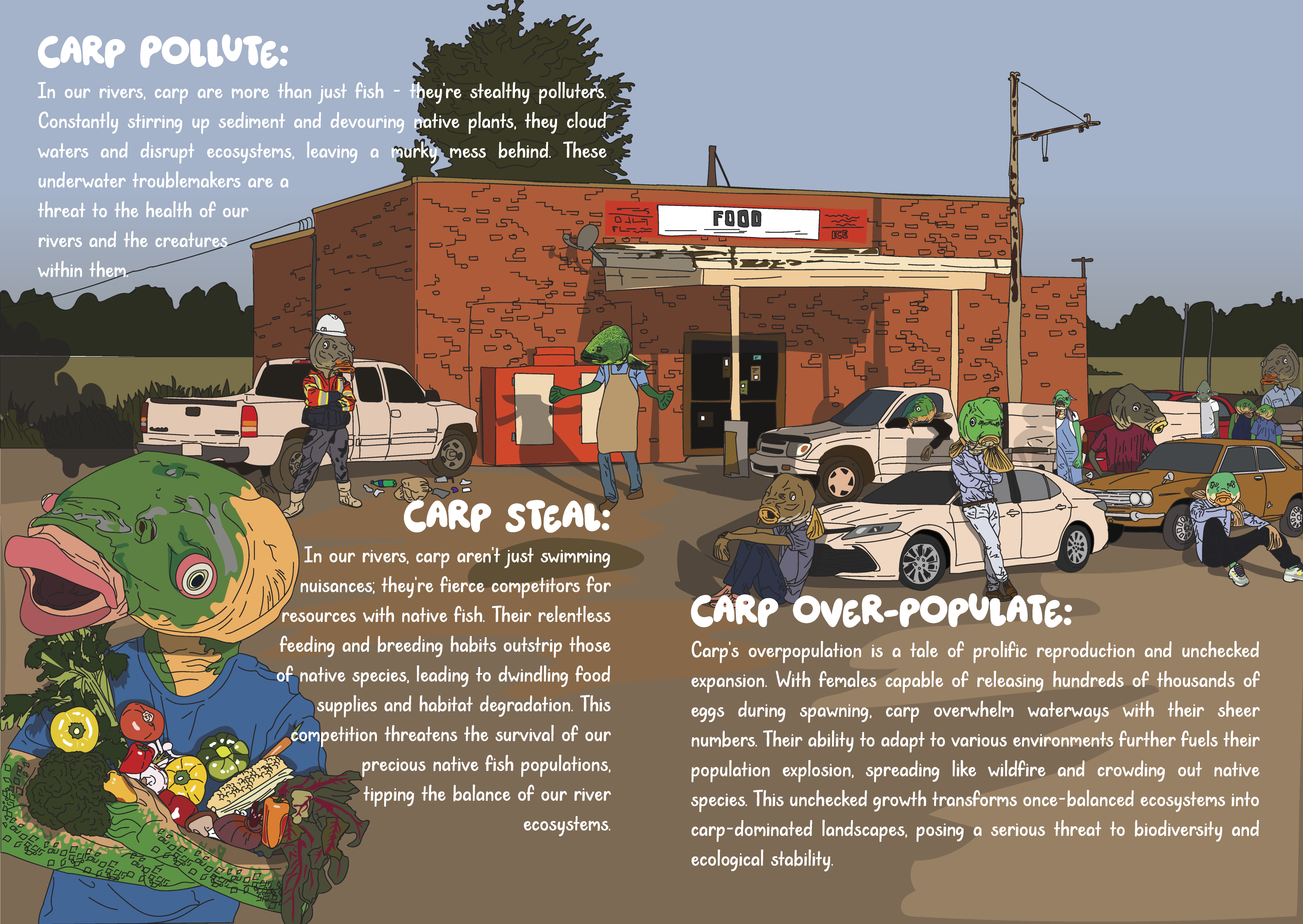
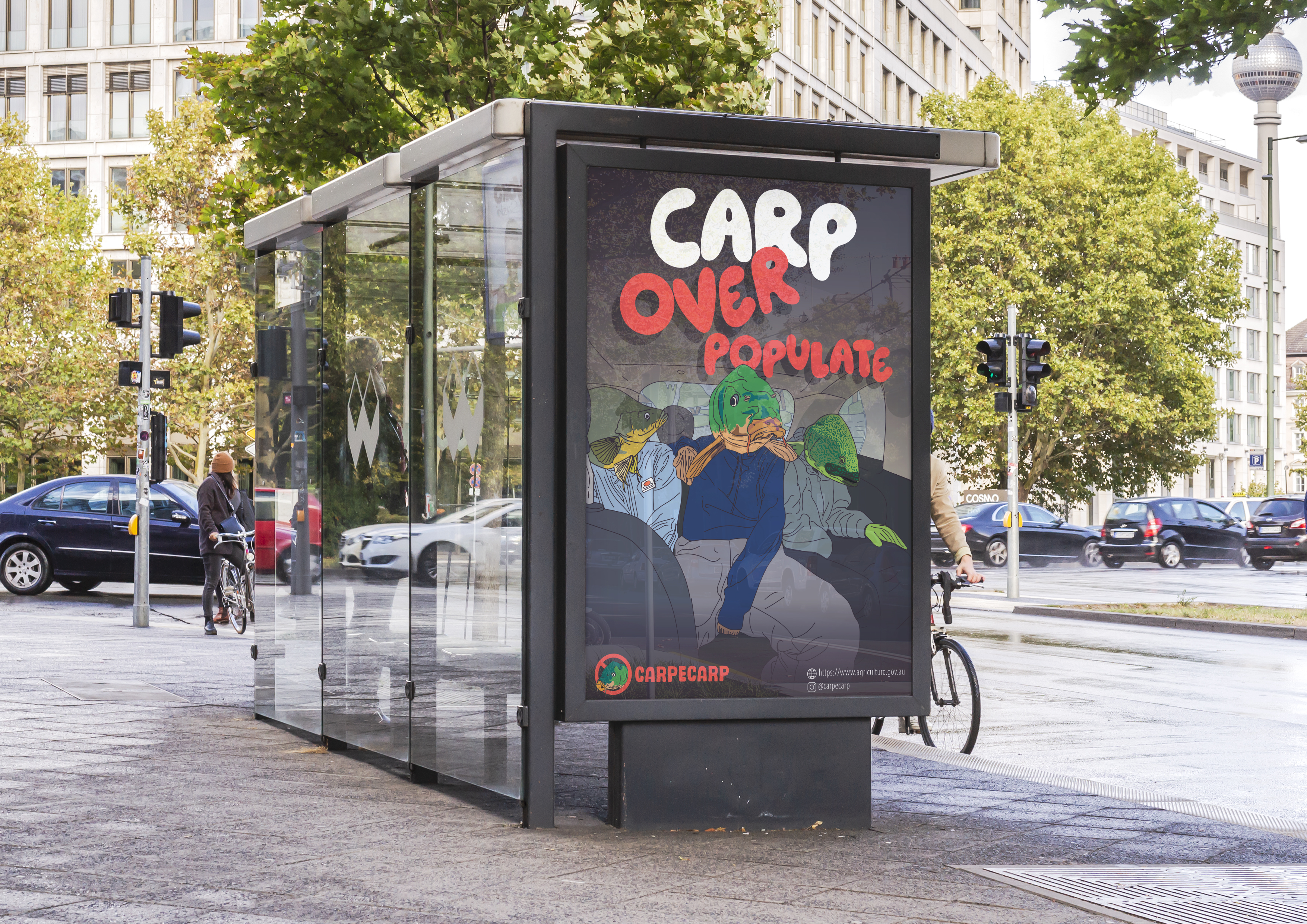
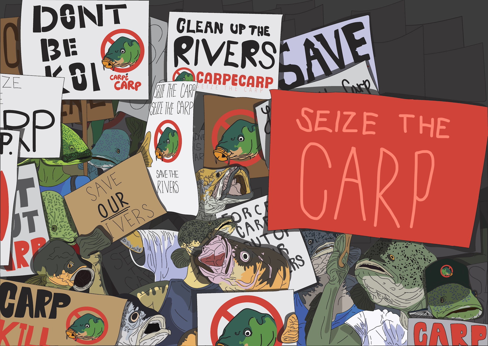
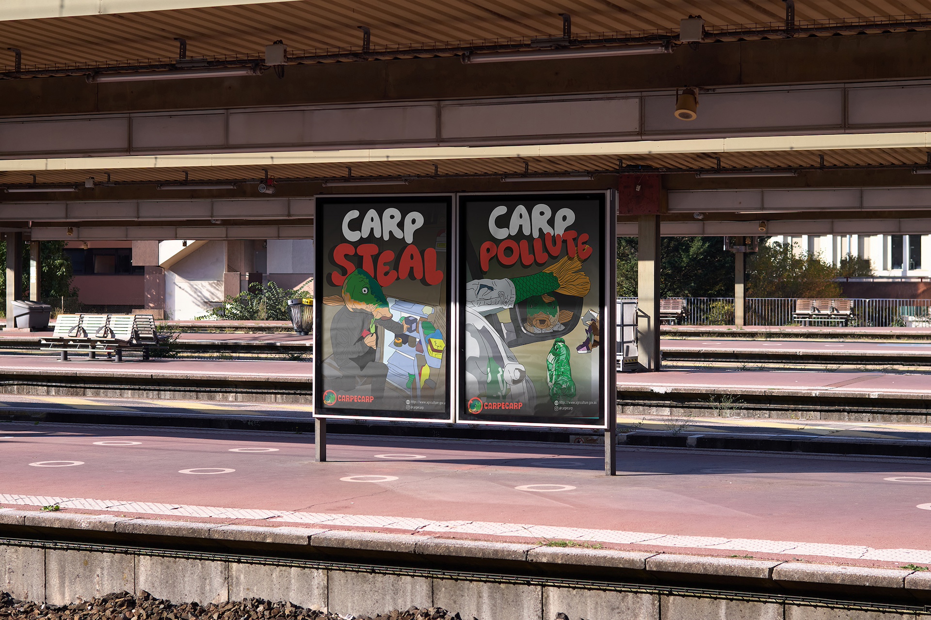
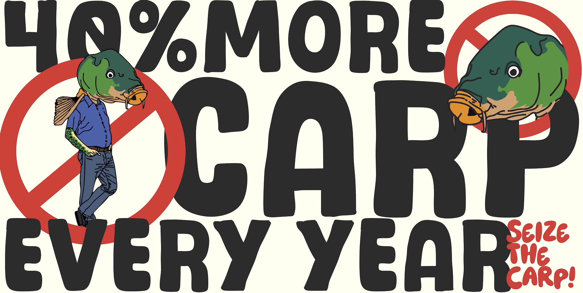
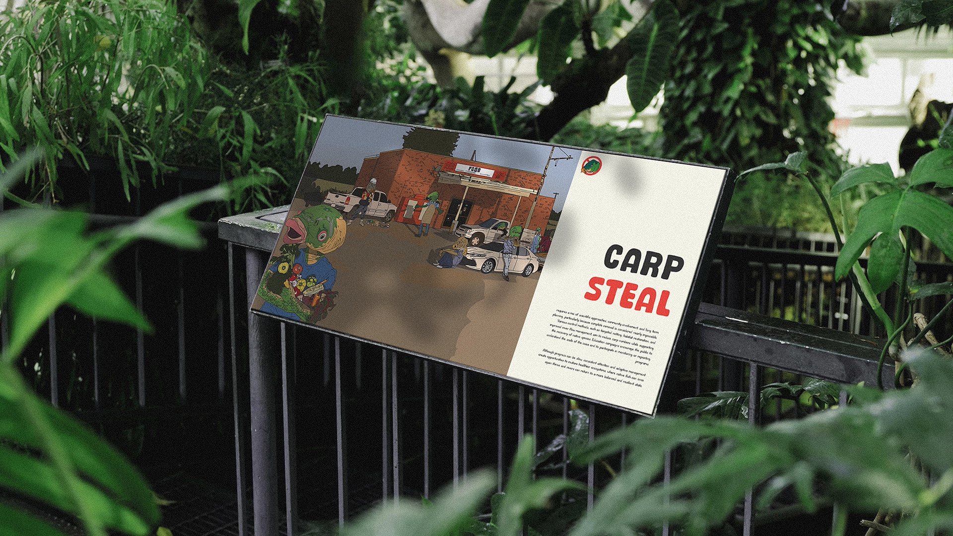
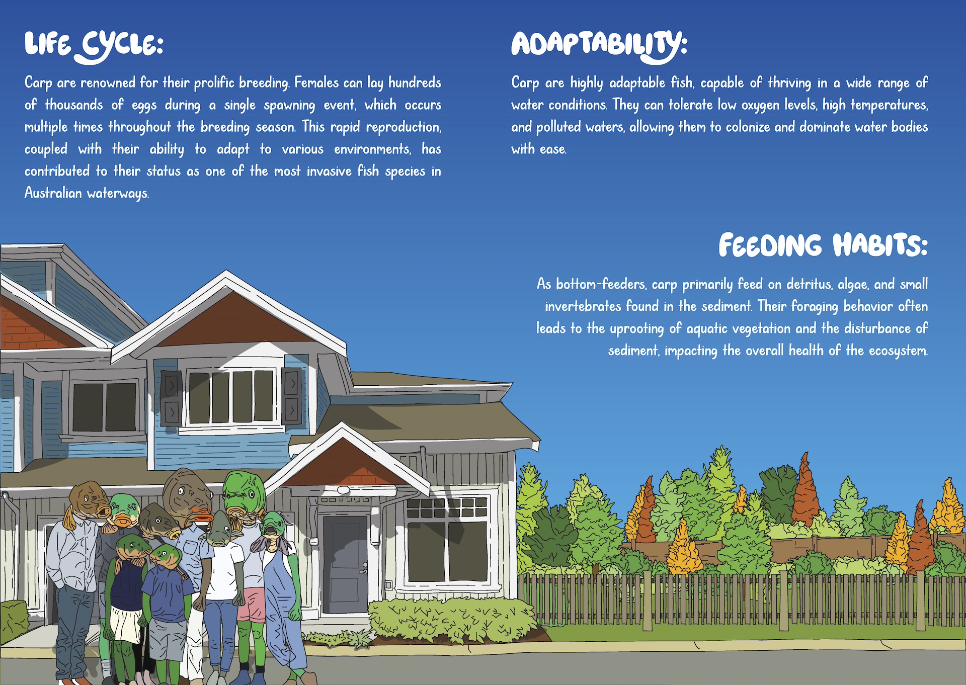
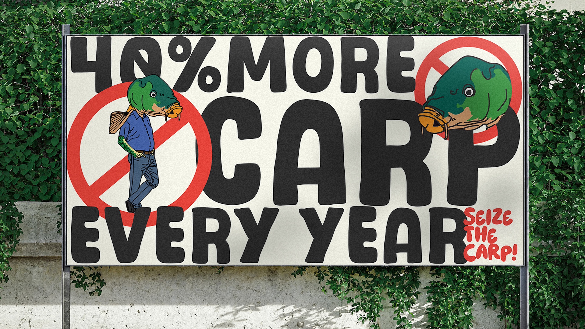
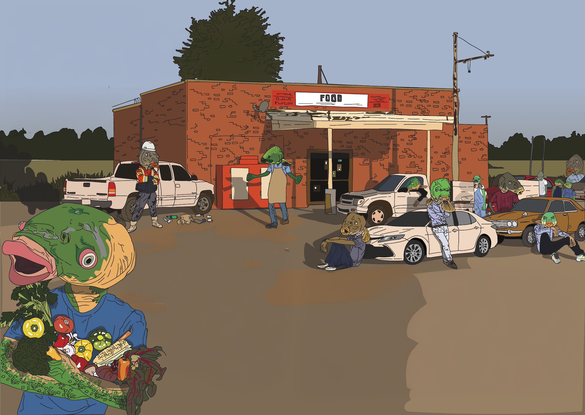
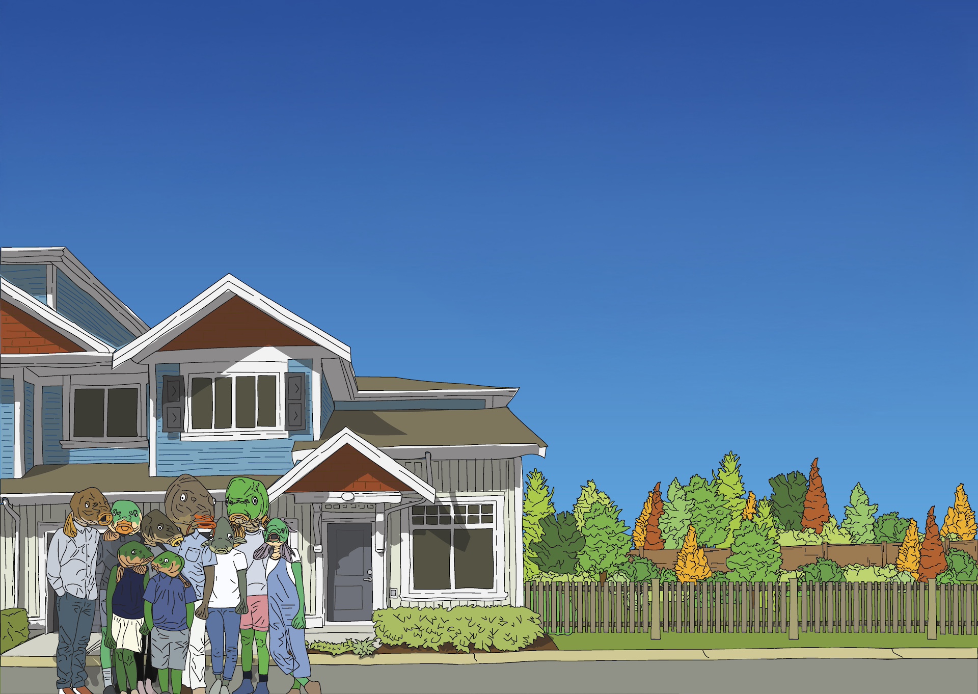
Early sketches focused on anthropomorphising carp in everyday human situations, creating scenarios that were funny, ironic, and slightly surreal. I explored different narrative angles and visual tones to find a balance between playfulness and ecological messaging. The key concept that emerged was turning the carp into memorable characters to make the environmental issue relatable and to stick in viewers’ minds, while keeping the underlying facts clear and understandable.
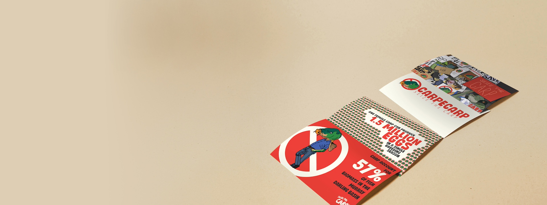
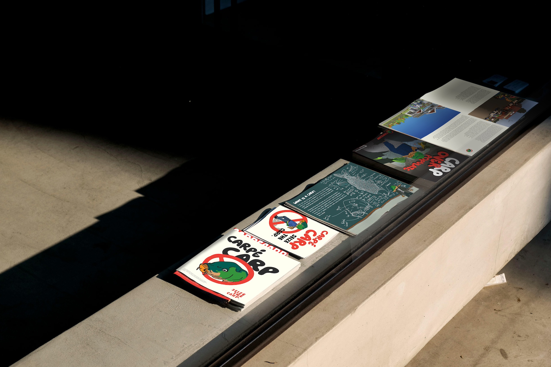
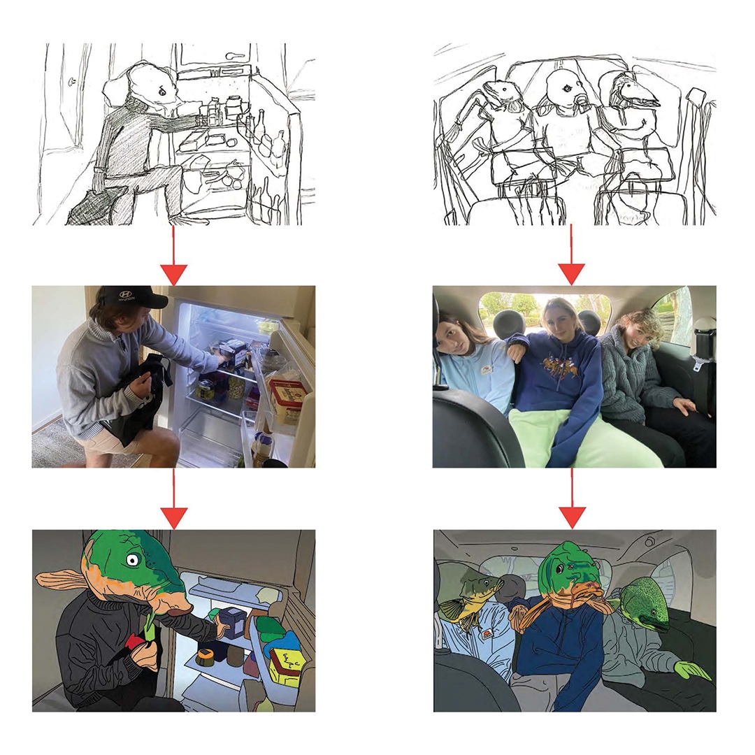
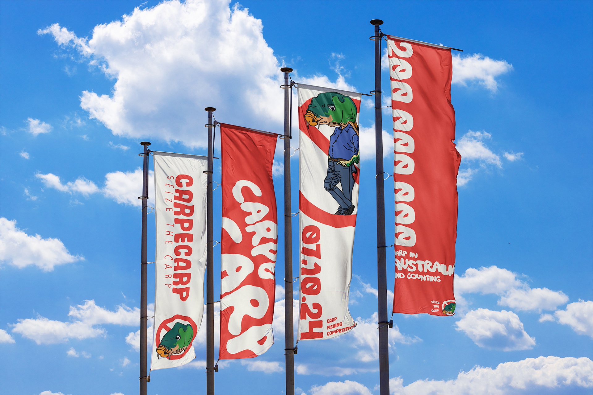
I developed multiple prototypes across posters, pamphlets, and social media tiles, testing approaches from text-heavy layouts to fully illustrated, character-driven visuals. Feedback quickly showed that the detailed illustrative approach had the most impact. Using staged reference photos helped me maintain perspective and cohesion while translating sketches into polished illustrations. Iteration focused on refining typography, hierarchy, and colour, ensuring readability without compromising the playful, ironic tone.
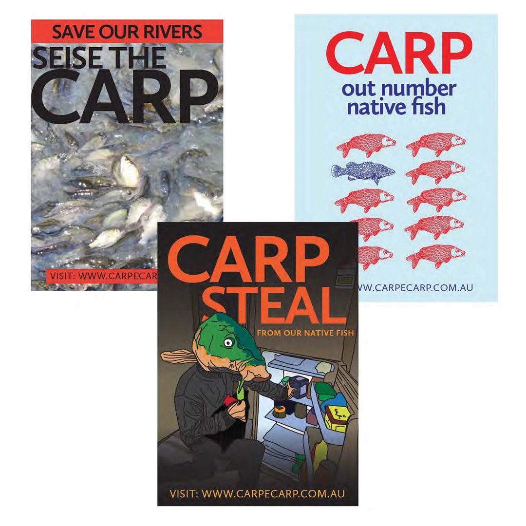
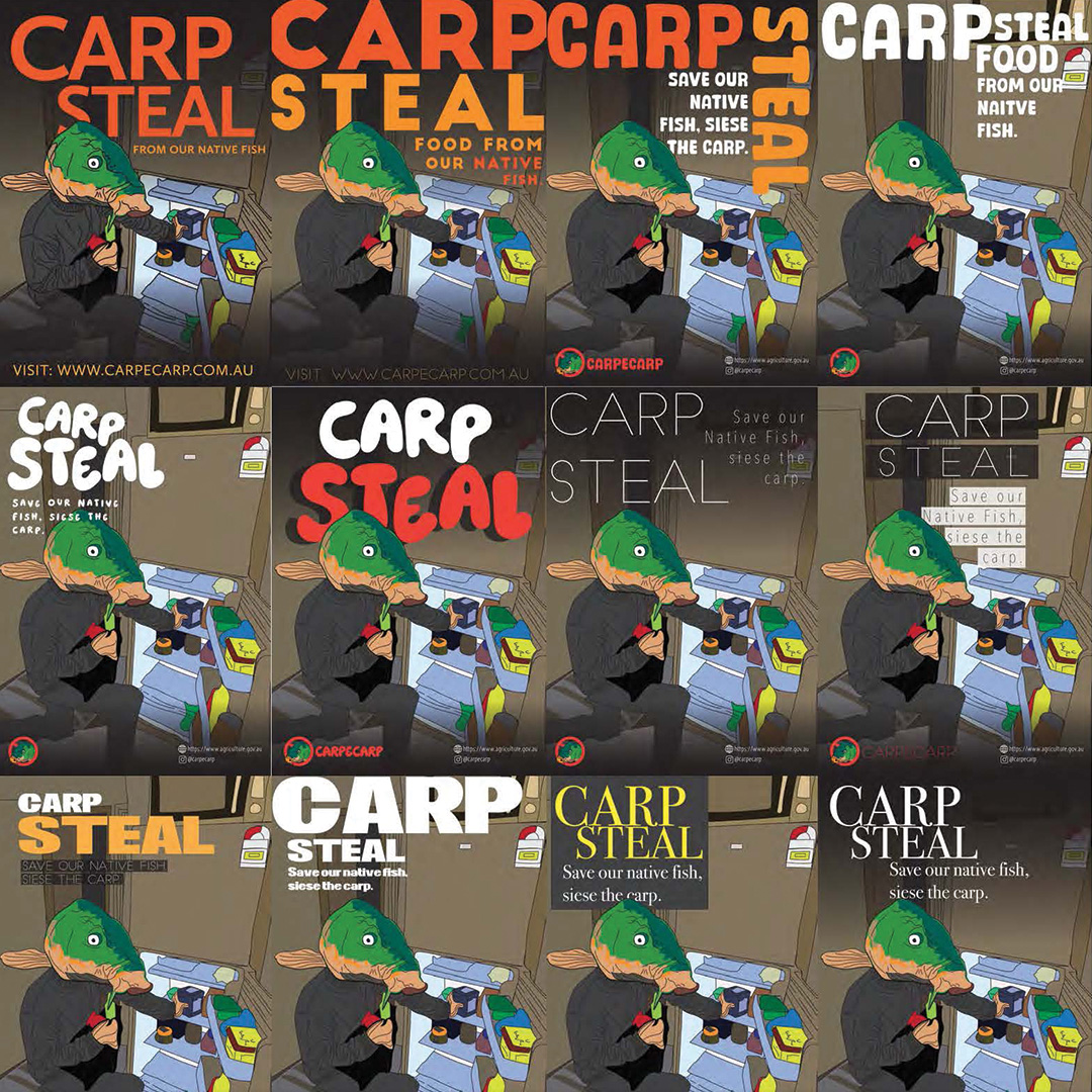
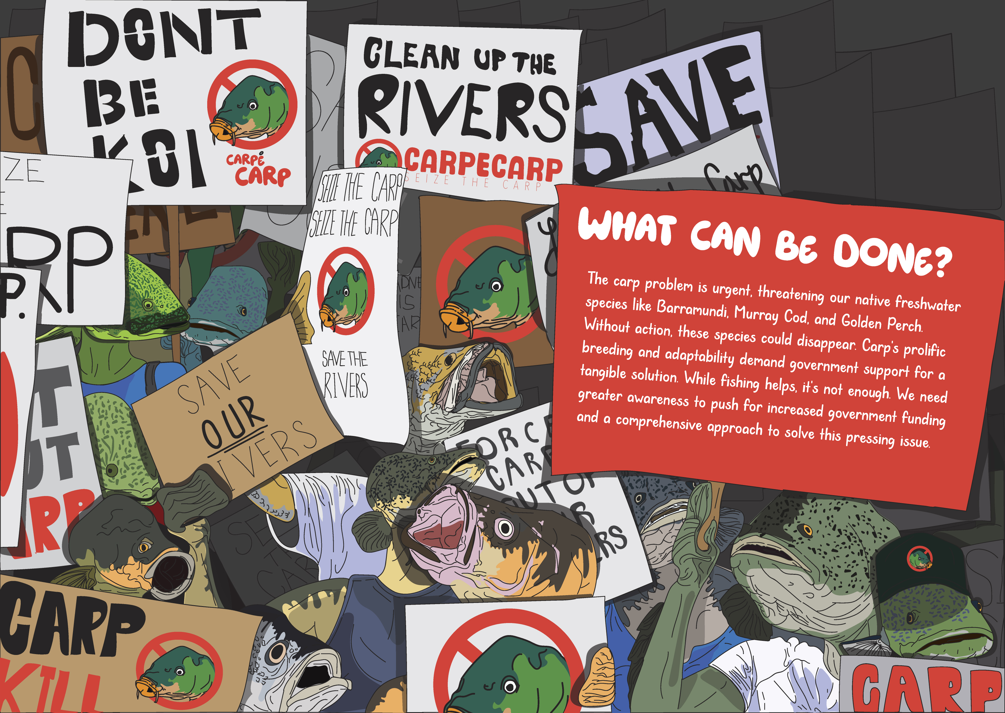
The final design suite delivers a coherent, engaging narrative that raises awareness and inspires action. Posters, pamphlets, and social tiles all feature anthropomorphised carp, bold visuals, and clear messaging, turning a dry environmental issue into something accessible and memorable. The project reinforced the power of humour and illustration in environmental communication, and highlighted how thoughtful design can transform public apathy into interest and motivation.
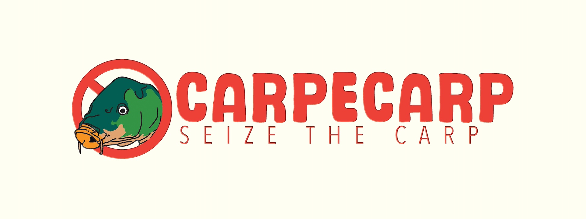
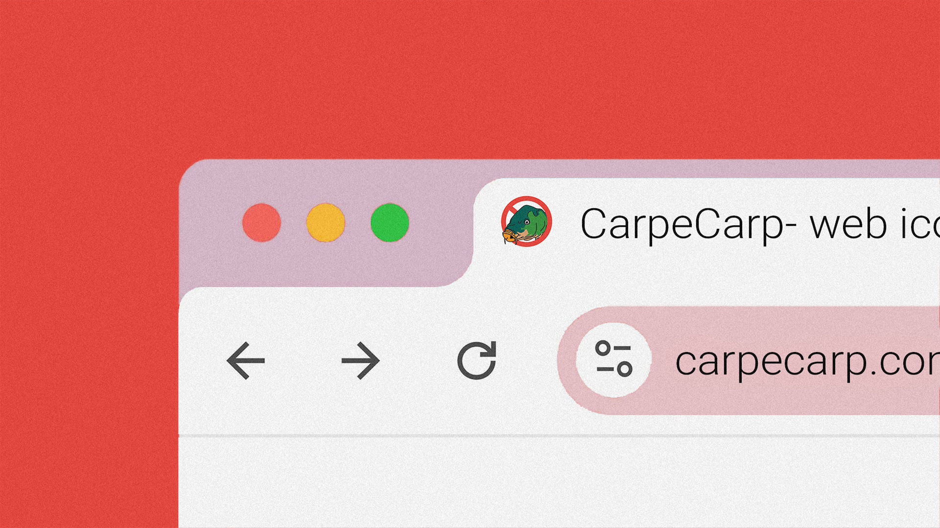
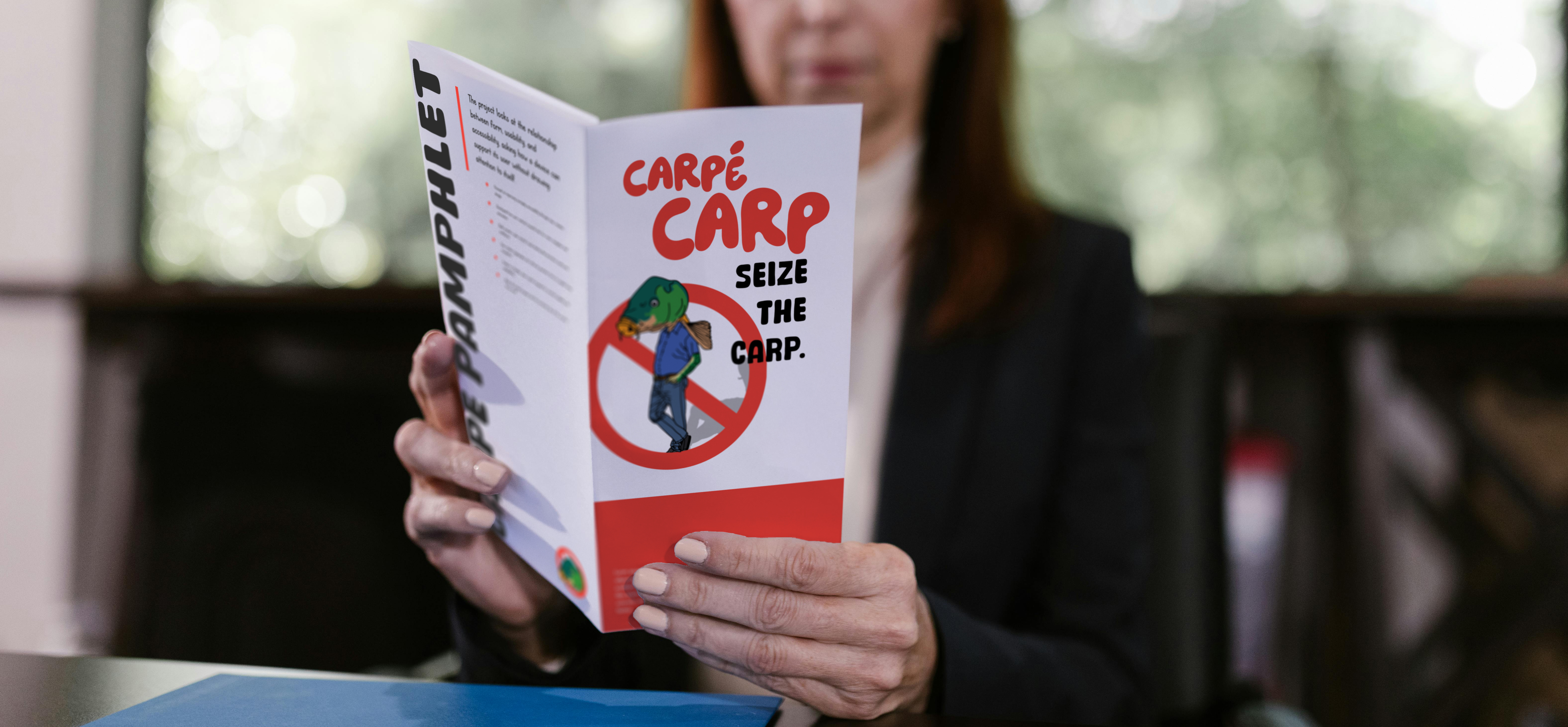
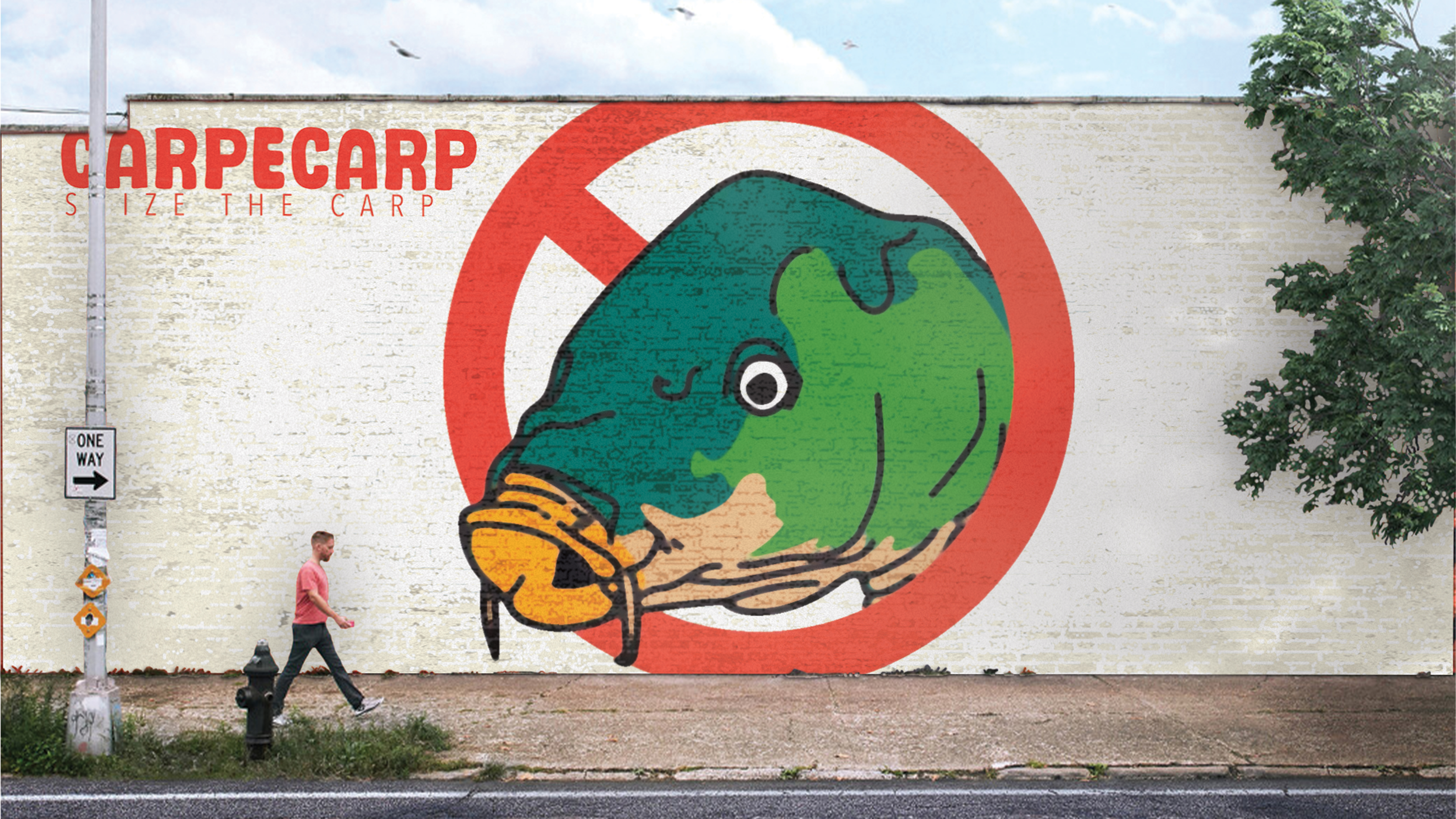
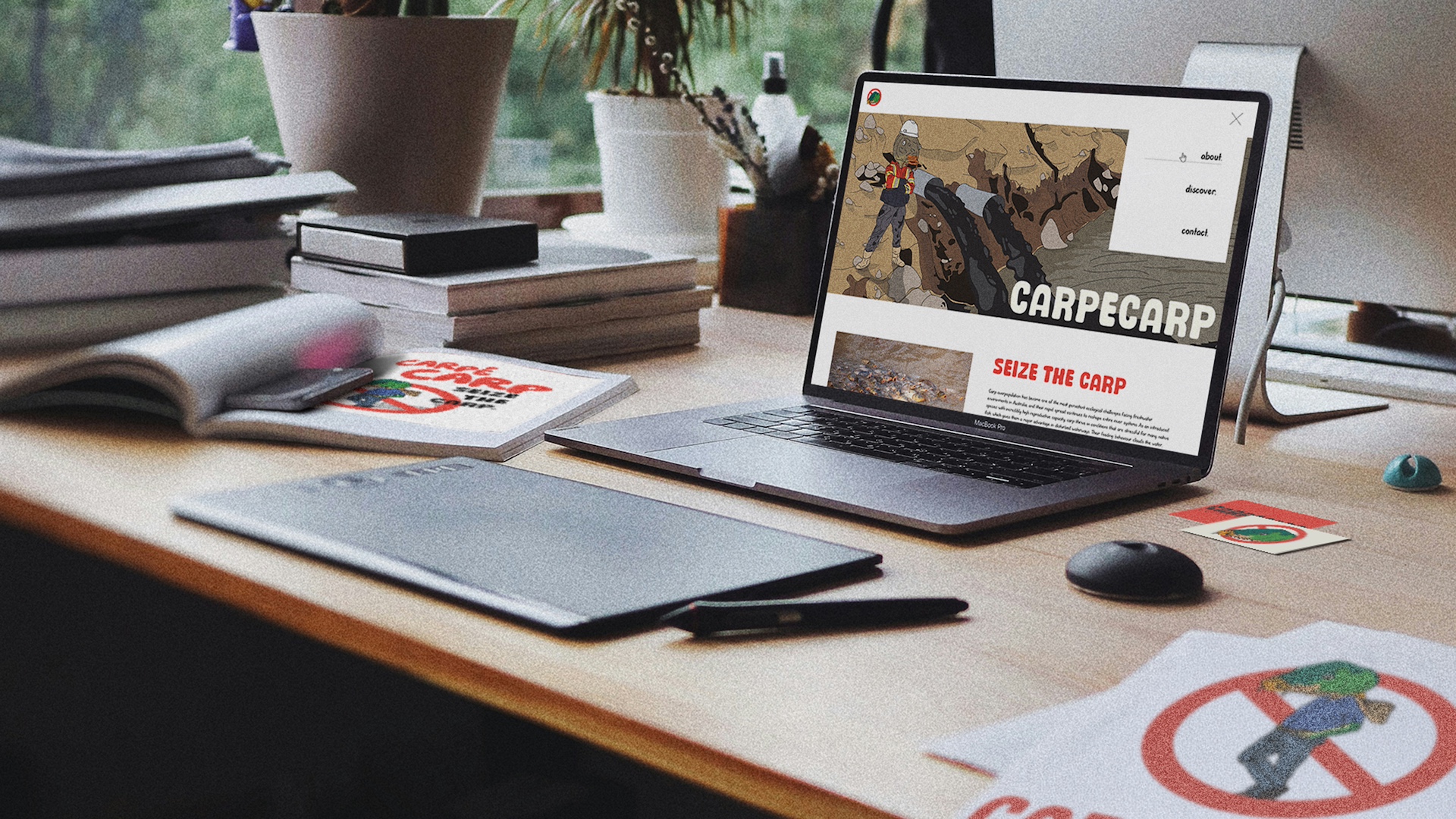
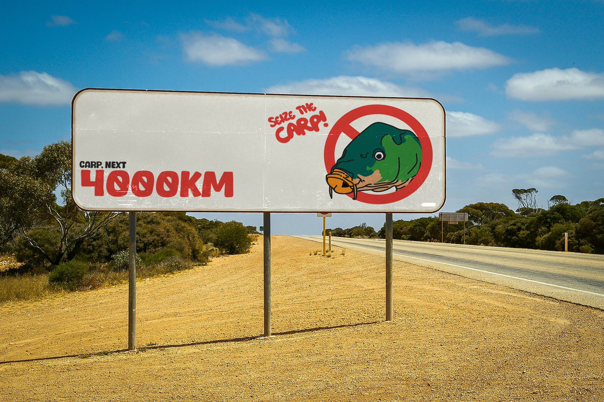
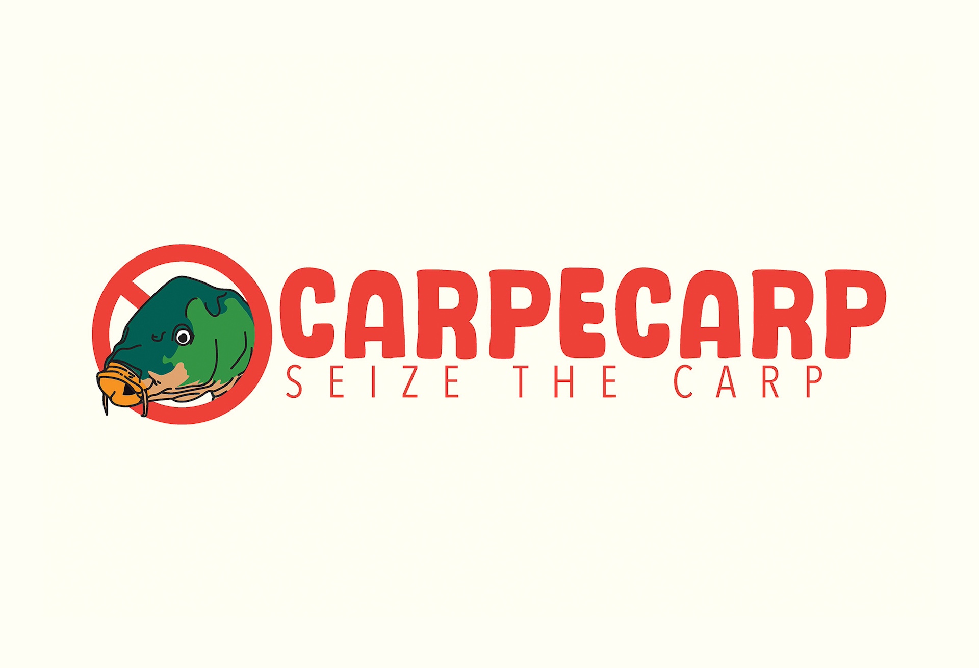
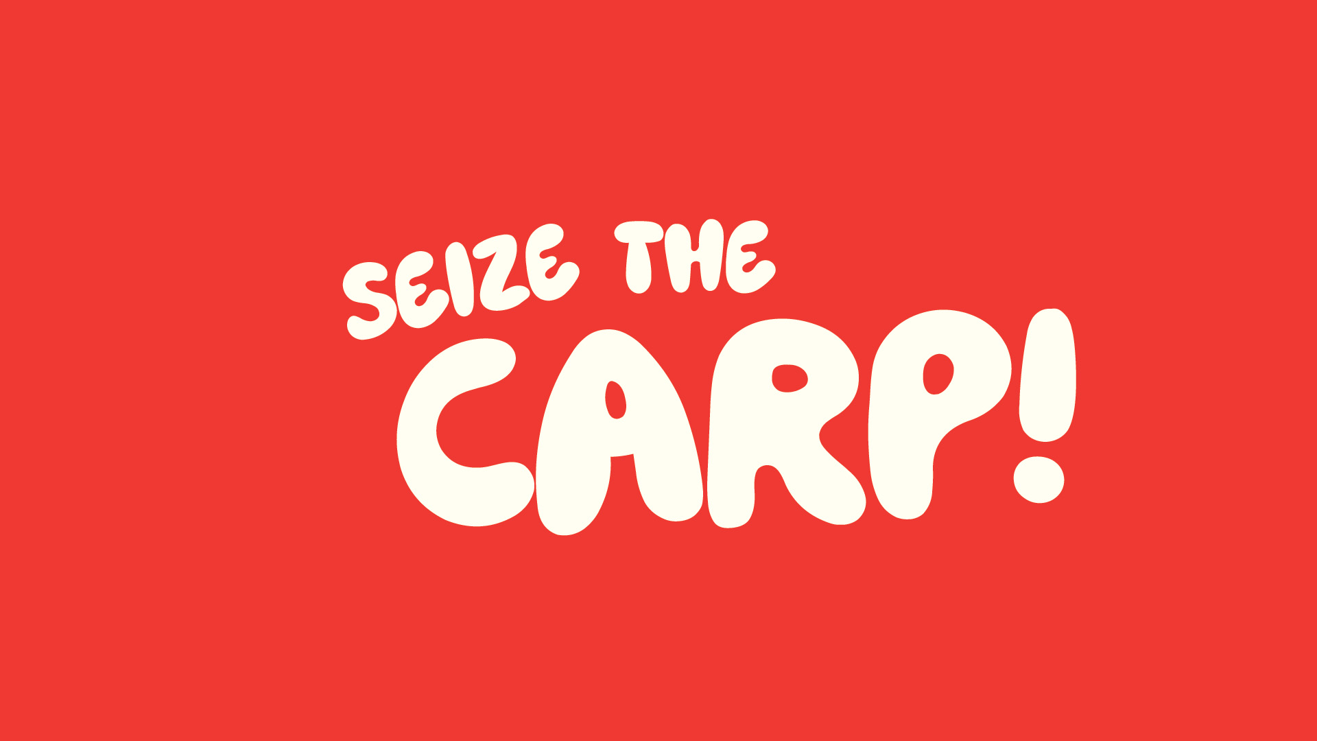
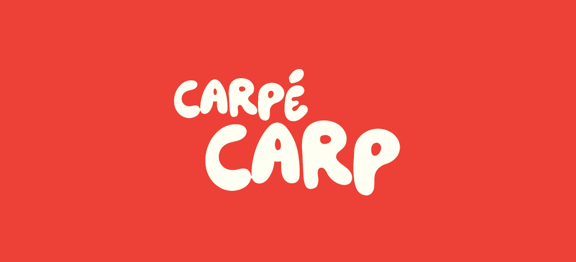
The name CarpeCarp came from wanting something that didn’t feel like your standard conservation campaign. Most environmental projects lean serious and scientific, so flipping that on its head with a name that’s both ridiculous and weirdly memorable felt right. It sticks in your brain because it’s a joke first, then a cause. The humour and irony in the name set the tone for everything else. It tells people straight away that this project is willing to be playful about something that’s actually a pretty ugly issue. It lets the audience drop their guard for a second, which is exactly what you need when the goal is engagement, not guilt-tripping.
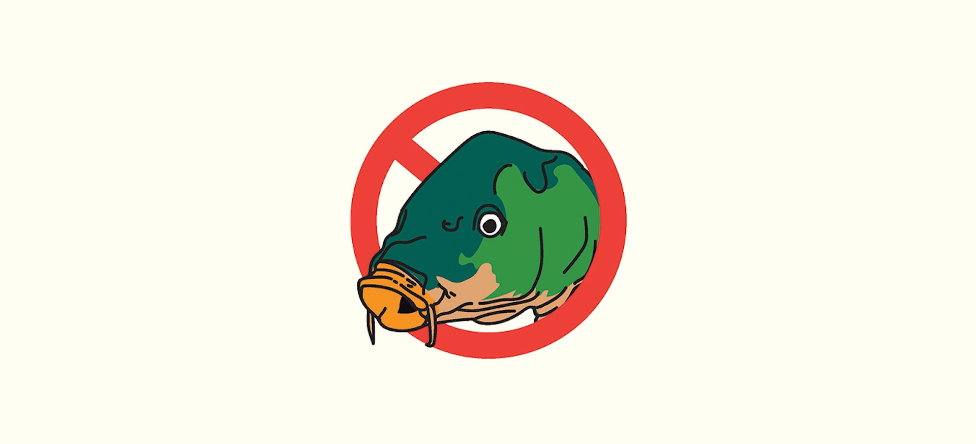
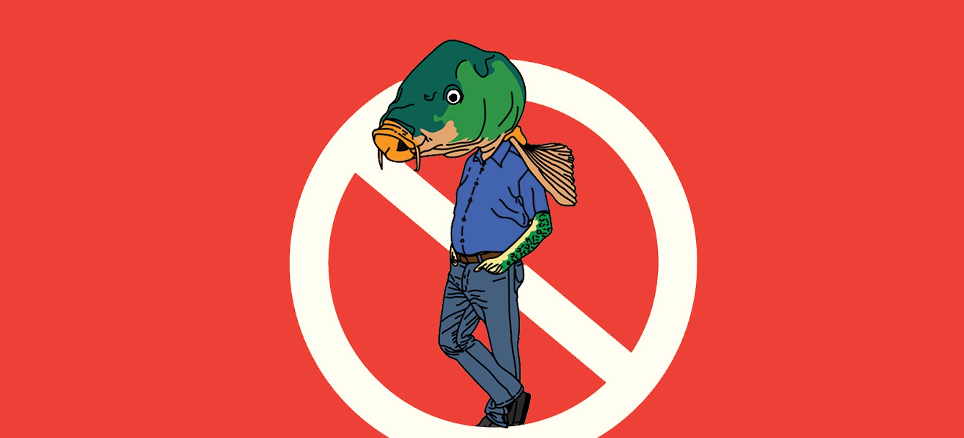
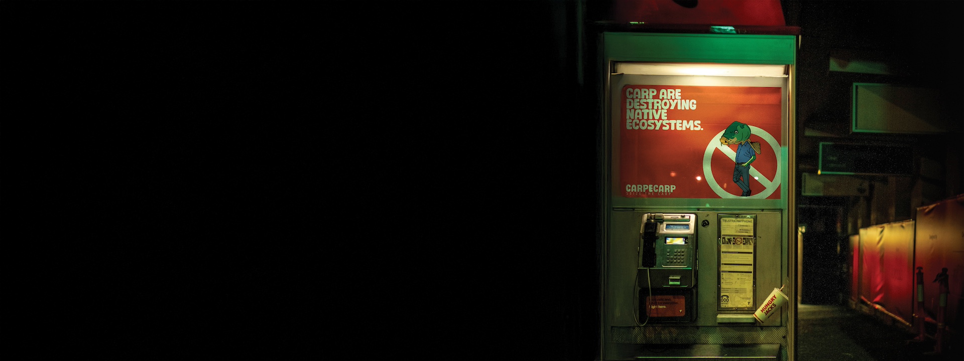
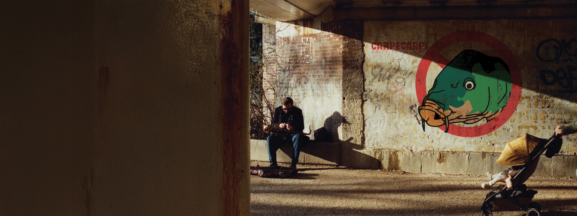
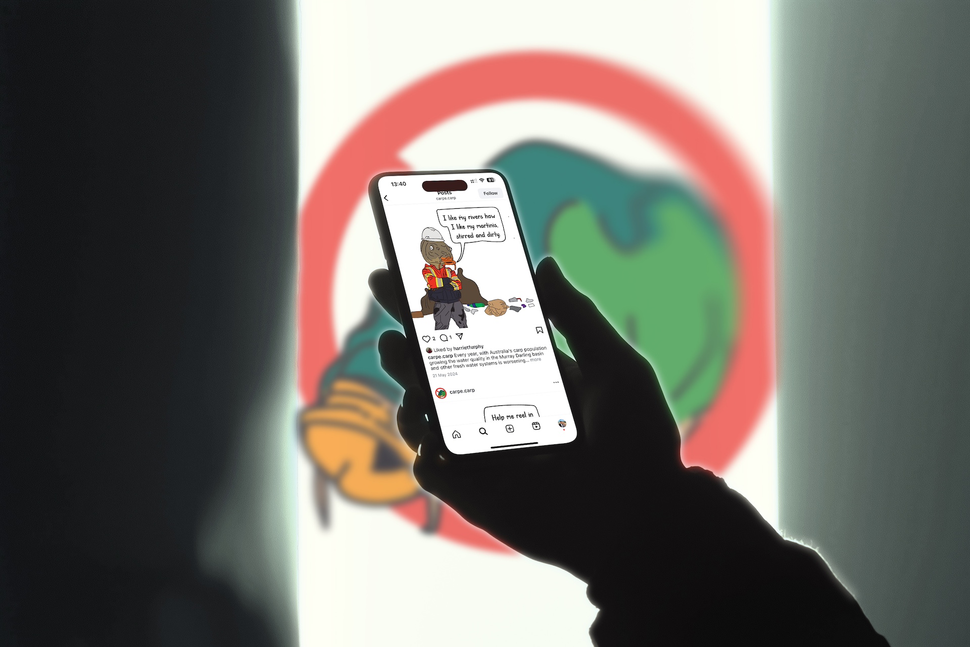
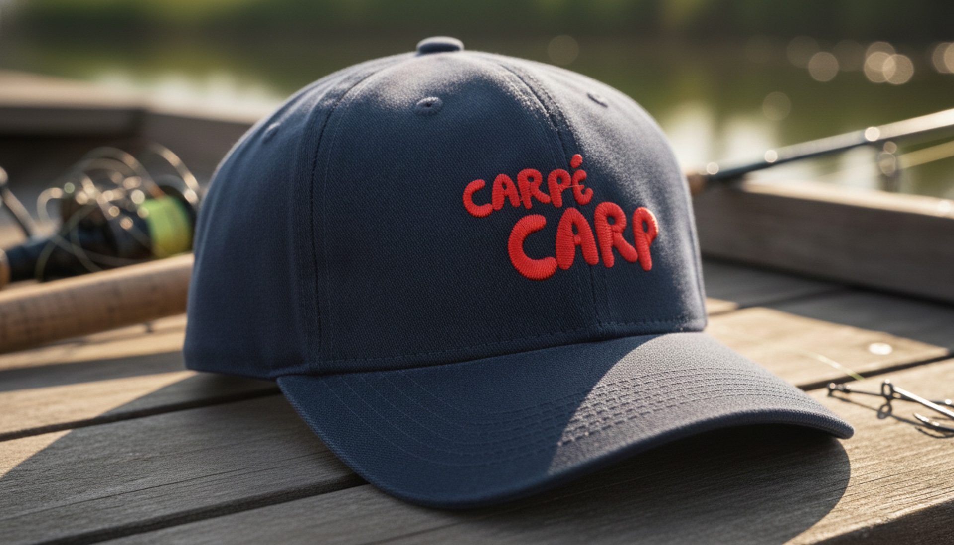
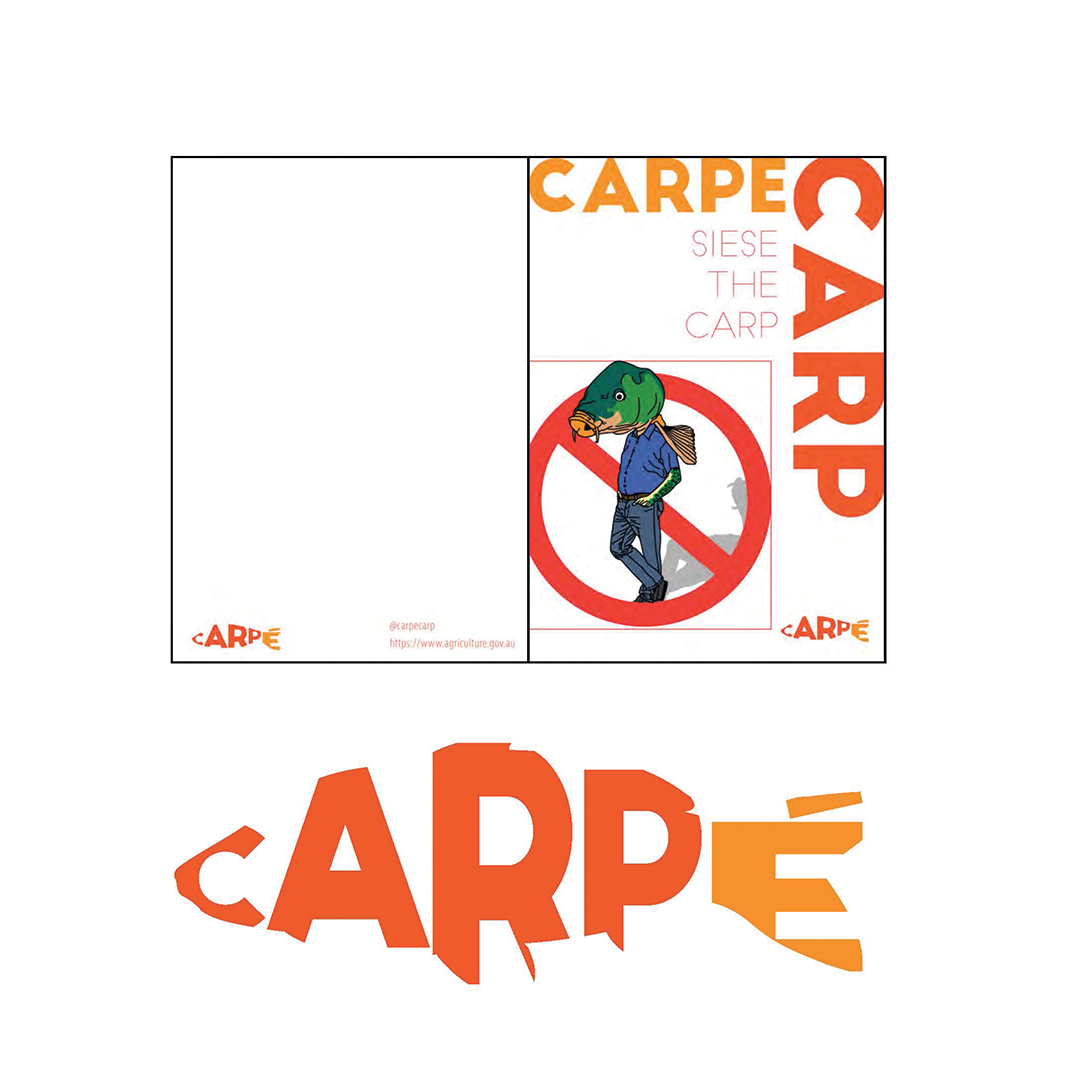
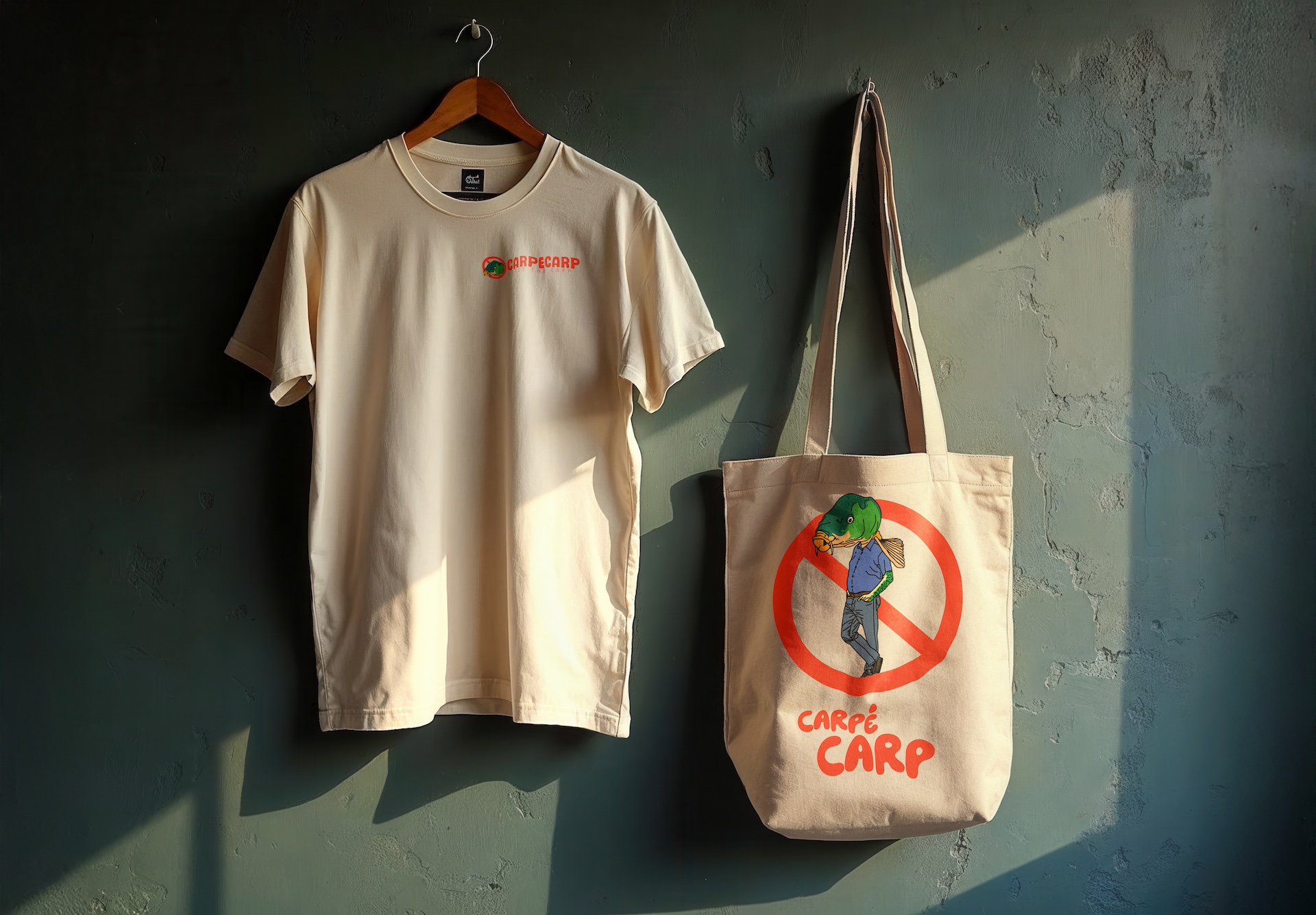
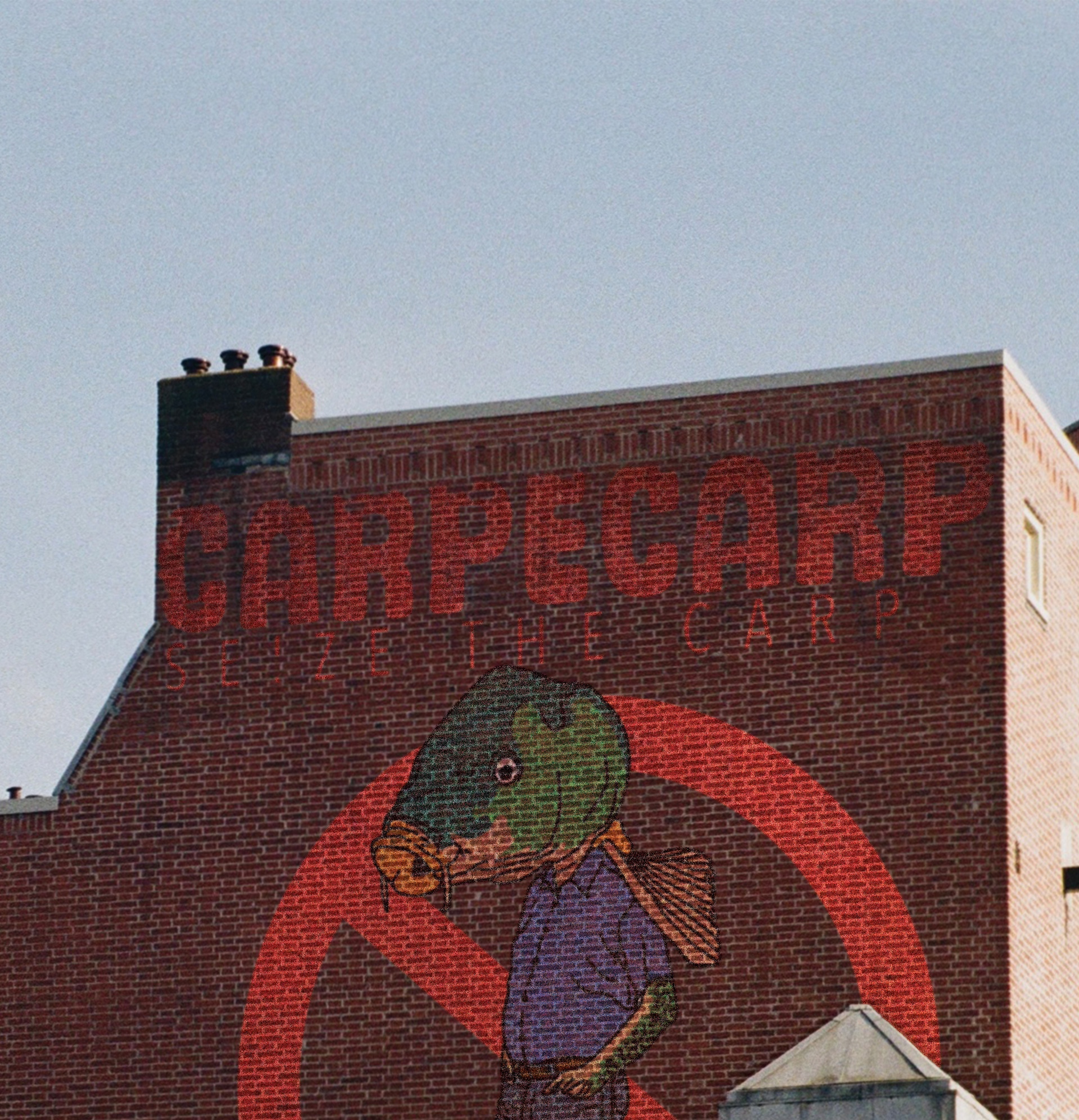
The logomark follows the same logic: clear message first, humour second. The core symbol, the carp head inside the classic circle-with-the-slash, gets the idea across instantly: carp are the problem. The alternative version with the anthropomorphised carp takes it a step further, leaning into the absurdity and personality that runs through the whole project. Both versions exist for different contexts, but the point is the same: the mark needed to be bold, simple, a little cheeky, and impossible to confuse for anything else. It says “carp are a problem” without needing a single line of text.
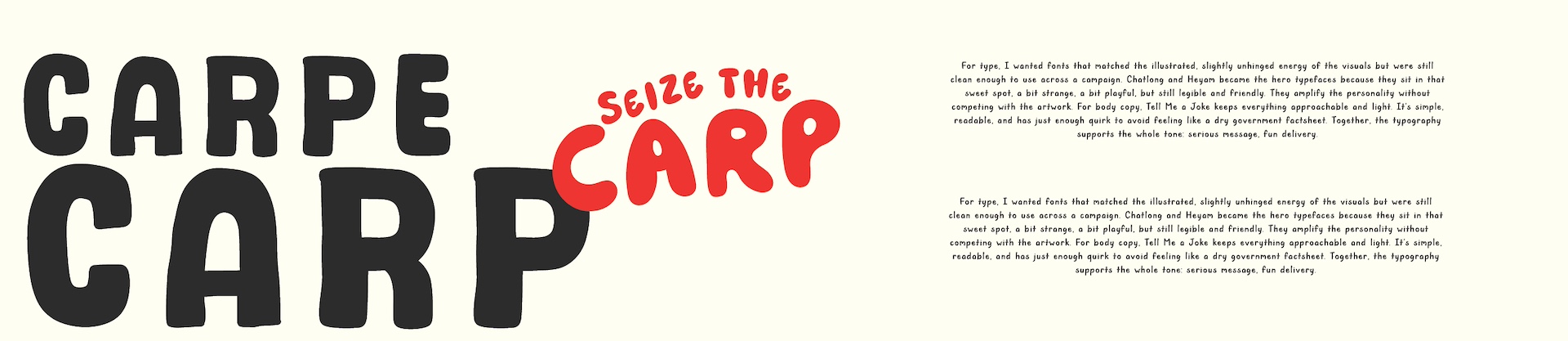
For type, I wanted fonts that matched the illustrated, slightly unhinged energy of the visuals but were still clean enough to use across a campaign. Chatlong and Heyam became the hero typefaces because they sit in that sweet spot, a bit strange, a bit playful, but still legible and friendly. They amplify the personality without competing with the artwork. For body copy, Tell Me a Joke keeps everything approachable and light. It’s simple, readable, and has just enough quirk to avoid feeling like a dry government factsheet. Together, the typography supports the whole tone: serious message, fun delivery.
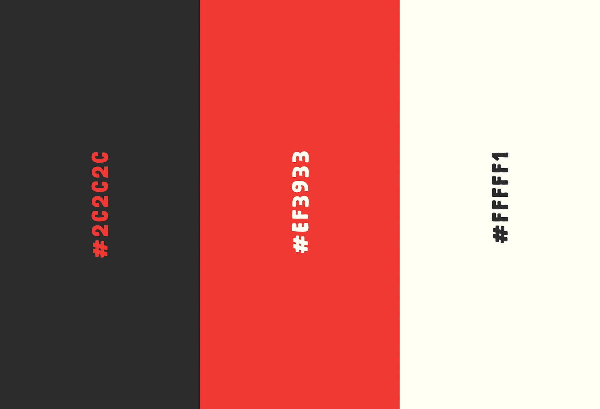
The colour palette is intentionally simple for the brand itself: red, black and white. It’s classic campaign energy, bold, high-contrast, and immediately urgent. Red also carries the anti-carp sentiment clearly without needing explanation. Once you move into the illustrations, though, the palette expands massively. The illustrations are where the surreal humour really lands, so giving them a broad and expressive colour range lets them feel lively and engaging without being locked into the strict campaign colours. This split keeps the identity tight and recognisable while giving the art room to breathe.