.png)
<project brief>
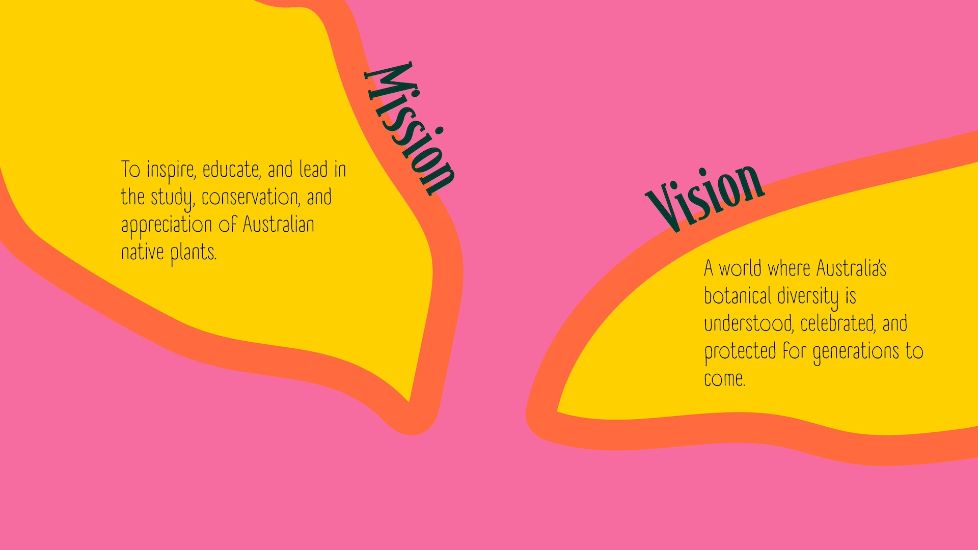
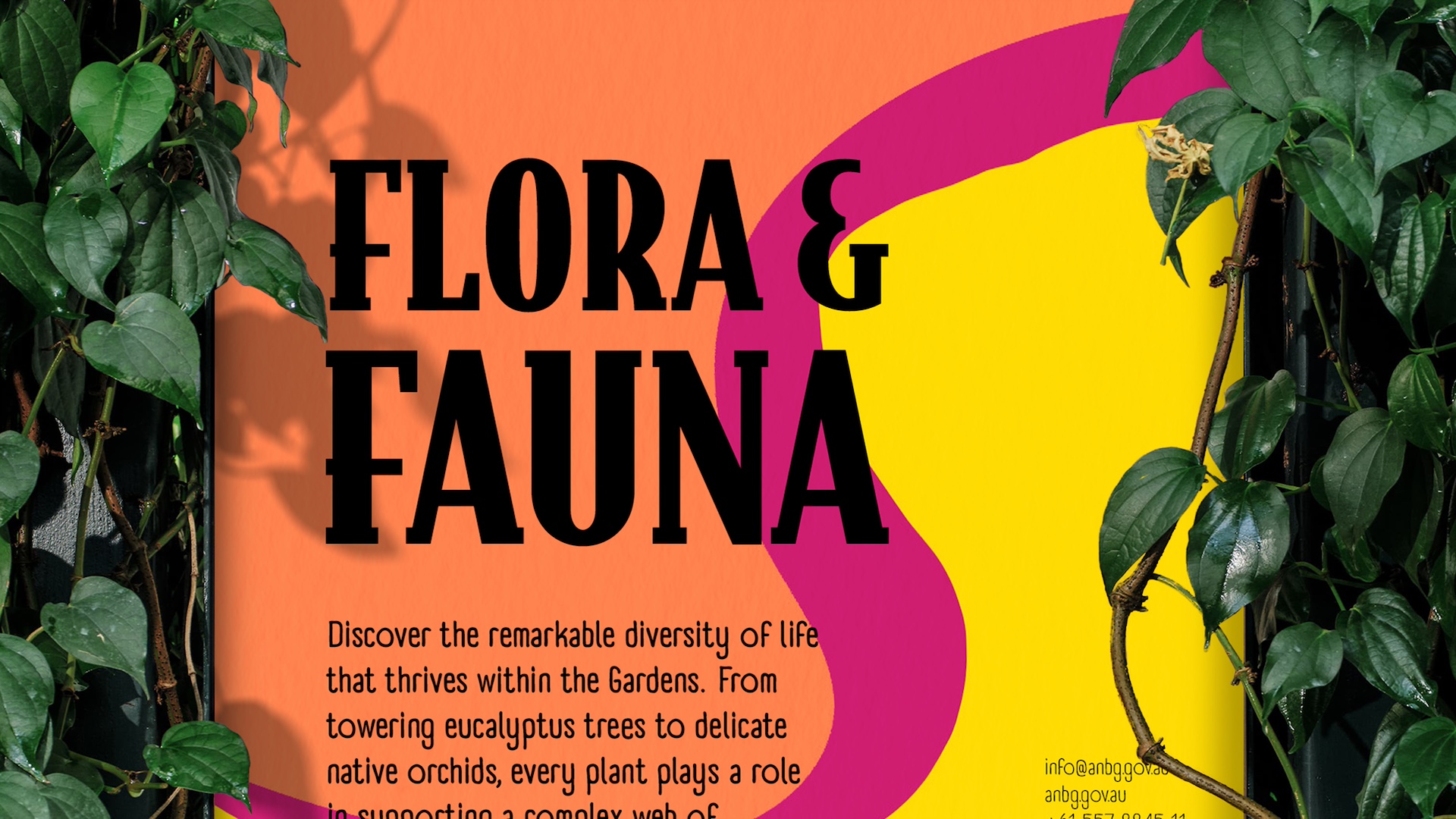
Inspired by the vibrancy of Australia’s native flora, this identity for the Australian National Botanic Gardens uses bold colour, expressive shapes, and generative code to create a living brand system. It’s playful and educational for younger visitors while staying refined and contemporary for the Gardens’ broader audience.
</project breif>
<touchpoints>
<touch points>
<key deliveries>
<key deliveries>


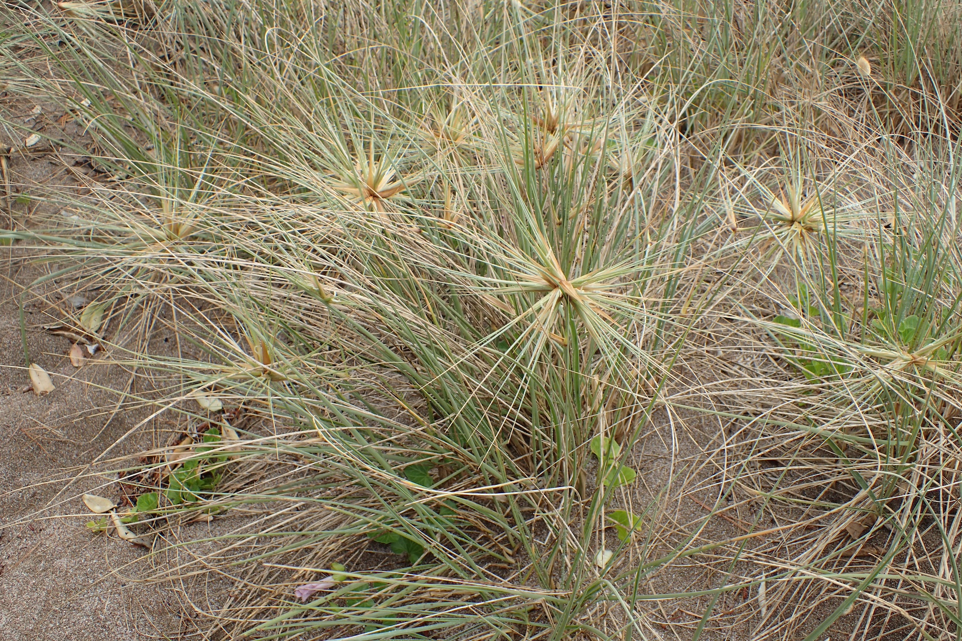
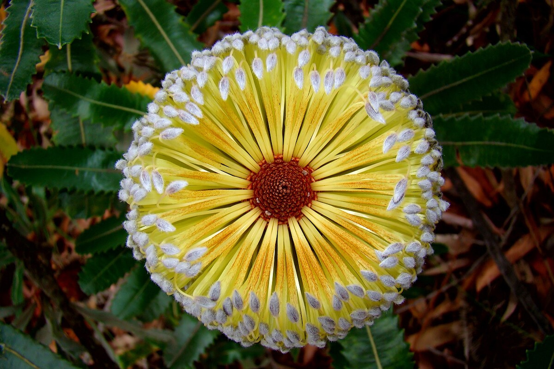
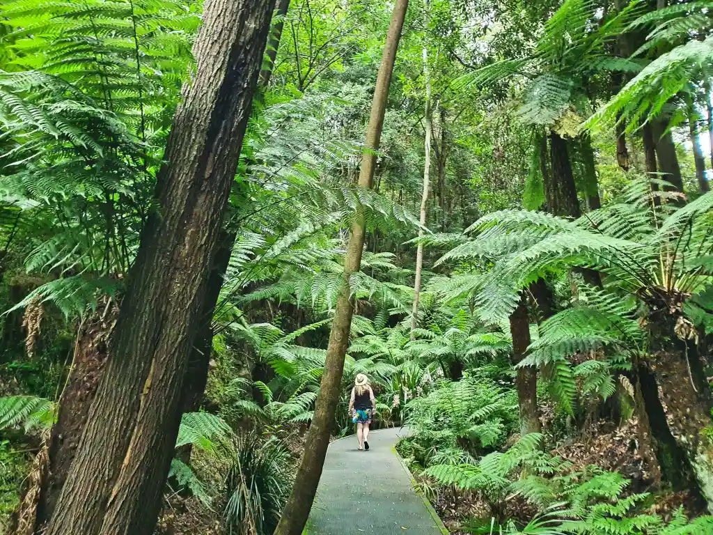
I started by spending time in the Gardens, sketching plants and noting the small details that often go unnoticed, the way stems twist, how colours shift in different light, and the patterns within each leaf. This helped me see the Gardens as something alive and interconnected rather than just a collection of species. The existing ANBG logo, by contrast, felt quite flat and restrained, it didn’t capture that living quality. This early research helped shape my goal of creating an identity that felt more expressive and connected to the natural energy of the place.

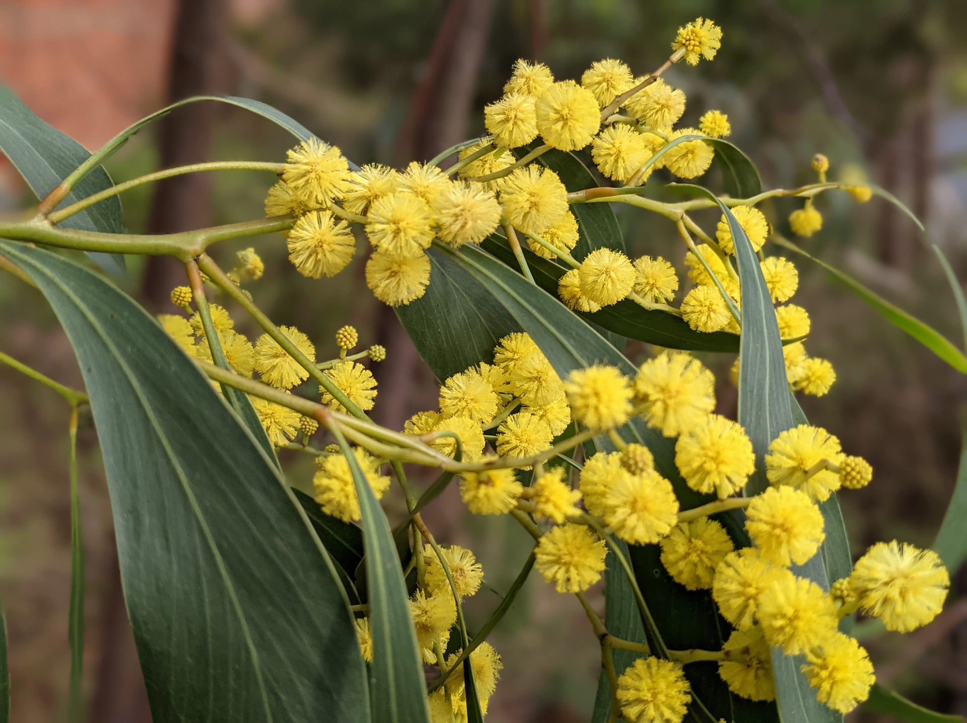
Back in the studio, I began by pairing type experiments with the Golden Wattle, Australia’s floral emblem. Its circular blooms and bright yellows gave the visuals a sense of movement and warmth, and for a while it felt like a strong direction. But the more I developed it, the more it felt limiting, one plant couldn’t speak for the diversity of the Gardens. That realisation shifted the project from a single motif to a larger system, where multiple native species could coexist within a shared visual language.
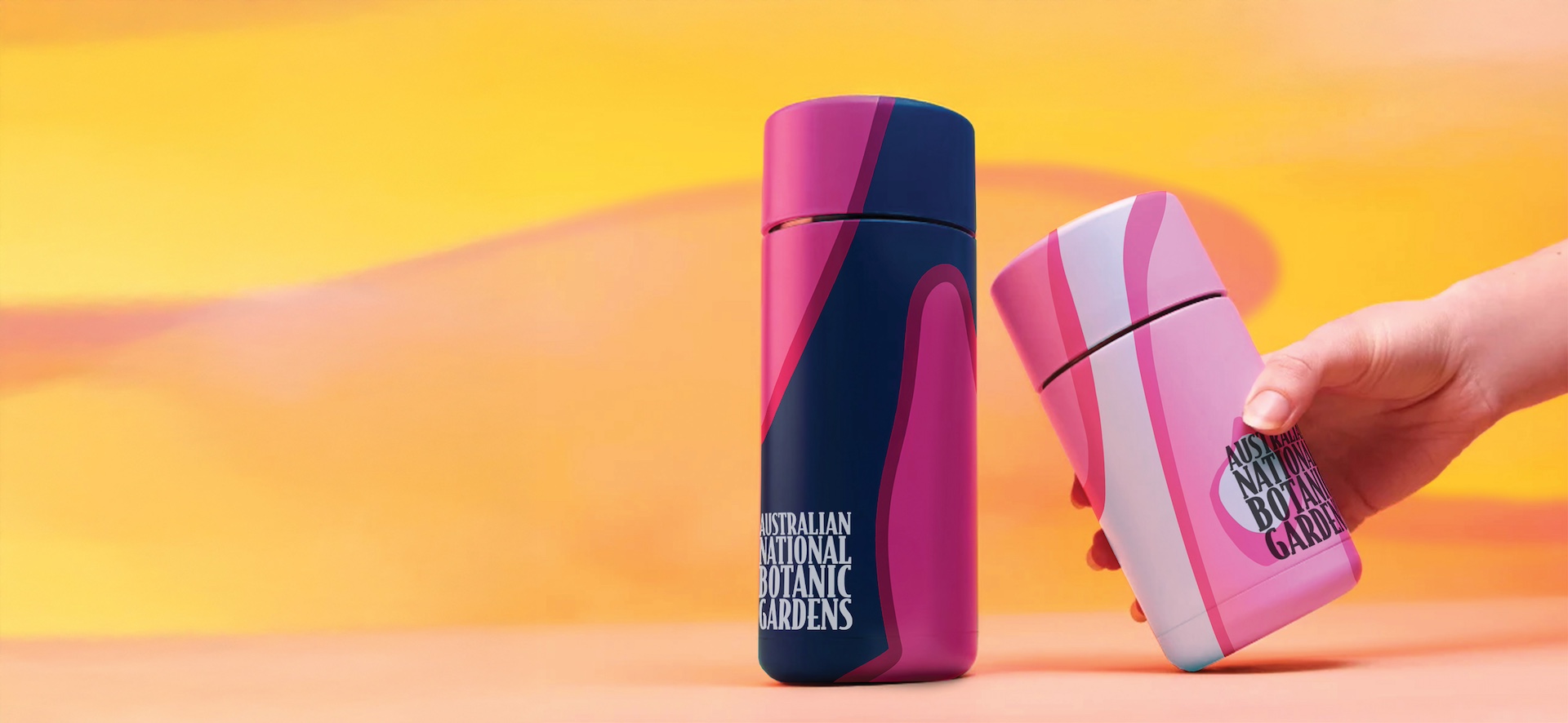
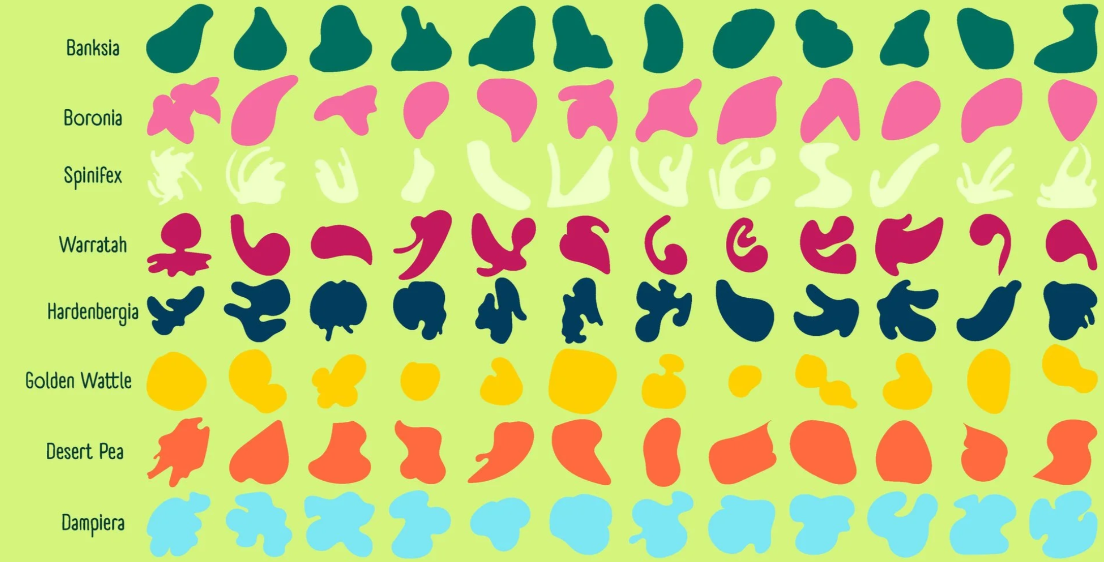
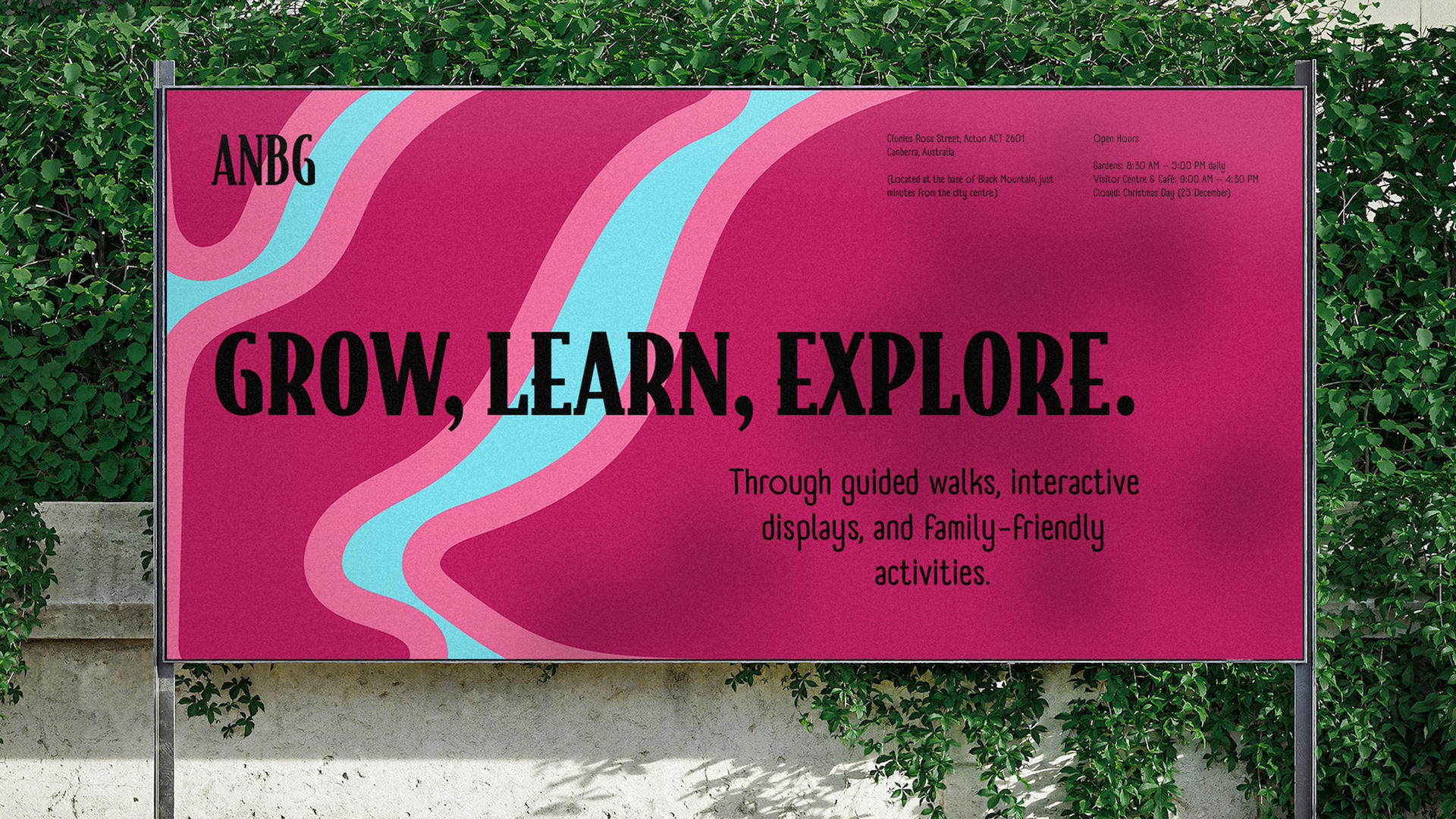
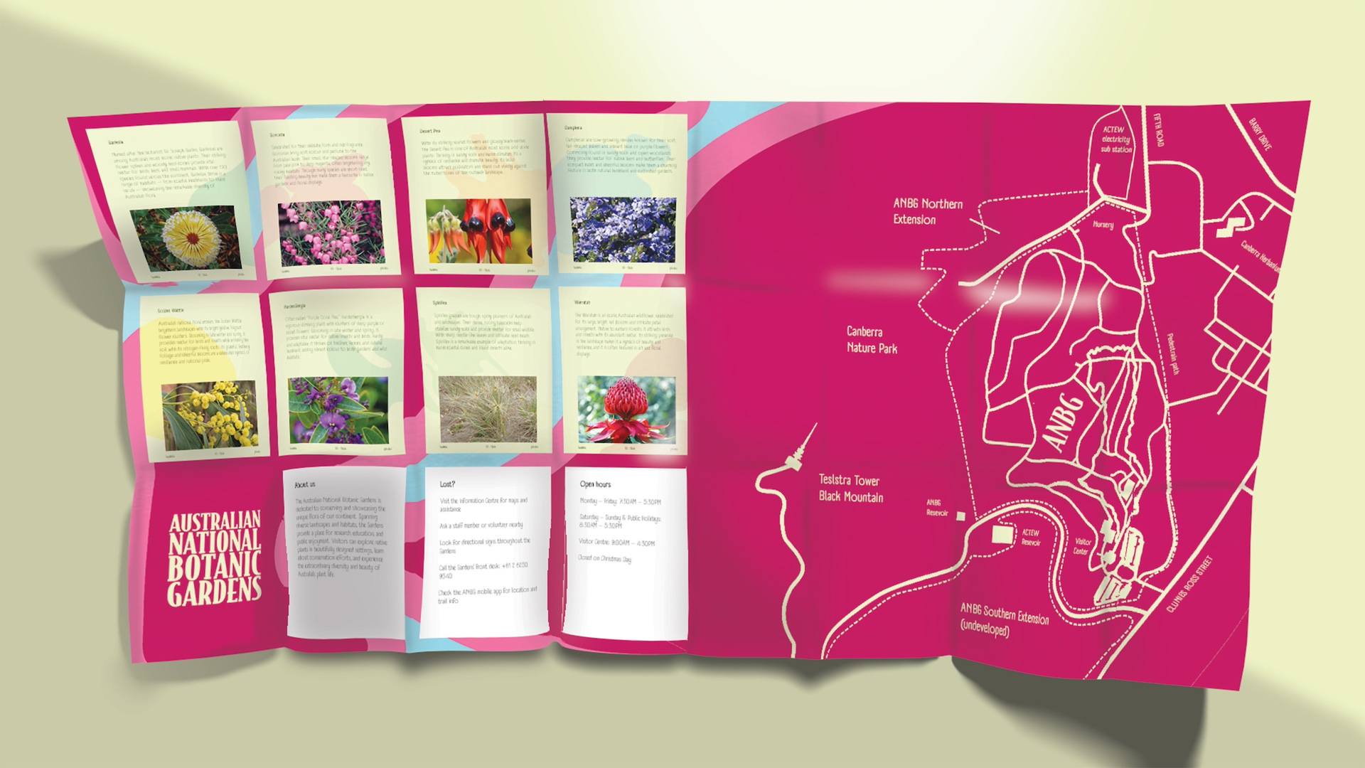
I started building a small library of plant forms, redrawing them over and over until they felt balanced and consistent. Each shape needed to work on its own but also sit comfortably alongside others. I then built a colour palette drawn from real botanical tones and tested different pairings to see what felt natural together. When colours clashed or blended too much, I used thick strokes to separate them and bring the shapes back into focus. Bit by bit, the system started to feel alive, flexible enough to move between screen and print without losing its rhythm.


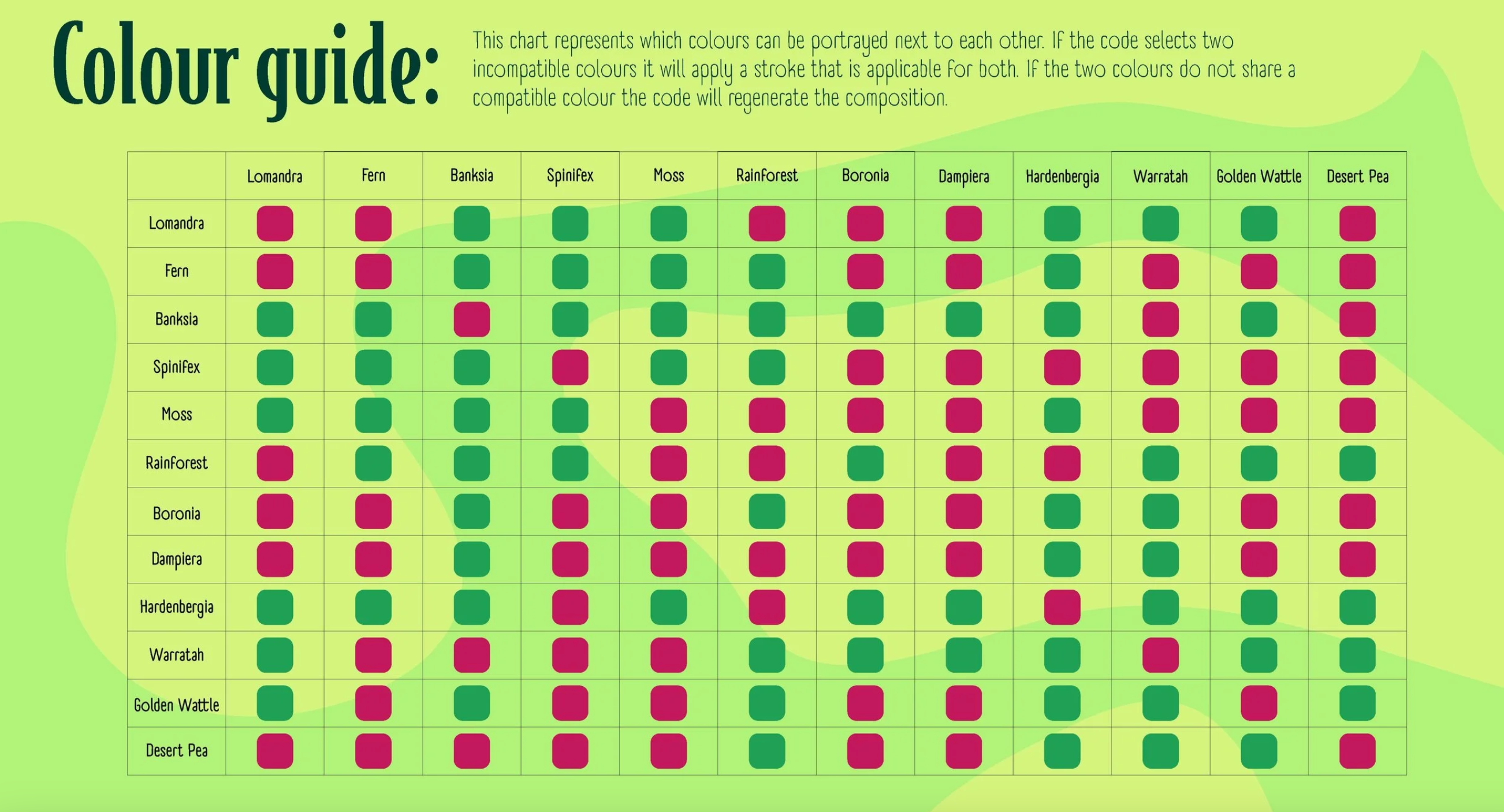
The project required balancing structure with flexibility, ensuring the identity could evolve without losing coherence. Early testing across formats revealed what worked at different scales and where adjustments were needed. Collaborating with creative programmers pushed the system beyond static applications, letting the brand feel genuinely dynamic. The challenge wasn't just designing individual elements but building a framework that could adapt while staying true to the client's vision. Further down the page are the justifications for each element of the identity.


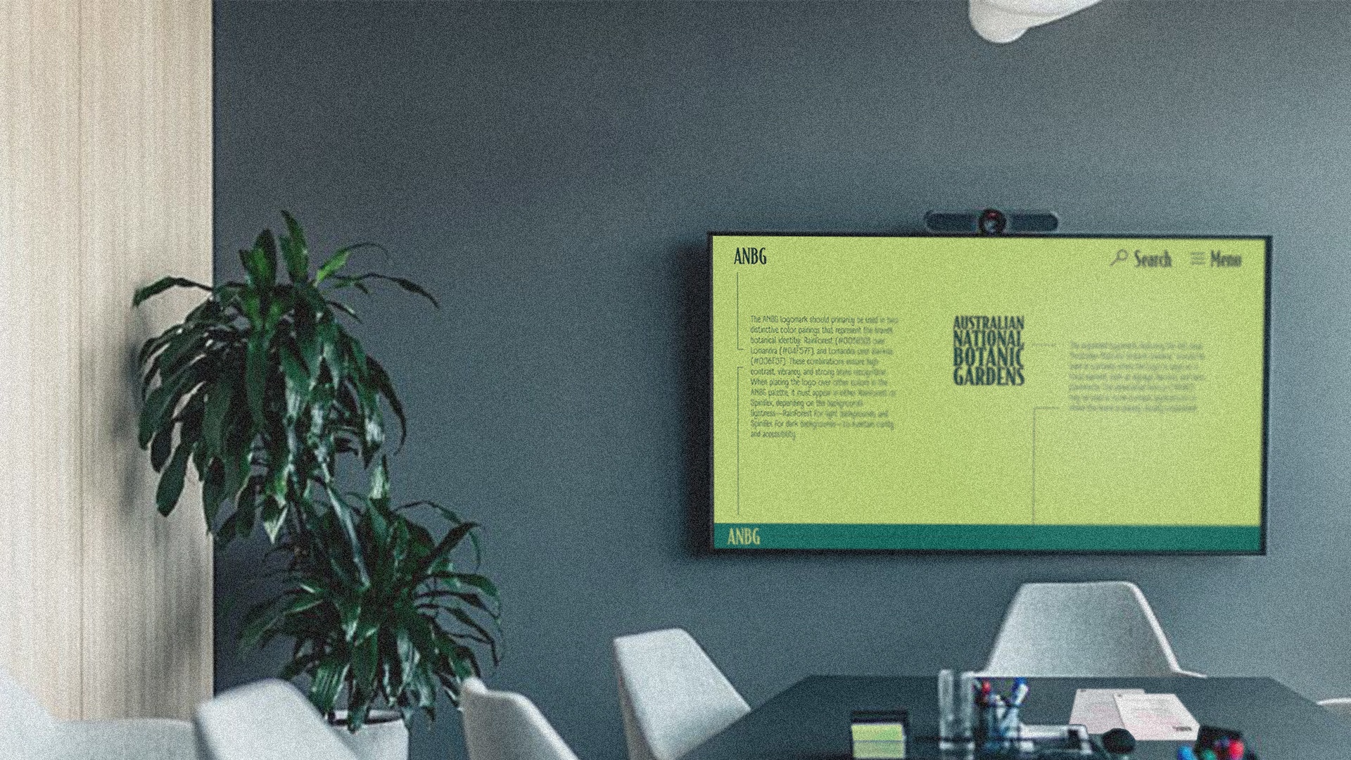
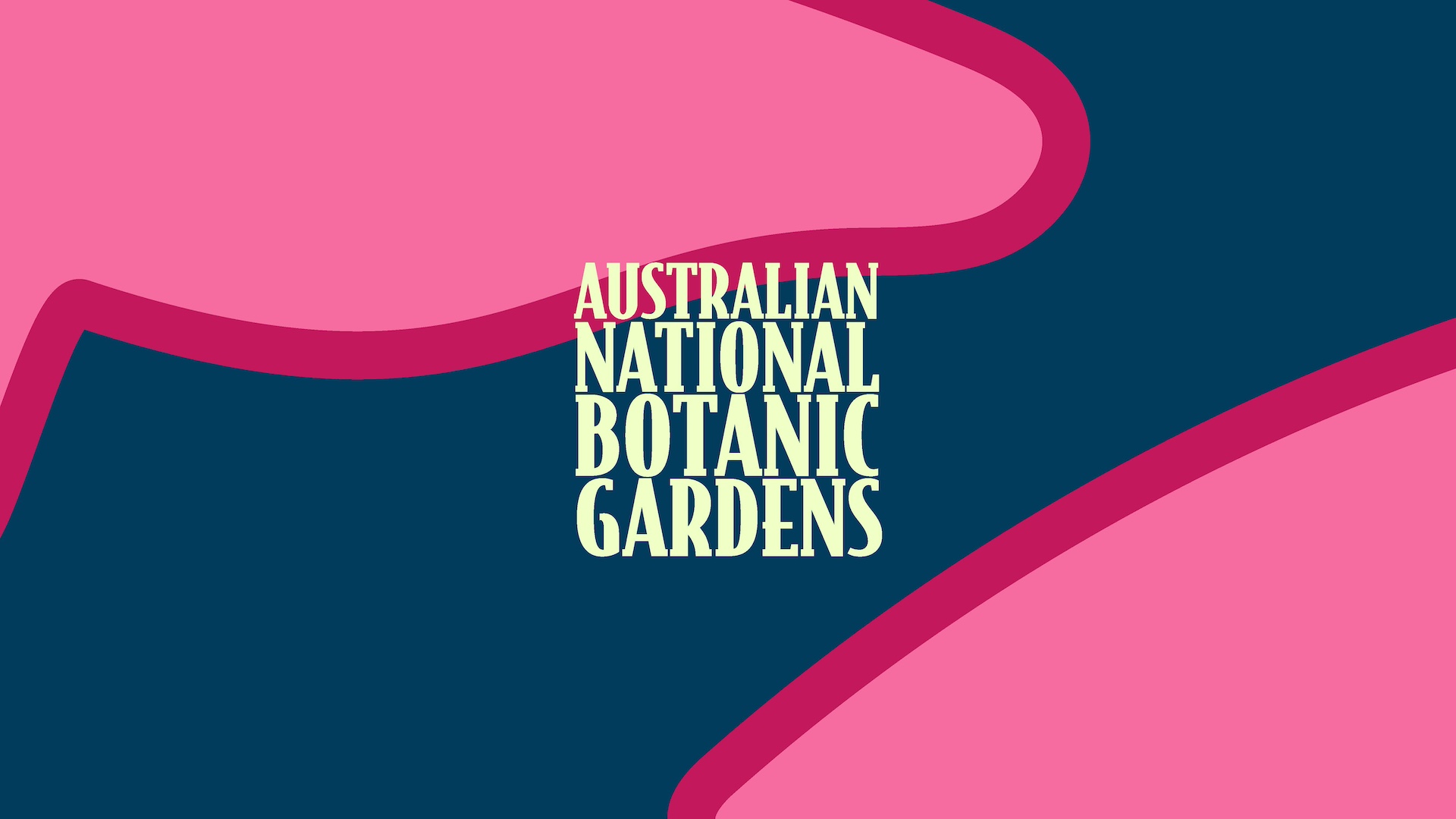
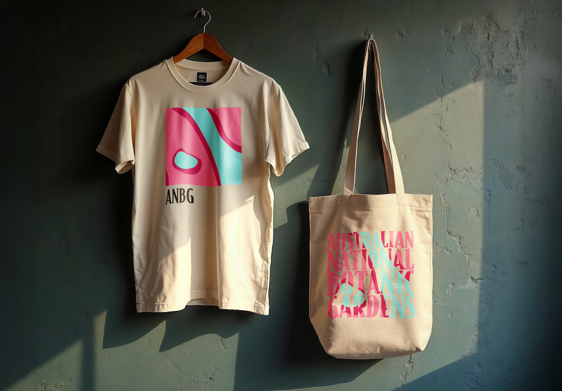
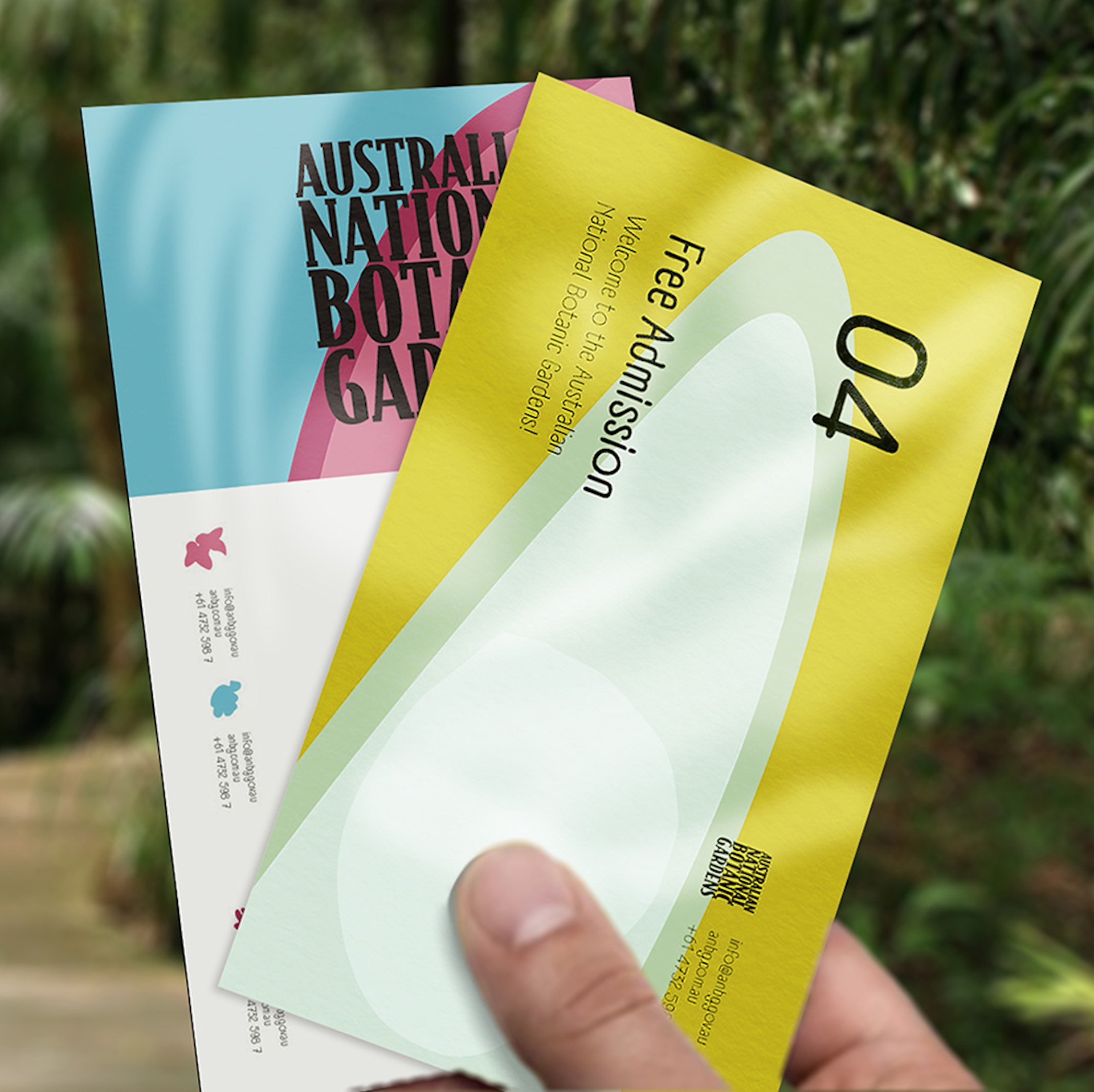
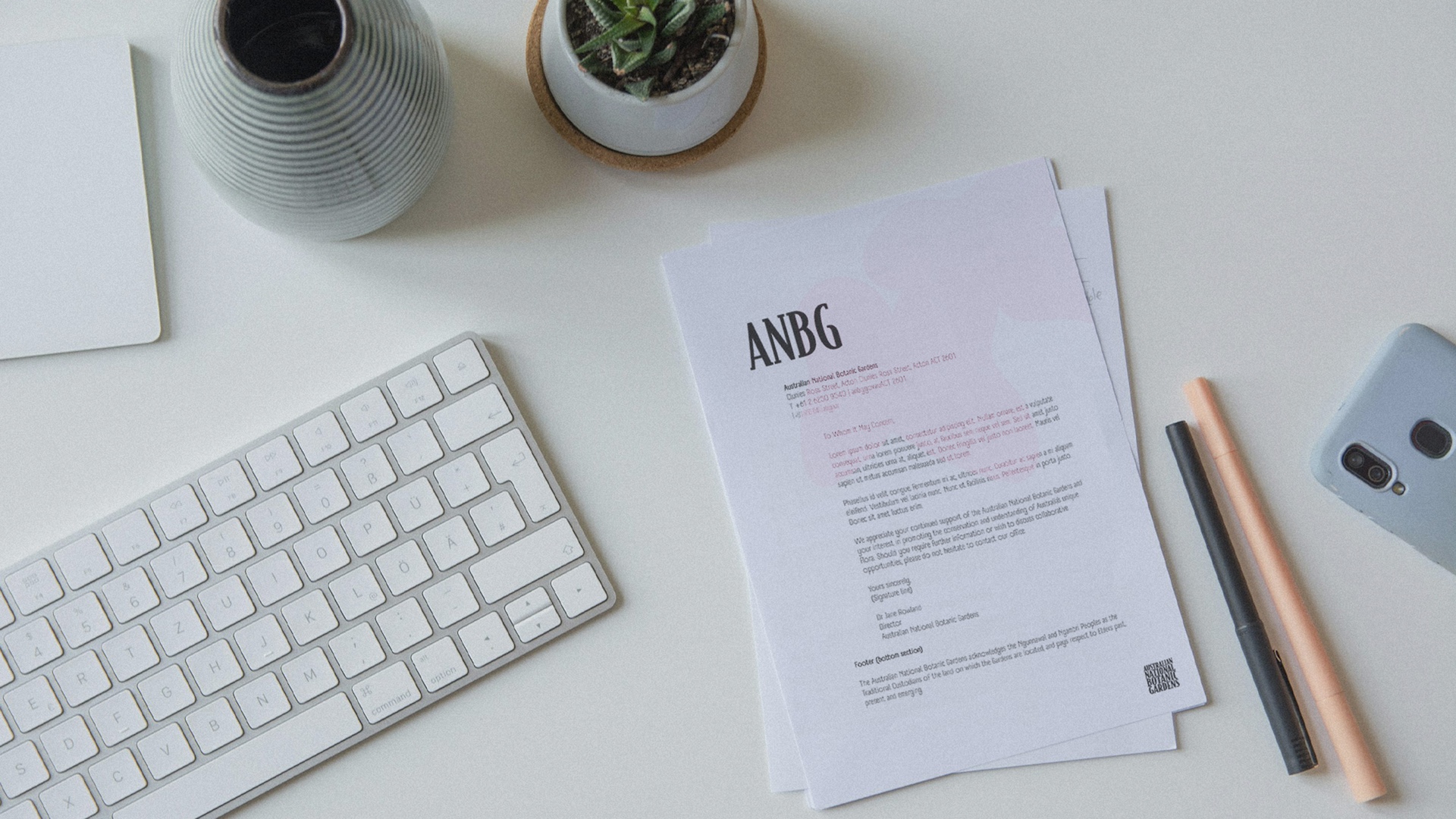
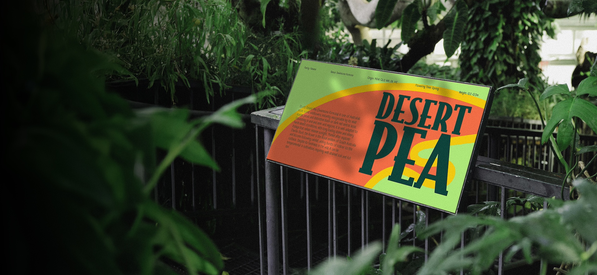
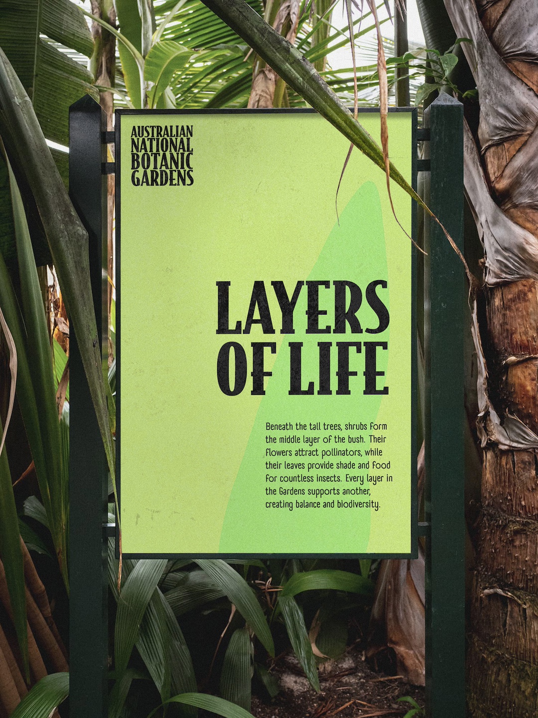
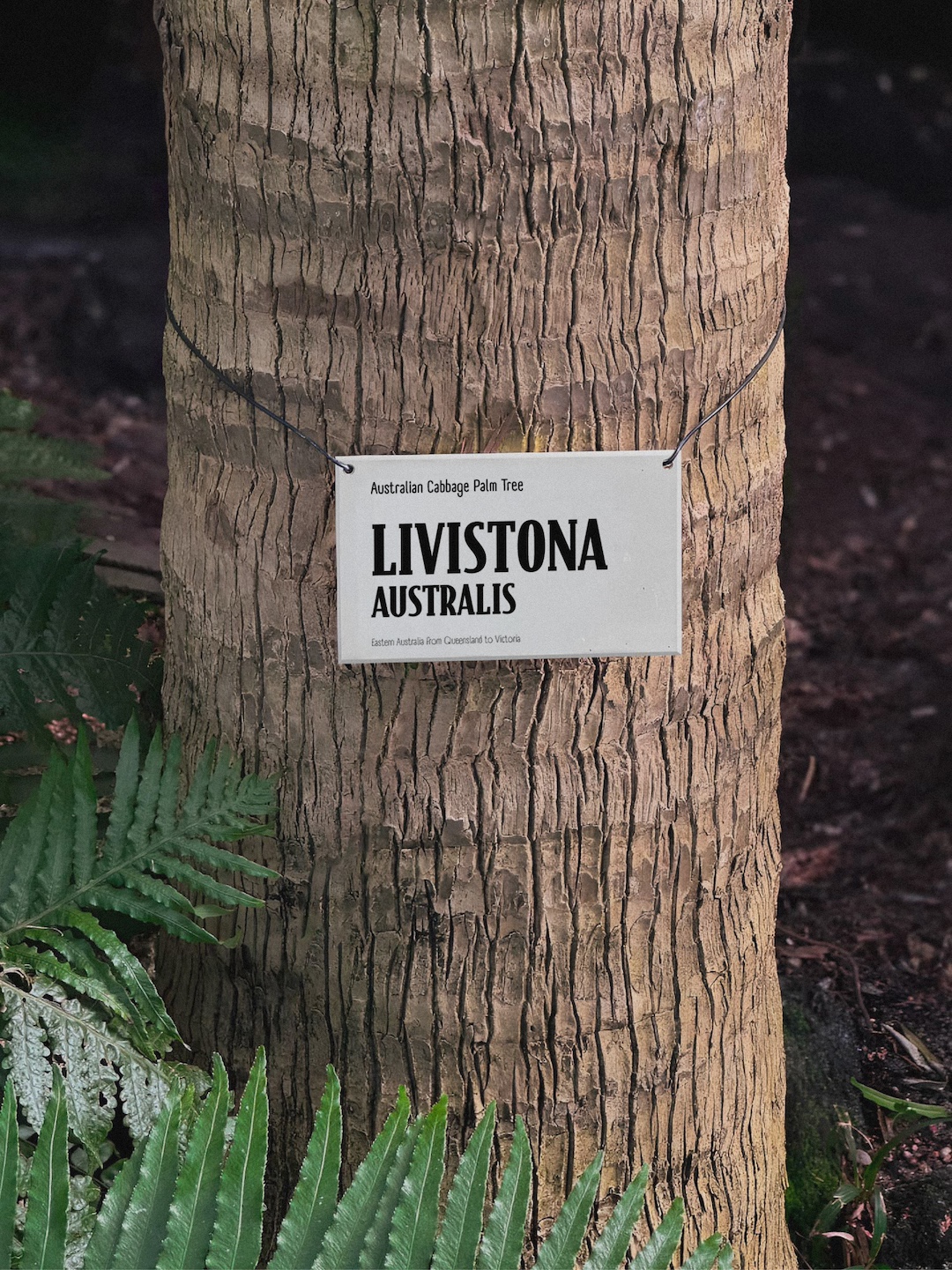
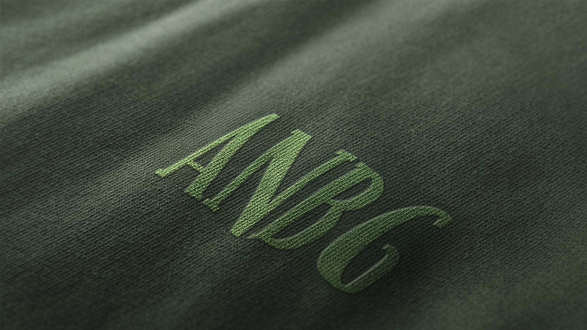
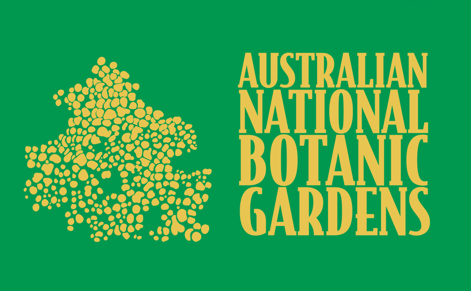
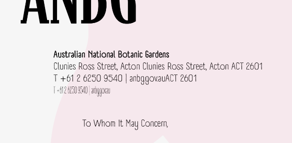
The logo uses Bodega Serif locked into a square format, a deliberate choice that balances warmth with authority. The serif brings a sense of established credibility and timelessness, grounding the identity in the institution's heritage while remaining approachable for families. Locking it in a square creates a stable, recognizable anchor that holds the entire visual system together. An alternate version condenses the name to "ANBG", a practical shorthand for smaller applications and digital spaces where brevity matters.

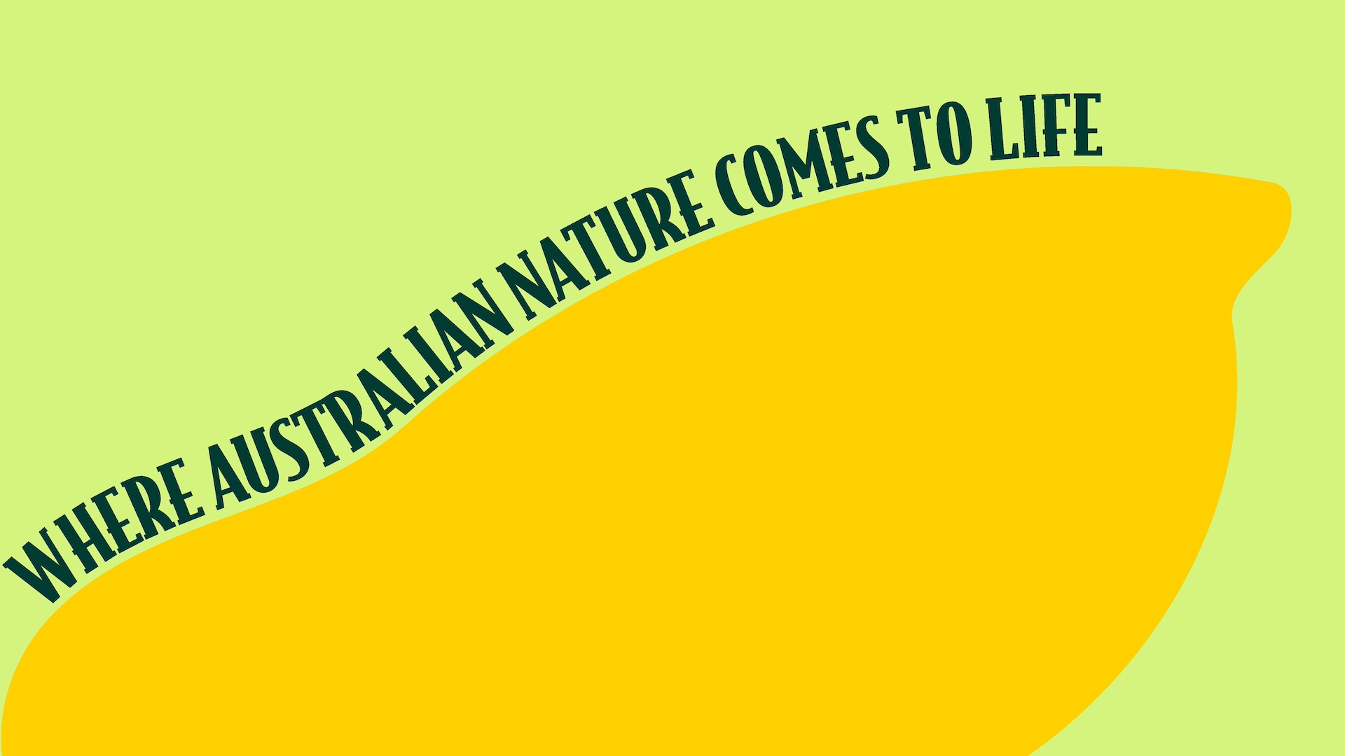
Typography pairs Bodega Serif for headings with A Day Without Sun for body copy. Bodega Serif extends the logo's warmth across hero text, maintaining visual consistency while reinforcing the institutional credibility families expect. A Day Without Sun keeps things conversational and approachable, hitting that sweet spot between fun and readable. The combination feels natural without being overly playful, ensuring the brand stays engaging for kids while remaining professional for all audiences. Together, they support the dynamic, accessible energy the client wanted without sacrificing clarity or polish.
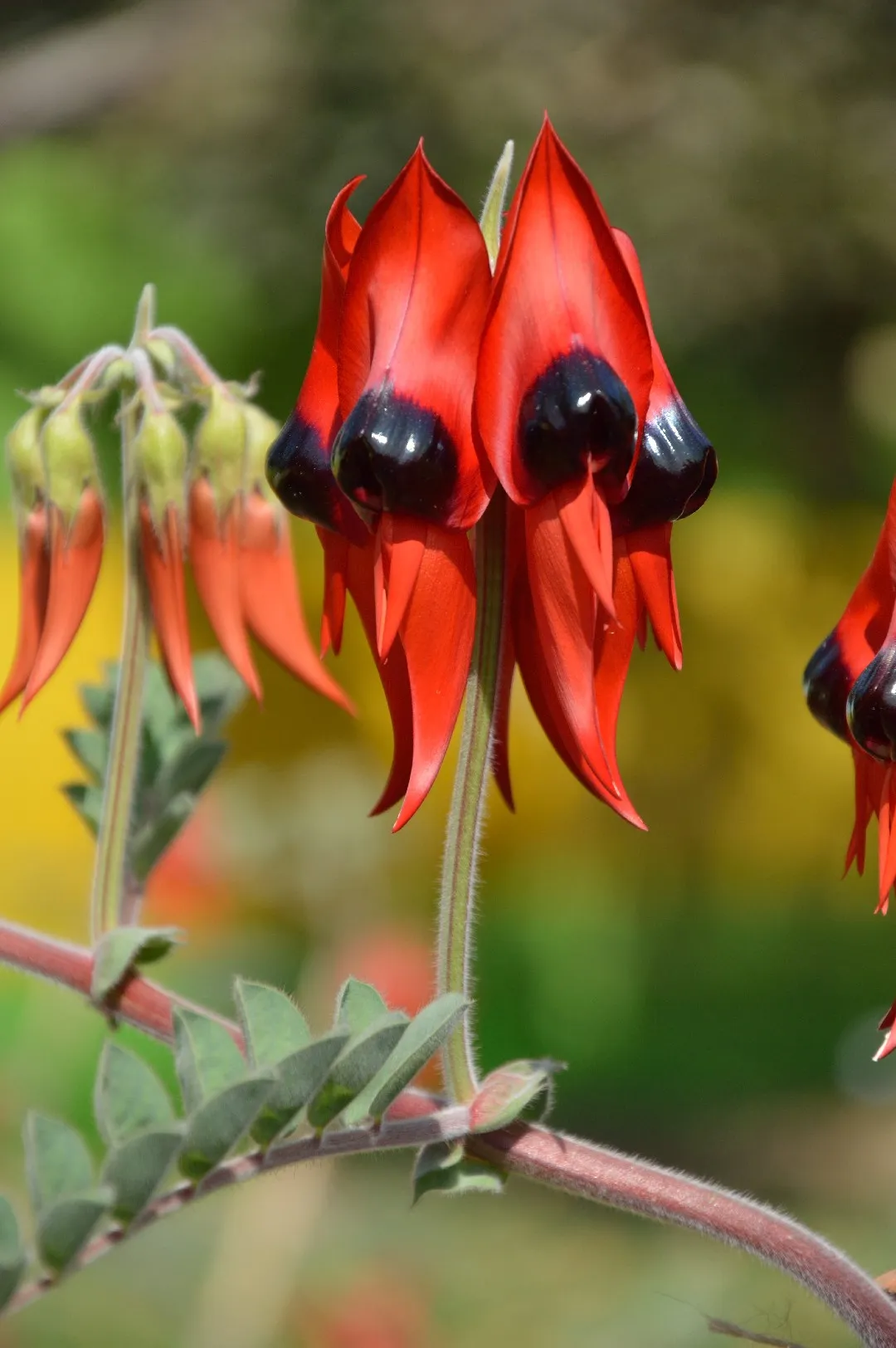
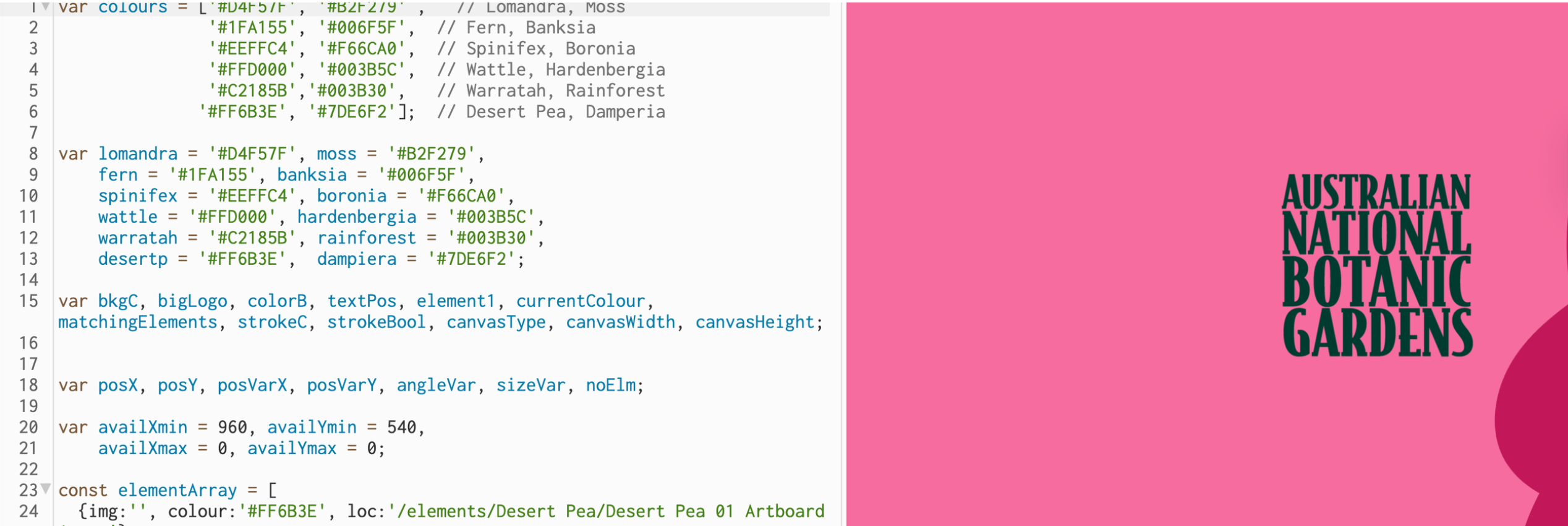
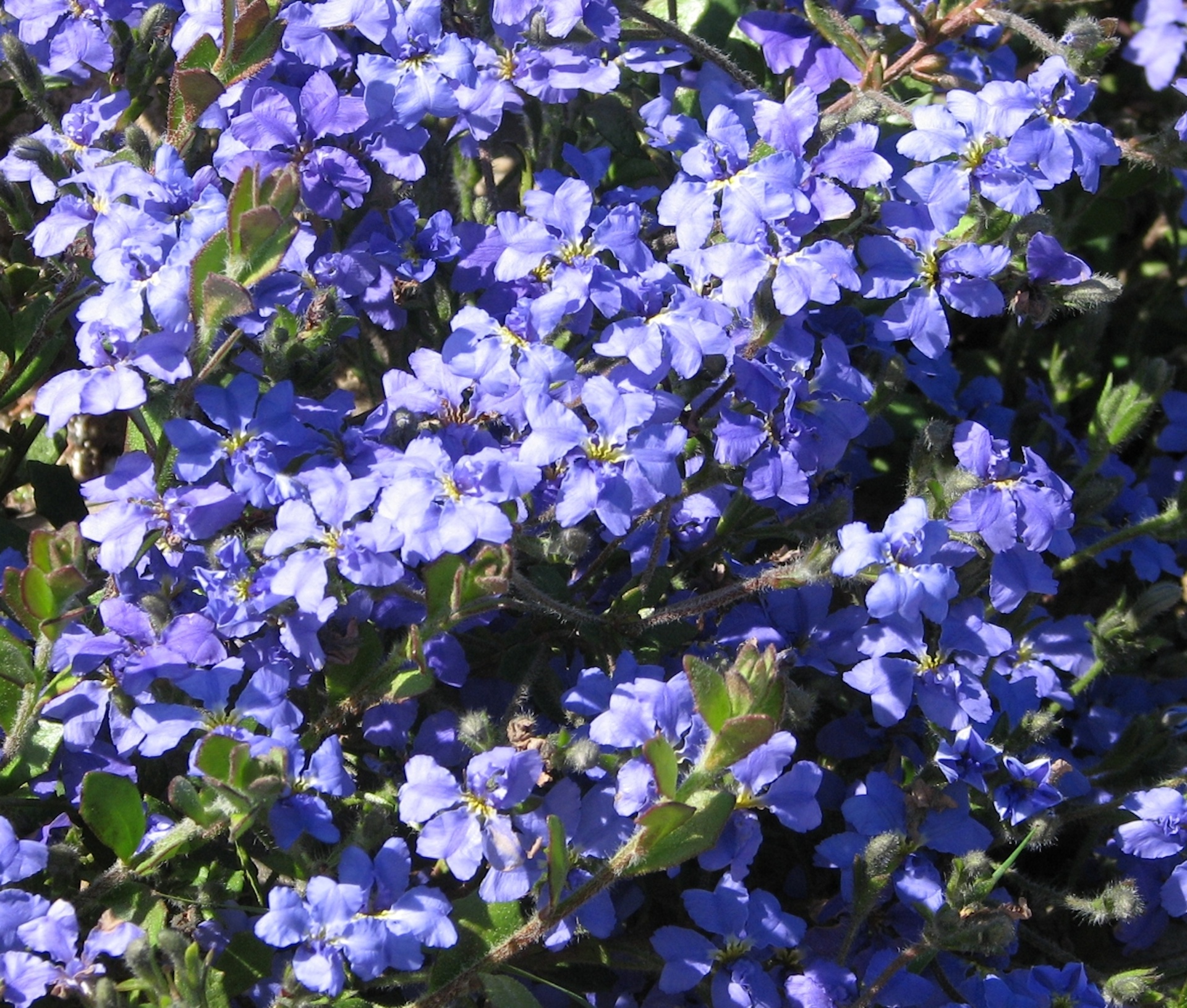
The palette draws directly from native Australian flora, grounding the identity in the Gardens' living collection. Each colour references a specific plant, creating an authentic connection to the subject matter while delivering the bold, energetic visual presence the client requested. The range captures Australia's botanical diversity, from earthy tones to vibrant florals, making the system feel alive and ever-changing.


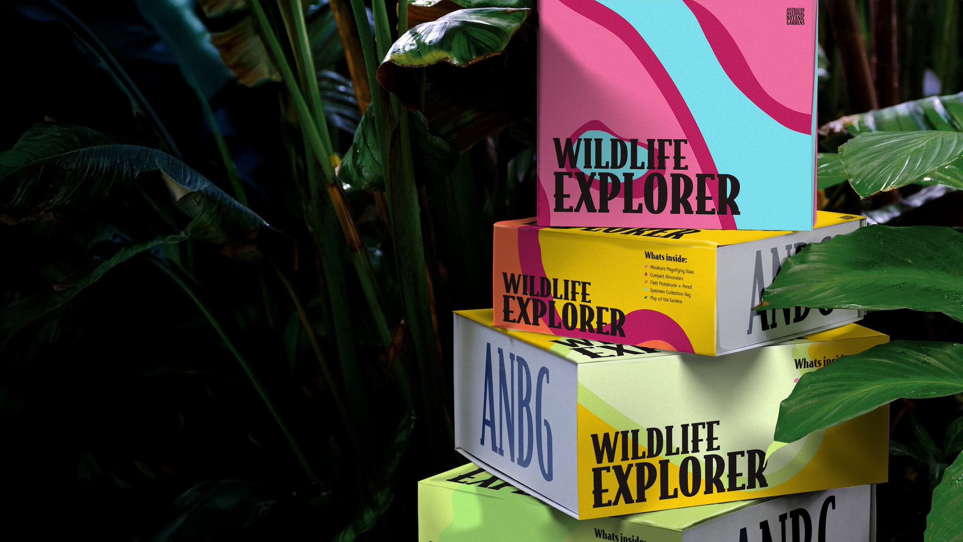
The generative system brings it all together arranging plant forms and colours dynamically, ensuring the identity never looks static. Built in p5.js, it creates endless variations while maintaining visual consistency, reflecting the Gardens' living, evolving nature. Each iteration feels fresh and engaging, capturing that sense of discovery the client wanted for families. The system adapts seamlessly across digital and print, staying bold and recognizable at every touchpoint while reinforcing the idea that the Gardens are always growing, always changing.