The SoCIETIE Project
Client: SoCIETIE
Year: 2024
Group Members: Jordyn Erdeljac (communication), Hugo Su (communication, mock ups), Moby Westwood (graphic design, ideation, communication)


Project Brief
The SoCIETIE Initiative is an alternative learning program focused on community outreach and social change, which launched in February 2025. The goal of this project was to develop a visual identity for SoCIETIE that could be applied across a variety of deliverables, including branding, a website and internal materials. The client, Chris Brown, founder of SoCIETIE, wanted a visual identity with a strong narrative that connected both to the Australian National University and to SoCIETIE’s mission.
A key challenge was ANU adjacent branding. The university has strict marketing guidelines, and because SoCIETIE is an ANU based program, the visual identity needed to be flexible enough to meet these standards while still retaining its own character.

Process
The process for this project was centred on client communication. Over 12 weeks, we held weekly meetings with Chris and other key stakeholders to identify which design directions best met the client’s needs. Throughout this process, we generated a large number of logos, each with its own rationale linking it to ANU and SoCIETIE. Each meeting refined our approach, eventually leading to the decision to base the visual identity on three core concepts: Sullivans Creek, KNOTs and a hub and spoke system.


Outcomes
The outcomes of this project were a Logo suite, Brand Mascot, set of digital badges, ANU adjacent alternatives and a brand guidelines book.
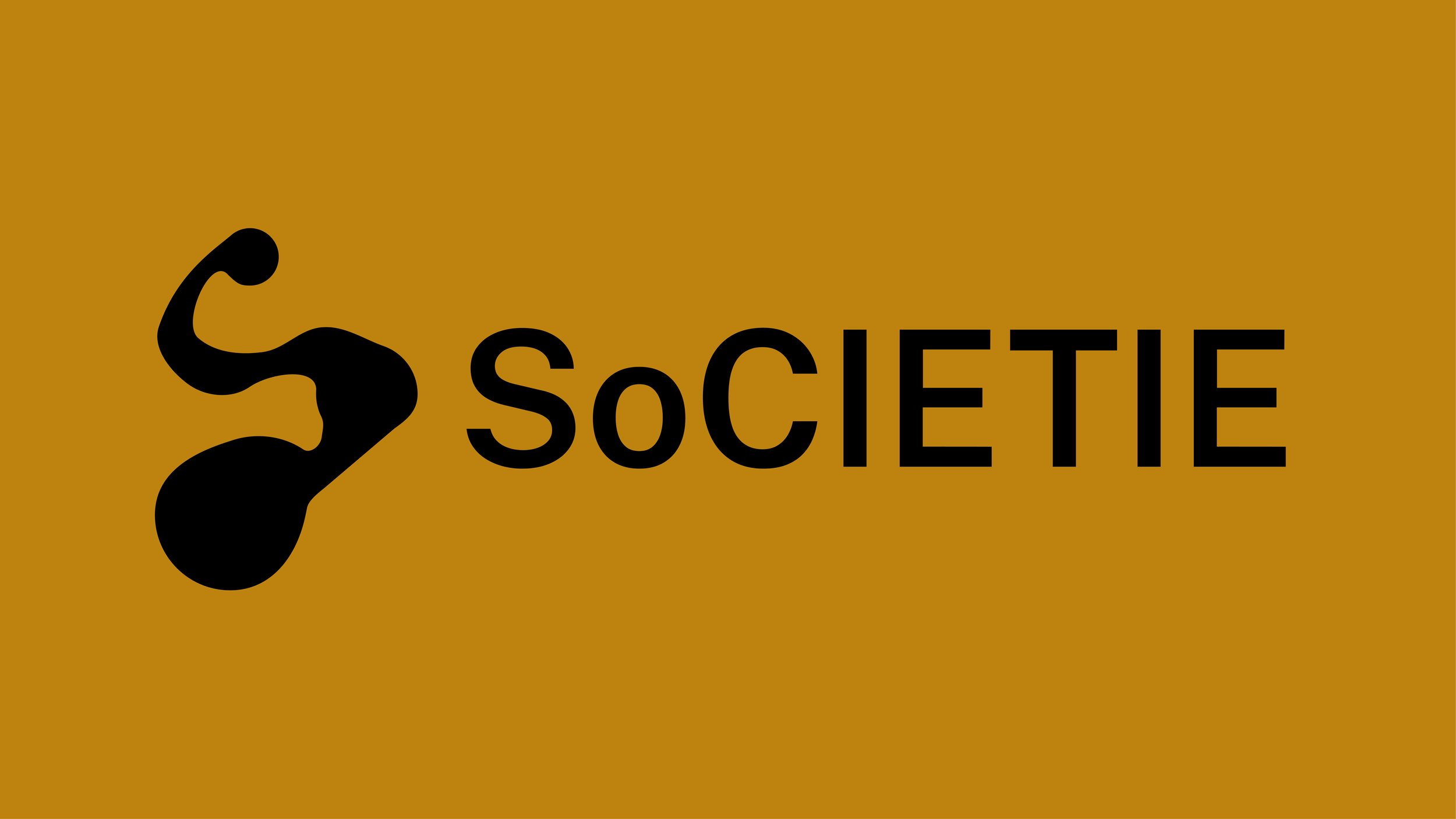
Logo suite
The final logo mark is based on three concepts. The three hubs are designed to resemble knots along a rope, reflecting SoCIETIE’s principle: to Know the Nature Of Things. The flow between the hubs evokes Sullivans Creek, symbolising how SoCIETIE connects transdisciplinary students and teachers just as the creek connects the ANU campus. Finally, the overall shape of the logo is a hub and spoke system forming an “S,” reinforcing SoCIETIE’s name and purpose.
The colours were chosen for their geographic relevance to the ANU campus: blue represents Lake Burley Griffin, green represents the wider campus, and bright yellow represents Kambri, the communal hub of ANU. Variex OT was selected for the logo type for its clean, sharp edges and distinctive forms, conveying professionalism while maintaining visual interest.


Creating a memorable mascot was a key part of SoCIETIE’s branding. To meet this need, I designed Knox, a cartoon character that brings the brand to life and separates it from corporate visuals.
Knox’s form is inspired by a knot, reflecting SoCIETIE’s principle to Know the Nature Of Things. His design draws on rich symbolic references, blending the monkey’s fist and the Gordian Knot to represent problems that tighten the more you pull, challenges that can only be solved by a shift in thinking. Just as Alexander the Great famously cut through the Gordian Knot, Knox embodies the idea that bold, unconventional approaches are needed to untangle complex issues.
Know’s shape is also informed by Gödel’s Loophole, a mathematical metaphor showing that the first breakthrough is always the hardest, but once achieved, subsequent solutions become easier. Together, these ideas give Knox a narrative weight: he is not just a problem, but a challenge that demands creativity and daring to solve, a key part of SoCIETIE’s identity.
Brand Mascot


A key deliverable was the digital badges that students could earn by completing elements of SoCIETIE’s course. Each badge needed to clearly represent its content while staying consistent with the established visual identity. Knox was the perfect solution. In every badge, Knox is placed in a scenario that reflects the theme or learning outcome, bringing personality and clarity to each achievement.
Digital Badges


ANU Adjacent
For all ANU adjacent branding, I ensured my designs adhered to the university’s strict guidelines. This involved adjusting colours, typography, and other visual elements to meet ANU standards while maintaining the integrity of SoCIETIE’s visual identity.


Brand Guidelines Book

The Brand Guidelines Book brings all of this together into a clear 90-page document. It shows how each design deliverable can be used, while also highlighting things to avoid with SoCIETIE branding. The book covers colour and typeface choices and includes plenty of examples showing the branding in action.


